Welcome to another Flutter update. This time we will dive into TwoPane, tell you how to get it from pub.dev and focus on the types of layouts you can build with it. Before we get to examples, we will first see what parameters it exposes. This widget has cousins in other frameworks, making its context interesting to explore. Let us first start with the context.
TwoPane cousins
Our team focuses on making it easy for developers to enhance their apps for dual-screen, regardless of what tech they use. We want to meet developers where they are. This means that a high-level component like TwoPane has many cousins, one in each “village”: TwoPaneView from Windows UI, TwoPaneView from React Native, TwoPaneView from Xamarin and TwoPaneLayout from Jetpack Compose. You are in good company when using the component. This also gives you a bit more context on the naming of parameters. For example, panePriority is a parameter you can find on all these components. Each framework has its own specifics, and each cousin has adapted to accommodate developers. With this bit of context and trivia, let us dive into how TwoPane for Flutter has adapted for your needs.
Desktop, tablet, and large screens
Flutter runs on almost anything now and this widget wants to help with your layout on larger screens. When spanned on Surface Duo, each pane occupies one screen. With this simple rule in mind, you can be confident about how your layout adapts to dual-screen devices and then focus on tablets and desktop instead. Let us take an example and then dive into each parameter.
TwoPane(
  startPane: BlueA(),
  endPane: OrangeB(),
  direction: Axis.horizontal,
  panePriority: TwoPanePriority.both,
  paneProportion: 0.33,
)
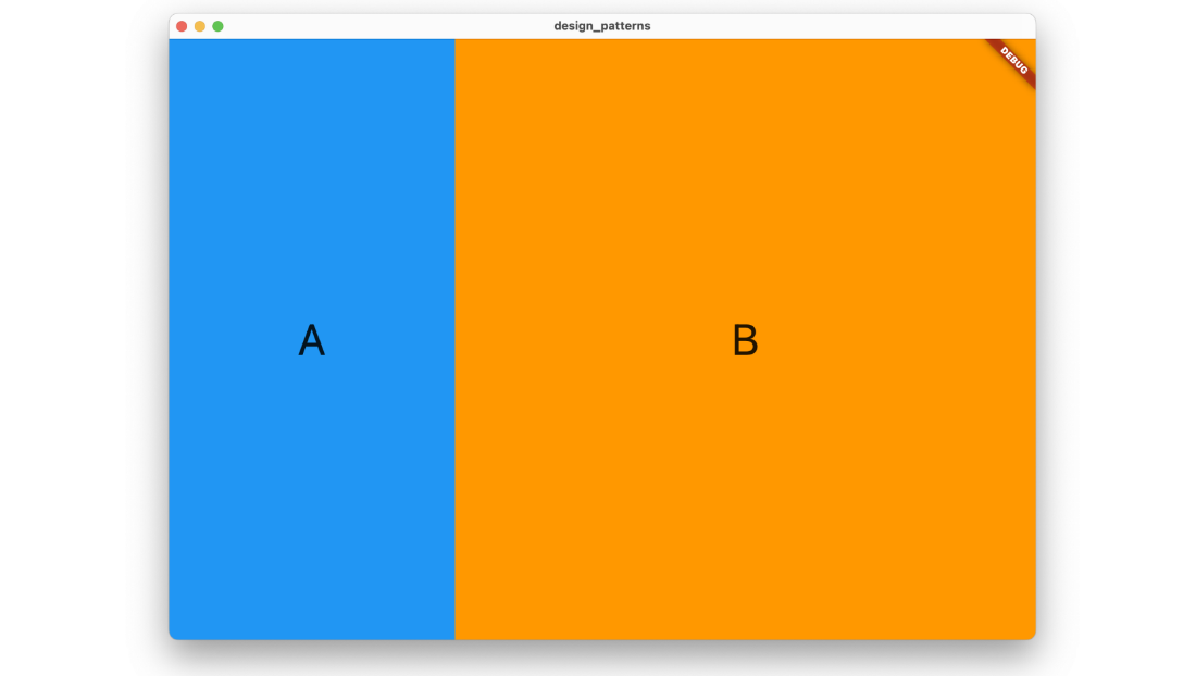
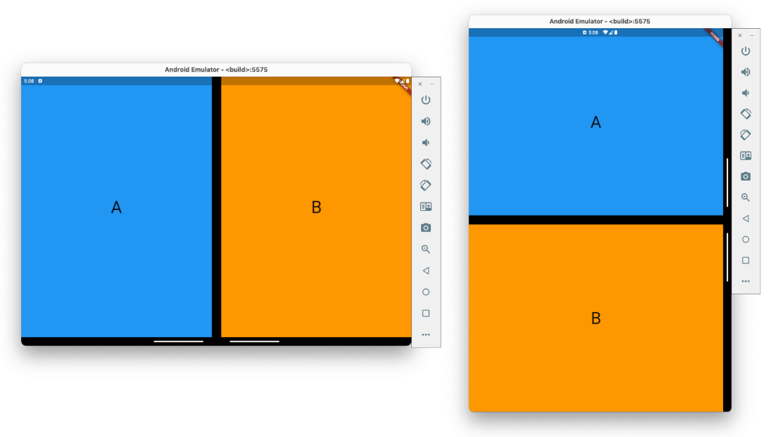
As you can see in the above images, all the parameters we gave TwoPane take effect on the desktop app. On the Surface Duo, each pane takes over one screen. Real world scenarios can be a bit more complex, and you might want to show just one pane if the screen is small. In this next example, the code is mostly the same. We only change the panePriority to show one pane when the screen is smaller.
bool smallScreen = MediaQuery.of(context).size.width < 500;
TwoPane(
  ...
  panePriority: smallScreen ? TwoPanePriority.start : TwoPanePriority.both,
)
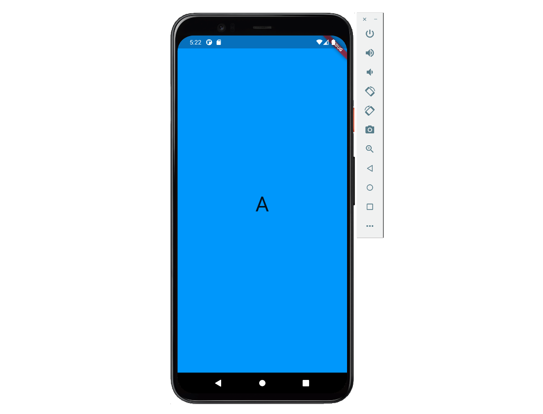
Hopefully, you can now better envision how to leverage this layout to scale up your designs. TwoPane makes it easy to create tablet and desktop layouts, and you also get the dual-screen for free.
TwoPane parameters
In this chapter we get into details on each parameter. If you wanted a light read, please skip ahead to the example usages. Structured details on each parameter can be found in our docs.
Flex similarities
TwoPane is based on the Flex widget, the same one that Row and Column are based on. This means that direction, textDirection and verticalDirection behave the same as they do for Flex. The only difference is that direction is ignored on a dual-screen device when spanned and will be decided by the orientation of the device.
Start and end
As the name suggests, this widget takes two child panes. They are named startPane and endPane to suggest that their order depends on textDirection. This comes in handy on right-to-left layouts, as the textDirection parameter defaults to ambient directionality, which means it works without effort on your side.
Priority and proportion
The parameters that are unique to TwoPane are panePriority and paneProportion. They are used to determine which pane is visible and how much space each takes up. For panePriority, the possible values are:
-
both: both panes are visible -
start: onlystartPaneis visible -
end: onlyendPaneis visible
The paneProportion parameter tells startPane how much to occupy of the total space and has values between 0 and 1, with 0.5 meaning that both panes take half the available space. Instead of using 1 to signal that you only want startPane to be visible, use panePriority instead.
Like direction, priority and proportion are also overridden on dual-screen devices when spanned, such that each pane is visible on its own screen. This is why both startPane and endPane are mandatory parameters.
Example layouts
At this point in the article, you might wonder what your app could look like on a dual-screen device. We went through the same thought process and are glad to say we created a few useful tools as a result. Among other things, our design kit contains a few design patterns that TwoPane is perfectly suited for.
![]()
We took the time to also implement these design patterns as examples in our Flutter Samples but there is a twist here. Since this is Flutter, the project also runs on desktop, where the layouts become responsive and react to size changes. This way you can see TwoPane shine as a large screen enhancement tool that gives you the dual-screen for free. As a case study, let us dive into one of the examples, the List-Detail design pattern. Please keep in mind that the samples project contains examples for all the other design patterns as well.
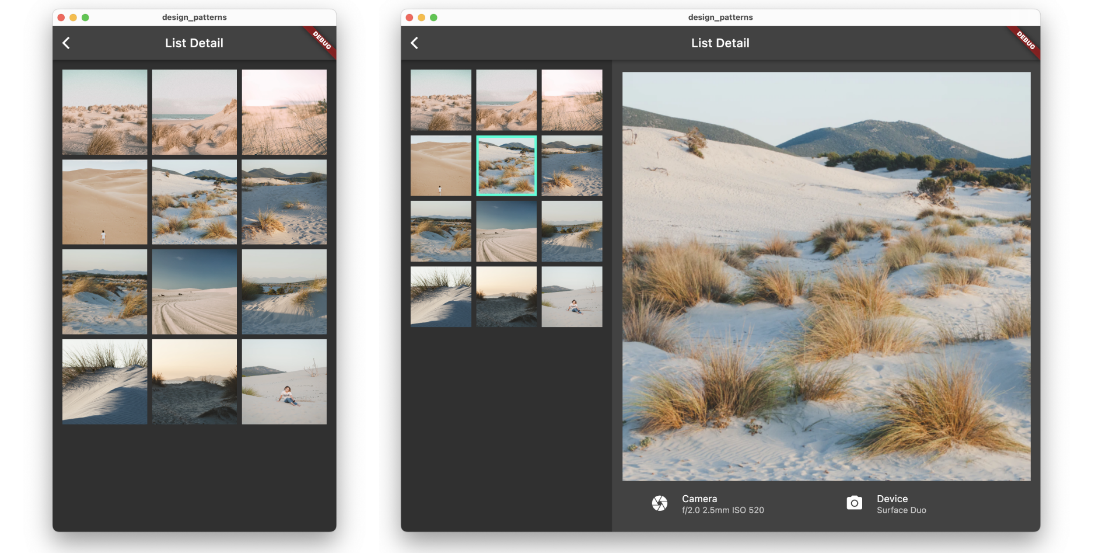
This is how the desktop layout looks like. You can notice that if the window is not wide enough, the layout only shows the list of images. You can also notice that if the window is wide enough, the list of images and the selected image are shown side-by-side. The list only takes a third of the window, while the selected image takes the other two thirds.
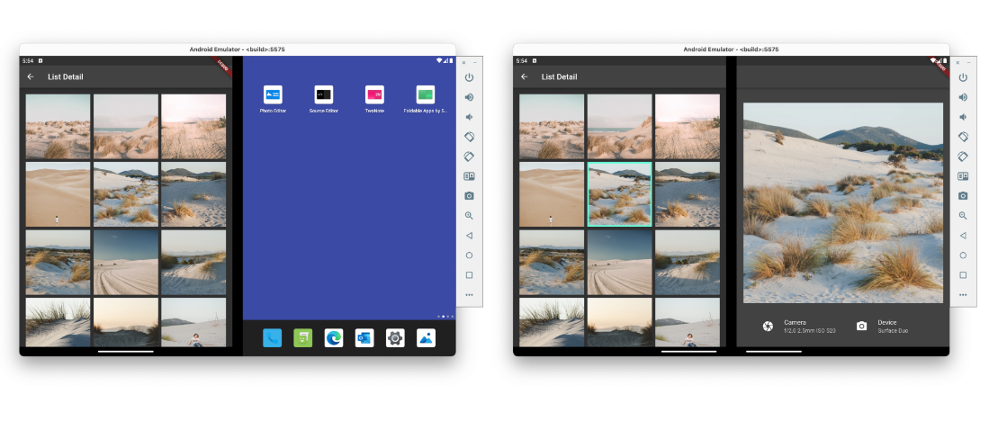
Running the exact same code on a Surface Duo emulator shows you that the promise this component makes holds up. When the application is spanned, the list takes over one screen, and the selected image takes over the other screen.
There are also a few navigation considerations that might, at this point, start to become a bit more visible. For example, showing a selection in the list makes sense only if both panes are visible. We invite you to have a look at the samples project to discover more details like this and are glad to respond to any questions on the feedback forum or on Twitter @surfaceduodev.
The dual_screen package on pub.dev
Having TwoPane be part of a library and not the Flutter framework allows us to iterate quicker on it and be more opinionated on how it should work. The dual_screen package contains all the extra tools we offer developers for crafting dual-screen and foldable experiences, like listening to hinge angle events or the TwoPane widget. Everything the library offers works on all foldable devices. Moving forward, we plan to add more components to help with navigation and other aspects of dual-screen layouts. So, if you want to use TwoPane, you need to add this library to your pubspec by running:
flutter pub add dual_screen
This will add a line like this to your package’s pubspec.yaml (and run an implicit flutter pub get):
dependencies:
  dual_screen: ^1.0.2+2
Add the library in the files you use TwoPane in, and you are good to go:
import 'package:dual_screen/dual_screen.dart';
One last note: The library depends on a few things added to Flutter in the past few months. If you run into compilation issues, please first try running flutter upgrade to bring whatever Flutter channel you use to the latest version.
Call to action
-
Clone our Flutter foldable samples:
git clone https://github.com/microsoft/surface-duo-sdk-samples-flutter.git. - Install and run on the Surface Duo emulator, which was used in all the emulator images in this article.
-
Run
flutter pub add dual_screenin your project and start using TwoPane. - If you have any questions or would like to tell us about your apps, use the feedback forum or message us on Twitter @surfaceduodev.
- Finally, please join us for the dual screen developer livestream at 11am (Pacific time) each Friday – mark it in your calendar and check out the archives on YouTube. We will discuss Flutter this Friday at 13h00 Central European Time and replay at 11am Pacific Time.

0 comments