
Hello Jetpack Compose developers!
We have two exciting new Jetpack Compose samples for Surface Duo to share with you. The first one, called Source Editor, was previously published, but we migrated it to take advantage of Jetpack Compose. The second one is a Diary application that demonstrates using Android Views components with Jetpack Compose.
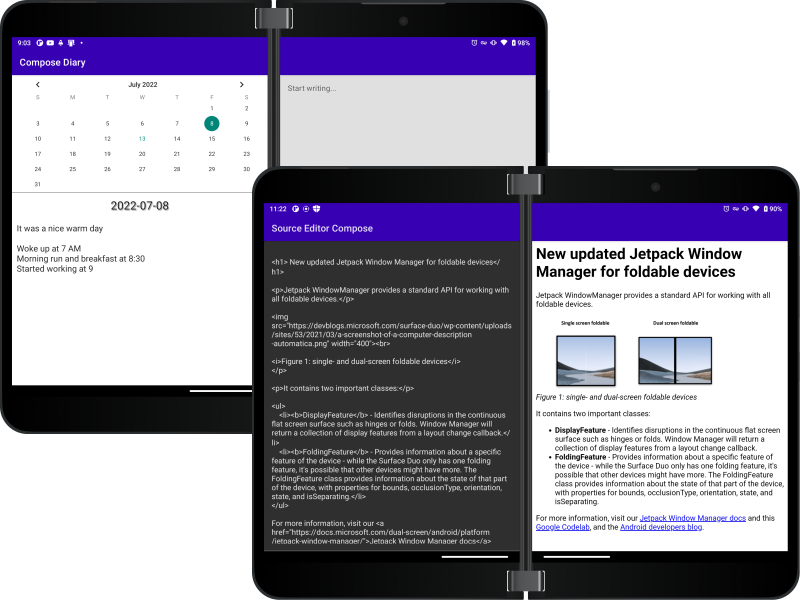
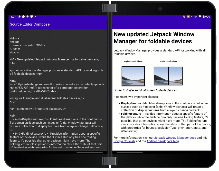
Source Editor
We published the original Source Editor app in 2020, and now with the rising popularity of Jetpack Compose, we thought it would be a fantastic idea to migrate this sample from Views to Compose. There are some fundamental differences when it comes to developing with Jetpack Compose. In my opinion, it’s a lot more fun to develop your apps using Jetpack Compose compared to traditional XML view-based Android development.
The Source Editor app mainly consists of two components; one is the HTML Editor and the other one is the Preview Screen which renders the HTML contents. The original source file, which is based on our Jetpack Window Manger Documentation, is stored in the app’s assets folder and used to load the first HTML preview. You can directly edit the Source file in the left pane, which is the Editor, and the changes will be reflected in real time on the Preview Screen.
The underlying SDK for Surface Duo has consistently been improving, and it’s easier than ever to use to build and optimize your applications on top of it. The TwoPaneLayout SDK now has a simple way to handle what is shown in different layouts. You can use the updated TwoPaneLayout to design Compose projects for large screens and foldables.
Let’s walk through how you can design your app to use the updated SDK. Our Compose Library can detect different orientations and postures, and it takes two parameters: pane1 and pane2. We can use a designed Composable called TwoPaneLayout which has two parameters called pane1 and pane2 which accept composable functions inside to be displayed on each of the panes. When the application is in a single-screen layout, the app will by default stick with pane1 composable.
Sometimes you would want your app to function differently when it’s operated on a single-screen vs. a dual-screen, and we have made it easier to do than ever. Inside your TwoPaneLayout, you can directly check if the app us running in one or two panes. This will help you adapt your app layouts accordingly.
Let’s look at our Source Editor example…
@Composable
fun TwoPaneScope.PreviewPage(text: String) {
    val twoPaneScope = this
    Scaffold(
        topBar = {
            TopAppBar(
                title = {
                    if (isSinglePane) {
                        Text(text = stringResource(id = R.string.app_name))
                    }
                },
                contentColor = Color.White,
                backgroundColor = MaterialTheme.colors.primaryVariant,
                actions = {
                    if (twoPaneScope.isSinglePane) {
                        IconButton(onClick = { twoPaneScope.navigateToPane1() }) {
                            Text(text = stringResource(R.string.editor_button))
                        }
                    }
                }
            )
        }
    )
Code: Using the isSinglePane method to determine if the app title and a top bar icon button should be shown
You can see that I have used the TwoPaneLayout feature called isSinglePane – it tells you if TwoPaneLayout is currently showing one pane or two panes. For example, if the device was in dual-landscape mode, but TwoPaneLayout was using HorizontalSingle pane mode, then isSinglePane would still be true (even though the device itself is dual-screen). Depending on if the device is in single-screen mode, the Source Editor app will render the app name in the top bar, otherwise if it is in dual-screen mode, we won’t render the app name on right side of the screen (Preview Page), as we have already rendered it on left page. Similarly, you can see that we have an additional button attached to the TopAppBar if it’s deployed on a single pane. It is done so to make the app functional even when it’s used in single-screen mode or other devices, as a user can use it to toggle between the Editor and Preview screens.
Whenever we use an EditText box to process input, it is important to make sure the view is not blocked when a keyboard pops up. After scratching my head on how to solve this problem, I finally found a solution which is really an easy way to adjust your view whenever it is blocked by a keyboard pop-up. You can just add android:windowSoftInputMode=" " attribute in your Activity XML present in your AndroidManifest.xml file to fix the problem. There are two modes which can fix this problem:
-
adjustPan– Using this mode, Android will resize your activity’s main window to contain the soft on-screen keyboard -
adjustResize– Using this mode, Android will not resize your window, but rather will pan the window to the current cursor point, bringing it in focus
<activity
    android:name="com.microsoft.device.display.samples.sourceeditorcompose.MainActivity"
    android:exported="true"
    android:label="@string/app_name"
    android:windowSoftInputMode="adjustPan"
    android:theme="@style/Theme.TwoPaneExample">
    <intent-filter>
        <action android:name="android.intent.action.MAIN" />
        <category android:name="android.intent.category.LAUNCHER" />
    </intent-filter>
</activity>
Code: Using the windowSoftInputMode adjustPan option to respond to keyboard input
In Source Editor, we have designed it in a way that if a user clicks anywhere in the Source file, the view would be pushed up to focus on the current input point.
One last thing I want to cover is using things which aren’t available in Compose through native composable support. Compose is still in early stages, and you may feel like it’s hard to add Compose to an app that uses View-based design, but Android has a way worked out for you. Using Interoperability APIs, you can combine your view-based design and wrap it into a generic AndroidView. It is also recommended not to hold reference to the view directly outside AndroidView Scope, as during a configuration change like screen rotation, multiwindow switch, the Activity, along with all of its UI elements are re-rendered, while the view model will stay the same. If the reference to the old activity is directly stored outside, performing operations with that reference will either lead to a memory leak or the app will crash.
AndroidView(
    factory = {
        WebView(it).apply {
            layoutParams = ViewGroup.LayoutParams(
                ViewGroup.LayoutParams.MATCH_PARENT,
                ViewGroup.LayoutParams.MATCH_PARENT
            )
            webViewClient = WebViewClient()
            loadData(text, "text/html", "UTF-8")
        }
    },
    update = {
        it.loadData(text, "text/html", "UTF-8")
    }
)
Code: Using Views in Compose wrapped in Android View
In our Source Editor example, I have used AndroidView wrapper to encapsulate the WebView. The update attribute can be used whenever an update is triggered on the view and all the methods available on the view will be accessible within that attribute scope. The loadData method is used to provide source for the WebView, calling it on the available reference to the view, will trigger an update to the WebView. In other words, whenever there is any update on the Source.html page, it will re-render the Preview Page WebView accordingly in real time.
Maybe this experience, and little things that come along with it, might come in handy when you are migrating existing projects from Views to Compose and designing apps for large screens and foldables.
Diary
The Diary app was a new sample idea. It is intended to demonstrate an implementation of the Calendar view within a Jetpack Compose layout:
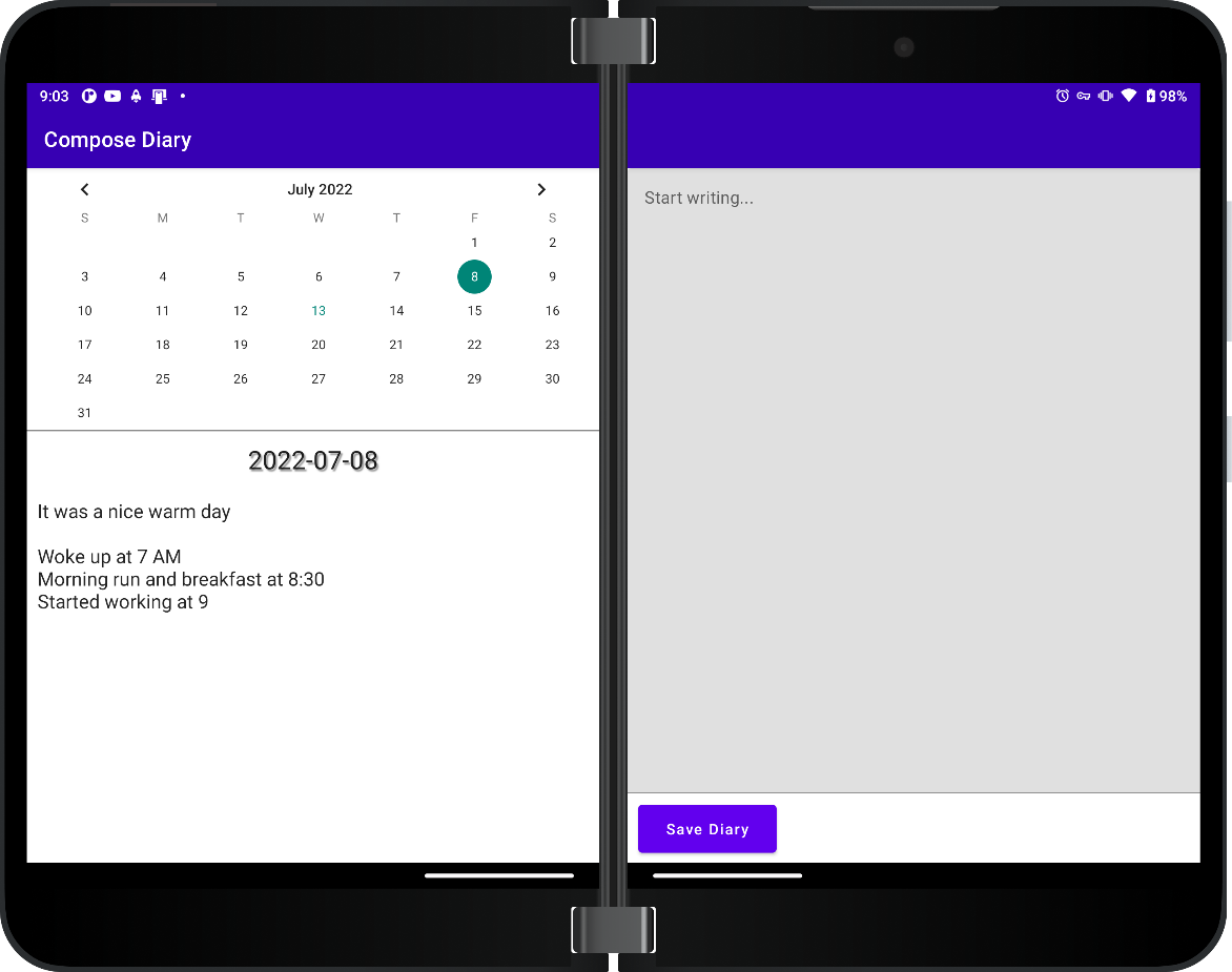
The design of the Diary application consists of CalendarView, and a TextField input box which can be used to write a diary entry for any particular day, and a Diary box which contains the actual diary if there’s anything saved on a particular day. The Calendar layout, along with its Diary counterpart, is spread across pane 1, while pane 2 is dedicated fully to writing and editing the diary text. When we write a diary entry for any day, the app will create or edit an existing text file with the new content. When we click on a day in calendar, it will check if a text file already exists for that day to load the diary contents. To do so, we are naming the text file with current selected date in mmddyyyy format. All of the state necessary for the application is stored in one place to make state management easier.
We talked about AndroidView in above sample app, let’s now see how it applies in the case of this Diary app sample:
AndroidView(
     {
        CalendarView(it)
            .apply {
                // centering the Calendar view vertically but letting it expand on width
                layoutParams = ViewGroup.LayoutParams(
                      ViewGroup.LayoutParams.MATCH_PARENT,
                      ViewGroup.LayoutParams.WRAP_CONTENT
                )
            }
      },
      modifier = Modifier.wrapContentWidth(),
      update = {
        it.setOnDateChangeListener { view, year, month, dayOfMonth ->
            val currentSelectedDate = LocalDate.of(year, month + 1, dayOfMonth)
              updateDate(currentSelectedDate)
              updateContent()
              Toast.makeText(
                  context,
                  "Date Changed to : $currentSelectedDate",
                  Toast.LENGTH_SHORT
              ).show()
          }
    }
)
Unlike the last app, this app does not manifest the WebView, instead, it uses a CalendarView which is a specific View in XML view-based design. Similarly, within its update attribute, we can actually set an OnClickListener on its reference which will return to us four parameters, the actual view, year, month and dayOfMonth. We can use these values to update the current selected date data in our application whenever a change is triggered in the CalendarView .
Looking at the code above, you might be wondering how to keep track of all the different data in the application and do state management. Well, there are not many things that we need to keep track of, so we can store these values inside our MainApp along with the lambda functions to update them whenever an update on a view is triggered.
For our application, we mainly need to keep track of three things.
- The current date which is selected
- Contents of the diary for a particular day
- Text present in the diary creation/editing EditText block
var text by rememberSaveable { mutableStateOf("") }
var currentSelectedDate by rememberSaveable {
    mutableStateOf(LocalDate.now())
}
var content by rememberSaveable { mutableStateOf("") }
When we need a way to modify this data, we will use lambda functions to modify these states.
val updateDate: (LocalDate) -> Unit = { date ->
    currentSelectedDate = date
}
val updateContent: () -> Unit = {
    content = fileOps.readDayFile(currentSelectedDate.toString(), rootDataDir, context)
}
val updateText: (String) -> Unit = { newText ->
    text = newText
}
Code: function declaration for managing state updates
In Jetpack Compose, when we want to update the data used throughout the activity, we can use a functional unit called lambda function to modify that data. Whenever we use this method to update the data that is accepted by the composable in its parameter, Jetpack Compose will automatically trigger a re-composition for that specific element.
Looking at our TwoPaneLayout, we can see the CalendarPage and DiaryPage along with the list of parameters that they accept.
TwoPaneLayout(
    pane1 = {
        CalendarPage(
            content = content,
            text = text,
            selectedDate = currentSelectedDate,
            updateDate = updateDate,
            updateContent = updateContent
        )
    },
    pane2 = {
        DiaryPage (
            text = text,
            updateText = updateText,
            selectedDate = currentSelectedDate,
            updateContent = updateContent
        )
   }
)
@Composable
fun TwoPaneScope.DiaryPage(
    text: String,
    updateText: (String) -> Unit,
    selectedDate: LocalDate,
    updateContent: () -> Unit
)
Code: TwoPaneLayout and DiaryPage Composable which accepts selectedDate as a parameter
In code above, we can see that the DiaryPage is accepting selectedDate as one of the parameters. Whenever we change the selected date on the Calendar Page, it will trigger the change in our data model, which will then change the selected date, which will lead to re-rendering the DiaryPage with the new selected date.
Have fun playing around and exploring both samples!
Resources and feedback
You can find the source for Source Editor and Diary on GitHub.
If you have any questions or would like to tell us about your dual-screen applications, use the feedback forum or message us on Twitter @surfaceduodev.
Finally, please join us every Friday on Twitch at 11am Pacific time to chat about Surface Duo developer topics!
0 comments