
Hello, Android dual-screen developers!
Today we are going to talk about how to use the new UI framework, Jetpack Compose to build a dual-screen app on the Surface Duo. Jetpack Compose is a new Declarative UI Framework in Android. Instead of using the traditional XML layouts, the developer calls the Composable functions to get the UI elements and modify them. Although Google just released the alpha for Jetpack Compose, we still believe it is a good idea to leverage it in the development for dual-screen apps.
Here is a simple sample we built on Surface Duo to demonstrate the use of Jetpack Compose. The sample is using the List-Detail app pattern to show a list of image thumbnails on the single screen. After spanning the app into dual-screen mode, the full image will be shown on the other screen. Selecting the image item on the list will update the full image accordingly.
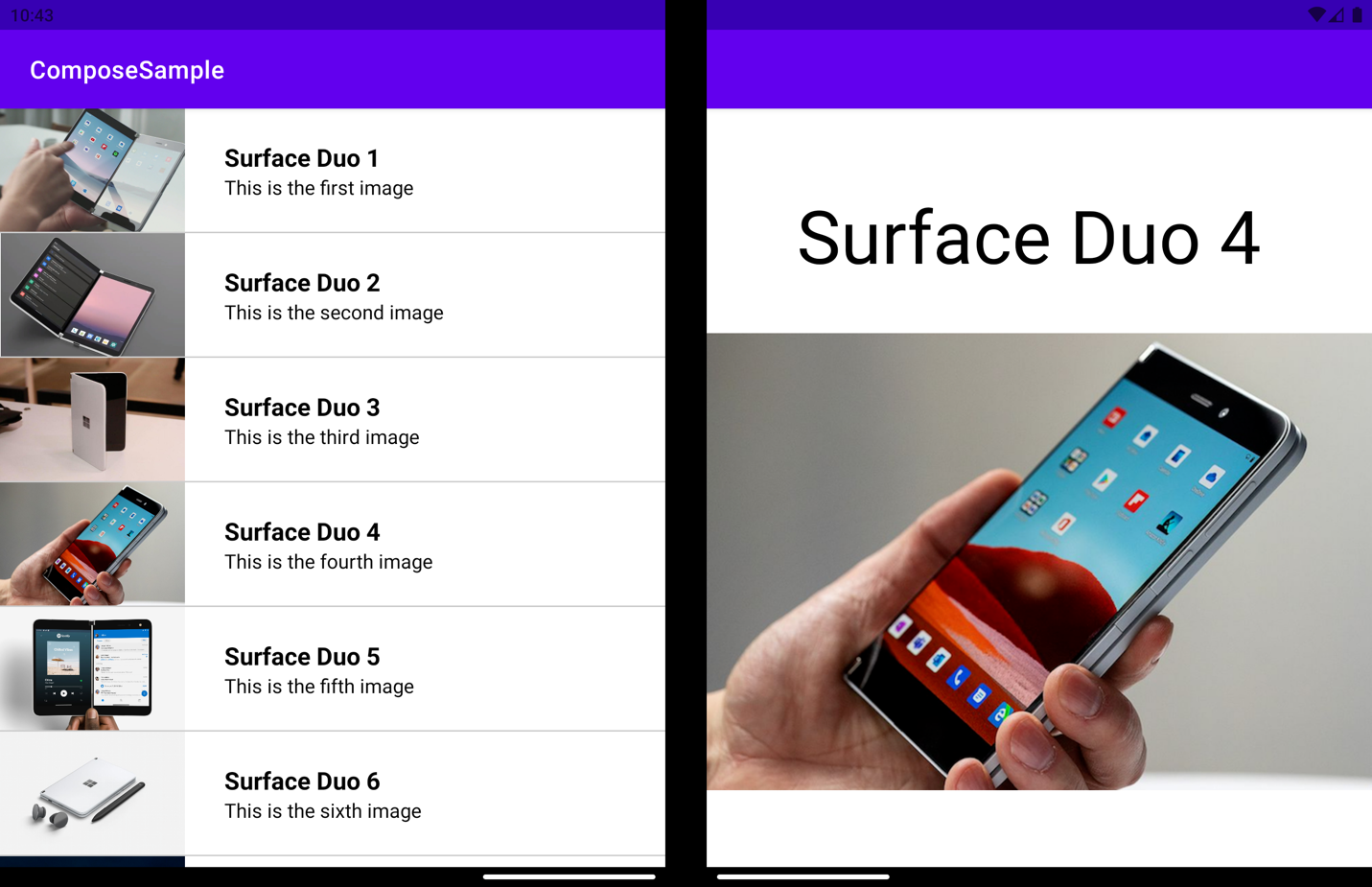
Figure 1: Screenshot of the sample built with Jetpack Compose
Prerequisites
Jetpack Compose requires Android Studio 4.2 Canary 8 which you can download from developer.android.com. The following items are also required:
| Item | Version |
|---|---|
| Jetpack Compose | 1.0.0-alpha01 |
| Kotlin | 1.4.0 |
| Gradle | 6.6-rc-6 |
| Android Gradle plugin | 4.2.0-alpha08 |
| AndroidX WindowManager | 1.0.0-alpha01 |
Detect dual-screen mode
To detect whether or not the app is in dual-screen mode is one of the key points to consider when developing an app on Surface Duo. In the sample, the AndroidX WindowManager is used to detect the screen mode. After the view is attached to the window, the WindowManager registers a callback for layout changes of the window.
override fun onAttachedToWindow() {
    super.onAttachedToWindow()
    windowManager.registerLayoutChangeCallback(mainThreadExecutor, layoutStateChangeCallback)
}
override fun onDetachedFromWindow() {
    super.onDetachedFromWindow()
    windowManager.unregisterLayoutChangeCallback(layoutStateChangeCallback)
}
A callback class, LayoutStateChangeCallback, is created to handle the WindowLayoutInfo as shown below. Using DisplayFeature inside WindowLayoutInfo to detect that the app is spanned in dual-screen mode. Check out the sample code below:
inner class LayoutStateChangeCallback : Consumer{ override fun accept(newLayoutInfo: WindowLayoutInfo) { val isScreenSpanned = newLayoutInfo.displayFeatures.size > 0 appStateViewModel.setIsScreenSpannedLiveData(isScreenSpanned) } }
After you have created the callback class, save the screen mode in the ViewModel with LiveData to allow the UI to update accordingly.
LiveData and State Management
Reacting to state changes is at the very heart of Jetpack Compose. When the composable is subscribed to a state, the function is updated when the value of the state is updated. With observeAsState, we can subscribe to the state of LiveData in the ViewModel and get the value from the function. Every time there is a new value posted into the LiveData, the returned State is updated, causing recomposition of every State.value usage.
val isScreenSpannedLiveData = appStateViewModel.getIsScreenSpannedLiveData()
val isScreenSpanned = isScreenSpannedLiveData.observeAsState(initial = false).value
Material Design
Jetpack Compose is a combination of 7 Maven Group IDs within androidx:
-
androidx.compose -
androidx.compose.animation -
androidx.compose.foundation -
androidx.compose.material -
androidx.compose.runtime -
androidx.compose.ui -
androidx.ui.test/androidx.ui.tooling
androidX.compose.material is one of the packages providing Composable functions that reflect the styling principles from the Material design specification. When creating an empty Compose Activity in Android Studio 4.2, a Theme.kt file will be created under the /ui/ folder. The file is used to set up the app theme with MaterialTheme, which will help us support both light mode and dark mode. Inside, there is a function ComposeSampleTheme to handle all the material design (colors, typography, shapes, content), take the UI content, and apply different app themes based on isSystemInDarkTheme. The function ComposeSampleTheme is typically named after the project.
@Composable
fun ComposeSampleTheme(darkTheme: Boolean = isSystemInDarkTheme(), content: @Composable() () -> Unit) {
    val colors = if (darkTheme) {
        DarkColorPalette
    } else {
        LightColorPalette
    }
    MaterialTheme(
        colors = colors,
        typography = typography,
        shapes = shapes,
        content = content
    )
}
UI layout
In Jetpack Compose, all components and functions start with a capitalized letter. Most of them work just like their names. Image is creating an ImageView. Text is creating a textView. Spacer is putting empty space between the components. Divider is drawing a separator line. To display a vertical list, there are several options, ScrollableColumn and LazyColumnFor/LazyColumnForIndexed. They are very easy to use and their implementations are also very similar. The following code is to create a vertical list with an image and two texts in each row. The content comes from the parameter models:
LazyColumnForIndexed(
    items = models,
    modifier = modifier
) { index, item ->
    Row(
        modifier = Modifier.selectable(
            selected = (index == selectedIndex),
            onClick = {
                appStateViewModel.setImageSelectionLiveData(index)
            }
        ) then Modifier.fillMaxWidth(),
        verticalGravity = Alignment.CenterVertically
    ) {
        Image(asset = imageResource(item.image), modifier = Modifier.preferredHeight(100.dp).preferredWidth(150.dp))
        Spacer(Modifier.preferredWidth(16.dp))
        Column(modifier = Modifier.fillMaxHeight() then Modifier.padding(16.dp)) {
            Text(item.id, modifier = Modifier.fillMaxHeight().wrapContentSize(Alignment.Center), fontSize = 20.sp, fontWeight = FontWeight.Bold)
            Text(item.title, modifier = Modifier.fillMaxHeight().wrapContentSize(Alignment.Center))
        }
    }
    Divider(color = Color.LightGray)
}
Modifier is an ordered, immutable collection of elements that decorate or add behavior to composable UI components, such as background, padding, style, and click event. Multiple modifiers can be combined with the keyword then (+(plus) is deprecated) and applied on one component, which needs to accept them as parameters.
Row(
    modifier = Modifier.fillMaxHeight().wrapContentSize(Alignment.Center)
        then Modifier.fillMaxWidth().wrapContentSize(Alignment.Center)
) {
    ShowListColumn(
        models, Modifier.fillMaxHeight().wrapContentSize(Alignment.Center).weight(1f)
    )
    Column(
        modifier = Modifier.fillMaxHeight().wrapContentSize(Alignment.Center).weight(1f),
        horizontalGravity = Alignment.CenterHorizontally,
        verticalArrangement = Arrangement.spacedBy(space = 40.dp)
    ) {
        Text(text = selectedImageModel.id, fontSize = 60.sp)
        Image(asset = imageResource(selectedImageModel.image))
    }
}
Building the different layouts on two screens can be tricky, but the code included above does it in just a few lines. A Composable Row is created, which is a horizontal list, with two columns to hold the layout for each screen, a vertical list on one screen, and a view with a full image on the other. Then setting a proper weight is the key point. Weight is a functionality in Modifier, which is used to divide the vertical/horizontal space according to the assigned value. Here, the value is set to 1 for both columns, meaning that both will be given the same weight. The parent Row will be divided into half and aligns the two columns equally with the same space.
Feedback
We hope you’ve got some ideas about Jetpack Compose and its development on Surface Duo. Jetpack Compose is actively developed, so we will keep our sample up-to-date and show you more about how to use it for Surface Duo development.
All our sample code is open source. Feel free to try the samples on GitHub and contribute your ideas. We’d love to hear from you! Please leave us feedback using our feedback forum, or message me on Twitter or GitHub.
0 comments