
Hello Android developers!
Last week Google announced an update to the SlidingPaneLayout component preview, which is being enhanced for dual-screen and foldable devices.
UPDATE: on September 1st, 2021 Google released beta01. The API has not changed from the instructions in this post, the updated implementation line is:
implementation("androidx.slidingpanelayout:slidingpanelayout:1.2.0-beta01")
As an intro note, the previous version of this component (1.2.0-alpha01) was the first version to include foldable support.
In this new version (1.2.0-alpha02), as we can see in its release notes, SlidingPaneLayout has been updated to support devices that have a non-zero folding feature width, which means that the component now works perfectly on Microsoft Surface Duo and its physical 360 hinge.
Ok, but what does the component do?
SlidingPaneLayout is a component that makes it easy to implement the list-detail design pattern in your app since it provides a way to create two panes (side/list pane and content/detail pane) that now adjusts automatically their sizes so that the panes are on either side of the fold, hinge, etc.
In single screen devices, single screen mode on Surface Duo, or on multi-window scenarios where the width of the screen is smaller than the width of the panes, the content pane will overlap the side pane.
The component also provides an API to open and close the content pane, and developers can also control whether users can swipe between the side and content pane by setting a lock mode.
Scenarios where this component is very useful are apps that wants to implement the list-detail functionality such as mail apps, to-do list apps, scheduling apps, etc. where you have a list/side pane with a list of items, and a detail/content pane with the specific details of the item you have just chosen from the other pane.
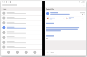
Figure 1. App that implements the list-detail design pattern, with a list/side pane on the left and detail/content pane on the right.
How can you use the component?
It’s very easy, first thing you have to do, as the documentation explains, is to declare the dependency to your build.gradle file at the app-module level:
  dependencies {
      implementation "androidx.slidingpanelayout:slidingpanelayout:1.2.0-alpha02"
  }
Then you will have to declare the component in the desired layout xml file.
As you can see in the below figure, inside of the SlidingPaneLayout you place two children where the first will act as the side/list pane and the second as the content/detail pane.
You can use a component such as FrameLayout, ConstraintLayout, RecyclerView, etc. as the root element for each child or also use components such as FragmentContainerView in order to define Fragments as hosts for the panes directly from the XML layout.
<androidx.slidingpanelayout.widget.SlidingPaneLayout xmlns:android="http://schemas.android.com/apk/res/android"
android:id="@+id/sliding_pane_layout"
android:layout_width="match_parent"
android:layout_height="match_parent">
<!-- first child -->
<!-- second child -->
</androidx.slidingpanelayout.widget.SlidingPaneLayout>
To define the side/list pane width and how it plays together with the content/detail pane, we have to define its width (using android:layout_width). When the combined desired width doesn’t fit on-screen at once, the content/detail pane is permitted to overlap the side/list pane.
In the sample app that we have created, we define a width for the side/list pane of 400dp. This size is smaller than the width of a single screen on Surface Duo that is 540dp. Following the previous explanation, since the content/detail pane doesn’t fit on the available width on the single screen (is just 140dp available), that pane is then permitted to overlap the left.
As we can see in the following figure, when we run the sample app on single screen mode on Surface Duo, we can see how the side/list pane (with orange color) uses the whole width of the screen.
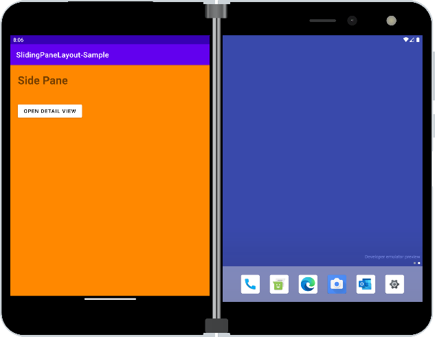
Figure 2. Side/list pane occupying the whole width of the screen.
And when we tap on the open detail/content pane button, since there is not enough width available to fit both panes, the content/detail pane (with green color) overlaps the list/side pane.
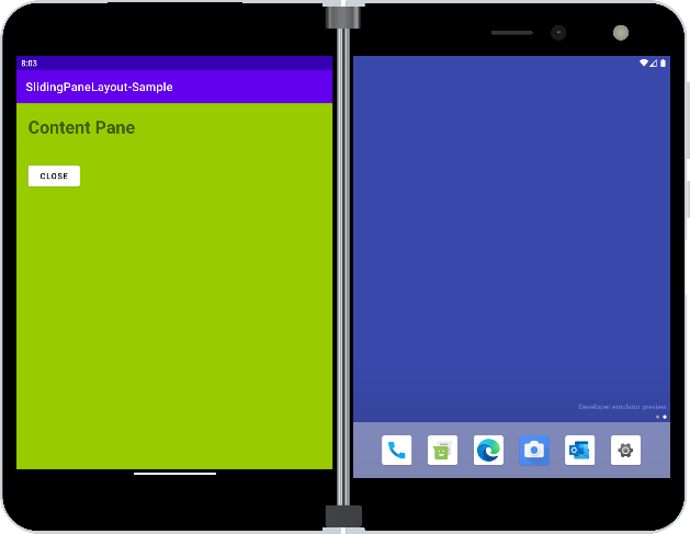
Figure 3. Content/detail pane overlapping the side/list pane since there is not enough width available for both panes.
So far so good; we have seen how the SlidingPaneLayout component works well in single screen mode or single screen devices, but as you can see in the following figure, without adding anything extra, when we span the sample app across displays, we see how the component automatically handles the panes sizes and align them to both sides of the hinge:
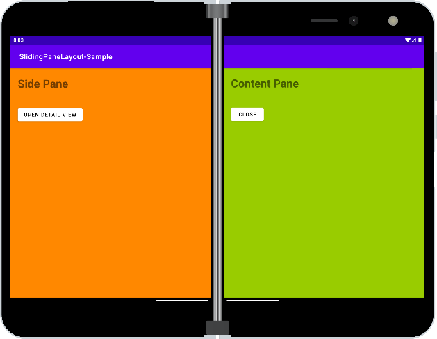
Figure 4. App spanned across displays, where both panes are displayed.
If you are wondering how the component works on a foldable device without a physical hinge, and whether you must do anything extra or not, the answer is: it works well too without adding any additional changes.
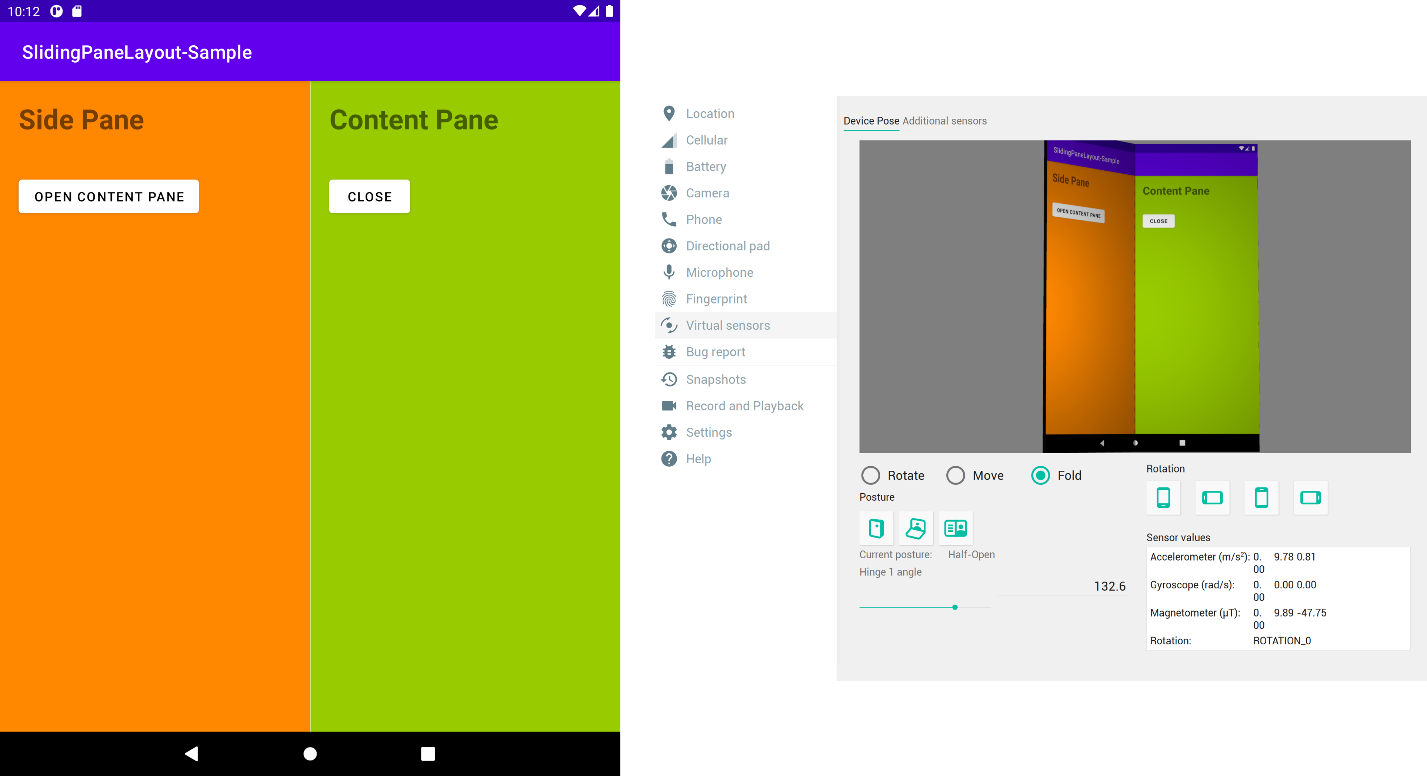 Figure 5. SlidingPaneLayout sample running on a foldable device emulator.
As you can see in the above image, the SlidingPaneLayout adjust its panes and places them on each side of the folding feature (as we can see in the device posture in the right side of the image).
In multi-window scenarios, where we have less width available per app, we can see how then the component behaves as the single screen scenario we have seen previously on Surface Duo, where the list/side pane takes the whole width of the screen and the detail/content pane when open overlaps the other pane.
Figure 6. SlidingPaneLayout on a device that supports multi-window
Conclusion
As we have seen, SlidingPaneLayout is a fantastic and versatile component. Its latest updates will help you to create/enhance apps that adjust to new form factor devices, such as foldable and dual-screen, without the need to do too much work from your side.
Resources and feedback
The sample code shown above is available on GitHub.
Join us at 11am PST tomorrow on twitch.tv/surfaceduodev to learn more about SlidingPaneLayout. You can also check out past streams on YouTube.
Visit the Surface Duo developer documentation and past blog posts for other ideas on enhancing your apps for dual-screen devices.
If you have any questions, or would like to tell us about your apps, use the feedback forum, message us on Twitter @surfaceduodev.
0 comments