
Hello web developers!
Foldable and dual-screen devices are becoming increasingly more common over time, but you may wonder if investing development time to support these devices might be worth it, especially when creating fully responsive web apps is already a challenge. Using the new CSS and JavaScript primitives is a fun way to discover and learn about the new possibilities offered by devices like the Microsoft Surface Duo, yet you might be looking for a more efficient way to adapt existing apps without having to make drastic changes and dive too much into custom CSS. That’s what we’re going to explore below.
Earlier this year, Aaron posted how to build a dual-screen web app using React, so today I’m going to show how to build for dual-screen devices using Angular.
In this post, we’ll take a look at how you can use Angular to create a foldable web experience, with minimal changes to an existing code base. We’ll start from the photo gallery demo, create an Angular version of it, and then see how using an Angular library makes the foldable adaptation much easier to approach.
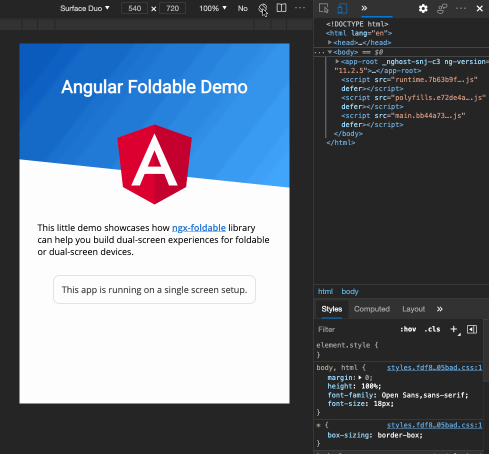
Figure 1: demonstration of dual-screen Angular web app
TL;DR key takeaway
Adapting existing apps to foldable devices does not mean that you have to rethink your design and code entirely. With the ngx-foldable library you can adapt existing Angular apps to support dual-screen devices with minimal changes to your app (and no CSS!). react-foldable is also an alternative if you’re working with React, and I’m sure that similar libraries will eventually become available for other frameworks.
Re-creating the Photo Gallery demo with Angular
I wanted to keep the demo app as simple as possible to understand, so I used the Angular CLI to generate the project using the minimal template:
ng new photo-gallery --minimal --prefix=pg --style=css --routing=false --strict
It gives us a nice working base with strict type checking and single file components, which looked perfect for building this demo. I won’t cover here all the details about what I did to recreate the demo, as I mostly took the existing JavaScript and CSS code from the original photo gallery app and put it in Angular components.
You can find the complete application source code on GitHub, but let’s have a closer look at the most interesting parts here.
App component
The file app.component.ts is the root component of our application. It contains the state, as which image is currently selected, and all the components composing our app. By looking at its template you can glimpse at how our application works:
<pg-gallery [images]="images" (select)="setImage($event)"></pg-gallery>
<pg-fold></pg-fold>
<pg-details [image]="currentImage">
<pg-fullview
  [image]="currentImage"
  (close)="closeImage()"
  (previous)="previousImage($event)"
  (next)="nextImage($event)"
></pg-fullview>
From there you can see that our app is made of four main components:
- Gallery – a scrollable list of thumbnails
- Fold – a placeholder for the space taken by the fold area on dual-screen devices
- Details – show the zoomed in version of the selected image with its description on dual-screen devices
- Fullview – show the selected image in full screen on single-screen devices
The App component also includes some styling to lay out these components depending on the device configuration:
:host {
  width: 100vw;
  height: 100vh;
  display: flex;
  flex-direction: row;
}
@media (screen-spanning: single-fold-vertical) {
  :host { flex-direction: row; }
}
@media (screen-spanning: single-fold-horizontal) {
  :host { flex-direction: column-reverse; }
}
@media (screen-spanning: none) {
  :host { flex-direction: row; }
}
Here we’re using specific media queries to adapt the layout on a dual-screen configuration. You’ll see these media queries also used in the other components to hide or show them and adapt their design for every configuration, so let’s have a closer look.
Fold, Details and Fullview components
These three components are used to display different things depending what device it’s running on. The Fullscreen component is used only on single-screen devices, whereas the Fold and Details components are used on dual-screen devices.
import { Component } from '@angular/core';

@Component({
  selector: 'pg-fold',
  template: ``,
  styles: [
    `
      .fold {
        height: 0;
        width: 0;
        background-size: 40px 40px;
        background-color: #737373;
        background-image: linear-gradient(
          45deg,
          rgba(255, 255, 255, 0.2) 25%,
          transparent 25%,
          transparent 50%,
          rgba(255, 255, 255, 0.2) 50%,
          rgba(255, 255, 255, 0.2) 75%,
          transparent 75%,
          transparent
        );
      }

      @media (screen-spanning: single-fold-vertical) {
        .fold {
          height: env(fold-height);
          width: env(fold-width);
        }
      }

      @media (screen-spanning: single-fold-horizontal) {
        .fold {
          height: env(fold-height);
          width: env(fold-width);
        }
      }
    `,
  ],
})
export class FoldComponent {}
You can see here that by default the Fold component is hidden (height and width set to 0), and it’s made visible with different sizes when a dual-screen device is used. The Details component uses a similar approach. The Fullview component does the opposite by hiding itself when a dual-screen device is detected, with this media query:
@media (screen-spanning: single-fold-horizontal),
       (screen-spanning: single-fold-vertical) {
  .container {
    display: none;
  }
}
With that, we’ve covered the main principles behind the original photo gallery adaptation. You can see the full source code for this version here.
But we’ve not really made good usage of Angular features here, as we are including all components whether they’re needed or not, and use CSS to show or hide them. We also had to use extra CSS with specific media queries, meaning more work was needed to make this demo. It might not be an issue here as our demo remains quite simple, but in more complex applications, this could result in reduced performance due to unnecessary component rendering, and maintenance issues due to the scattered CSS approach.
Introducing ngx-foldable
The Angular library ngx-foldable was specifically designed to allow adapting Angular applications while making minimal changes to your code. It provides directives and services to access the screen context information and react to changes automatically.
We install it with npm install ngx-foldable and then import the FoldableModule into our app:
import { FoldableModule } from 'ngx-foldable';

@NgModule({
  imports: [
    FoldableModule
    ...
  ],
  ...
})
export class AppModule {}
Revisiting the App component
With the library set up, we can now use the provided fdSplitLayout, fdWindow and fdIfSpan directives to rebuild our App component template:
<div fdSplitLayout="flex reverse">
  <pg-gallery fdWindow="0" [images]="images" (select)="setImage($event)"></pg-gallery>
  <pg-details fdWindow="1" *fdIfSpan="'multi'" [image]="currentImage"></pg-details>
  <pg-fullview
    *fdIfSpan="'none'"
    [image]="currentImage"
    (close)="closeImage()"
    (previous)="previousImage($event)"
    (next)="nextImage($event)"
  ></pg-fullview>
</div>
First, you will notice that we added a top <div> container with the directive fdSplitLayout. This directive enables us to build a split layout on dual-screen devices without the need for extra CSS. The first parameter allows you to choose which kind of CSS layout you want to use, so we’re using flex here. Other possible options are grid or absolute, to better fit your existing app layout. The second parameter allow you to choose whether you want to reverse the window segments order when the spanning (ie the orientation) changes, or keep the normal order.
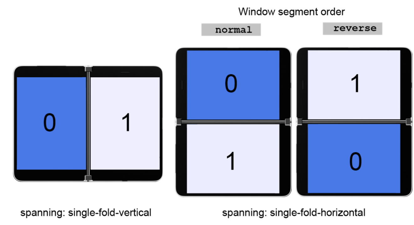
Figure 2: Illustration of impact of window order values
Next you will notice that we added the fdWindow directive to the Gallery and Details components. This one allows you to assign a particular component to a window segment in dual-screen mode and works only within a fdSplitLayout container element.
The best part of the fdSplitLayout and fdWindow directives are that they’re only activated on dual-screen devices, so absolutely no CSS is added when the app is running on a single-screen device.
Notice that we also got rid of the Fold component, as it’s no longer needed.
Finally, we used the fdIfSpan structural directive to show/hide the Details and Fullview components depending on the context. This directive works the same as ngIf, except that it’s wired to pre-defined conditions related to the current screen context.
*fdIfSpan="'multi'" means that the Details component will only be attached to the DOM in a multi-screen context, no matter what the orientation of the device is. The Fullview component uses the opposite value of 'none', meaning that it will be present only on single-screen devices. Note that we could have also used the else syntax, exactly like a regular ngIf.
Other possible conditions are 'fold-vertical' and 'fold-horizontal' if you need to target a specific orientation.
Using these three directives, we can now remove ALL the specific CSS related to single/dual screen adaptation. Yup, you read that right. With that, the new CSS for our App component simply becomes:
:host {
  width: 100vw;
  height: 100vh;
}
Less code in the end, better performance, and no need for specific CSS; sounds like a win here? 🙂
You can see and test the final web app online.
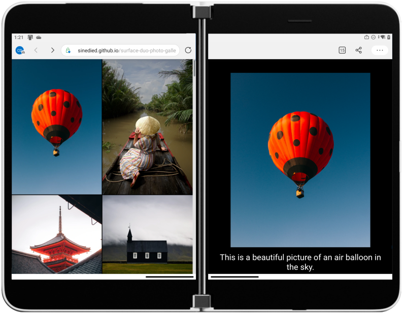
Figure 3: Screenshot of the final photo gallery app
Going further
We’ve seen how we can abstract the handling of device adaptation and provide a higher-level API using Angular. While it’s always interesting to have a look at the CSS primitives behind it, sometimes we just want a more straightforward way of achieving our intent. That’s also why CSS libraries like Bootstrap and Tailwind CSS are so popular for quickly creating responsive designs.
You can take a look at the app final code and the details of the changes when using the ngx-foldable library.
If you’re curious, you can also dive into the code behind ngx-foldable and see how it works. Contributions are welcomed too 😉.
Resources and feedback
Check out the Surface Duo web developer documentation for more details on the CSS and JavaScript APIs for enhancing your web apps for the Surface Duo and other dual-screen devices.
If you have any questions, or would like to tell us about your apps, use the feedback forum or message us on Twitter @surfaceduodev.
0 comments