
Hello designers,
This week we are excited to share with you our journey that inspires, educates, and showcases real world usage of various design patterns and provides designers a sense of exploring foldables with working examples of how to make use of the dual-screen/folding form factors in different ways when an application is spanning both displays.
The experience of this sample application is centered around the needs of a travelling salesperson who visits various stores across the city that buy the salesperson’s products. The sample app helps the salesperson select and navigate to multiple customer locations across the city, assists the salesperson with various tasks during the visit to each potential client location, and creates a purchase order for each new customer product purchase.
In this blog we take you through a design-development process for creating foldable app experiences. The result is an app that’s available on Google Play Store for download which we highly encourage you to try out and share with us your feedback.
Process
The developer experience team at Microsoft, after having conversations with various app partners and several Android app creators, realized that there are quite a few challenges when it comes to designing and developing apps for foldable smartphones. Questions like — What does it mean to be hinge-aware? What does it mean for apps to adapt to dynamic layouts? How can single-screen apps become dual-screen apps? How to design for foldables?
With these questions we thought to ourselves:
There are five design patterns for apps to consider but looking through the lens of an existing application in a real-world scenario,we wanted to create an artifact that would spark inspiration for both developers and creators and showcase all the existing design patterns that apps can utilize when enhancing their experiences for foldable form factors.
App Feature Ideation
While brainstorming possible ideas, we had discussions around creating an application that would walkthrough the experience of using an app on foldable devices and highlighting all five design patterns through a user’s perspective and providing a learning resource in a handheld format.
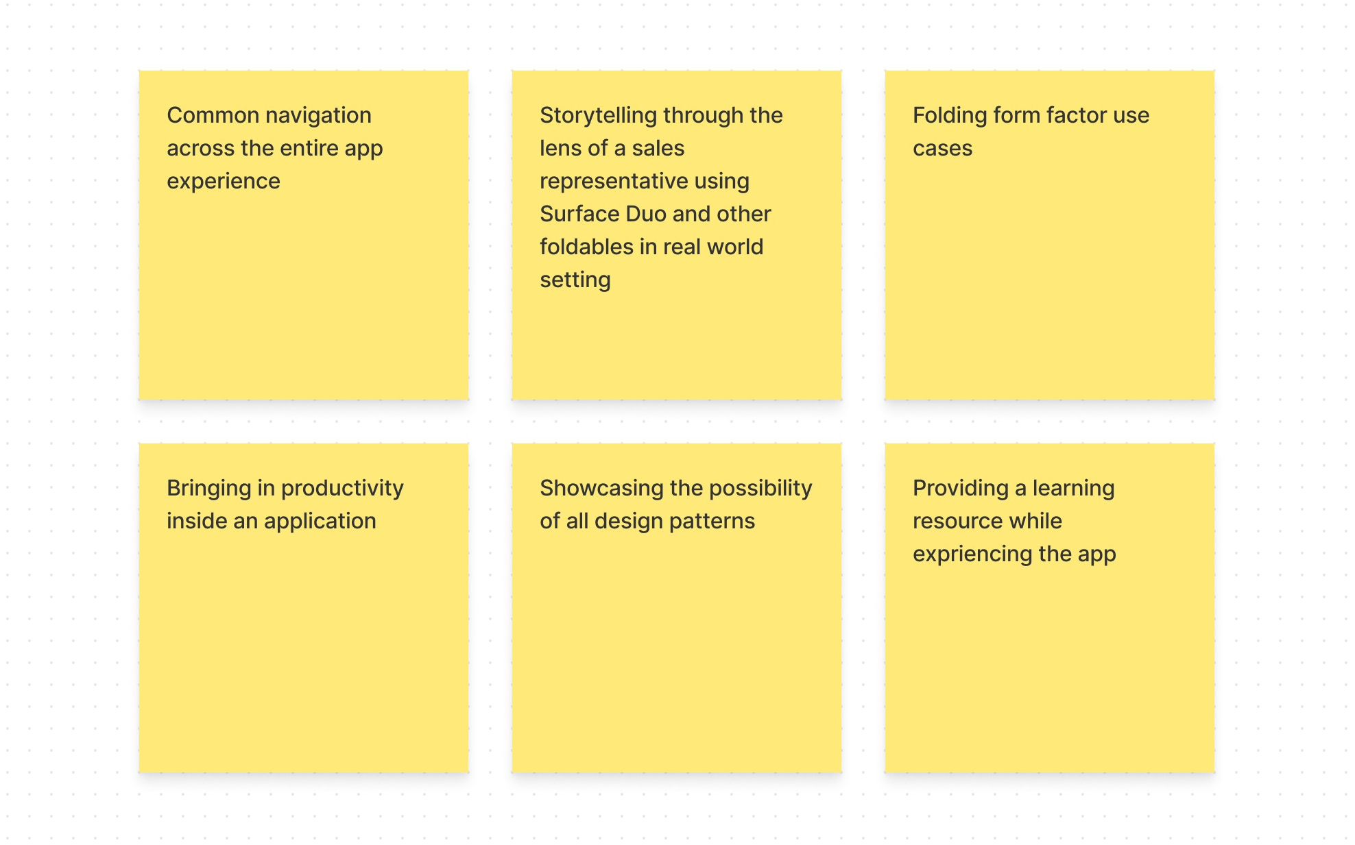
As a team we began to list our ideas and downselect to the most relevant ones that would resonate with the overall goal of the application by having:
- Common navigation across the entire app experience
- Storytelling through the lens of a sales representative using Microsoft Surface Duo and other foldables in a real-world setting
- Folding form factor use cases
- Bringing in productivity inside an application
- Showcasing the possibility of all design patterns
- Providing a learning resource while experiencing the app
Information Architecture and User Journey
When looking for ways for creating such experiences we wore the hat of a sales representative and thought through what it takes to mimic a scenario of selling products from an inventory to customers.
We then mapped all the design patterns together through a common navigation by bringing in hierarchy to foster a sense of exploration in the application and the journey to place an order for the end customer.
Sketches
Once we mapped all the design patterns with the user journey,we were able to jump into the next phase of creating wireframes.
Then we began to drill into the details of the entire workflow, from the time a salesperson would search around on the map for stores to the time they would learn about the store, present a product catalog, customize a product, place an order from the inventory, and generate receipt.

Finally, with these wireframes we were able to seek feedback amongst the team members to see if the entire journey of a sales representative made a good use case for showcasing all five design patterns inside a single experience.
With iterations and feedback, we lead into the final phase of design – mocking up the experience and handing off to development.
Design and Solution
In the final phase of design, we began to drill into the details of design by creating high fidelity assets. We did this with the help of the Surface Duo Design Kit that we released on the Figma community.
While mocking up the experience we focused mainly on the dark theme UI to reflect the guitar store and the love that developers showed towards the color system. Following are some of the interactions that highlight the design patterns in the dual-screen experience app that gives a real-world picture of how each pattern plays a unique role in serving productivity on-the-go.
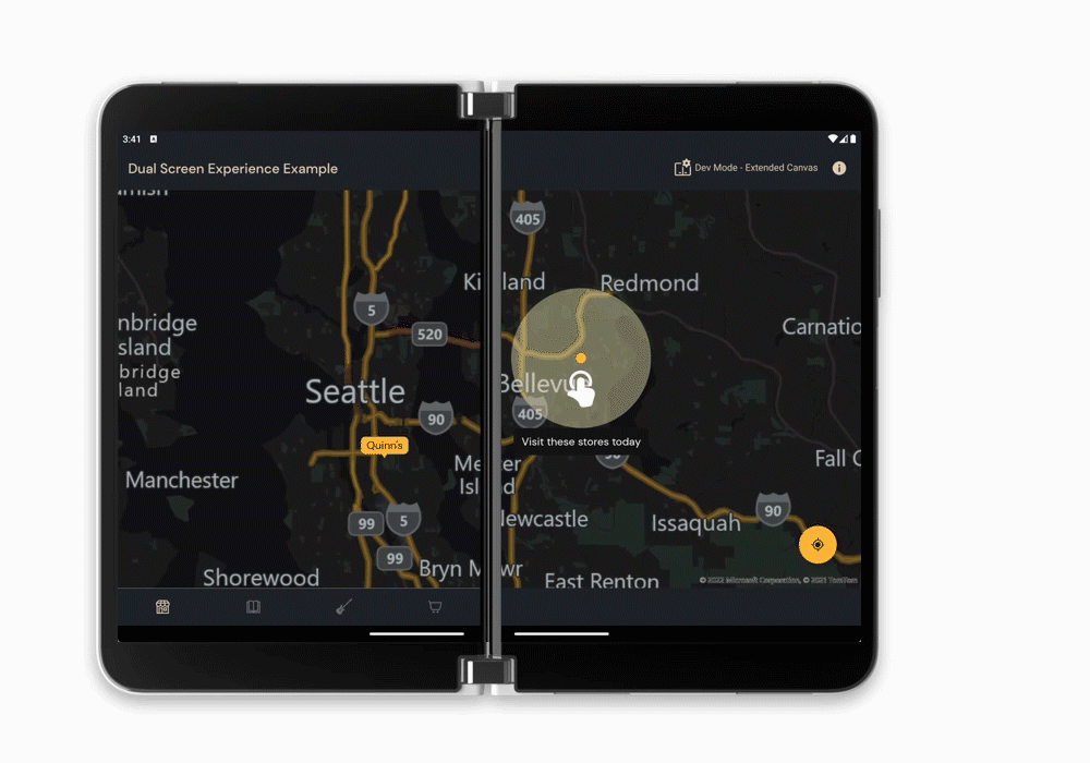
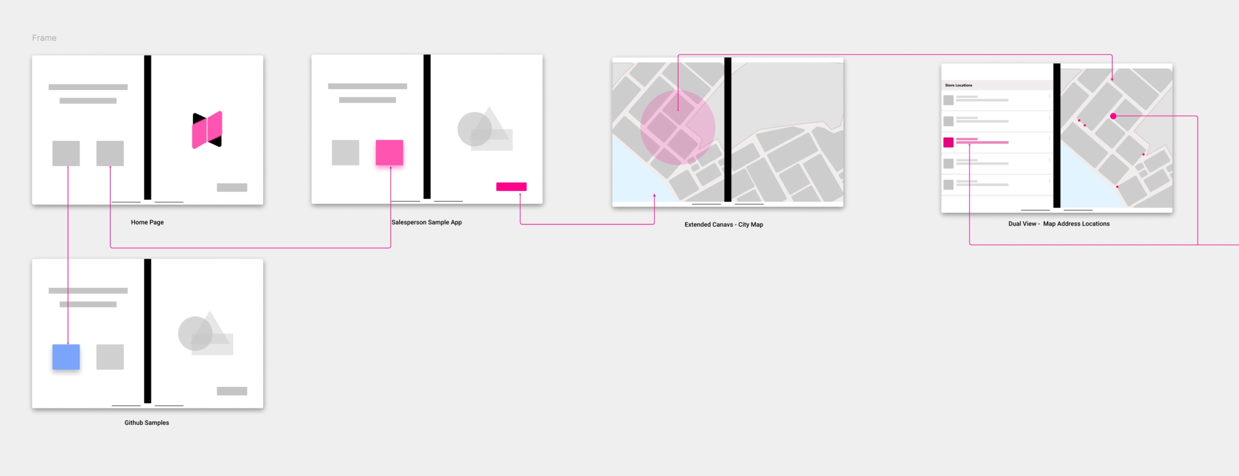
Extended Canvas
The extended canvas design pattern is used to provide a map experience that gives your app more screen real estate rather than constricting it to one screen or another.
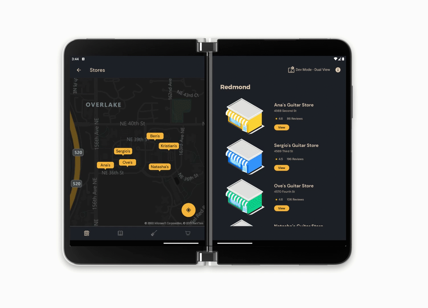
Dual View
The Dual view design pattern is used to give two different views of the same data. Where one screen shows a list of stores on the map,the other screen shows the same list of stores in a list representation.

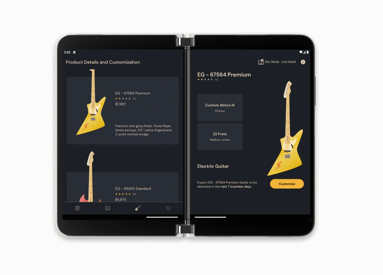
List Detail
The List detail design pattern is used to showcase a list and a detailed view of a particular store providing more context if the salesperson wishes to pull up the contact details or learn more about the store.
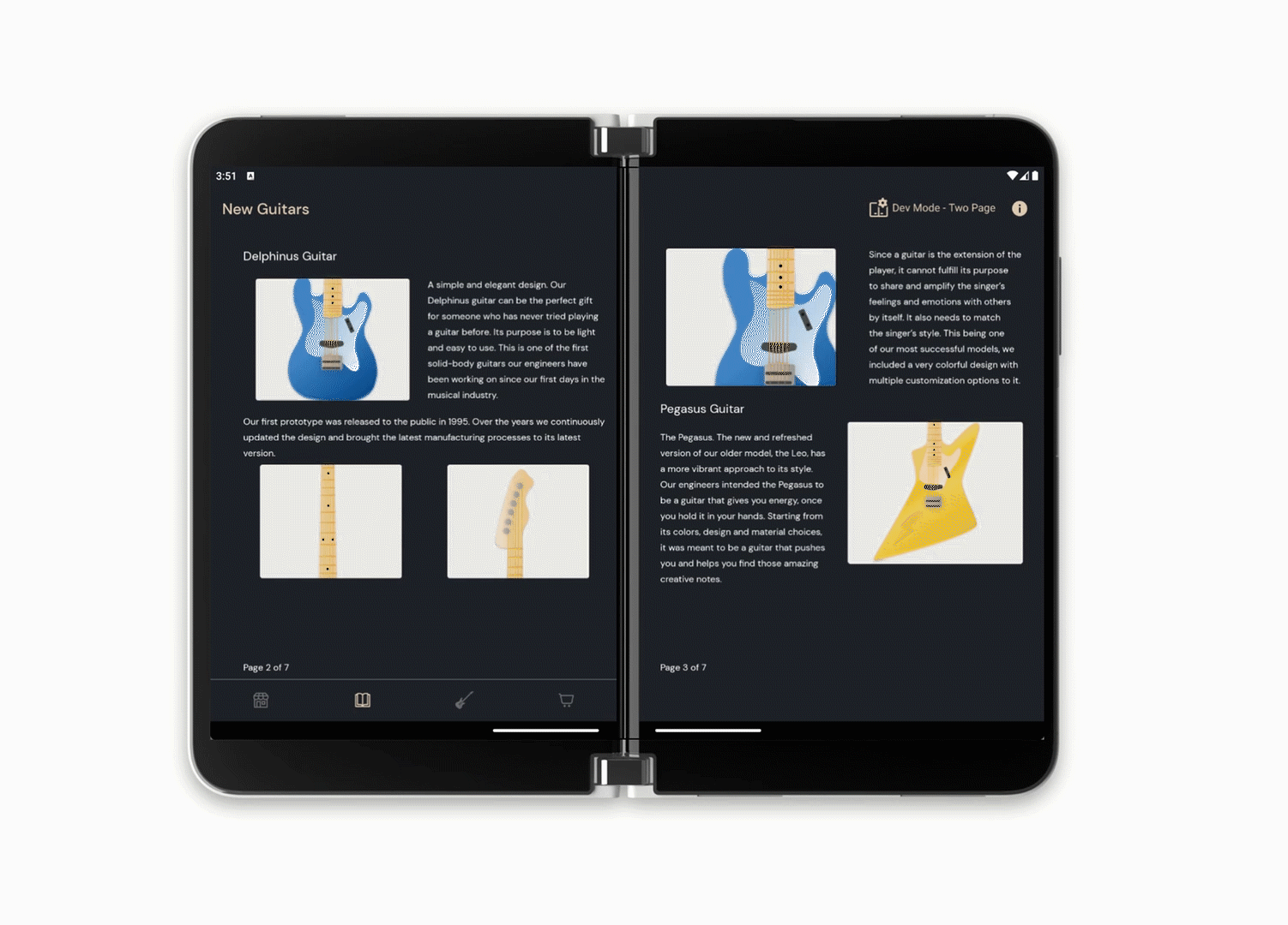
Two Page
The Two page design pattern is used to showcase a brochure-like reading experience to the salesperson when they are communicating with the store person in charge. Two displays for an application provide an ergonomic use case when it comes to providing a paging experience.
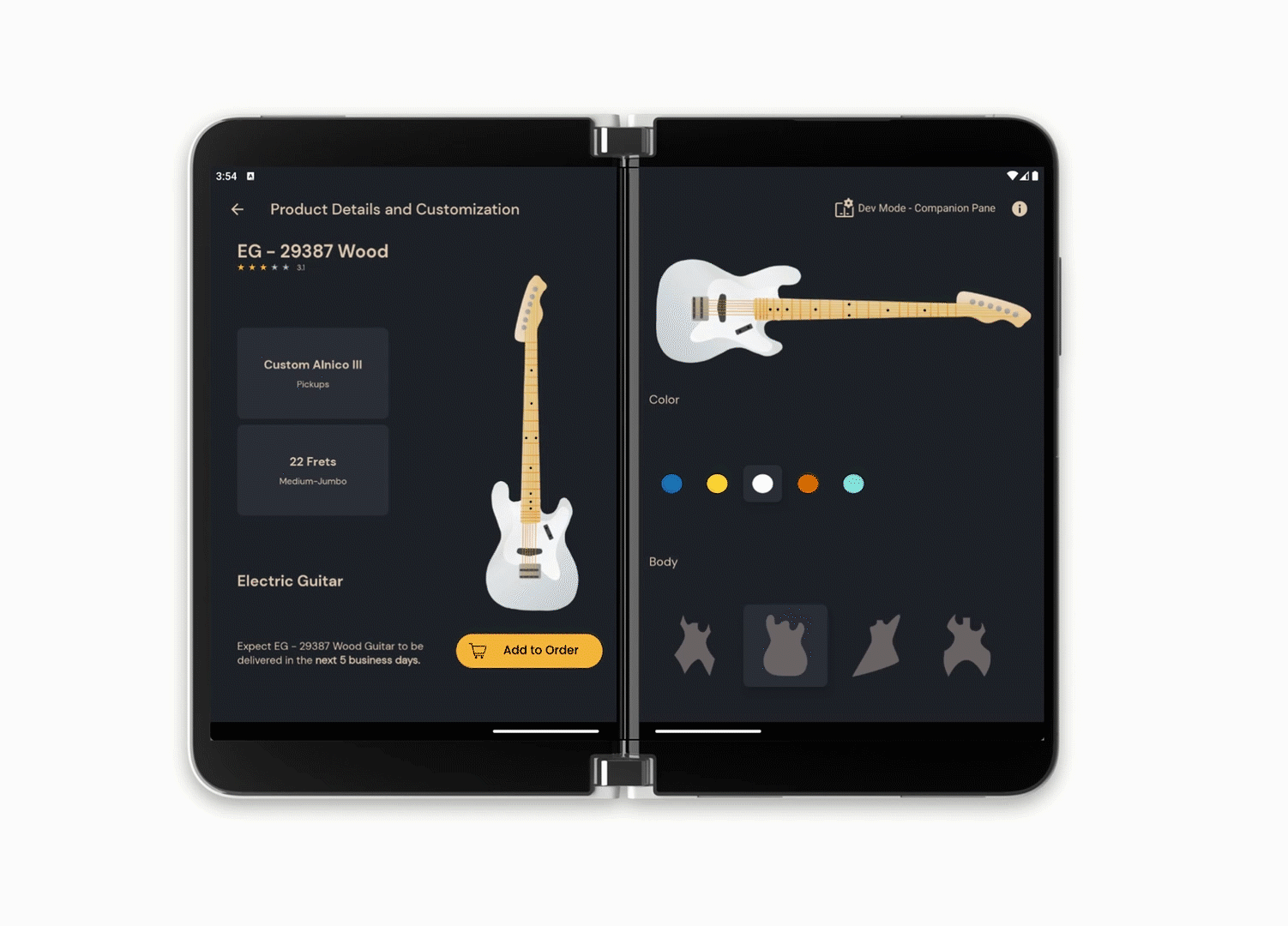
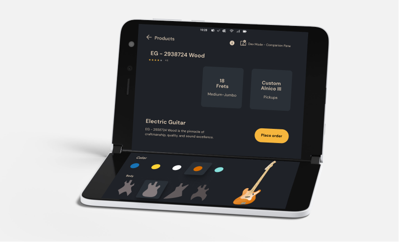
Companion Pane
The Companion Pane design pattern enables customization of the product (here in the app – guitars) while the salesperson places orders for the store that they visited. Where one pane/screen is used to look at the product and another screen to allow room for customization.
Finally, with all the mockups and interaction design, design files were handed off to the developers on the team.
Development Process
Before the implementation of the UI designs started, we had some team discussions regarding architecture and navigation. We split the flow into different sections identified four Activities, each containing multiple Fragments.
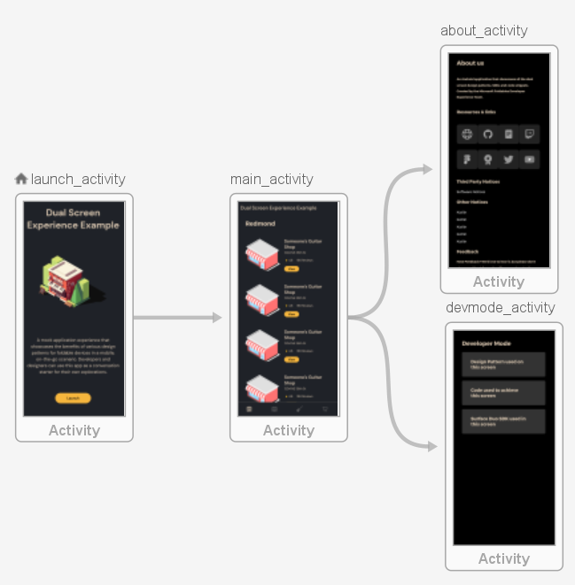
Application flow split into four Activities
With all design patterns showcased inside the Main Activity, we ended up having the most Fragments in this section which needed their transactions handled. Depending on the design pattern, some Fragments needed to be displayed on the whole display area, while others required two individual Fragments side-by-side in case of a foldable/dual-screen device. We thought that for this application the design patterns would look best if implemented as follows:
- One Fragment on both screens – Extended Canvas (showing a larger view of the map), Two Page (handling the swipe between different pages)
- Two different Fragments side-by-side – List-Detail, Dual View, Companion Pane
To achieve this faster, we used the Foldable Navigation Component and ended up with several navigation-graphs, which fit perfectly with the Bottom Navigation View because the menu items represented the start destinations for the main navigation-graph.
The next step was transforming the UI designs into Android components, taking it one feature at a time. To have it look good on various screen sizes and resolutions, we used ConstraintLayout and its helpers for complex layouts and continuously improved them by testing the application on multiple emulators and devices. For example, in the Launch screen we took advantage of the Guideline percentages, having each component take up as much as a specific percentage of the display area it is rendered on, and used Groups to handle the visibility of multiple items. Therefore, instead of using fixed width and height dimensions, they end up relative to the screen size they are displayed on.
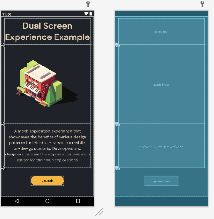
Launch Activity layout using Guideline percentages
The idea of having more than one Fragment displayed at the same time comes with another responsibility – handling synchronization between user interactions and their results. We used an MVVM approach – the ViewModel saves the states and Fragments have observers attached to LiveData changes and update the UI in real time. For example, in the List-Detail design pattern each item selection triggers changes to the Details Fragment. In a similar way, the Dual View has two different representations of the same data on both sides so a single point of truth should be used, while the Companion Pane connects the controls from one screen to the result on the other one.
Interaction between two visible Fragments
Resources and feedback
The Surface Duo Design Kit is available on Figma at the Microsoft Design Page.
While we are expanding the Design Kit, we would love to hear from you about your experiences designing dual-screen experiences for Surface Duo. Please reach out using our feedback forum or find us on Twitter @surfaceduodev.
0 comments