
Hello Android developers,
The Microsoft Surface Duo SDK offers a variety of custom controls to help enhance your dual-screen apps, from layouts, tabs, and navigation controls for Kotlin and Java developers to the TwoPaneView for Xamarin, React Native, and Uno Platform developers. However, you might have an application-specific requirement that is not offered in our SDK, so this blog post shows how to build a simple dual-screen aware layout control.
This custom control might be useful in your apps, or you can use the source code as the basis for your own dual-screen control ideas!
Introducing ZipperLayout
ZipperLayout is based on the LinearLayout, and on a single screen it behaves exactly like a linear layout:
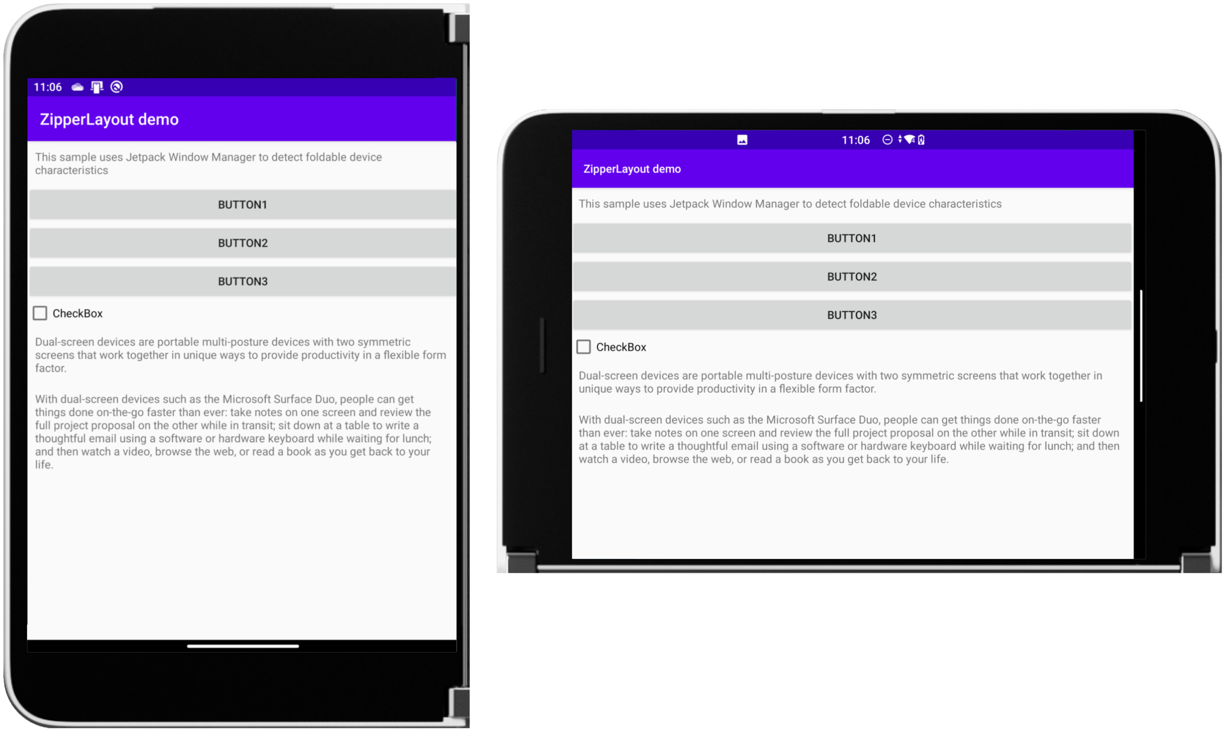
Figure 1: ZipperLayout in single-screen portrait and landscape orientations
However, when the app is spanned, the elements of the layout are rendered on either side of the hinge without appearing underneath. The developer chooses which elements appear on the left and right screens:
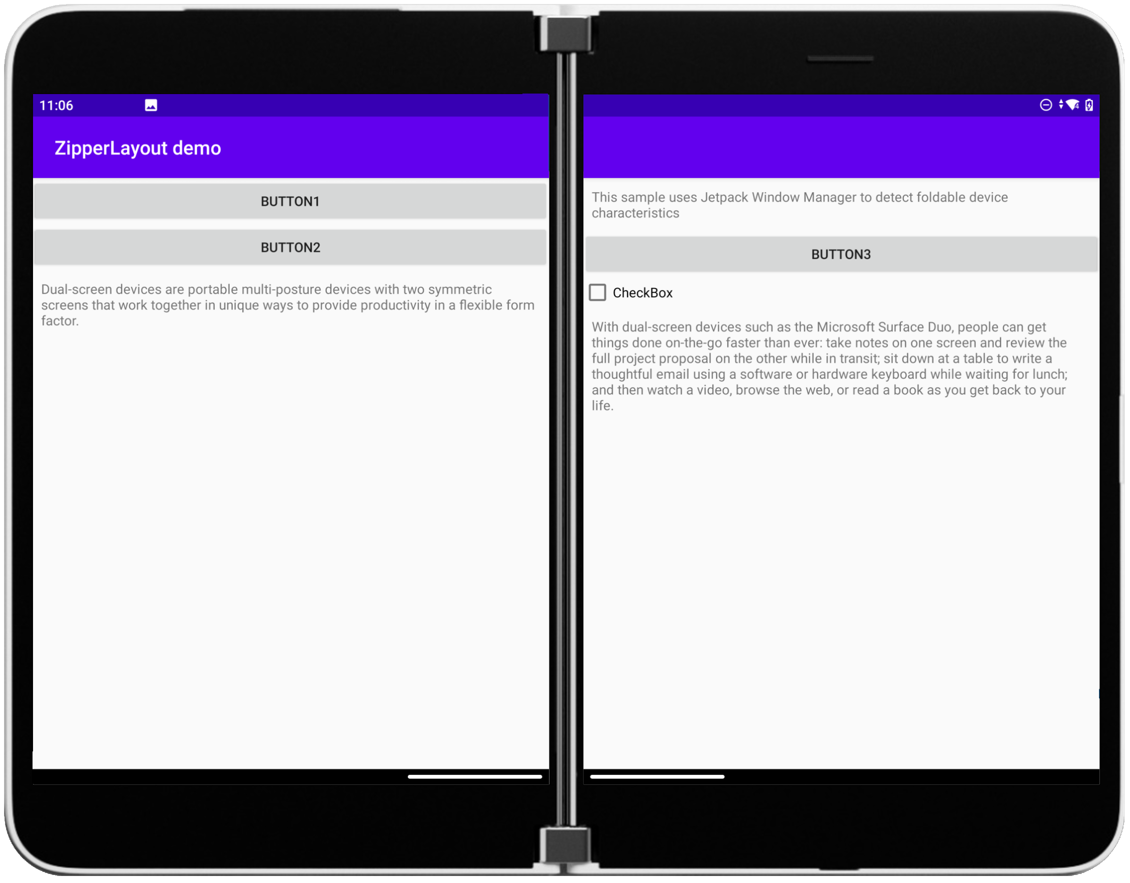
Figure 2: ZipperLayout spanned across both screens
Here is an example of the layout XML (with some items removed for clarity) – notice the app:layout_rightSpanned attributes which control which screen the element is rendered on:
<com.example.myapplication.ZipperLayout...
    android:layout_width="match_parent"
    android:layout_height="match_parent"
    android:orientation="vertical">

    <TextView
        app:layout_rightSpanned="true"
        android:id="@+id/txtMain" ... />

    <Button
        android:id="@+id/button" ...
        android:text="Button1" />

    <Button
        app:layout_rightSpanned="true"
        android:id="@+id/button2" ...
        android:text="Button2" />

    <Button
        android:id="@+id/button3" ...
        android:text="Button3" />

    <CheckBox
        app:layout_rightSpanned="true"
        android:id="@+id/checkBox" ...
        android:text="CheckBox" />
Implementing a dual-screen layout
The custom control is implemented in the ZipperLayout.java file and extends the built-in LinearLayout control:
public class ZipperLayout
extends LinearLayout {
To facilitate the custom child attribute layout_rightSpanned, add this XML to the values/attrs.xml file:
<declare-styleable name="ZippperLayout_LayoutParams">
    <attr name="layout_rightSpanned" format="boolean"/>
    <attr name="layout_weight" format="float"/>
    <attr name="android:layout_gravity"/>
</declare-styleable>
Within the ZipperLayout class declaration, extend LayoutParams and override the methods required to use the subclass (such as generateLayoutParams). In the subclass, create a local variable rightSpanned for the value and parse it via the LayoutParams constructor using:
TypedArray a = context.obtainStyledAttributes(attributeSet, R.styleable.ZipperLayout_LayoutParams);
rightSpanned = a.getBoolean(R.styleable.ZipperLayout_LayoutParams_layout_rightSpanned, false);
...
This custom attribute is used later when laying out the child controls.
Jetpack Window Manager
Dual-screen awareness for this example is provided by the WindowBackend interface described in the AndroidX API documentation, which is added to the project by including a dependency in the build.gradle file
implementation "androidx.window:window:1.0.0-alpha01"
To use the window manager, it is instantiated in onAttachedToWindow (and set to null in onDetachedFromWindow).
protected void onAttachedToWindow() {
    super.onAttachedToWindow();
    wm = new WindowManager(getContext(),null);
}
The window manager is then available during the layout process to determine if the app is spanned and the dimensions of the control to distribute the layout elements. Window manager is used in two important overrides: onMeasure and onLayout.
onMeasure is called first, and the window manager is used to determine if there is a display feature (which is the API terminology for the hinge). If the hinge is detected, and it is detected to be vertical in the middle of the screen, the layout’s widthMeasureSpec is modified to use only the width of one screen, rather than the entire spanned screen width.
windowLayoutInfo = wm.getWindowLayoutInfo(); ListdisplayFeatures = windowLayoutInfo.getDisplayFeatures(); if(displayFeatures.size() > 0) { ...
This will affect the width of the child controls when they are ready to be positioned on the screen.
When onLayout is called, it also checks for the presence of the hinge via getDisplayFeatures and determines the x coordinate for the child elements to be displayed on the right screen. The method then lays out the child controls in a loop, checking if the app is split across two screens, and whether the child element should be placed on the right screen:
for(int i=0;i<getChildCount();i++)
{
    final View childAt = this.getChildAt(i);
    final LayoutParams lp = (LayoutParams) childAt.getLayoutParams();
    if (lp.isRightSpanned() && split) {
...
The loop keeps track of the height of each element as it stacks them down each screen until all the controls are positioned. In double-landscape mode, the hinge is ignored and the control behaves like a regular LinearLayout.
You can download the complete sample from GitHub.
November Surface Duo emulator update
A new version of the Surface Duo emulator image was released last week. Follow the instructions to download and install the new version, and check the release notes for the version history.
Coming soon – droidcon APAC 2020
The Surface Duo Developer Experience team was a presenter at droidcon EMEA and droidcon AMERICAS (see this recap). We’ll also be presenting at droidcon APAC 2020 on December 14th-15th, 2020. Register now and join us for 90+ tech talks, hackathons, roundtables, 1:1 meetings, and more.

Feedback
I hope this has been a good introduction to building custom controls for dual-screen devices. There are many additional features that could be added to this control and the possibilities for other custom layouts is only limited by your imagination.
We would love to hear from you about your experiences using the controls in our dual-screen library, as well as any custom controls you build.
Please reach out using the feedback forum or find me on Twitter or the team @surfaceduodev.
0 comments