
Hello Android developers,
In a previous post, we shared code to handle pen events including pressure, orientation, and button presses on the pen. Today’s post introduces a preview of a new pen and inking control that you can easily add to your Android apps to get pen (and touch) support without a lot of custom code.
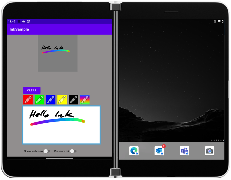
Figure 1: pen and ink sample app
The screenshot above shows the InkView control on a Microsoft Surface Duo. It will work on any Android with API version 29 or newer. The control uses the BlendMode API, which was introduced in API 29.
Android does not offer a built-in drawing canvas, which means developers typically need to implement the input handling, drawing, and erasing themselves. The InkView control provides a working pen input region that you just add to your view and wire-up any customizations you would like, such as the color palette. The sample for this post demonstrates how to use the control and covers the following topics:
- How to place InkView in a layout
- How to change pen color using properties in the InkView
- How to customize pen behavior with a helper class
- How to export the drawing to a bitmap
You can use the extensibility features to add additional behaviors (like different pressure sensitivity effects) or view the open-source code and let us know what additional features you’d like to see!
InkView alpha
The InkView alpha version can be added to your Android Studio project in three steps:
-
In build.gradle, under
allprojects > repositories
add
mavenCentral()
-
In build.gradle, under dependencies add
implementation "com.microsoft.device:ink:1.0.0-alpha2"
-
Also in your module build.gradle, under
android > defaultConfig
ensure the minSdkVersion is set to API 29 or newer.
Next, update the Android XML view where you want to host the ink control and your app’s ready for pen and touch input once you add the following controls:
-
Add a custom namespace in the root element
xmlns:InkView="http://schemas.android.com/apk/res-auto"
-
Then you can add the drawing surface:
<com.microsoft.device.ink.InkView
    android:layout_width="400dp"
    android:layout_height="100dp"
    InkView:enable_pressure="true"
    InkView:ink_color="@color/black"
    InkView:max_stroke_width="8"
    InkView:min_stroke_width="3"/>
InkView is transparent, so make sure to host it in a view with an appropriate background color.
Custom ink
The InkView control has a number of properties you can set to control the ink input, including color and stroke width properties.
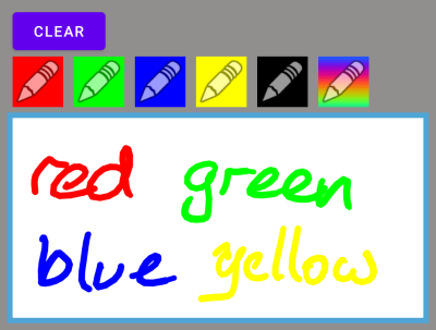
Figure 1: changing the ink color
The buttons in the view call methods or set properties directly on the InkView, such as for clearing the canvas or changing the ink color:
inkView.clearInk()
inkView.color = Color.RED
inkView.color = Color.GREEN
//etc
For more sophisticated customization, you can implement the DynamicPaintHandler interface and control the ‘ink’ emitted for each painted segment. Use the PenInfo class to track location, pressure, orientation, and button state, and customize the output to create interesting visual output effects.
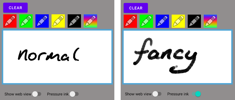
Figure 2: the custom DynamicPaintHandler implements pressure with opacity
The sample on GitHub includes an example paint handler that uses the pressure value to set the transparency (alpha value) of the lines:
inner class FancyPaintHandler : DynamicPaintHandler {
    @RequiresApi(Build.VERSION_CODES.O)
    override fun generatePaintFromPenInfo(penInfo: InputManager.PenInfo): Paint {
        var paint = Paint()
        val alpha = penInfo.pressure * 255

        paint.color = Color.argb(
            alpha.toInt(),
            inkView.color.red,
            inkView.color.green,
            inkView.color.blue
        )
        paint.isAntiAlias = true
        // Set stroke width based on display density.
        paint.strokeWidth = TypedValue.applyDimension(
            TypedValue.COMPLEX_UNIT_DIP,
            penInfo.pressure * 10 + 5,
            resources.displayMetrics
        )
        paint.style = Paint.Style.STROKE
        paint.strokeJoin = Paint.Join.ROUND
        paint.strokeCap = Paint.Cap.ROUND;
        return paint;
    }
}
Another customization you can try rainbow ink inspired by Microsoft Whiteboard:
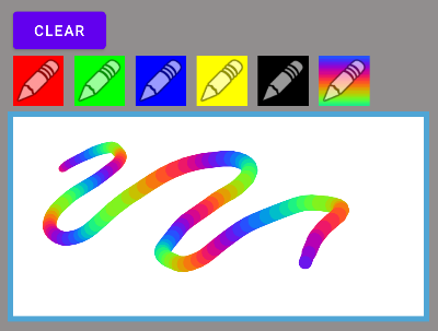
Figure 3: custom pen that changes color
This can also be achieved with a DynamicPaintHandler subclass that iterates through the color spectrum on each paint event:
inner class RainbowPaintHandler : DynamicPaintHandler {
    var frequency = .3
    var steps = 20
    var i = 0
    override fun generatePaintFromPenInfo(penInfo: InputManager.PenInfo): Paint {
        var paint = Paint()
        if (i > steps) i = 0 else i++
        paint.color = Color.argb(
                255,
                (Math.sin(frequency * i + 0) * 127 + 128).toInt(),
                (Math.sin(frequency * i + 2) * 127 + 128).toInt(),
                (Math.sin(frequency * i + 4) * 127 + 128).toInt()
        )
        paint.isAntiAlias = true
        // Set stroke width based on display density.
        paint.strokeWidth = TypedValue.applyDimension(
                TypedValue.COMPLEX_UNIT_DIP,
                penInfo.pressure * 10 + 5,
                resources.displayMetrics
        )
        paint.style = Paint.Style.STROKE
        paint.strokeJoin = Paint.Join.ROUND
        paint.strokeCap = Paint.Cap.ROUND
        return paint
    }
}
Export the image
In the sample, you can touch the bitmap placeholder at the top of the screen and it will be set to a copy of the InkView’s contents.
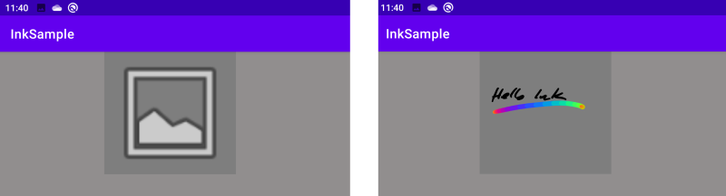
Figure 4: tap on the placeholder to generate a bitmap of the InkView contents
The control provides a saveBitmap method you can use to export the image
imageView.setImageBitmap(inkView.saveBitmap())
Learn more
You can read more about the API in the pen and ink SDK docs.
The source code for InkView is available on GitHub; we’d love to hear your feedback or contributions to the project.
Resources and feedback
Check out the Surface Duo developer documentation and past blog posts for links and details on all our samples. You can also find them summarized in the Microsoft Samples Browser, or explore on GitHub.
If you have any questions, or would like to tell us about your apps, use the feedback forum or message us on Twitter @surfaceduodev.
0 comments