
In Part 1, we discussed the different types of columns options available in WPA’s table views and how those views can be configured.
This blog will continue the series by digging into how to configure columns for different graph styles that can show numeric aggregations, time, and hierarchical data:
- Column options (Aggregation/Format/Sort/Text Alignment) – Part 1
- How to configure columns for graphing (Line/Bar/Gantt) – Part 2
- Quick saving presets and Profiles – Part 3
Graphing Overview
Before we dive into how to configure the tables and graphs, we should do a quick introduction to the Group & Graph bars in WPA’s tables.
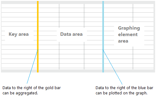
Any column in the Data Area or Graphing Element Area can be aggregated (see Part 1 – Aggregation). Aggregated columns are graphed when placed in the Graphing Element Area. Tables are pre-configured with presets on the recommended way to graph the data when analyzing at a high level, but can be modified based on user preference.
There are two primary graphing modes:
- Plottable/Numeric
- Time Based (Gantt)
Both graphing modes utilize the Group (Gold) Bar to pivot how the data can be displayed. The Legend to the left of the graph will help identify the data to the graph; the tooltip can also be used when hovering over the graph data.
Plottable/Numeric
Plottable or Numeric graphs are useful for quickly analyzing the impact of different data sets over time. These numeric data columns are required with an aggregation to enable graphing. Each graphing column’s aggregation changes how the data is graphed in real time.
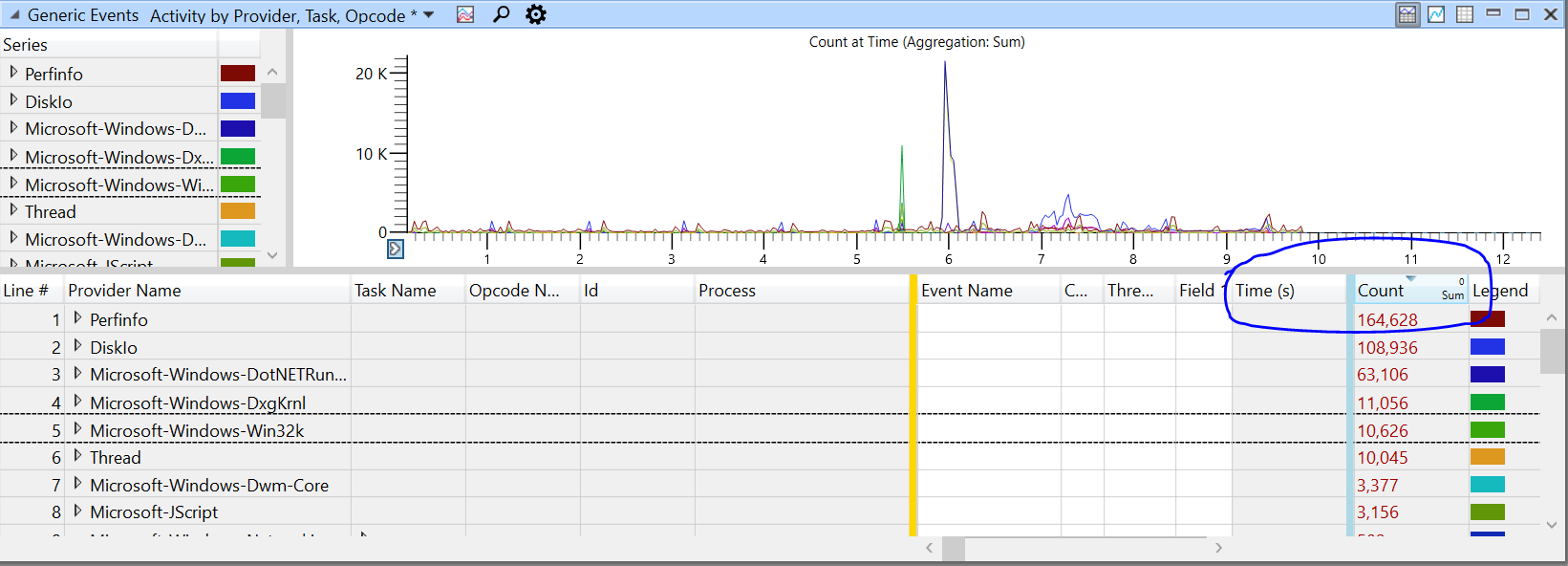
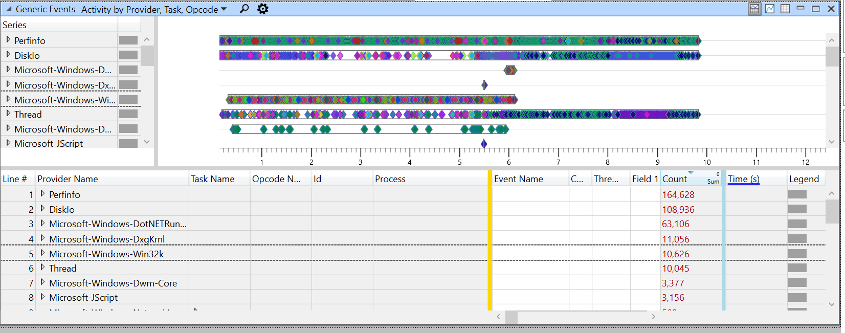
As an example, open a ETL file captured with WPR’s GeneralProfile (First Level Triage) and open the Generic Events Table. By default the table is configured to display as a Time Based graph; let’s change the graph to render event counts as a line graph:
- If not done already, Drag and Drop the Generic Events table into the Analysis View from the Graph Explorer
- Drag the ‘Time’ Column to the left of the Graph (Blue) Bar
- Drag the ‘Count’ Column to the right of the Graph (Blue) Bar
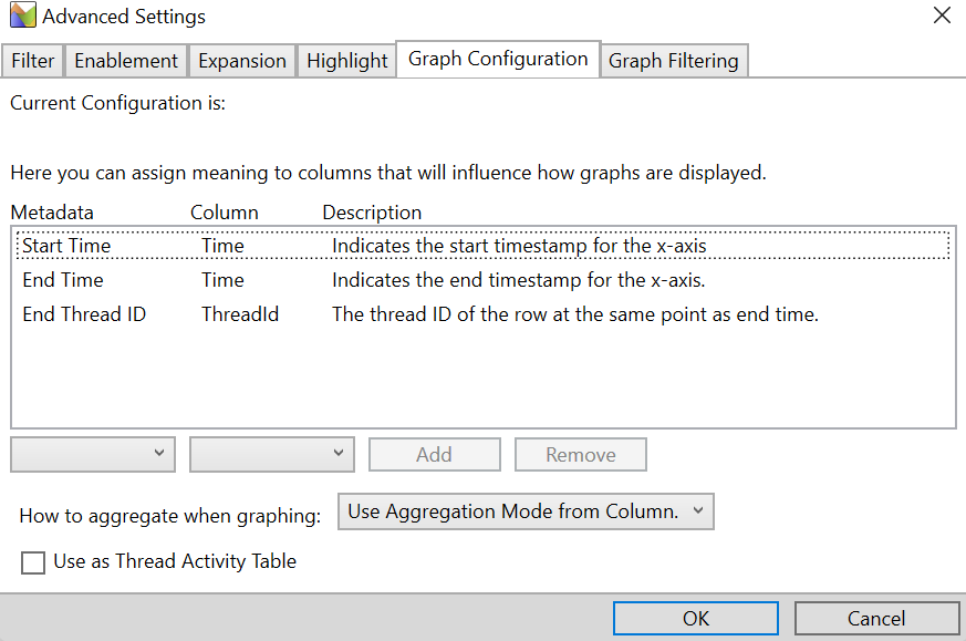
WPA utilizes column metadata to understand how to configure time on the x-axis, these are configurable in the ‘Graph Configuration’ tab in the ‘Advanced’ dialog accessible via the ‘View Editor’:
Since the ‘Count’ column is already configured to ‘Sum’ aggregation by the default preset, in the below snapshot we can quickly see where event counts spiked across the timeline:
To change between the different graph modes, select the graph config drop down next to the magnify glass:
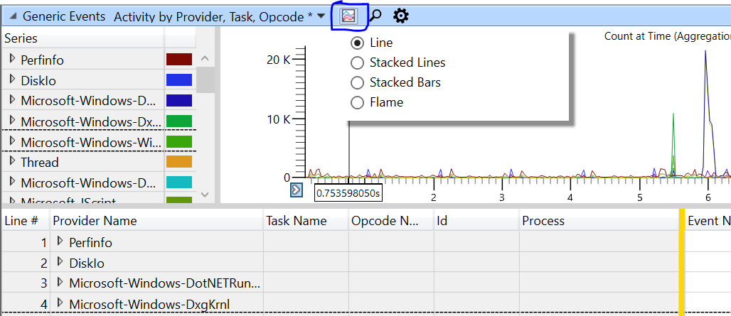
Line, Stacked Lines, & Stacked Bars can be displayed with any aggregation type, where as Flame only supports the Sum aggregations only.
Time Based (Gantt)
Gantt charts are useful for looking at time based information, whether it’s point-in-time or time-range of data.
A single time stamp column configured to the right of the blue bar will generate a point based graph, where each diamond (♦) represents a single point of time:
A pair of time stamp columns (or a time stamp column + time delta column) to the right of the blue bar will generate a range based graph, where each bar represents a time range data: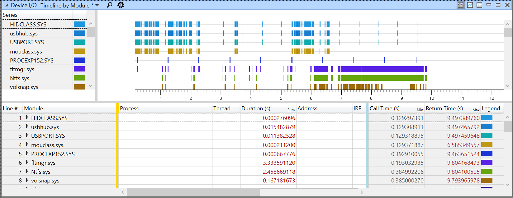
Depending on the analysis you are doing, it may make sense to switch between these two types of Gantt charts. Thankfully, WPA makes this very easy to do!
Conclusion
I hope this post gives a quick overview on how to configure the table for graphing in WPA, there are many more scenario we did not cover that can be found at Microsoft Docs.
Keep a look out for Part 3 of the series where we dig into how to take these configuration into presets and profiles!
0 comments