Background
Connected cars, which have the ability to collect and transfer data via cellular networks, offer us the opportunity to make road transport safer, more organized and more ecologically friendly. To push forward widespread adoption and help the technology fully enter the mainstream, manufacturers and third parties, like insurance companies, need to overcome a number of challenges first. These obstacles include the accurate estimation of driver safety, assessing the eco-friendliness of different vehicles and driving styles, and monitoring driver behavior to allow for more personalized insurance policies and better fleet management.
To overcome many of these roadblocks, the first step is to gather the right data. Microsoft partnered with Pointer Telocation, a global car telemetry device provider, to create an automated driver safety estimation solution which can be proposed to Pointer’s fleet managers and other customers.
To do this, we proposed using an unsupervised machine learning approach to estimate driver safety by comparing each driver’s behavior to the behavior of the general population:
Challenges and objective
Effectively assessing and documenting driver safety from thousands, if not millions, of connected vehicles at any one time requires handling a huge amount of data. Pointer Telocation’s devices are capable of automatically detecting and recording incidents of potentially dangerous driving such as harsh turning, harsh braking, and harsh acceleration; these devices then document these incidents, accounting for a total of 70~ million events recorded daily. As connected cars further enter the mainstream in coming years, this number is going to rise exponentially.
For this reason, a scalable cloud-based solution is needed to effectively manage huge amounts of real-time data from all over the world. Pointer chose to establish a cloud environment capable of analyzing and modeling this huge amount of data. Microsoft offered to assist in creating this cloud environment, as well as in creating a preliminary solution to estimate driver safety.
For estimating driver safety, Pointer Telocation required the development of an extendable unsupervised machine learning model that could later be improved by adding additional data, such as driver accident records obtained from 3rd parties. The approach of comparing a driver to a population required creating an objective scoring mechanism which could give us a driver ‘risk score,’ effectively measuring how risk-prone a driver is relative to the general driving population. The entire drivers’ population was segmented by factors determined by Pointer’s system, such as vehicle type, country, and device type, and each driver was compared to his or her homogeneous population.
For example, we compared bus drivers in Italy to other bus drivers in Italy, to avoid inaccurate estimations resulting from confounding factors in the data. Furthermore, we had to make sure that each population segment was big enough to give a fair representation of the real driver population.
The Solution
Preliminary inspection of the data
We started this analysis with an initial dataset of 242 drivers, taken as a sample out of the total dataset containing a few million drivers. After deciding on the modeling approach, we extended the model to support all drivers in the system. As the data did not contain the actual safety score for each driver, there were only two options for accurate analysis:
- Solution 1: Label data manually to solve a supervised/semi-supervised learning problem
- Pros: Easy to measure and improve
- Cons: Costly, and the perceived safety would be subjective
- Solution 2: Unsupervised learning / traditional statistics
- Pros: No human supervision required
- Cons: No robust metric for estimating the model’s predictions
Our team decided to focus on the latter for this project, choosing an unsupervised learning approach. For insight into how to best follow the route of a supervised approach to driver risk analysis, see this link.
Before deciding to follow the unsupervised path, we created a few visualizations to estimate what would it take to manually provide a score for each driver. The main motivation for visualizing the data was to provide a clear understanding of when and where harsh events happen.
The first visualization is a timeline:

A timeline visualization allows analysts to better understand temporal relationships between events, as well as frequencies of said events. In addition, timelines provide mechanisms to incorporate contexts, such as the time of day (driving at night vs. driving during the day), traffic congestion and weather. This context allows an analyst or a labeler to determine whether the harsh behavior was the driver’s fault or not.
The second visualization we used was a geographic representation of where events occurred on a map:
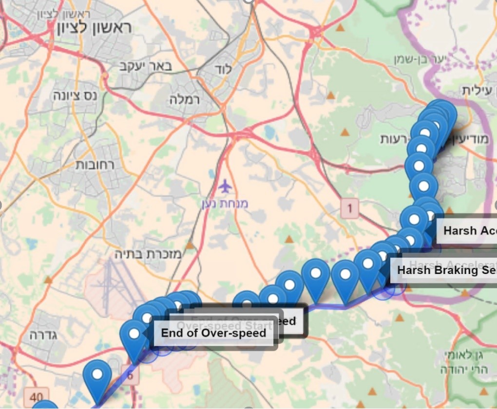
The map offered context to analysts about which type of road or the area in which an occurrence of dangerous behavior occurred. This context is important, as incidents such as speeding are comparatively less dangerous on highways than in busy cities.
This data visualization was created in R, using shiny, googleVis and leaflet packages. We also created a generic tool for analyzing discrete temporal events, such as the examples offered in this case study. The tool can be found here: github.com/Microsoft/eventsVis
Exploratory data analysis
The next step in our analysis was to dive into the driver data to understand what it contained, what was missing and whether there were any mistakes. We also needed to highlight any business-related questions, statistical distributions, correlations and more. To do this, we started at a high level and dove deeper into issues that were relevant for modeling. See the project’s GitHub repository for a notebook describing the exploratory data analysis.
The structured raw data looked like this:

The dataset contained events of various types (behavioral and functional), which are stored in the EventName column alongside metadata such as the current location (as seen in the Latitude and Longitude columns), Speed km/h and time (ts column). The DriverId column represents the unique identification code of an individual driver.
It is important to mention that all events were created on Pointer’s edge device and calculated using Pointer’s proprietary sensors. As a part of this analysis, we did not have any control over the way events were calculated. Essentially, each harsh event was calculated by comparing the change in value of a specific sensor – e.g., accelerometer or GPS – to a fixed threshold.
The distribution of the number of events per driver logged in the system are displayed in the following graph:

The mean number of events per driver was calculated as 7435. However, to make an accurate safety estimation, we needed to not only look at the number of events, but also the types of event which occurred. The distribution of event types across sample drivers can be found in the following graph:
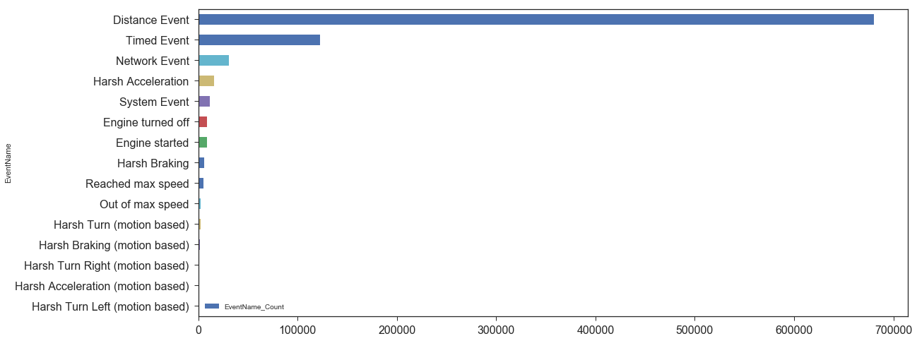
There are two types of events: system events and behavioral events. Since the system events: distance, timed, network and system events did not contain behavioral information about driving style, we decided to only use them to calculate distance and estimate over-speeding. After cleansing of the data, a dataset of 54,000 samples remained, out of the 900k samples we had started with.
The clean data displayed the following distribution of event types:
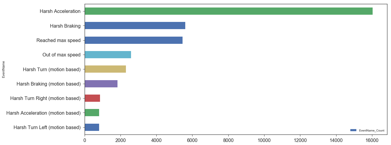
The above chart offered us some interesting insights:
- The number of ‘Reached max speed’ events did not equal the number of ‘Out of max speed’ events, which raised a red flag. In addition, we decided that since these types of event data compared the current car speed with a constant (e.g. 120 km/h) rather than the actual speed limit, they were invalid, and thus would be omitted. We instead chose to use an API that provided road segment max speed and compared the car’s actual speed to the max speed. These APIs also offered the option of ‘snap-to-road,’ which eliminated the room for error due to inaccurate GPS readings. For more info on setting up this service on Azure, see this link.
- We found two types of events in our dataset which actually represent the same action. In the end, ‘Harsh Acceleration’ and ‘Harsh Acceleration (motion based)’ were simply logged as different event categories due to the fact they came from two different versions of the device, or two different sensors.
- The motion-based device featured three different values for harsh turning: Harsh Turn, Harsh Turn Left, and Harsh Turn Right. We then found that Harsh Turn Left + Harsh Turn Right <> Harsh Turn. This was based on the time at which each event type was introduced into the data system. In the end, we decided to solely use Harsh Turn, and ignore the left and right values.
Since more days of data were logged on the system for some drivers than others, we decided that looking at the absolute number of events was not entirely accurate. Instead, we normalized the number of events per driver by dividing by either total drive time or total distance. We do require a minimum number of usage days prior to analysis to avoid outliers.
Feature set creation
We defined a feature set as the normalized number of events per event type. For each behavioral event, we counted the number of events and then divided by total drive distance recorded. In the case of over-speeding (which is not shown here), one can calculate the total amount of time each driver was over speeding or a metric for the ratio between the current speed and the allowed maximum speed. The following code snippet describes how raw data is turned into a feature set of normalized events per km:
def create_feature_set(df, distancePerDriver):
    dfEventAggByDriver = df.groupby(['DriverId','EventName'])[['EventName']].agg('count').add_suffix('_Count').reset_index()

    dfEventMatrix = dfEventAggByDriver.pivot(index='DriverId',columns='EventName', values='EventName_Count').add_prefix('F_').fillna(0).reset_index()
    dfEventMatrix = dfEventMatrix.merge(distancePerDriver, how = 'inner',on='DriverId')
    dfEventMatrix.set_index('DriverId', inplace=True)

    cols = [col for col in dfEventMatrix if col.startswith('F_')]
    dfEventMatrix[cols] = dfEventMatrix[cols].div(dfEventMatrix['Distance'], axis=0)

    dfFeatureSet = dfEventMatrix[cols]

    return dfFeatureSet

features = create_feature_set(df,distancePerDriver)
These are the first few rows of the feature set we used:
 /p>
/p>
Since there were two different types of systems (motion based and not), we looked at one at a time rather than joining the two, as the values and their proportions might be incomparable. Additionally, we ignored the inaccurate over-speeding event, as mentioned earlier.
The following graph shows the distribution of behavioral features – harsh acceleration, harsh turning and harsh braking:

On the diagonal, we see a histogram of each feature. On the upper triangle we see a scatter plot of each pair of features, and on the bottom triangle, we see a KDE (Kernel Density Estimation) plot of each pair of features.
All features are skewed to the right with a long tail. There were some outliers, which we dealt with separately.
Outliers handling
We had to adjust for outliers as they may have affected the statistical approaches taken. To handle these, we transformed the features to a distribution closer to normal (using a box-cox transformation) and adjusted the remaining outliers based on the μ+k*σ rule – this meant that every sample with a value higher than k standard deviations from the mean of the population was considered an outlier, where k is a parameter for the modeler to choose.
In retrospect, a second approach could have been to truncate the tail using some constant, but it would have been more difficult to find this threshold than when using the standard deviation rule. A third option would have been to remove samples that are outliers in a multivariate distribution (using a multivariate normal distribution, for example).
The following graph shows the same scatter plot matrix, after the outliers had been adjusted using the box-cox transformation and applying a threshold (each outlier value was changed to the limit: μ=k*σ). Using k=2.5, outliers were found only on the Harsh Acceleration feature. This graph shows the distribution after outlier adjustment and after a scaling all values between 0 and 1:

To get some more insights on the exploratory analysis, refer to the jupyter notebook describing this process.
Modeling
Main hypothesis
Our main assumption while analyzing this data was that the more harsh events a driver had, the more likely he/she was to be an unsafe driver. A driver with zero harsh turns, zero harsh accelerations, zero over-speeding and zero harsh braking over some distance was more likely to be classified as a safe driver. On the contrary, we can assume that a driver who made multiple harsh movements over the same distance was an unsafe driver.
Modeling approaches
We used a number of different approaches for modeling:
- Modeling the problem as an anomaly detection problem or using some sort of clustering to find clusters of safe/unsafe drivers.
- Finding a multivariate metric that encompasses our assumption in multi-dimensions and allows us to estimate unsafe driving using probabilities over this multivariate distribution.
- Reducing the dimension to 1 and trying to find a rule/rank on this one unified metric.
- Using a univariate statistical model: modeling each event type individually by using statistical distributions.
In the following section, we discuss how we evaluated different approaches for modeling this data:
Anomaly detection:
The first approach we used was anomaly detection. We tried to see if we could highlight meaningful anomalies that might contain information about driver safety. A few approaches were evaluated, among them a method called Histogram Based Outlier Score (HBOS) and Local Outlier Factor (LOF).
The following plot shows the output of LOF on two dimensions of the dataset:
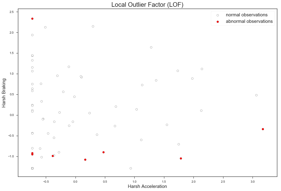
The LOF model looks for anomalous points in respect to each point’s neighborhood. We ran LOF on all three dimensions, though this plot shows only the first two dimensions for easier visualization. Even after playing with the model’s parameter (number of neighbors) and other models, we did not achieve meaningful results. It appears that statistical outliers did not imply behavioral outliers in this case.
Multivariate analysis
The second approach was to find a multivariate representation of the distribution and then use it to calculate the probability of one driver being unsafe when compared to a general population of drivers. This link describes some of the methods around multivariate density estimation. Essentially we looked for drivers that lay on the tail of a multivariate right-skewed distribution. However, in the end, we didn’t continue with this approach since most methods assume normal distribution, had other unmet assumptions or didn’t have a robust enough implementation that we could employ.
Dimensionality reduction
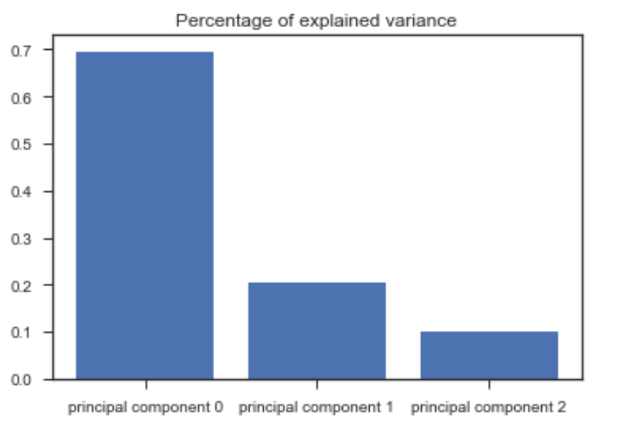
The third approach we used was to try to reduce the dimensionality down from 3 or 4 dimensions to just 1, as a means of finding a compact representation of driver behavior. Out of the various viable tools available, we chose to use a PCA. This Scree plot presents the amount of variance explained by each principal component. We see that the first component explains ~70% of the variance:
We were most interested in finding principal components that had a positive correlation with all original features. In the following graphs, the leftmost plot shows the distribution of the first principal component. The three plots to the right show the correlation between the first principal component and the original features (acceleration, braking, and turning):

The first principal component was the only one that preserved the order of the data (had a positive correlation with all original features). However, since this component only explained ~70% of the variance, and it relied mostly on harsh acceleration, and as such, was not accurate enough to be used as a metric for ranking.
The selected model: comparing each driver to a homogeneous population
In the end, we decided to use the technique of modeling the distribution of each event and then evaluating each individual car by comparing it to general data from the overall homogeneous population.
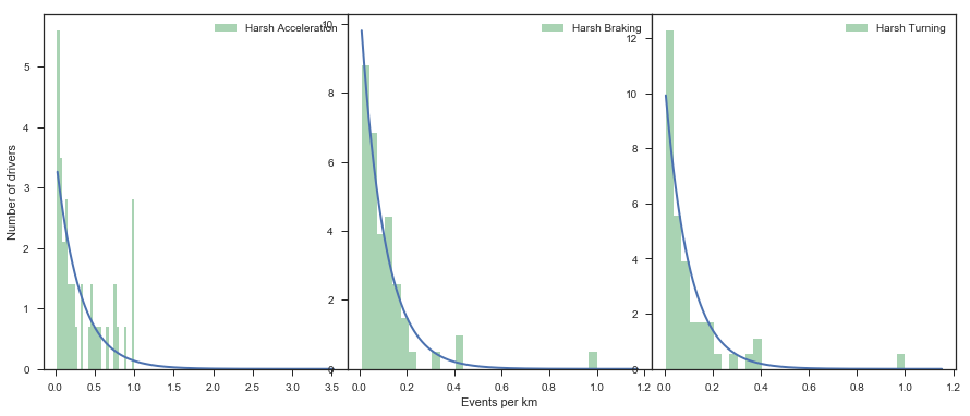
Since all events had a skewed distribution, we decided to use an exponential or gamma distribution. In this approach, instead of using a multivariate model that might be difficult to explain, we used a weighted sum of probabilities. For each event distribution, we estimated the Cumulative Distribution Function (CDF) value and performed a weighted sum across all event types. This is a naïve approach as it ignores the dependency between events, but helps in making the model easily explainable.
Additionally, it is possible to evaluate the goodness-of-fit or the SSE measure between the data and the proposed distribution to detect drifts or changes in the data that might affect the model once it is finally deployed to production. This figure shows histograms for each event (normalized between 0 and 1), together with a fitted Exponential density function:
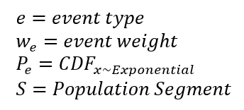
We defined the scoring metric as a weighted sum of the CDF value of a driver:

where
An example:
A hypothetical driver has made 0.05 harsh accelerations, 0.05 harsh brakes and 0.05 harsh turns per kilometer during his/her time in the system. The next step would be to calculate this driver’s CDF values for each event, which is the area under the blue density function from 0 to 0.05 (after normalization). Let’s assume we got a CDF vector (P~e) of [0.82, 0.32, 0.31] for accelerations, brakes and turns respectively.
Assuming that the decided weight (w~e) of each of the behaviors is 0.4 for accelerations, 0.2 for brakes and 0.4 for turning, the final score would be (0.40.82)+(0.20.32) + (0.4*3.1) = 0.516. We could further explain the result by saying that the main reason this driver got this score was due to him/her being on a high percentile (82%) in the population of harsh accelerators.
Model parameters selection
In order to decide what is the right weight for each factor, we referred to accident statistics relevant to a population. For example, the National Motor Vehicle Crash Causation Survey has details on accidents causing factors such as over speeding, aggressive driving, accelerating and more.
Model assumptions:
The primary assumption of this approach is that the population segment is homogeneous, i.e. no confounding effect could cause drivers to be different from others in the population, other than the mode of driving. In addition, this approach might not be appropriate for population segments in which a large majority of the drivers are unsafe.
In order to overcome the latter, we suggest rejecting population segments in which the driver’s distributions don’t follow a predefined distribution (e.g. Exponential) using goodness of fit statistical tests, such as the Anderson-Darling test or the Kolmogorov-Smirnov test. We also suggest rejecting populations with too few drivers, e.g. less than 1,000.
Segmentation of drivers
As noted earlier, we wanted to compare each driver to his or her homogeneous population, which was possible because Pointer’s system contains metadata on each driver, such as the type of vehicle, country, and device type.
We divided all drivers into distinct groups, in which each group had a specific value of the triplet [vehicle, country, device]. In order to generalize this approach from 242 drivers to all drivers in all segments, the pipeline proposed here was duplicated for each segment for which the models’ assumptions hold. For drivers in segments that were too small or whose distributions are unknown, no estimation was made.
Operationalization results – How to scale the process to manage 70 million events per day
Thanks to this project, Pointer’s systems are now able to process more than 70 million events on Azure daily. For safety estimation and other data-driven analyses, we built a pipeline to ingest data and process in a batch operation.
We used the following Azure tools:
- Event Hubs: A data ingestion tool
- Azure DataBricks: A managed spark platform which facilitates the creation, management, monitoring and deployment of Spark jobs
- Azure Blob Storage: For storing raw events before analysis
- Application Insights: A tool for monitoring jobs in production
The following diagram outlines the high-level architecture:

On the left-hand side of the diagram, you can find the data producers – in this case, the various devices installed in connected vehicles. On the right-hand side, you can find the data consumers – in this case, private customers accessing the data insights via an app or operations center, including fleet managers, insurance companies and others. The center column outlines the different modules in the data pipeline. Data flows from Pointer’s existing IoT Hub (for handling IoT devices) into Event Hubs and then into the data pipeline.
Data pipeline
Once data is ingested into the cloud system, it is processed on two different paths:
Batch operation:
- All events are written into Azure Blob Storage.
- A periodical batch operation transforms all events from an Avro format (in which they were written) to Parquet. The Parquet format allows Spark to fetch the specific files needed for analysis. In our case, it collects only the files that were written in the last n days.
- A periodical batch Spark operation runs the driver safety estimation model and provides a score for each driver.
- The batch operation writes scores and other metadata into an Azure SQL Database.
- Customers consume results via an API using the Azure API Management tool, which handles all the aspects of the API – including permissions, optimization, security, documentation, monitoring and more.
- We used Application Insights and PowerBI as tools for monitoring and analyzing the process and the results.
Stream operation:
Although not covered in this code story, we could potentially use an event streaming module (such as Spark Streaming) to detect specific behaviors within incoming event data in real time. This streaming process is extremely useful for cases where we need to treat incoming events: classify each event, cluster events, find anomalies and more.
Platform selection
Since the driver safety score use case employs a batch operation, we focus on this path at this stage. For this process, we selected Spark given that it’s a mature parallel platform which scales easily and is well documented. Using Azure, we had three options for scaling up this process:
- Azure Batch / Azure Batch AI : Cloud-scale job for scheduling and compute management
- HDInsight: A fully managed, full spectrum open-source analytics service
- Azure DataBricks: A spark workbench for unifying data science, data engineering and dev-ops for spark jobs
We selected DataBricks as it simplifies a lot of the management aspects of the cluster, in addition to its nice notebook-based interface. The GitHub repository for this case study features the PySpark code for running the driver safety estimation on top of Spark. In addition, it includes the deployment details for automatically deploying a similar pipeline in your own environment.
Future projects
Our project highlighted just how challenging and subjective obtaining ground truth information of safe and unsafe drivers is. Accurately profiling drivers requires a lot of context on each action, as well as multiple human annotators for each sample. We hope that our project will help future teams with the annotation task, by providing insights into the percentile in the population each driver resides in.
Future projects could include incorporating other factors, such as over-speeding events, and also trying out new approaches for segmenting drivers. Finally, analysts could achieve a better understanding of real driver behavior by first obtaining ground truth data, in order to optimize the model’s parameters and add more context.
Such data is important to develop a global behavioral model which is capable of estimating driver safety accurately regardless of population segments.
Conclusion
During this project, our team created and implemented a pipeline for statistical analysis at scale. Using the new tool, data is ingested into a system that analyzes it either by batch process or in a streaming manner. The Spark-based system is also capable of expanding to support additional scaling of the data and to analyze and model this data at scale.
While our tool was created for applications in the connected car insurance industry, as the expansion of connected devices increases worldwide, we hope our approach can also assist monitoring the safe use of devices in smart homes, and other environments. With the worldwide network of connected devices, homes, and vehicles growing exponentially, we are being offered the ability to not only monitor the upkeep of the devices we utilize daily but also optimize the way that we use them. Connected cars offer a means of making the roads safer, but also ensuring that drivers who use them correctly are rewarded with the benefits they deserve from insurance companies. However, as connected car fleets grow around the world, we need the data management systems in place which allow us to do so.
With our system, we hope we have moved a step closer to realizing this by assisting Pointer Telocation in creating a scalable cloud-based system that allows them to not only manage upwards of 70 million driver behavioral events daily but also fairly assess individual users’ driving safety while doing so. The driver safety use case is only one of many for connected cars. For additional connected cars use cases using Azure, see the Microsoft’s Connected Vehicle Platform.
We encourage anyone building an unsupervised machine learning approach to estimate safe use of machinery or other devices to leverage these techniques, and leverage the code we have shared in our GitHub repo.
If you have any questions or feedback on this code story, please reach out in the comments below.
This project is a collaboration between various engineers in Microsoft and Pointer, including Guy Bertental (Microsoft), Tamir Kamara (Microsoft), Omri Mendels (Microsoft), Noa Keidar (Pointer) and Oded Bosme (Pointer)
References
- A Comparative Evaluation of Unsupervised Anomaly Detection Algorithms for Multivariate Data
- HBOS – Histogram based outlier score
- Multivariate kernel density estimation
- Local Outlier Factor (LOF)
- Goodness of fit
- More on correlations between principal components and the original variables
- Microsoft Connected Vehicle Platform
- National Motor Vehicle Crash Causation Survey
