
The Accessibility Insights team recently fixed a bug in our Windows Presentation Foundation (WPF) app where checkboxes in a WPF tree view were not properly reporting their checked or unchecked state to adaptive technologies such as screen readers. This longstanding issue created a sub-par accessible experience in Accessibility Insights for Windows, our Windows app introduced in John’s December 13, 2021, post. Previously, we worked around the problem to make our app usable for adaptive technologies, but with this fix we have improved the experience to meet industry standard accessibility patterns. As a team working on accessibility every day, we know how much users benefit from accessibility best practices. We promote accessibility as a fundamental part of all applications and pursue solutions that make accessible apps achievable for developers. To demonstrate what this looks like for us, we’ll walk you through how we fixed this bug in our own code.
The problem Before fixing this bug, screen reader users couldn’t tell when the state of tree view items changed in the event configuration checkboxes in the Accessibility Insights for Windows events view, a WPF tree view that nested checkboxes as children of the tree view items.
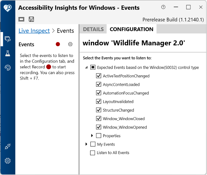 The checkboxes didn’t provide any state information to screen readers, so we were adding the current state (“checked” or “unchecked”) directly to the control’s name. However, this workaround didn’t solve the problem of state changes and was insufficient to provide the best experience. Screen readers allow users to customize how information is rendered. For example, screen reader configuration can announce state before names instead of after, not announce state at all, or present state in braille. Putting the control’s state in its name bypasses all the semantic information that the system tries to provide to screen readers. In this case, the best way to provide the information which allows adaptive technologies to work to their fullest potential is the UI Automation toggle control pattern. This pattern enables screen readers to deliver a truly accessible experience to the user rather than embedding the state in the name, which is suboptimal.
The solution: The toggle control pattern Windows’ accessibility framework,
UI Automation (UIA) provides element properties like name and control type, and more importantly for our purposes, control patterns. Control patterns are specialized interfaces which represent information or behaviors such as invoking a link or scrolling through a list. One such pattern is the toggle control pattern, which is the standard way to expose to a UIA client the state of a control like a checkbox, as well as when that state changes. All WPF controls support appropriate UIA control patterns by default. As such, WPF checkboxes support the toggle pattern. However, a common pattern for adding checkboxes to a WPF tree involves nesting checkboxes inside tree view items, which do not support the toggle pattern. This is the root cause of the bug and the ideal fix is to create and use a custom TreeViewItem that implements the toggle pattern.
The implementation While using the toggle control pattern is the right fix for this issue, implementing UIA control patterns can be complex. UIA control patterns are exposed as interfaces that a control’s
automation peer can implement. As a result, when adding a new control pattern to our TreeViewItems, the first step was to create a custom automation peer.
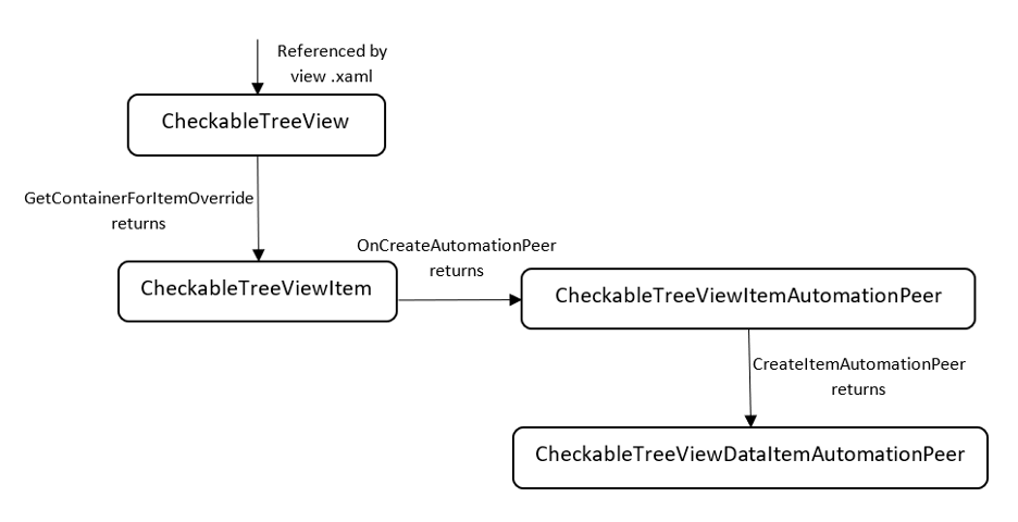
Creating a Custom Automation Peer In most cases, creating a custom automation peer is relatively simple and only involves subclassing the default control and overriding its
OnCreateAutomationPeer method. However, TreeViewItems present a wrinkle because they are created by TreeViews and not referenced explicitly in a view’s XAML. Furthermore, we wanted to create a custom automation peer for the TreeViewDataItems, the TreeViewItem’s children and grandchildren in the control hierarchy. As a result, we created multiple custom controls and automation peers to implement the new toggle pattern. These included: * CheckableTreeView, a subclass of TreeView. This class replaces WPF’s default TreeView in the view’s .xaml and overrides GetContainerForItemOverride to return a CheckableTreeViewItem instead of WPF’s default TreeViewItem. * CheckableTreeViewItem, a subclass of TreeViewItem. This class overrides OnCreateAutomationPeer to return a CheckableTreeViewItemAutomationPeer instead of WPF’s default TreeViewItemAutomationPeer. * CheckableTreeViewItemAutomationPeer, a subclass of TreeViewItemAutomationPeer. This class overrides CreateItemAutomationPeer to return CheckableTreeViewDataItemAutomationPeer instead of WPF’s default TreeViewDataItemAutomationPeer. * CheckableTreeViewDataItemAutomationPeer, a subclass of TreeViewDataItemAutomationPeer. This class implements the new UIA control pattern.
Implementing the Toggle Pattern With these changes complete, we finished hooking up our custom tree view data item automation peer and were able to implement a new UIA control pattern. In our case, this meant implementing the
IToggleProvider interface. This was simple since the interface only requires classes to expose a ToggleState property and a Toggle method. Since we already implemented a view model which exposed the checkbox’s IsChecked property, implementing the toggle pattern was a simple matter of wiring up the existing IsChecked property into the toggle pattern’s interface. With these changes, we were able to verify with a screen reader that the checkboxes were now correctly announcing their state as it changed. To see more details and the final implementation, the PR with these changes can be found on the Accessibility Insights for Windows GitHub repo.
The results These changes were merged in November 2022 and are available now in Accessibility Insights for Windows. Bug fixes like this are vital to ensuring that apps like ours are accessible to all and up-to-date with industry standard accessibility patterns.
Download Accessibility Insights for Windows to try these changes and keep up to date with all the latest developments by visiting the GitHub repo for Accessibility Insights at github.com/Microsoft/accessibility-insights-windows.
0 comments