
I’m excited to share the new navigation we’re working on for Visual Studio Team Services (VSTS) to modernize the user experience and give you more flexibility. As Lori mentioned in her blog post, our goal to create an integrated suite that also gives the flexibly to pick and choose the services that work best for you. That goal is a common customer request and at the heart of this new design. In the next few weeks, you’ll see a “New Navigation Preview” message pop up in your VSTS account. Please give it a try, it only affects your view of your account and you can easily roll back if you need to. This is the beginning of the update to our design and so we are very keen to get your feedback at this early stage.
A new design style
The new style is inspired by the Fluent design language being adopted across Microsoft and will be rolled out over the next few months. We’re starting with design improvements to the navigation and then we’ll deliver updates to the content of each page. The goals of the new design language are to be clear, to gracefully support high information density, and – of course – be fast. The result will be an emphasis on the content of your work while providing a consistent and predictable experience across all aspects of VSTS.
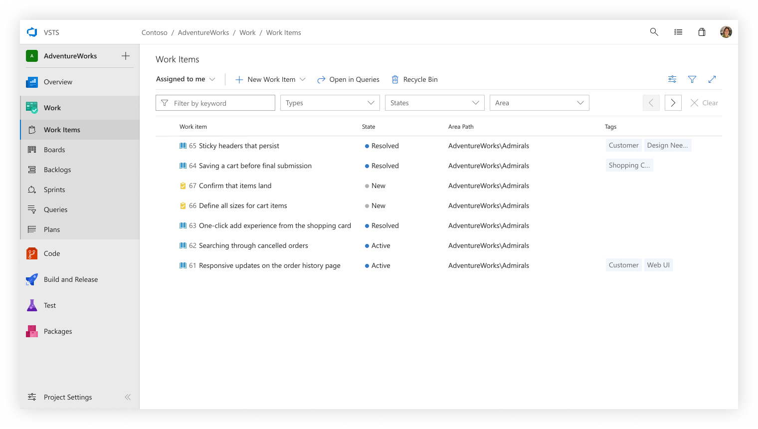
Project navigation
The project navigation was moved to the left so that there’s a clear separation between the project and global spaces. To improve wayfinding, we’ve added service icons with color accents along with new section icons.
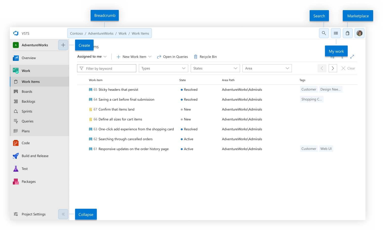
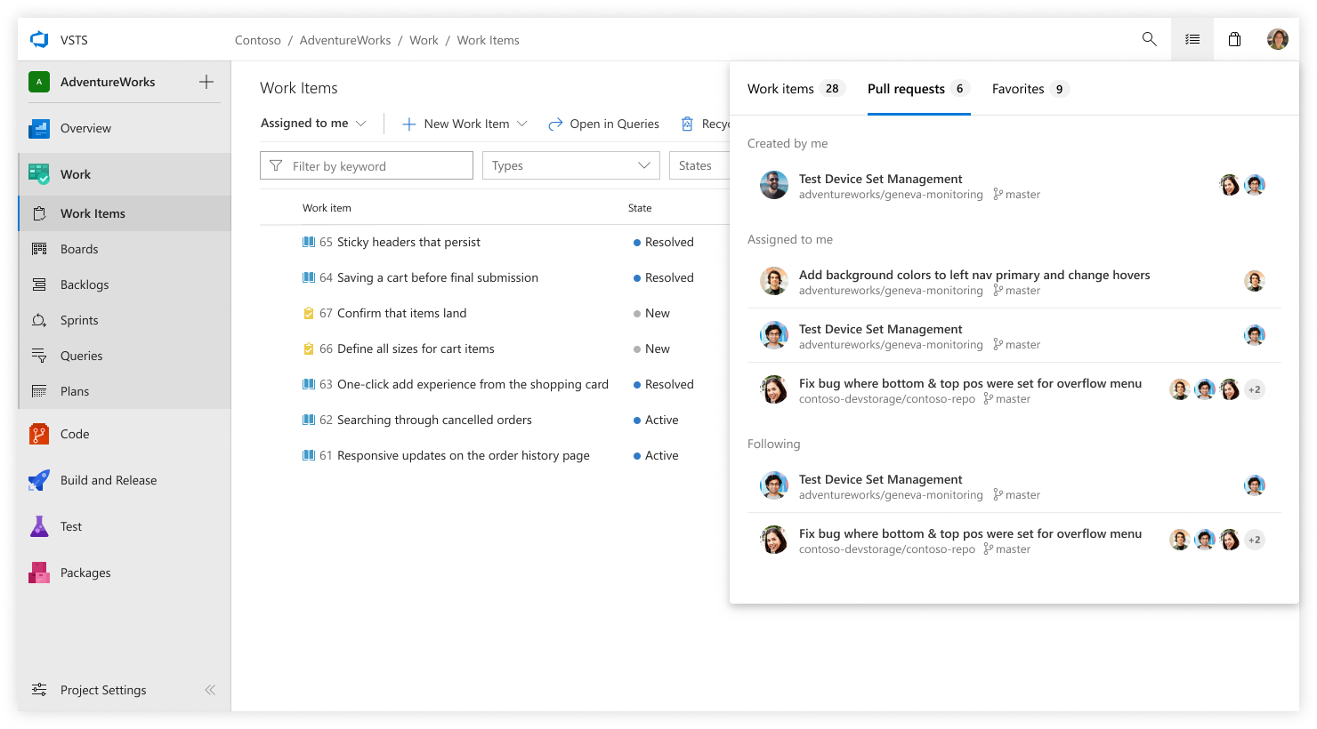
A new global header is present on every page of the product regardless of where you are. It shows location context along with providing quick access to global controls.

From left-to-right, the components of the header are:
- Homepage – The VSTS logo is a quick link back to the homepage where you can see your list of projects and switch accounts
- Breadcrumb – This shows the logical hierarchy of the page by displaying the account, project, service, and hub
- Search – Query across work items, code, or your wiki
- My Work – See your work items, PRs, and favorites
- Marketplace – Browse the marketplace to discover new extensions
- User Profile – View your profile, settings, and help
One major user-reported pain point we set out to address with the new header is that it can be challenging to pinpoint where specifically you are within VSTS. In our research we’ve found this confusion often stems from seeing the project and team picker together in the top navigation. As a result, we’ve separated the two and moved Team context into the content area of each page that uses it and removed it from the top navigation.
The left navigation menu provides more vertical real estate for page content and can be collapsed to get more horizontal space. This can be especially useful if you’re viewing a Kanban board with a lot of columns.
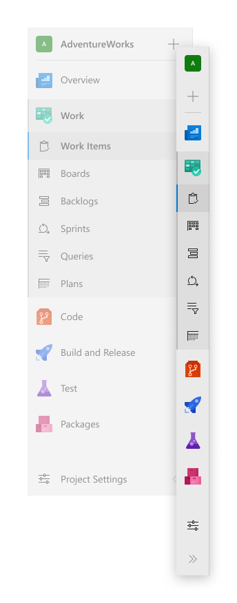
We’ve also grouped our cross-product experiences (summary, dashboards, and wiki) under Overview. The motivation for creating this Overview set is to have clear alignment of shared functionality and to ensure that these features remain discoverable if an individual service is disabled.
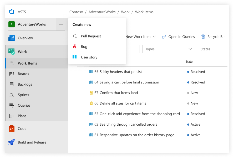
Create new
Another improvement to the project navigation is a “create new” button next to the project name. This makes it easy to create any of the common artifacts no matter where you are in the project. It’s a handy time saver when you need to quickly file a bug or create a pull request.
My work
The current account page has tabs for My Work Items, My Pull Requests, and My Favorites, but telemetry data shows that these aren’t fully utilized today. Through our research we’ve learned users are looking for quick access to their work items, pull requests and favorites from anywhere. As a result, the My Work flyout is available at the upper right of every page, providing quick access to the items you care about, no matter where you are in VSTS.
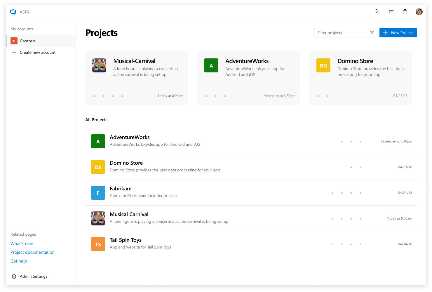
Homepage
This VSTS homepage now provides quick access to your recent projects as well as other projects in the account. You can search all your projects that are part of a given account and if you use multiple accounts, there’s a list in the top-left so it’s easy to switch between them.
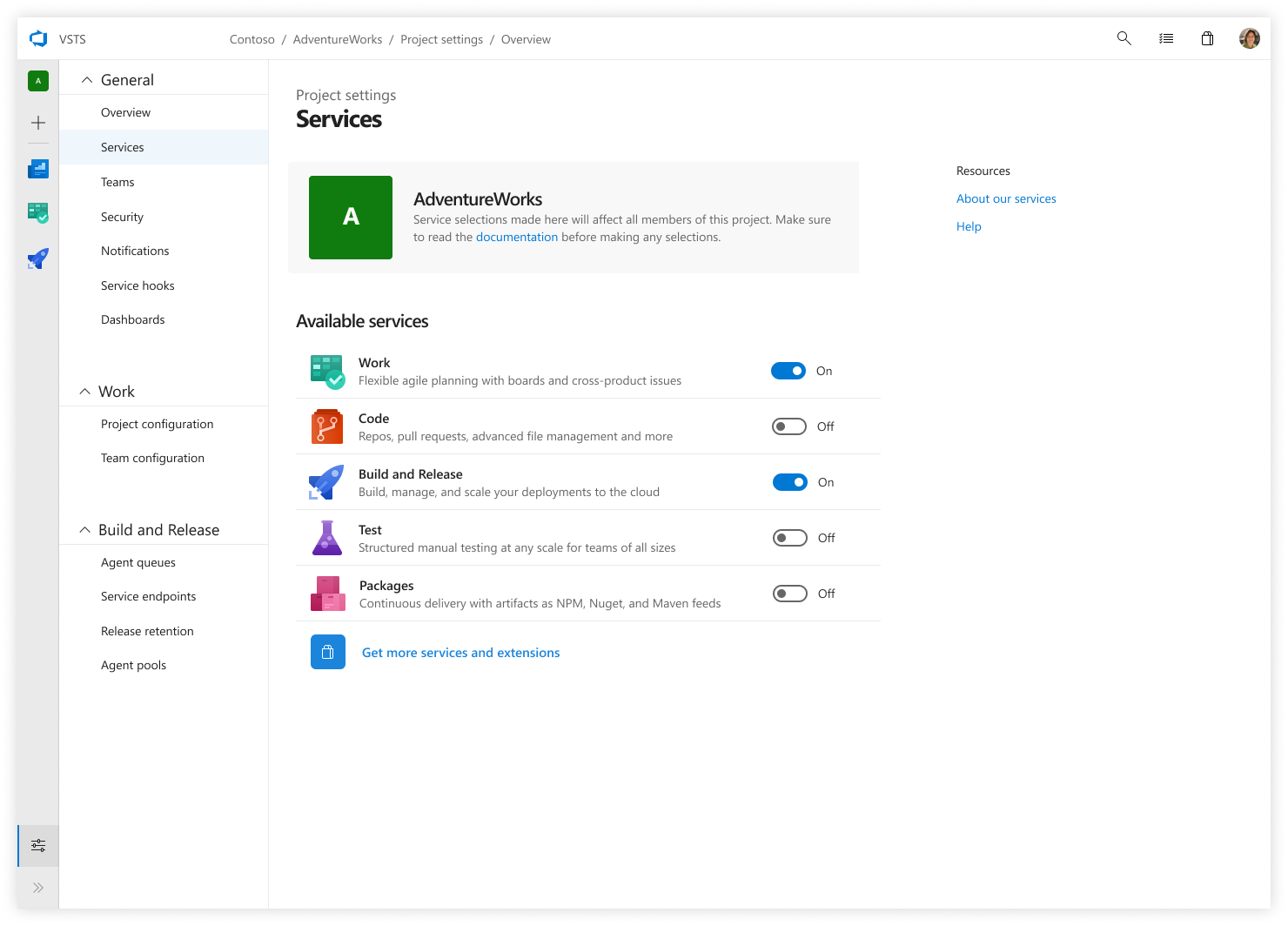
Settings
We’ve heard your feedback that the admin / settings area of VSTS could be confusing as the top navigation inside a project was similar to the top navigation for settings. To improve on this, we’ve introduced a different pattern for navigation within settings and grouped them by their associated service. Also, within settings you can turn on and off individual services in each project – a long-standing feature request.
Try the preview and send us feedback
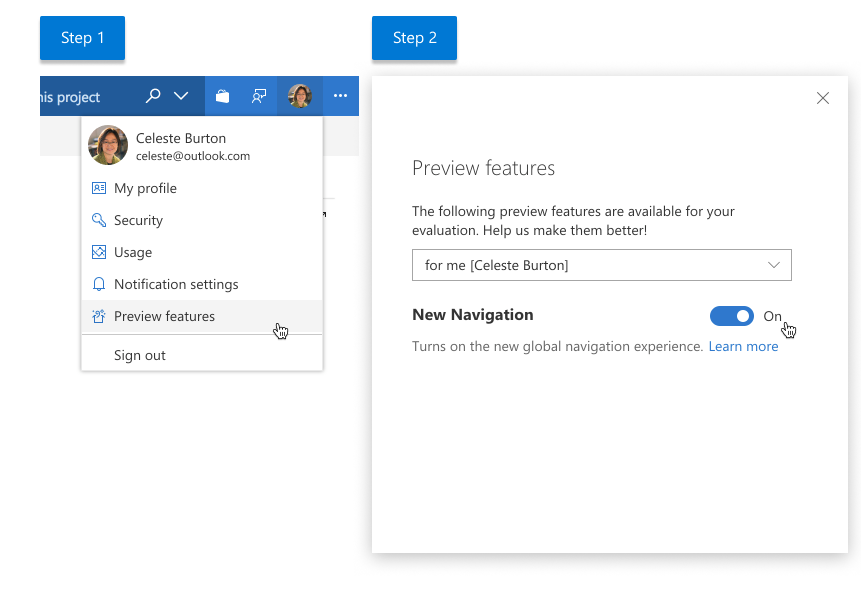
Over the next couple weeks we’ll progressively roll out the ability to opt-in to the new navigation preview. When it’s available in your account, you’ll see a new feature announcement with a link to our preview feature menu. If you choose to preview the new navigation, note that only your view of VSTS data will be updated for a given project (your team will not experience any visual changes). Once it’s available in your account, you can turn it on like any other preview feature:
- Select your picture in the top right of a VSTS project
- Select Preview Features
- Select New Navigation
We need your thoughts to make this preview better, and will provide more updates in this blog as we proceed and start to get feedback. Please leave a comment below or contact us on Twitter or via our Developer Community.
Jeremy Epling, GPM and John Lea, Design Director
0 comments