We are excited to announce that Card Styling is now available for Delivery Plans 2.0! Styling a card helps bring attention to it quickly so it’s a nice way to help with visualization.
Card Styling
Cards can now be styled using rules, similar to the Kanban boards. Open the plan settings and click on “Styles”. In the Styles pane click on “ + Add styling rule” to add the rule and then click “Save”. There can be up to 10 rules and each rule can have up to 5 clauses.
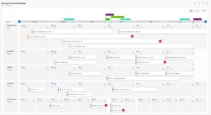
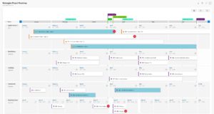
Here is an example that shows the before and after views of a Delivery Plan with a card styling rule that highlights architecture work.
Before… which work items are architecture work?
After… much nicer! I can see the architecture work items!
Clarifications
Based on feedback we’ve been receiving I want to provide clarification on some common activities
- To toggle the display of dependency lines, click on the bottom of the card.
- If a work item on the delivery plan isn’t showing, check that the start and target dates fields or the iteration path have been filled out.
What’s next?
Delivery Plans 2.0 is on track for general availability(GA) at the end of April. New features will be picked up after GA.


Nice, improvement.
Does Delivery Plans API the ability to manage markers. That would be very interesting for planing automation.
Very nice, this helps with the cards.
One big issue for us when working with DevOps for planning is that the burndown charts are not good enough. We have issues with userstories that are big enough to span over several days.
See this suggestion to solve this issue:
https://developercommunity.visualstudio.com/t/burndown-with-storypoints-are-not-detailed-enough/1361804?from=email
Thanks for sharing
Thanks for the tutorial . . .
اجاره دیزل ژنراتور