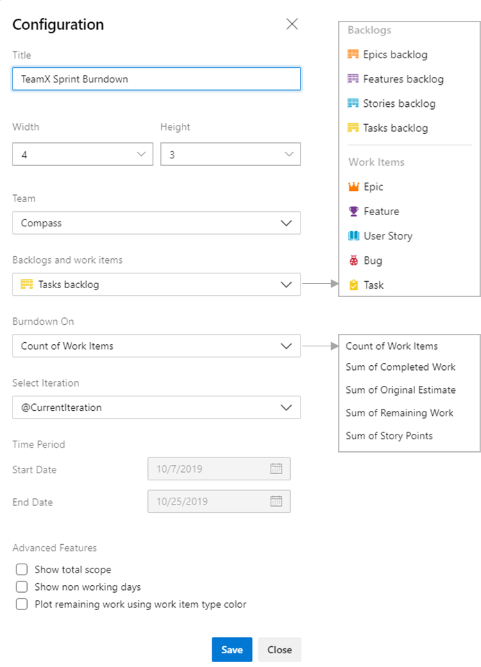
With Sprint 160, we are releasing a new Sprint Burndown widget that lets you choose how to burndown for a sprint.

You can burndown by Story Points, count of Tasks, or custom fields. You can create a burndown for Epics, Features, and Stories. In fact, you can burndown by summing any field or by counting any type of work item. The new widget displays average burndown, % complete, and scope increase. You can choose to burndown on a specific team, which lets you display sprint burndowns for multiple teams on the same dashboard. With all this great information to display, we let you resize it up to 10×10 on the dashboard

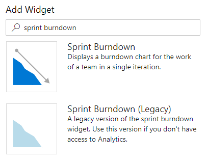
You’ll notice that we have two versions in the widget catalog.

The new version requires access to Analytics. Since some customers restrict “View Analytics” permissions, we kept the legacy version as a backup option for them.
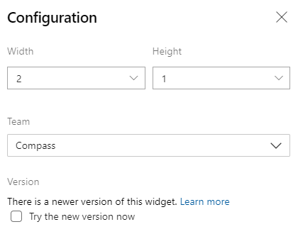
To try the new version, you can add it from the widget catalog. Or, you can edit the configuration of an existing legacy Sprint Burndown widget and check the Try the new version now box.

For more information, check out our docs.
We know many of you have been asking for these features for a while. We are so happy to provide them. Enjoy!

Is the new sprint burndown available in Azure Devops ChartImages API? When I checked and tested the api, it still return the sprint burndown legacy.
Hi Cristopher - This is not available through Azure DevOps ChatImages API. This widget is powered by Azure DevOps Analytics. You can query the data that is used to render this chart using OData and then integrate it will BI tools like Power BI to create the visualization you want.
https://docs.microsoft.com/en-us/azure/devops/report/powerbi/odataquery-connect?view=azure-devops
Below is a sample to create sprint burn down report using Power BI.
https://docs.microsoft.com/en-us/azure/devops/report/powerbi/sample-boards-sprintburndown?view=azure-devops&tabs=powerbi
Regards,
Pradeep
Hi!
This is an interesting feature that my company wish to try out.
Any information about when this will be released for Azure Devops Server?
Regards,
Tejas.
It will be available in the next major release of Azure DevOps Server (2020)
On the new sprint widget, I cannot get the chart to scale correctly. You have a max value of 30 on your example, but my top scale is around 250. (when have only 50 story points in sprint)?
Determined the scale (y axis) is incorrect because it is using the “capacity” value – an hours metric. We still estimate hours on tasks, but are using story points for the parent. We do not measure story point capacity for each individual. Trying to transition away from hours, but not there yet.
Hey Timothy,
I want to make sure I understand your comments. You are correct, the y-axis is based on whatever you selected for “Burndown On”. If you “Burndown On Remaining Work”, then the scale should adjust appropriately. Do you still have issues or unanswered questions?
Hi Gregg, there is a bug in the y-axis. I have selected Burndown On “Sum of Story points”.
But the y-axis shows the hours capacity for the team.
No matter which selection i make in the Burndown On combobox, the y-axis never changes.
This way the chart becomes pretty unusable as it looks like this:
https://imgur.com/a/aWkduVx
In this case our team capacity is 496 hours.
While we have added a total of 28.5 story points to the sprint.
Hi @Saurabh Jain,
Thanks for the reply.
1. I don’t see a way to disable that. When i open the configuration for the widget, there is no way for me to do that. Am i missing that?
This is an option i don’t prefer. We like to use Story points for our workitems, and hours for our actual availability.
Hi Mark,
This is happening as we are showing different units(hours and story points) on the same y axis (this is by design to keep graph simple).
To make graph usable you can try following things:
1. If we disable/unselect the green legend the y axis on graph will change appropriately.
2. Teams can Configure Story points and capacity to use same unit either hours or points.
Please let us know if you need any help.
Mark, we are investigating what the problem might be. We will loop back when we know more.