Back in June of this year, we rolled out the first iteration of our new navigation model for Azure DevOps. We’ve spent the summer improving that experience based on the feedback many of you have provided. Thank you! Our next step is to move from the new model being a preview, to becoming the navigation for the product.
In this post, I’ll walk through some of the key feedback we’ve addressed and lay out the schedule you can expect going forward.
What’s changed?
First, we’ve done a lot of polishing to address many of the bugs reported in the new model. I won’t go through them all, but here’s a list of some of the highlights:
- Performance fixes
- Improved scrolling behaviors
- Elimination of left navigation “jumpiness”
- Improved filtering and styling
- My Work panel updates to include work items, pull requests, and favorites
- Improved navigation across hubs in Azure Boards
One of the most prominent pieces of feedback received was that navigation between the hubs in Azure Boards was more difficult given the removal of the global team context. We agree, and so we’ve made some specific changes to ensure the use of these hubs is more natural.
During a session, any navigation between Boards, Backlogs, and Sprints will now bypass the directory page and take you directly to the corresponding artifact for the same team. This should make switching between these artifacts much easier.
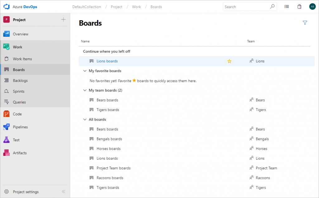
Additionally, all directory pages have been changed to be a single page (rather than a page with two pivots) organized with the following sections.
- Continue where you left off. This new section provides you a quick link directly to the last (Board | Backlog | Sprint) you were on.
- Favorites. All your favorited (Boards | Backlogs | Sprints) across all teams.
- My. All of the (Boards | Backlogs | Sprints) for teams you belong to.
- All. A full list of all (Boards | Backlogs | Sprints).
Below is a picture of an updated directory page.

In this example, you can see that I’m a member of two teams (Bears and Tigers) and that I was last viewing the boards for the Lions team.
Dashboards will also use this same directory page model starting in mid-October. So, if you’re reading this before then, you’ll continue to see the existing behavior.
Roll out schedule
Below is the schedule we’re following to roll out these changes.
- In mid-October, we’ll turn on the new navigation for all organizations and users. Our deployment starts on October 15th, so expect your organization to get the update in the weeks that follow.
- Up until January 16th, 2019 we will allow organizations and users to opt-out of the new navigation. On January 16th we will remove the opt-out and have the new model be the only navigation option. During this final opt-out period, we’ll continue to address feedback.
Additionally, the new navigation model will be the only option that ships in the next version of Azure DevOps Server (previously known as TFS). The first release candidate of that version is slated for later this calendar year.
Turning the new navigation On/Off
If you’d like to continue using the old navigation for now, follow the instructions below.
- From any Azure DevOps project, click your profile picture in the top right of the page.
- Select Preview features.
- Toggle the New Navigation feature to On/Off.
- Please leave us a comment so we know how to continue improving the experience.
Feel free to share your comments and feedback here. We’re committed to continually improving our navigation model to ensure it is efficient, understandable, and easy to use.
Thanks,
Aaron Bjork

0 comments