When we designed the user experience of Austin, we spent quite some time thinking about the different page views and layouts, and how to transition between them. We wanted to create an immersive experience where the user can manipulate and navigate Austin’s pages in an intuitive way; pages zoom in and out in 3D with pinch gestures, and the camera glides over the pages and even tilts a little bit when a finger is dragged on the screen. This makes the pages simply appear to “float” in 3D space and move around and re-arrange themselves as needed. To add some visual eye-candy, I spent some time having the pages cast shadows. This subtle addition makes the scene visually much richer and way more interesting.
I didn’t really have a lot of experience in graphics programming, so this was somewhat of a challenge for me. I spent some time looking into very well-known algorithms, such as shadow mapping and volume shadows. I prototyped a version using shadow maps but couldn’t quite make it look the way I wanted. In the end, I figured that I could probably fake most of it since I have the advantage that the geometry that would cast shadows in my scene is incredibly simple (just a flat, square piece of paper!), so I ended up with the technique I describe here. I am sure there’re much better ways to do this, but I am very happy with the way the result looks. Speed was also a goal of mine as my initial implementations were quite a drag on my frame rates, but this implementation turned out to be very fast.
The source code for Austin, including the bits specific to shadow rendering described here, can be downloaded here.
So how does it work?
The fact that our pages always lie flat over the XY plane is a key point to solving this problem. This means we know the shadow that’s going to be cast on that plane is always also a rectangle. There’s one small exception to this which is when we curl a page as the user drags a finger across to pass to the next page, and in that case we just render a thinner, yet still rectangular, shadow depending on how curled the page is. It’s not a perfect projection of the deformed page but it’s good enough to do the trick.
With this in mind, we can draw a shadow by rendering a simple quad that’s in the same position as the page but moved backwards in the Z axis so it sits flat on the XY plane, and scaled and offset a bit as well to “fake” the projection of the shadow volume cast on the XY plane. This quad is rendered in a darker color than the color of the background, which is always a solid color.
Drawing a solid quad would create a very “hard” shadow, so we want to soften it a bit. To do that we apply a Gaussian blur filter, which is implemented as a pixel shader on the GPU. This is a very well documented filter and there are plenty of articles online on how to do it. To see what the effect looks like, check out Gaussian blur effect on MSDN for an example.
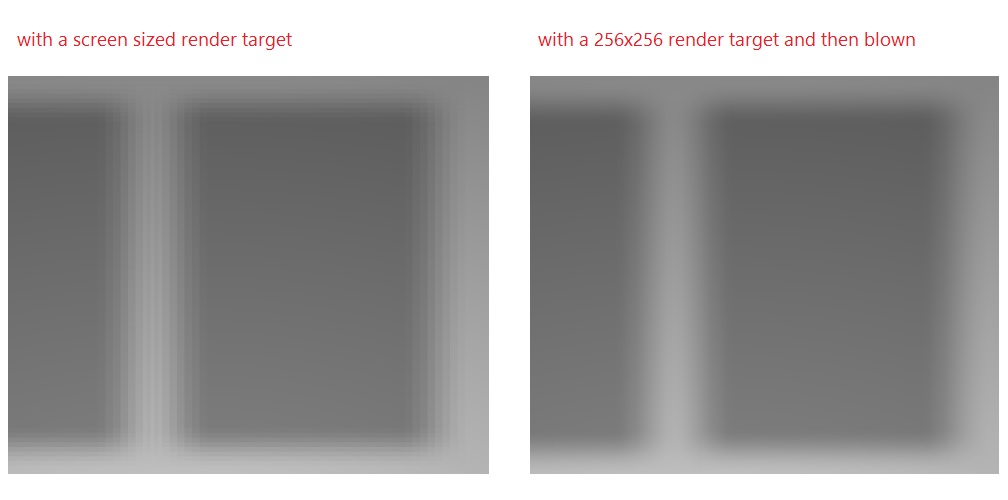
The second thing we do that helps blur and soften the shadows is rendering this scene to a much smaller rendering target than screen, in our case to a 256×256 texture. Then when we copy the final texture to the back buffer, we blow it up to the screen dimensions, and this operation softens the shadows further due to the filtering applied to the texture to go from 256 pixels to the actual resolution. And as a bonus side effect, the 256×256 texture is much smaller and much faster to render to.
Finally, to add a bit more depth, we do one last post-processing effect and do a “radial darkening” such that the picture gets darker the further you go from the center of the background.
You can get the code for all of this in the Austin project, look at notebook::renderFrame for the main chunk of code performing the different steps, and in the quad_pixel_shader_*.hlsl files for the pixel shaders for the different effects. page::renderShadow contains the code that shows how the shadow node is scaled and translated to create the fake projection.
In pictures
An image is worth a thousand words, so let’s see how all this looks in the app.
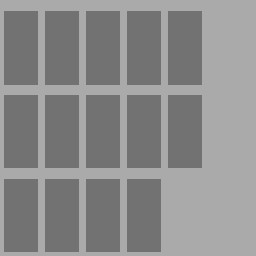
First, this is how the darker quads look like rendered on the flat background, on the 256×256 texture:
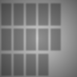
This is how it looks with the Gaussian blur applied:
And then, with the radial darken filter:
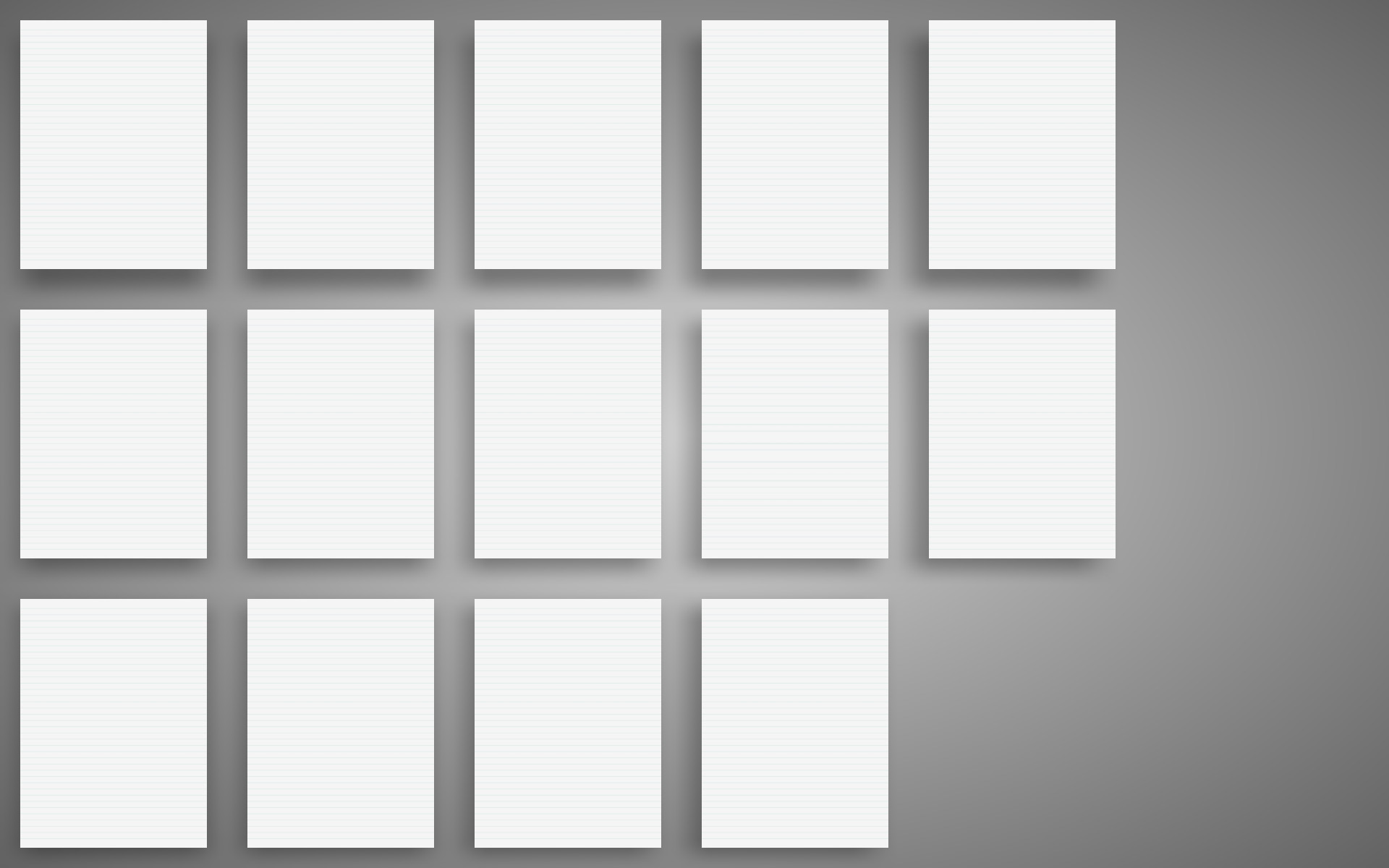
Finally, that’s blown up to the screen size and then the paper pages rendered on top of it:
This next picture show how the same scene looks like without the shadows and just the flat background, and what a difference it all makes:
The following picture shows the difference between rendering directly to a render target the size of the screen and to a smaller (256×256) render target that then gets enlarged to the size of the screen:
In the end, this technique ended up looking very good and more importantly, giving me the performance I wanted. I had a great time doing this bit of work and I hope these ideas can help someone else trying to solve the same problem.
Can’t get enough? Check out Cascaded Shadow Maps and Common Techniques to Improve Shadow Depth Maps for more details on achieving high-performance 3D shadows.



0 comments