
Cascadia Code is finally here! You can install it directly from the GitHub repository’s releases page or automatically receive it in the next update of Windows Terminal.
Wait, what’s Cascadia Code?
Cascadia Code was announced this past May at Microsoft’s Build event. It is the latest monospaced font shipped from Microsoft and provides a fresh experience for command line experiences and code editors. Cascadia Code was developed hand-in-hand with the new Windows Terminal application. This font is most recommended to be used with terminal applications and text editors such as Visual Studio and Visual Studio Code.
Programming Ligatures
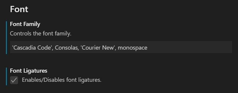
Cascadia Code supports programming ligatures! Programming ligatures are most useful when writing code, as they create new glyphs by combining characters. This helps make code more readable and user-friendly for some people.

👉 Note: If you are using Visual Studio Code, you will have to enable font ligatures in your settings in order to see them.
Did we mention it’s open source?
Yes, you heard right! Cascadia Code is licensed under the SIL Open Font license on GitHub, so feel free to contribute as you wish!
👉 Note: There is currently no proper testing framework built into the repository, so all pull requests will have to be manually tested and validated. This will slow down pull request approvals, so please bear with us. 😊
Why is it named Cascadia Code?
The name Cascadia Code originated from the Windows Terminal project. Before it was released, the codename for Windows Terminal was Cascadia. In fact, some of the source files within the Terminal still use this name! As an homage to the Terminal, we liked the idea of naming the font after its codename.
We added Code to the end of the font name to help indicate that this font was intended for programming. Specifically, it helps identify that it includes programming ligatures.
To ensure Cascadia Code was the right choice for the font name, we held a poll on Twitter along with other names we were considering. We were very grateful for everyone’s participation and were so excited Cascadia Code came out as the winner. 😊

Who Designed Cascadia Code?
A huge thank you goes out to Aaron Bell, the designer of Cascadia Code. We were fortunate enough to work with him over the past year and he has done some truly great work. Aaron Bell is a font designer with his own company, Saja Typeworks, and has worked with Microsoft for many years. He was the designer of Selawik back in 2015! You can follow him on Twitter at @aaronbell and he will also be active in our GitHub repository. We plan to continue working with him to help improve Cascadia Code and make it a great font for everyone!
What’s Next for Cascadia Code?
As of today, Cascadia Code version 1909.16 is available publicly on GitHub. It’ll be following the Windows versioning syntax as the font receives updates with new and refined glyphs.
Stay Connected
For any updates coming to Cascadia Code, feel free to keep an eye on the repo or follow Kayla (@cinnamon_msft) and Rich (@richturn_ms) on Twitter. We are so excited to be releasing our font into the wild and we can’t wait for you to use it!

23 comments