Xamarin.Forms 3.2.0 continues the theme of previous releases to give you big wins by making little things much easier to do. The entire version 3 series has been about reducing the friction of doing such things as positioning the Android tabs to the bottom, controlling spellcheck and capitalization and prediction on text controls. There are even trivial improvements to setting ImeOptions, coloring various elements of switches and bars, and so many more.
Released to NuGet today, Xamarin.Forms 3.2.0 kicks off another round with the highly requested TitleView. This allows you to put any content you wish into the NavigationBar’s title space. Let’s take a look at that new capability and several other enhancements that you’ll want to start using immediately. Much of this work is the result of close collaboration with you, the awesome Xamarin.Forms community!
Release Highlights
Customize the TitleView
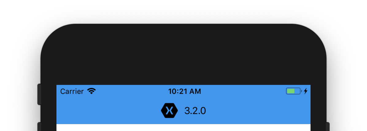
Often, you may have asked something like, “How do I add my logo to the top bar?” or “How do I insert multiple lines of text into a title?”. Up till now, the answer has been “with a custom renderer”. That’s one of the beautiful things about Xamarin.Forms: you can always extend the controls on any of the platforms. Now the answer is even more simple in 3.2.0. Using TitleView you don’t have to dive into your native projects at all.

TitleView is part of the NavigationPage, which displays the title of the ContentPage it manages. From your ContentPage you’ll access this and place whatever content you wish within a view:
<ContentPage>
    <NavigationPage.TitleView>
        <StackLayout Orientation="Horizontal" VerticalOptions="Center" Spacing="10">
            <Image Source="iconXamagon.png">
                <Image.GestureRecognizers>
                    <Image.TapGestureRecognizer
                        Tapped="HandleTapped" />
                </Image.GestureRecognizers>
            </Image>
            <Label Text="3.2.0" FontSize="16" TextColor="Black" VerticalTextAlignment="Center" />
        </StackLayout>
    </NavigationPage.TitleView>
    ...
</ContentPage>
Some specific things to note:
- You can place interactive content to handle gestures.
- Content will only acquire the space necessary to display itself and will not take over the entire bar.
- The height of the bar will clip taller content. On Android you may use a platform specific to adjust the height, however iOS does not allow this.
- Navigation elements such as ToolBarItems may conflict with the TitleView content or adjust the positioning to avoid collision.
Span Gestures

Reducing the number of labels used in your application by using formatted text is a great way to improve the performance of your UI. Now you can make use of gestures to make bits of text interactive within the larger text block. This is perfect for phone numbers, web addresses, mapped locations, and any number of other things you can imagine.
<Label>
    <Label.FormattedText>
        <FormattedString>
            <Span Text="Sometimes you want a span to be tappable, like a phone number or URL: " />
            <Span Text="{Binding Url, Mode=OneWay}" TextColor="Blue">
                <Span.GestureRecognizers>
                        <TapGestureRecognizer
                            Command="{Binding TapCommand, Mode=OneWay}"
                            CommandParameter="https://www.xamarin.com"/>
                </Span.GestureRecognizers>
            </Span>
            <Span Text=". Tap it to launch a browser."/>
        </FormattedString>
    </Label.FormattedText>
</Label>
You may use commands with or without parameters, or just the tapped event. Combined with the bindings work introduced in 3.1.0, spans have become very useful. So easy!
Button Padding
To get your buttons looking just right, all you need is the ability to tweak the padding around the text. This is now as simple as setting the new Padding property on Button.
<Button Text="Pad Me"
    FlexLayout.AlignSelf="Center"
    Padding="60,40"
    BackgroundColor="Black"
    TextColor="White"/>
Editor Placeholder Color
The designer you work with has handed you a beautiful, functional design with great colors. It is now up to you to make it happen. Then you notice the text fields don’t use the standard grey placeholder color – No!
Not to worry, you can now easily set the color with the addition of the PlaceholderColor property. No sweat.
<Editor Placeholder="Leave your comments here"
        PlaceholderColor="Purple" />
These really are the little things that make a big difference!
New OnPlatform/OnIdiom XAML Extension
Xamarin.Forms uses these convenient methods to customize your UI and app behavior for the different platforms and devices you target. Typically in XAML this looks like:
<Button Text="Extensions" BackgroundColor="Black" TextColor="White">
    <Button.HeightRequest>
         <OnPlatform x:TypeArguments="x:Double" Default="40">
            <On Platform="iOS" Value="60"/>
            <On Platform="Android" Value="80"/>
        </OnPlatform>
    </Button.HeightRequest>
</Button>
That can be a bit much to type, over and over again. With this new extension, the same code can become:
<Button Text="Extensions" BackgroundColor="Black" TextColor="White"
        HeightRequest="{OnPlatform iOS=60, Android=80, Default=40}"/>
Both variations work, so it’s up to you. This syntax also supports type converters and arguments.
Get Started Today!
This is the tip of the iceberg for all the great improvements in 3.2.0. Be sure to look into the new SwipeGesture, additional CSS properties, binding updates, and all the great bug fixes. Check the full release notes for the details, and definitely explore the documentation.
The update is now available on NuGet and via your Visual Studio package manager.
NuGet: https://www.nuget.org/packages/Xamarin.Forms/ The Little Things Playground Sample: https://github.com/davidortinau/TheLittleThingsPlayground
Find an issue?
Please report it to use on GitHub: https://github.com/xamarin//issues/new
To see what we are working on now, explore our sprint project boards on GitHub.
For what comes next, visit the Xamarin.Forms Feature Roadmap
