
Xamarin.Forms makes setting Tabs Icons super easy! All there is to do is set the Icon property to the path of an image and you are done.
<Tab Title="Browse" Icon="tab_feed.png">
Tabs and Fonts
Better still, you can use FontImageSource to have scalable vector graphics used for your icons. As well as avoid all that hassle with resolution dependent images.
A great source of fonts that can be used for icons can be found at FontAwesome or GlyphSearch.
Once you’ve downloaded you chosen .tff file to use the custom font you will need to embed a copy as local resource/asset in the native projects to make them accessible from the Xamarin.Forms shared code.
iOS and Android have different ways of reference embedded resources. In order to abstract out these differences and access the font resources consistently from XAML, we use the magic of OnPlatform in the Applications resource dictionary as shown below.
<Application.Resources>
   <ResourceDictionary>
       <OnPlatform x:TypeArguments="x:String" x:Key="FontAwesomeSolid">
           <On Platform="iOS" Value="FontAwesome5Free-Solid"/>
           <On Platform="Android" Value="fa-solid-900.ttf#Solid"/>
       </OnPlatform>
       <OnPlatform x:TypeArguments="x:String" x:Key="FontAwesomeRegular">
           <On Platform="iOS" Value="FontAwesome5Free-Regular"/>
           <On Platform="Android" Value="fa-regular-400.ttf#Regular"/>
       </OnPlatform>
   </ResourceDictionary>
</Application.Resources>
Note, this process can be automated using a third–party tool such as MFractor.
- Check out this MFractor blog using custom fonts in Xamarin.Forms
Below is an example where a Font has been set as a StaticResource on the Tab Icon using FontImageSource.
<Tab Title="Browse">
<Tab.Icon>
<FontImageSource FontFamily="{StaticResource FontAwesomeRegular}" Glyph=""/>
</Tab.Icon>
</Tab>
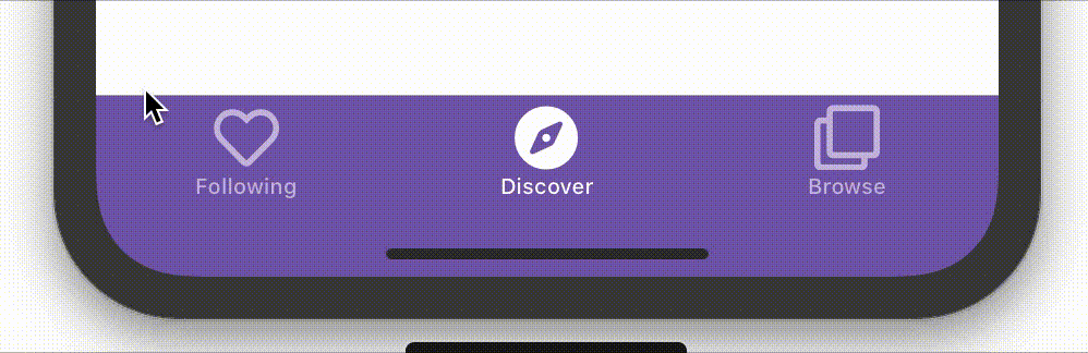
However, what if you want the ability to switch between icons based on the selected tab? One option is to write some logic in code which changes the icons on an event. With StyleTriggers this can be done entirely in XAML!
Triggers
Triggers allow you to set a property or group of properties based on the value of another property.
The simplest and most common form of trigger is the property trigger. It is supported by any Forms Element that has the Triggers element. As the name suggests, this holds a collection of Triggers that will be applied to the control.
Below, we have an example property trigger that changes the background of an Entry when it has focus:
<Entry Placeholder="Username">
    <Entry.Triggers>
        <Trigger TargetType="Entry" Property="IsFocused" Value="True">
            <Setter Property="BackgroundColor" Value="Yellow" />
        </Trigger>
    </Entry.Triggers>
</Entry>
Style Triggers
Some controls do not have a Triggers property and so, do not directly support triggers. All is not lost, however, as you can simply have a trigger within a style. Style triggers are a powerful way of dynamically changing the visual appearance of a control based on the value of a bindable property. They are very similar to property triggers but can be applied to any control that has a Style property, such as a Tab.
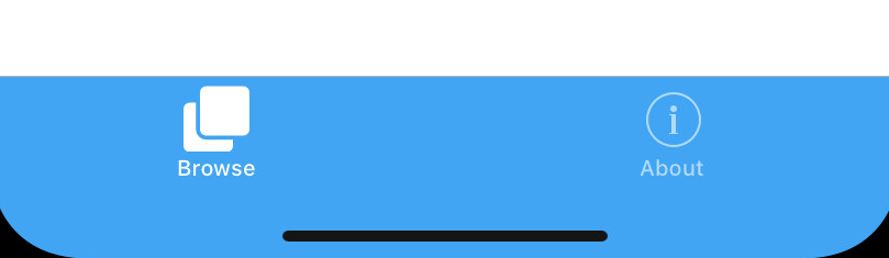
Below, we have an example where we can use the checked state of a Tab to determine which Glyph to use:
<Style TargetType="Tab" x:Key="BrowseTab">
<Style.Triggers>
<Trigger TargetType="Tab"
Property="IsChecked" Value="False">
<Setter Property="Icon" >
<Setter.Value>
<FontImageSource FontFamily="{StaticResource FontAwesomeRegular}" Glyph=""/>
</Setter.Value>
</Setter>
</Trigger>
<Trigger TargetType="Tab"
Property="IsChecked" Value="True">
<Setter Property="Icon" >
<Setter.Value>
<FontImageSource FontFamily="{StaticResource FontAwesomeSolid}" Glyph=""/>
</Setter.Value>
</Setter>
</Trigger>
</Style.Triggers>
</Style>
Learn More About Tabs and Triggers
Learn more about Tabs and Triggers and from our amazing documentation.
You can also check out the sample app on GitHub
For video walkthrough that demonstrates this technique in action, check out Live Stream: Zimmer EP02 – Building a mobile app with Ben Buttigieg
I tried to implement in Prism app but it’s not working.
Tried different Properties like IsEnabled, IsTabStop, IsVisible of ContentPage but couldn’t able to work.
Only with IsFocused, it set value only when value is “False”.
Here is Code
It is perfectly working on iOS but Android doesn’t give same result. I had to tap twice for selection Android. Also TabBarTitle color not working on Android.