Guest Post: Charlin Agramonte is a Microsoft MVP and co-founder of CrossGeeks. She writes Xamarin articles in her blog http://xamgirl.com/. Find her on twitter as @Chard003.
A few months ago we received a request from one of our customers which required us to develop and test an application on multiple device resolutions. While doing this we realized that we were doing something wrong in our development process.
Device Resolutions
When developing an application, what normally happens is that we receive a design which is specific to one resolution (if we have luck maybe one for tablet and another for phone). Then we try to adjust the design to make sure it looks good on all the platforms and device resolutions by doing some general validations such as making sure controls aren’t cut off, are reachable, visible, usable, etc.
But we realized that making it look good is not enough; it has to be adaptive. When I say adaptive, I don’t mean just making sure controls aren’t cut off, but that it ADAPTS EVERYTHING. It should look as if it was designed for that screen. For example, if we get a design for iPhone X with a specification that all the medium sized text should have a font size of 15 pixels, probably on small devices 15 px won’t look good.
Example:
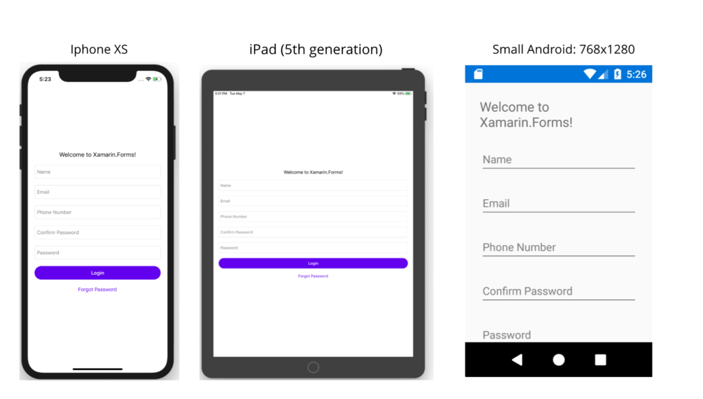
Let me show you how to handle this by using different styles per resolutions.
Let’s do it step by step
1. Create new resource files
First, create two new resource style files: one for small devices and another one to be the default which will handle the general phones/tablets resolutions.
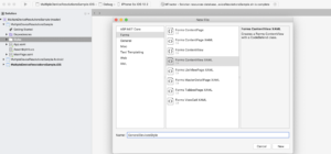
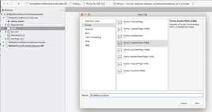
NOTE: We are using the content view vs template as a shortcut, so make sure to replace the ContentView type by a ResourceDictionary once files created.
<?xml version="1.0" encoding="UTF-8"?>
<ResourceDictionary xmlns="http://xamarin.com/schemas/2014/forms"
             xmlns:x="http://schemas.microsoft.com/winfx/2009/xaml"
             x:Class="MultipleDeviceResolutionsSample.GeneralDevicesStyle">

</ResourceDictionary>
In the code behind of our resource file, let’s add a singleton so that we can use our style anywhere.
namespace MultipleDeviceResolutionsSample
{
    public partial class GeneralDevicesStyle : ResourceDictionary
    {
        public static GeneralDevicesStyle SharedInstance { get; } = new GeneralDevicesStyle();
        public GeneralDevicesStyle()
        {
            InitializeComponent();
        }
    }
}
Make another file for “SmallDevicesStyle” and we’ll populate them with styles in a moment.
2. Create a method to detect the device size
To detect the device size use Xamarin Essentials which makes it really easy to get the metrics of a device with DeviceDisplay.MainDisplayInfo.
As a reference value will choose a small device resolution to compare (width=768 and height=1280), this value is based on this table: http://screensiz.es/ in which the iPhone 5 (the largest of the small devices) has a resolution of 640 x 1136 pixels which will fit into our small reference value as well as the smallest Android that on average has 768 x 1280 pixels.
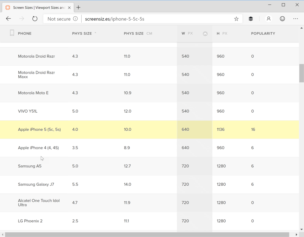
To validate this I tested in 15 different devices and wrote the following method to determine if the device is “small”.
const int smallWightResolution = 768;
const int smallHeightResolution = 1280;

public static bool IsASmallDevice()
{
            // Get Metrics
            var mainDisplayInfo = DeviceDisplay.MainDisplayInfo;

            // Width (in pixels)
            var width = mainDisplayInfo.Width;

            // Height (in pixels)
            var height = mainDisplayInfo.Height;
            return (width <= smallWightResolution && height <= smallHeightResolution);
}
3. Set the resource file based on device size
In the App.xaml set a name for your resource dictionary that you can merge with your resolution specific styles. In this case I use “dictionary”.
<?xml version="1.0" encoding="utf-8"?>
<Application xmlns="http://xamarin.com/schemas/2014/forms"
             xmlns:x="http://schemas.microsoft.com/winfx/2009/xaml"
             x:Class="MultipleDeviceResolutionsSample.App">
    <Application.Resources>
        <ResourceDictionary x:Name="dictionary">
            <Color x:Key="Primary">#6200EE</Color>
            <Color x:Key="Secondary">#3700B3</Color>
            <Color x:Key="Accent">#03DAC6</Color>
            <Color x:Key="Light">White</Color>
        </ResourceDictionary>
     </Application.Resources>
</Application>
Now back in the App.xaml.cs you can set the appropriate resource file to match the device size.
using Xamarin.Essentials;
using Xamarin.Forms;

namespace MultipleDeviceResolutionsSample
{
    public partial class App : Application
    {
        const int smallWightResolution = 768;
        const int smallHeightResolution = 1280;

        public App()
        {
            InitializeComponent();
            LoadStyles();

            MainPage = new MainPage();
        }

        void LoadStyles()
        {
            if (IsASmallDevice())
            {
                dictionary.MergedDictionaries.Add(SmallDevicesStyle.SharedInstance);
            }
            else
            {
                dictionary.MergedDictionaries.Add(GeneralDevicesStyle.SharedInstance);
            }
        }

        public static bool IsASmallDevice()
        {
            // Get Metrics
            var mainDisplayInfo = DeviceDisplay.MainDisplayInfo;

            // Width (in pixels)
            var width = mainDisplayInfo.Width;

            // Height (in pixels)
            var height = mainDisplayInfo.Height;
            return (width <= smallWightResolution && height <= smallHeightResolution);
        }
    }
}
4. Add styles to each resource file
In Xamarin.Forms we have the properties Tablet and Phone, and we are going to use them in the styles file to set the proper values depending on if it’s tablet or phone device.
GeneralDevicesStyle
<?xml version="1.0" encoding="UTF-8"?>
<ResourceDictionary xmlns="http://xamarin.com/schemas/2014/forms"
             xmlns:x="http://schemas.microsoft.com/winfx/2009/xaml"
             x:Class="MultipleDeviceResolutionsSample.GeneralDevicesStyle">

        <OnIdiom  x:TypeArguments="x:Double" Tablet="30" Phone="20" x:Key="PageSpacing" />
        <OnIdiom  x:TypeArguments="Thickness" Tablet="30" Phone="20" x:Key="PagePadding" />

         <Style TargetType="Button" x:Key="MainButtonStyle">
             <Setter Property="HeightRequest">
                <Setter.Value>
                  <OnIdiom x:TypeArguments="x:Double" Phone="40" Tablet="60"/>
                </Setter.Value>
             </Setter>
             <Setter Property="FontSize">
                <Setter.Value>
                  <OnIdiom x:TypeArguments="x:Double" Phone="15" Tablet="24"/>
                </Setter.Value>
             </Setter>
           <Setter Property="CornerRadius" Value="20" />
           <Setter Property="FontAttributes" Value="Bold" />
           <Setter Property="HorizontalOptions" Value="FillAndExpand" />
           <Setter Property="TextColor" Value="White" />
           <Setter Property="BackgroundColor" Value="{StaticResource Primary}" />
      </Style>

     <Style TargetType="Entry" x:Key="MainEntryStyle">
            <Setter Property="HeightRequest">
                <Setter.Value>
                  <OnIdiom x:TypeArguments="x:Double" Phone="40" Tablet="60"/>
                </Setter.Value>
             </Setter>
             <Setter Property="FontSize">
                <Setter.Value>
                  <OnIdiom x:TypeArguments="x:Double" Phone="15" Tablet="24"/>
                </Setter.Value>
             </Setter>
           <Setter Property="HorizontalOptions" Value="FillAndExpand" />
           <Setter Property="TextColor" Value="{StaticResource Primary}"/>
           <Setter Property="PlaceholderColor" Value="Gray" />
      </Style>

    <Style TargetType="Label" x:Key="MainTitleStyle">
             <Setter Property="FontSize">
                <Setter.Value>
                  <OnIdiom x:TypeArguments="x:Double" Phone="18" Tablet="24"/>
                </Setter.Value>
             </Setter>
           <Setter Property="HorizontalOptions" Value="CenterAndExpand" />
      </Style>

    <Style TargetType="Label" x:Key="NormalTitleStyle">
             <Setter Property="FontSize">
                <Setter.Value>
                  <OnIdiom x:TypeArguments="x:Double" Phone="15" Tablet="19"/>
                </Setter.Value>
             </Setter>
           <Setter Property="HorizontalOptions" Value="CenterAndExpand" />
      </Style>

</ResourceDictionary>
SmallDevicesStyle
<?xml version="1.0" encoding="UTF-8"?>
<ResourceDictionary xmlns="http://xamarin.com/schemas/2014/forms"
             xmlns:x="http://schemas.microsoft.com/winfx/2009/xaml"
             x:Class="MultipleDeviceResolutionsSample.SmallDevicesStyle">

    <OnPlatform  x:TypeArguments="x:Double" iOS="10" Android="10" x:Key="PageSpacing" />
    <OnPlatform  x:TypeArguments="Thickness" iOS="10" Android="10" x:Key="PagePadding" />

    <Style TargetType="Button" x:Key="MainButtonStyle">
           <Setter Property="HeightRequest" Value="35"/>
           <Setter Property="FontSize" Value="13"/>
           <Setter Property="CornerRadius" Value="15" />
           <Setter Property="FontAttributes" Value="Bold" />
           <Setter Property="HorizontalOptions" Value="FillAndExpand" />
           <Setter Property="TextColor" Value="White" />
           <Setter Property="BackgroundColor" Value="{StaticResource Primary}" />
    </Style>

     <Style TargetType="Entry" x:Key="MainEntryStyle">
           <Setter Property="HeightRequest" Value="35"/>
           <Setter Property="FontSize" Value="13"/>
           <Setter Property="HorizontalOptions" Value="FillAndExpand" />
           <Setter Property="TextColor" Value="{StaticResource Primary}"/>
           <Setter Property="PlaceholderColor" Value="Gray" />
      </Style>

     <Style TargetType="Label" x:Key="MainTitleStyle">
           <Setter Property="FontSize" Value="17"/>
           <Setter Property="HorizontalOptions" Value="CenterAndExpand" />
      </Style>

    <Style TargetType="Label" x:Key="NormalTitleStyle">
           <Setter Property="FontSize" Value="13"/>
           <Setter Property="HorizontalOptions" Value="CenterAndExpand" />
      </Style>

</ResourceDictionary>
5. Apply the styles to your XAML
<?xml version="1.0" encoding="utf-8"?>
<ContentPage xmlns="http://xamarin.com/schemas/2014/forms"
             xmlns:x="http://schemas.microsoft.com/winfx/2009/xaml"
             x:Class="MultipleDeviceResolutionsSample.MainPage">
   <ScrollView>
    <StackLayout Padding="{StaticResource PagePadding}"
                 VerticalOptions="CenterAndExpand"
                 Spacing="{StaticResource PageSpacing}">

         <Label Text="Welcome to Xamarin.Forms!"
                Style="{StaticResource MainTitleStyle}"/>

        <Entry Placeholder="Name"
               Style="{StaticResource MainEntryStyle}"/>

        <Entry Placeholder="Email"
               Style="{StaticResource MainEntryStyle}"/>

        <Entry Placeholder="Phone Number"
               Style="{StaticResource MainEntryStyle}"/>

         <Entry Placeholder="Confirm Password"
                 IsPassword="true"
                 Style="{StaticResource MainEntryStyle}"/>

        <Entry Placeholder="Password"
               IsPassword="true"
               Style="{StaticResource MainEntryStyle}"/>

        <Button Text="Login"
                 Style="{StaticResource MainButtonStyle}"/>

        <Label Text="Forgot Password"
               Style="{StaticResource NormalTitleStyle}"
               TextColor="{StaticResource Primary}" />
    </StackLayout>
  </ScrollView>
</ContentPage>
The Result
Now we have styles that better fit the resolution of the devices we are targeting.
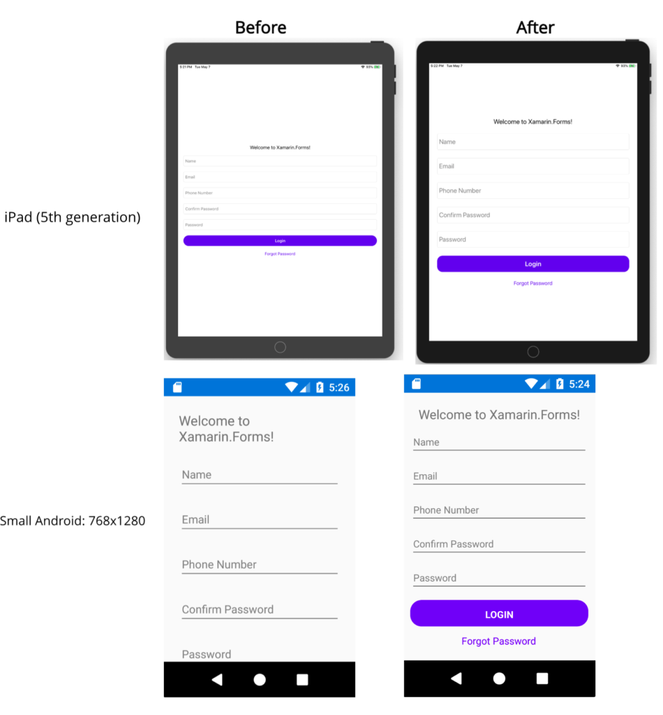
Some extra tips
Having multiple styles is important to make sure our pages support these different resolutions but there’s much more you can do. Here a list of some extra tips:
- Make sure to use adaptive layouts such as: Grids, FlexLayouts, AbsoluteLayouts are probably the best options.
- If you are using Grids, try to use the property “Auto” instead of specifying a hard-coded sizes.
- Make sure to add a ScrollView even if it does not looks necessary, there are some devices that can be pretty pretty small, so make sure to add a ScrollView if not there might controls that are unreachable when used in small devices.
- Try to use the LayoutOption “FillAndExpand” when possible, to make sure that the content gets expanded.
Check the full source code here.
Happy coding!

Hello. Great article.
It might be worth expanding your IsASmallDevice() method to also consider density. This is specifically important on some Android tablets, (don't know about iOS) because the user can modify the display Zoom settings, which changes the density and reduces the effective device resolution i.e. the dp values will change. Does not seem to be as big of a problem on Android phones.
For example, on an Android device with a resolution of 1280x800 and a density of 1.33 you will only have an effective resolution of about 960x600 (dp) to work with. This has caused me some...
@Charlin Font size causing issue in iPad Slide over. System detecting the app is in Tablet. But running in 25% of the screen width of the tablet causing issue fonts looking bigger in slide over screen
Hi @charlinagramonteI appear to be running into a couple of problems with the latest version of Xamarin forms.Firstly, the resource directory is null when the method runs - even when the LoadStyles is afer the InitializeComponent
InitializeComponent();LoadStyles();
So i had to add dictionary = new ResourceDictionary();Also, when I do merge the directories they are not present in "Application.Current.Resources.mergeddirectories" and so I get Key cannot be found errors.In the end i changed the code to merge the directories directly into "Application.Current.Resources" however now I can only access the styles usign "DynamicResources" and not "StaticResources".Any help would be amazing.Regards
Bravo…
HiThis is a fantastic article.Something I have been looking for as a guideline for some time .I find all your articles very good and "real world".
I have been building apps for a year using xamarin forms and I find difficult to find articles that describe how to tackle layout in multiple devices.
How do you make your form to move up and resize when the keyboard shows?
I have found that
None of the keyboard plugin currently work.(work on 1 or 2 devices)Controls get overlapped.
Android:(does not work on all devices)xmlns:android="clr-namespace:Xamarin.Forms.PlatformConfiguration.AndroidSpecific;assembly=Xamarin.Forms.Core"android:Application.WindowSoftInputModeAdjust="Resize"iOS I used/tried few renderers to handle overlapping/resizing controls...
Hi,
Some months ago I wrote an article about it:
https://xamgirl.com/adjusting-elements-when-keyboard-shows-in-xamarin-forms/
Anything let me know,
Charlin A.
Awesome topic! Thank.
Could you please help me update your topic “Select multi picture from Gallery”.
Thank you!
Hi, please check this blog post updated
http://www.xamboy.com/2019/03/12/select-multiple-images-and-videos-in-xamarin-forms/
Anything let me know,
Charlin A.