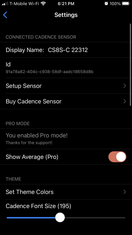
Every app has a settings screen, you know that screen that has all those small preferences, app version information, and open-source licenses. I never really spent too much time thinking about my setting screen of my apps. My goal was to always to put something together as fast as possible and not really think about design. So, when I put out my first version of My Cadence for iOS & Android my settings screen used the built in Xamarin.Forms TableView and looked a bit like this:

It gets the job done by displaying a lot of great information and the code could not be easier:
<TableView HasUnevenRows="True" Intent="Settings">
        <TableRoot>
            <TableSection Title="Connected Cadence Sensor">
                <EntryCell x:Name="EntryName" Label="Display Name:" />
                <TextCell
                    x:Name="CellId"
                    Text="Id"
                    TextColor="{AppThemeBinding Dark={StaticResource WindowForegroundColorDark},
                                                Light=Black}" />
                <TextCell
                    x:Name="SetupSensor"
                    StyleId="disclosure"
                    Tapped="SetupSensor_Tapped"
                    Text="Setup Sensor"
                    TextColor="{AppThemeBinding Dark={StaticResource WindowForegroundColorDark},
                                                Light=Black}" />
                <TextCell
                    x:Name="BuyCadence"
                    StyleId="disclosure"
                    Tapped="BuyCadence_Tapped"
                    Text="Buy Cadence Sensor"
                    TextColor="{AppThemeBinding Dark={StaticResource WindowForegroundColorDark},
                                                Light=Black}" />
            </TableSection>
  </TableRoot>
</TableView>
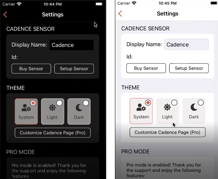
I was happy that I could use the TableView to be super productive and push the app out, but after a few weeks after release I decided it was time for a change. I wanted to make a uniform great looking settings screen across iOS & Android that had a nice Card look and feel to it. I also wanted it to be completely themeable for light and dark theme. After just 2 hours of re-writing the settings screen here is what I produced:

This new settings screen uses all built in controls in Xamarin.Forms including the Frame, RadioButton, and normal layouts. Here is a snippet of the first section of the settings screen:
<ScrollView>
    <Grid Padding="12" ColumnDefinitions="{OnIdiom Phone='Auto,*,Auto', Default='.05*,.9*,.05*'}">
        <StackLayout Grid.Column="1">
            <Label Style="{DynamicResource BLabelMedium}" Text="CADENCE SENSOR" />
            <Frame Style="{DynamicResource BCard}">
                <Grid
                    ColumnDefinitions="*,*"
                    ColumnSpacing="10"
                    RowDefinitions="Auto,Auto,Auto"
                    RowSpacing="10">
                    <StackLayout Grid.ColumnSpan="2" Orientation="Horizontal">
                        <Label Style="{DynamicResource BLabelSmall}" Text="Display Name:" VerticalOptions="Center" />
                        <Entry
                            x:Name="EntryDisplayName"
                            BackgroundColor="{AppThemeBinding Dark={StaticResource WindowBackgroundColorDark},
                                                              Light={StaticResource WindowBackgroundColor}}"
                            HorizontalOptions="FillAndExpand"
                            Style="{DynamicResource BEntry}"
                            TextColor="{AppThemeBinding Dark=White,
                                                        Light=Black}" />
                    </StackLayout>
                    <StackLayout Grid.Row="1" Grid.ColumnSpan="2" Orientation="Horizontal">
                        <Label Style="{DynamicResource BLabelSmall}" Text="Id:" VerticalOptions="Center" />
                        <Label
                            x:Name="LabelId"
                            Style="{DynamicResource BLabelMicro}"
                            Text=""
                            VerticalOptions="Center" />
                    </StackLayout>
                    <Button
                        Grid.Row="2"
                        Command="{Binding BuySensorCommand}"
                        HorizontalOptions="FillAndExpand"
                        Style="{DynamicResource BButton}"
                        Text="Buy Sensor" />
                    <Button
                        Grid.Row="2"
                        Grid.Column="1"
                        Command="{Binding SetupSensorCommand}"
                        HorizontalOptions="FillAndExpand"
                        Style="{DynamicResource BButton}"
                        Text="Setup Sensor" />
                </Grid>
            </Frame>
            <Label Margin="0,12,0,0" Style="{DynamicResource BLabelMedium}" Text="THEME" />
          <!--More Frames-->
        </StackLayout>
    </Grid>
</ScrollView>
As you can see here the UI is simplistic in construction but looks very lovely when displayed to users. I leverage a lot of new features of Xamarin.Forms including the RadioButton with control templates, and the new AppThemeBinding to react to light and dark mode changes.
I also use a a few styles to theme my controls such as my Card:
<Style x:Key="BCard" TargetType="Frame">
    <Setter Property="BackgroundColor" Value="{AppThemeBinding Dark={StaticResource SystemGray6Dark}, Light=White}"/>
    <Setter Property="Padding" Value="16"/>
    <Setter Property="CornerRadius" Value="8"/>
    <Setter Property="HasShadow" Value="{OnPlatform iOS=false, Android=true}"/>
</Style>
With just a little work and a little styling of the built-in controls here is what I ended up with:
Wrap-up
I hope that you found a bit of inspiration in this blog post to make your settings screen look fantastic!

Great work and excellent idea!
Unfortunately, this code doesn’t work for me…
I don’t know how you do it? This is about the 3rd time you have released a great article going over JUST the thing I was looking to do myself! Great minds and all… https://www.twitter.com/georgeleithead
Using your article as inspiration, I have replaced the (poorly working with a new card look to match the rest of my app. Thanks https://github.com/GeorgeLeithead/LiLo.Lite