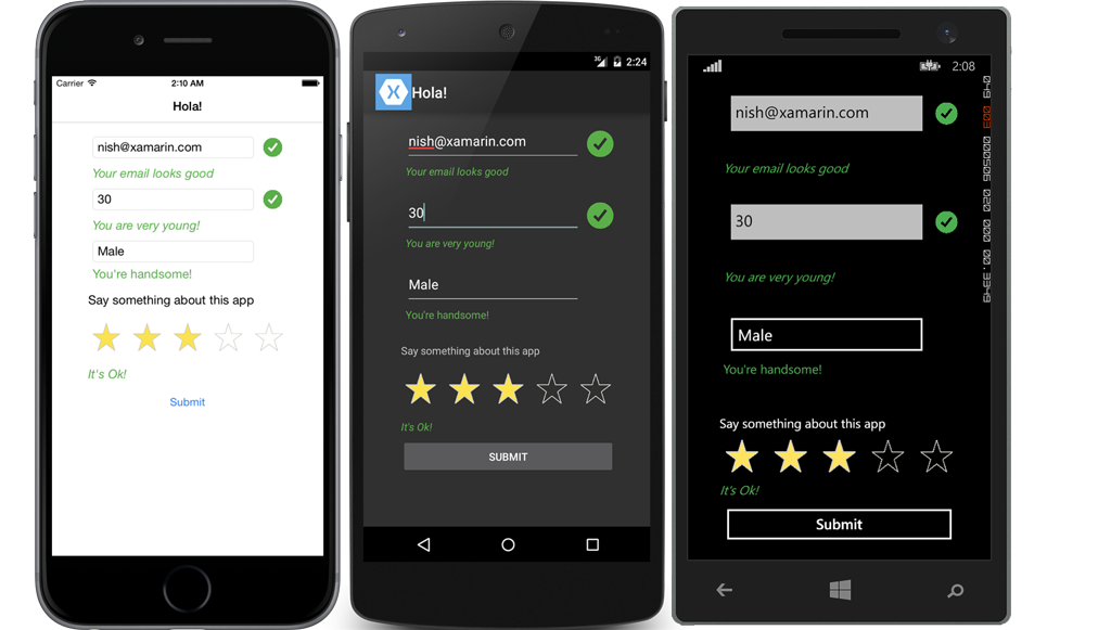
Last month, we announced some exciting new features in Xamarin.Forms as part of the 1.3 release. One of these features is Behaviors, which are extremely useful for attaching a piece of functionality to an existing element in a view. Technically, they are C# classes that inherit from Behavior<T> where T is the UI element to which a functionality is attached. Behaviors are powerful because they are reusable and easy to incorporate into unit testing since they are an independent piece of functionality. They can be used from the simplest example, like adding an email text validator to the Entry element, to advanced situations like creating a rating control using tap gesture recognizer in a view. Let’s take a look at how to get started with behaviors.

A behavior class must inherit from Behavior<T> and override two methods OnAttachedTo(T view) and OnDetachingFrom(T view).
{
    protected override void OnAttachedTo (Entry bindable)
    {
		...
    }
    protected override void OnDetachingFrom (Entry bindable)
    {
		...
    }
}
- OnAttachedTo – This method is fired immediately after the behavior is attached to the view. You can use this method to add a specific functionality to the UI element. For example, you can subscribe to the TextChanged event of the Entry control and validate the text for email.
- OnDetachingFrom – This method is fired when the behavior is removed from the attached control. You can use this method to remove the TextChanged event handlers that were previously attached to avoid memory leaks.
XAML
Every VisualElement has a behavior collection. Behaviors are attached to the element by simply adding the behavior to that collection.
<Entry Placeholder="Sample">
  <Entry.Behaviors>
    <local:SampleBehavior  />
  </Entry.Behaviors>
</Entry>
To see this in action, let’s create an email validator behavior and attach it to the Entry element.
Email Validator Behavior
 Validating emails from user keyed text is the most common requirement in an app these days, and this is something that you might need to use more than once. Wouldn’t it be nice to simply add the email validation logic to behaviors and attach them to the Entry element? Not just once, but as many Entry elements as you want?
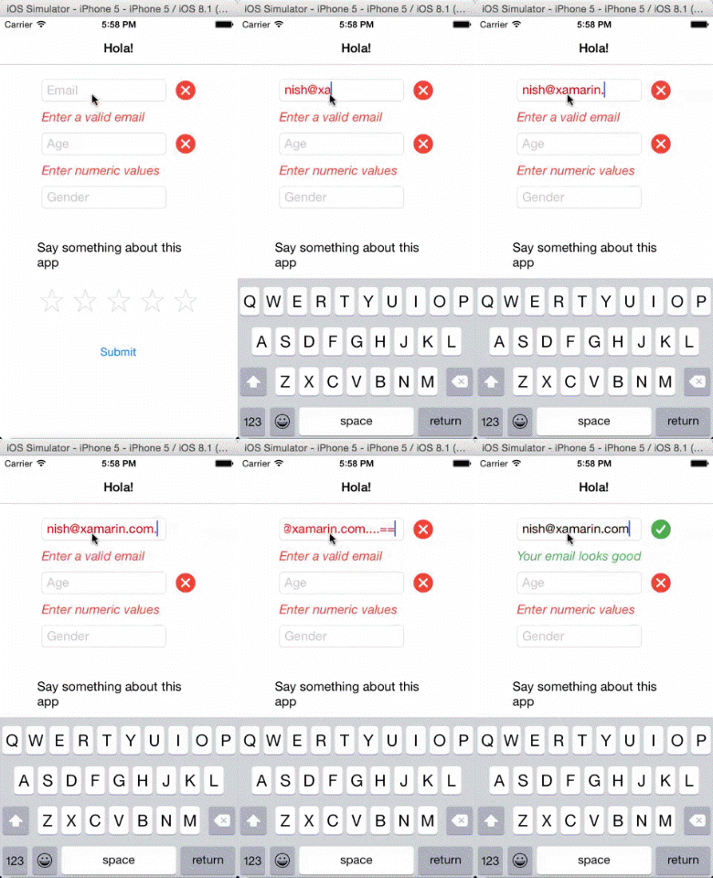
To achieve this, all you need to do is create a behavior in the OnAttachedTo method by subscribing to the TextChanged event and adding your email validation logic within that. Be sure to unsubscribe the TextChanged handler in the OnDetachingFrom method.
public class EmailValidatorBehavior : Behavior
{
    const string emailRegex = @"^(?("")("".+?(?<!\\)""@)|(([0-9a-z]((\.(?!\.))|[-!#\$%&'\*\+/=\?\^`\{\}\|~\w])*)(?<=[0-9a-z])@))" +
        @"(?(\[)(\[(\d{1,3}\.){3}\d{1,3}\])|(([0-9a-z][-\w]*[0-9a-z]*\.)+[a-z0-9][\-a-z0-9]{0,22}[a-z0-9]))$";

    static readonly BindablePropertyKey IsValidPropertyKey = BindableProperty.CreateReadOnly("IsValid", typeof(bool), typeof(NumberValidatorBehavior), false);

    public static readonly BindableProperty IsValidProperty = IsValidPropertyKey.BindableProperty;

    public bool IsValid
    {
        get { return (bool)base.GetValue(IsValidProperty); }
        private set { base.SetValue(IsValidPropertyKey, value); }
    }

    protected override void OnAttachedTo(Entry bindable)
    {
        bindable.TextChanged += HandleTextChanged;
    }

    void HandleTextChanged(object sender, TextChangedEventArgs e)
    {
        IsValid = (Regex.IsMatch(e.NewTextValue, emailRegex, RegexOptions.IgnoreCase, TimeSpan.FromMilliseconds(250)));
        ((Entry)sender).TextColor = IsValid ? Color.Default : Color.Red;
    }

    protected override void OnDetachingFrom(Entry bindable)
    {
        bindable.TextChanged -= HandleTextChanged;

    }
}
IsValid – BindableProperty
There are a number of ways you can handle the validation results. For example, you can set the TextColor of the Entry field to red to indicate the invalid email, or you can create an IsValid BindableProperty and let the consuming code decide how the validation needs to be handled.
<Entry Grid.Row="0"
 		Grid.Column="1"
        Placeholder="Email" >
	<Entry.Behaviors>
	  <local:EmailValidatorBehavior x:Name="emailValidator"/>
	</Entry.Behaviors>
</Entry>
<Image Grid.Row="0"
	   Grid.Column="2"
	   x:Name="emailSuccessErrorImage"
	   Style="{Binding Source={x:Reference emailValidator},
	                        Path=IsValid,
	                        Converter={StaticResource boolToStyleImage}}"/>
In the above code, BooleanToObject converter is used, which converts the IsValid boolean value to an appropriate image – a green tick is shown when true and a red error for false.
Adding Multiple Behaviors
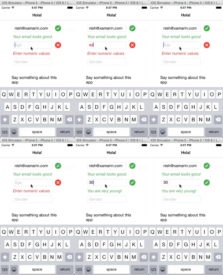
 In many instances, you may want to add multiple validators to the UI element. For instance, you might limit the length of an entry field to two characters and restrict the characters to numbers only. You can do this by adding both the behaviors to the same UI element. An example of this would be asking the user to key in his or her age, and restricting the field to numbers limited to two characters. If you notice the code, the MaxLengthValidator accepts the MaxLength property, which gives you the flexibility to reuse this validator for many other occasions.
 <Entry Grid.Row="2"
 		Grid.Column="1"
       	Placeholder="Age">
 	<Entry.Behaviors>
    	<local:NumberValidatorBehavior x:Name="ageValidator" />
    	<local:MaxLengthValidator  MaxLength="2"/>
  </Entry.Behaviors>
</Entry>
Rating Control Using Behaviors
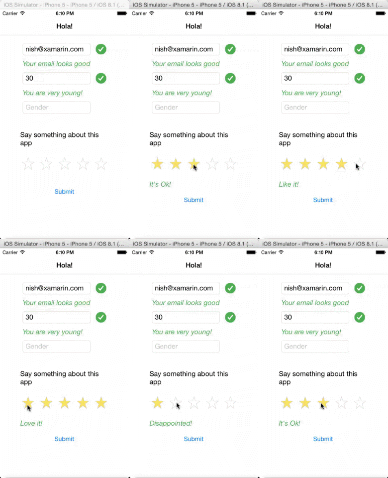
 Behaviors are powerful and can be used to write advanced code, such as creating a star based rating control that uses the tap gesture recognizer. The sample here uses logic to find which star in the group was tapped and sets the IsStarred property of self and the other stars in the group to appropriate values. Since the entire logic of the rating is encapsulated inside a Behavior, you can easily re-arrange the stars in the UI or even change them completely, to smilies for instance. You can download this sample from my GitHub repository.
For even more information on Xamarin.Forms, be sure to check out our samples and the detailed documentation.

Hi Nish,
good blog, thank you. <Entry> seems to be missing from public class EmailValidatorBehavior : Behavior<Entry>.
Without it the over-rides errored.
Great topic!
Please create ListView Behavior!
Thank!