
This week, Xamarin.Forms 3.6 shipped with another round of improvements, the most exciting of which is called Visual. Visual enables developers to create beautiful, cross-platform mobile applications that share not only a massive amount of code but also design and behavior. Material Design is the first style of cross-platform controls to take advantage of Visual.
A Unified Experience Across Android & iOS
Every month the Xamarin product team surveys Xamarin developers and has hundreds of one-on-one interactions with Microsoft customers to learn how we are progressing on key challenges developers face every day. One such challenge is making your Android and iOS apps look and behave consistently with each other. Xamarin values deep integration with the host platform, culture, and design patterns that are expected by people like us, living and working on their devices. In fact, Xamarin excels at this by providing all those native controls out-of-the-box. When you start a new Xamarin project, you get the same starting point you would get if you started new projects with Xcode and Android Studio.
Today, we believe we can do better to boost your productivity when your design goal is to achieve mostly the same visual appearance and behavior across these mobile targets. In Xamarin.Forms 3.6 we are introducing the first iteration of Visual with a suite of Material design components for Android and iOS. When you enable Material Visual, supported and decorated controls adopt the same design system cross-platform to create a unified look and feel. Let’s look at our implementation of the Material design components to see how this works by making your own, then get you started with Material, and finally look at the roadmap for this exciting new capability.
Material Design in Xamarin.Forms
In 2014, Google introduced the Material design system to describe guidelines for how interactive UI should be implemented in order to achieve highly usable interfaces that would delight people. This system has been so well received, that it inspires many of the mobile app designs we see from you. Let’s start by looking at a Button.
If you enable the Material theme in your Android platform project, you will get this design and behavior by default. But what about iOS? Google now also provides a set of iOS controls that implement an interpretation of Material design. Xamarin.Forms Material Visual makes it possible to use both at once and does some additional work to improve the consistency between platforms.
How Visual Works
Visual is a set of control renderers. At its most fundamental level, that’s it. You can use Visual today to tie together all your custom renderers across all the Xamarin.Forms backends (platforms). If you are unfamiliar with how custom renderers work, then our documentation guides can bring you up to speed.
Let’s run through the steps for making your own Visual. To begin, declare an IVisual marker in your Xamarin.Forms library.
namespace MyApp
{
    public class FancyVisual : IVisual
    {
    }
}
The code is a couple of lines; the marker exists to tie renderers together. Next, in your platform project you add this marker to the custom renderer’s ExportAttribute:
[assembly: ExportRenderer(typeof(Xamarin.Forms.Button), typeof(FancyButtonRenderer), new[] { typeof(MyApp.FancyVisual) })]
namespace MyApp.Droid
{
	public class FancyButtonRenderer : ButtonRenderer
	{
		public FancyButtonRenderer(Context context) : base(context)
		{
		}

		protected override void OnElementChanged(ElementChangedEventArgs<Xamarin.Forms.Button> e)
		{
			base.OnElementChanged(e);
			Element.Text = "I am a Custom Visual Renderer";
		}
	}
}
Now in your XAML, when you use a Button and mark it to use your new Visual="FancyVisual" the Xamarin.Forms toolkit will use your special renderer. You can also omit the “Visual” suffix, Xamarin.Forms will respect both.
<Button Visual="Fancy" />
What about other controls? If no renderer is found for your marker, then the Xamarin.Forms default renderers are used.
Getting Started with Visual Material
When it comes to delivering Material Design consistently across Android and iOS, we are of course using Visual. The Material Design system is opinionated, as are most design systems. It prescribes the size, color, spacing, and potentially other aspects of how individual controls and entire layouts should look and behave. As such, when you adopt Visual=”Material” in your code, those design system rules are applied by highly customized renderers. In the case of Material for iOS, we have supplied those renderers in a specific NuGet package, Xamarin.Forms.Visual.Material.
Install The Visual Material NuGet
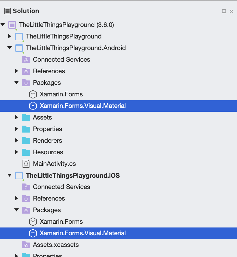
To get started using Visual in a Xamarin.Forms 3.6 projects, open your NuGet package manager in Visual Studio and add Xamarin.Forms.Visual.Material to the Android and iOS projects. This is the style you want, because…well, it’s the only style available at this time! More on that later.
Note: On Android and iOS, this NuGet delivers Xamarin.Forms optimized renderers, and on iOS provides the transitive dependency to Xamarin.iOS.MaterialComponents, a C# binding to Google’s Material Components for iOS. On Android it provides some compile targets to make sure your Target Framework version is setup properly.
Next, initialize the renderer package in your AppDelegate.cs like this:
global::Xamarin.Forms.Forms.SetFlags("Visual_Experimental"); // ONLY if using a pre-release of Xamarin.Forms
global::Xamarin.Forms.Forms.Init();
global::Xamarin.Forms.FormsMaterial.Init();
For Android, update your MainActivity.cs like this:
global::Xamarin.Forms.Forms.SetFlags("Visual_Experimental"); // ONLY if using a pre-release of Xamarin.Forms
global::Xamarin.Forms.Forms.Init(this, savedInstanceState);
global::Xamarin.Forms.FormsMaterial.Init(this, savedInstanceState);
Note: Be sure your Android project is using:
- FormsAppCompatActivity
- Android Support Libraries 28.0.0 or greater
- Target Android framework (v9.0 presently)
- Minimum Android Version 5.0 (API 21) or greater
Decorate Your Controls
Now you’re ready to start seeing some Material design. Let’s take a look at 2 Buttons and how you can apply Visual. Notice the difference between the normal buttons and the consistency between the buttons using Visual.
<StackLayout Spacing="8">
    <Button Text="Normal Button"/>
    <Button Text="Material Button" Visual="Material"/>
</StackLayout>
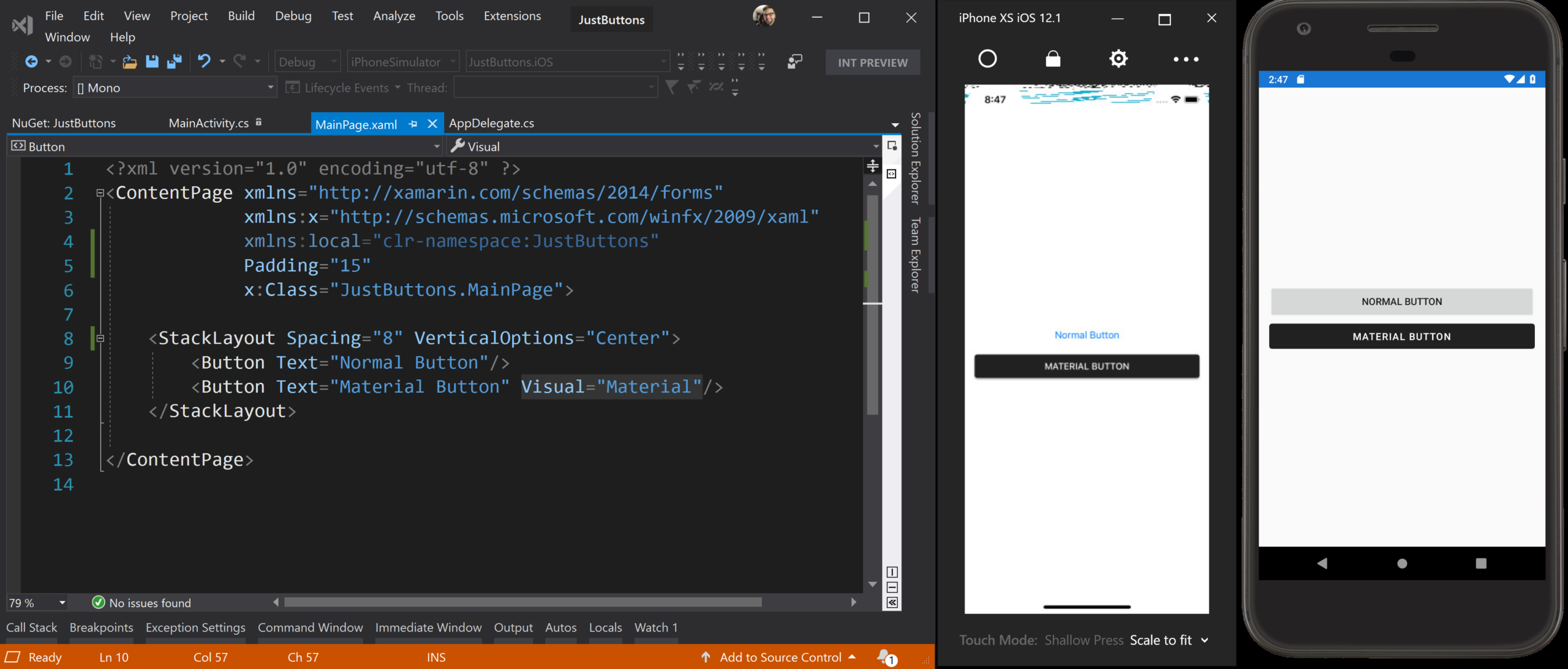
In the XAML above, we tell Xamarin.Forms to use the Material renderer for the Button on the bottom. Imagine how powerful it is to be able to opt-in and out of Visual per control, even at runtime! You can also declare Visual on any layout, ContentPage, or even at the app level, and it will cascade down to all child controls.
<ContentPage Visual="Material">
    <StackLayout Spacing="8">
        <Button Text="Normal Button" Visual="Default"/>
        <Button Text="Material Button" />
    </StackLayout>
</ContentPage>
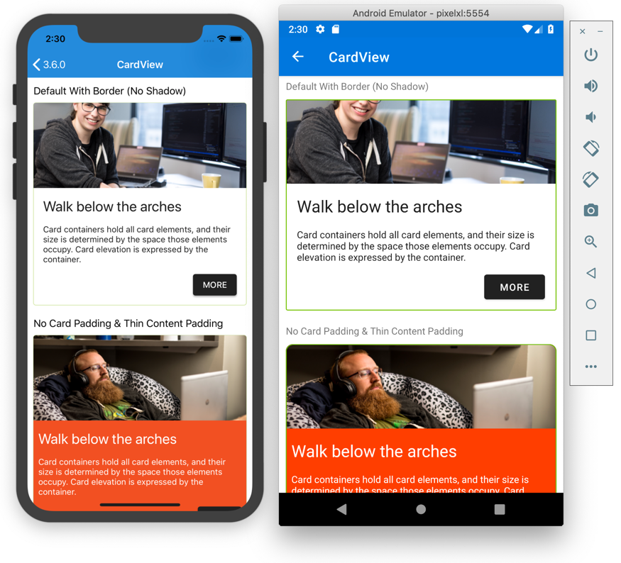
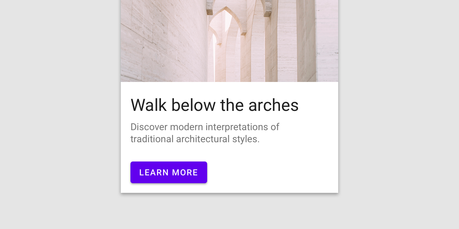
This XAML achieves the same result as the previous. The Default Visual or any control is the base platform renderer. In the animation below from TheLittleThingsPlayground app, you can see a variety of examples of a simple Button in the Material style. Notice the nice ink ripple effect!
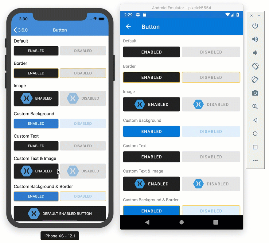
Some Limits Apply: Material Design components adhere closely to Google’s guidelines. As a result, the controls are biased towards that sizing and behavior. When you need more control of the styles or behavior, you can still create your own Effect, Behavior, or Renderer to achieve the detail and polish you desire.
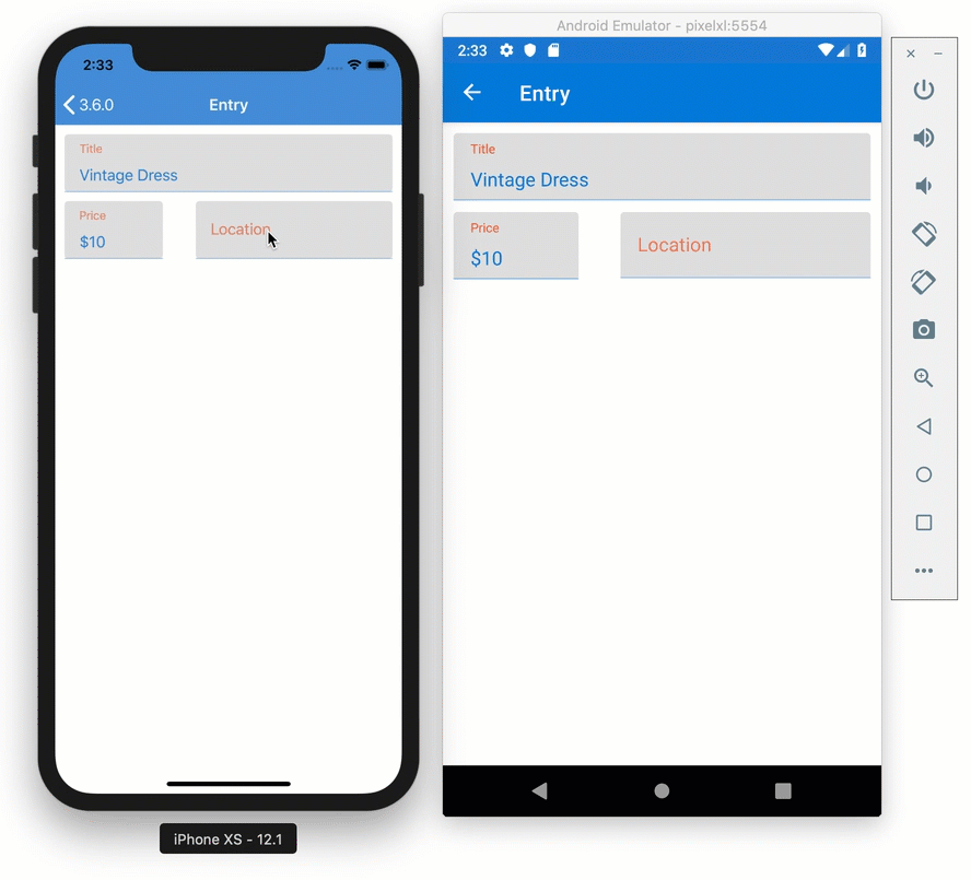
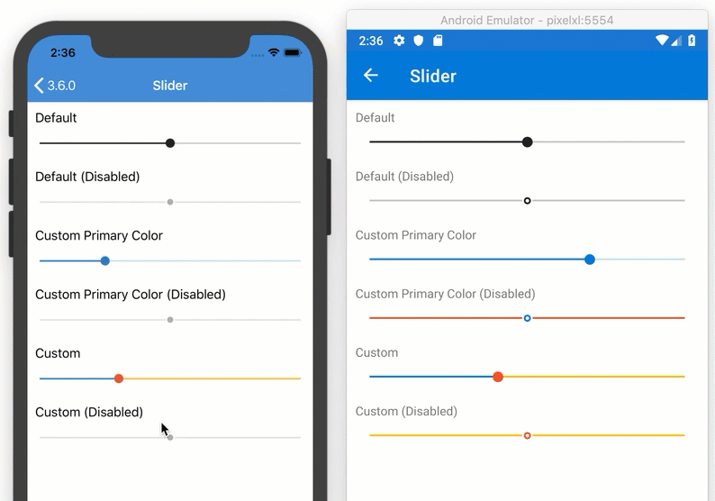
The Xamarin.Forms team has adapted and implemented 11 controls for Material design. You can see the list below, and explore these controls in TheLittleThingsPlayground app.
| ActivityIndicator Button DatePicker Editor Entry Frame | Picker ProgressBar Slider Stepper TimePicker |
What’s Next
Now that we have a stable first release, it’s time to hear again from you. Is this as helpful as we expect? What should we address next?
We have been inviting developers to take a “visual challenge” using this new capability to recreate an existing design that should look mostly the same across Android and iOS. Don’t be shy, you can participate too! We are challenging Visual, not you; though, feel free to show off your skills.
The goal is to spend an hour on the exercise and then submit your progress and learnings in the form of a pull request to the project repository. Here’s what we are learning so far:
- More styling properties need to be surfaced. We opted in the initial release for more controls vs going deep on a single control. It’s clear the next biggest win is enabling those styling options.
- More controls like Picker: actually, we were already working on this and it’s now part of the package!
- Entry height is a common need to change
We owe a huge thanks to the adventurous souls that have participated thus far:
- Nathan Westfall (nwestfall)
- Lachlan Gordon (lachlanwgordon)
- Mario (15mgm15)
- Matthew Leibowitz (mattleibow)
- Pedro Jesus (pictos)
- Maciej Gos (maciejgos)
More have taken the challenge, but not submitted pull requests. There’s still time, and we have more to be learned. Please take a shot and join us! In the meantime, here is a recap of the resources mentioned in this article, as well as future proposals for your consideration.
- TheLittleThingsPlayground App
- Visual Challenge Repository
- Visual Documentation
- Xamarin.Forms 3.6.0 Release Notes
- Material Design System
- [Proposal] Attached Properties for Styling
- [Proposal] Switch
Here are some other popular examples of design systems:
BONUS: Mobile Community Standup
Today on the Mobile Community Standup, Xamarin.Forms engineer Shane Neuville joined James Montemagno and myself to discuss Visual, Material components, and creating your own Visual. Hit the links below for a look “under the hood”.
Hello,
This article is very good,
Please share an example to implement DatePicker Material Design and how we can use google material design in Xamarin.
Thanks
Where’s the theme for Microsoft’s own Fabric design?
https://developer.microsoft.com/en-us/fabric#/
Supposedly a company-wide design collaboration. So, does nobody at MS actually use Xamarin themselves?