Make 2016 the year that your UIs look beautiful on all form factors! By using Auto Layouts, you ensure that you app’s UI is responsive and looks great no matter what device it runs on, and also get support for iOS 9’s multitasking feature for free.
What is Auto Layout?
Auto Layout is a constraints-based layout system introduced in iOS 6 that has since been adopted on OS X and tvOS. It allows us to easily create adaptive user interfaces rather than the traditional layout system, where each element’s has a hardcoded value for its position. We only had to worry about one screen size when the App Store initially launched, which made development relatively simple. Today, the device landscape is very different—we need to think about both different devices, such as the iPod, iPhone, Apple TV, and iPad, as well as different form factors within those devices, which further complicates how we create our user interfaces.
Auto Layout solves this by creating a mathematical representation of the relationship between views (which is called a constraint). Although a constraint may sound complex, in reality it translates to the size and position of a UI element, relative to the size of the display or other views around it.
UITraitCollection
In iOS 8, Apple introduced two new additions to UIKit to help us create interfaces for multiple devices. These were size classes and UITraitCollection.
A UITraitCollection describes the properties (or traits) for a user interface element. These include properties such as size, display scale, and user interface idiom (an iPhone or iPad). This allows us to redefine our UI based on a set of traits, which means we can have unique UIs depending on the device’s orientation or size. Just as the introduction of the iPhone 6 moved us from pixels to points, UITraitCollection forces us to think about screen dimensions, device orientations, and UIs in a more abstract way.
Size Classes
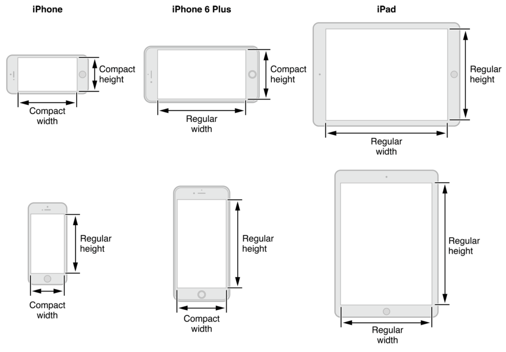
Size classes combined with Auto Layout allow the UI to adapt to the different traits of a device. In fact, a UITraitCollection contains two properties, HorizontalSizeClass and VerticalSizeClass. UIUserInterfaceSizeClass enumeration contains three members: Compact, Regular and Unspecified.
When using Auto Layout, we no longer have numerous physical devices to concern ourselves with when developing for iOS. Instead we have four abstract devices to design against: regular-compact, regular-regular, compact-compact and compact-regular. This approach results in all iPhones in portrait having compact-width and regular height size classes and translates to your UI looking great on both the iPhone 4S and the iPhone 6 Plus without any modification.
Size classes aren’t just for the device class, but can also be used for views. This means our views can differ from the device size classes listed above and opens up a world of possibilities since we’re able to display multiple views on screen at the same time, each with its own unique size class. A popover on the iPad, for example, could have a Regular-Compact Size Class, which would result in it displaying full screen on the iPhone in Portrait without any extra work from the developer.
An Abstract New Way of Thinking
Some readers may not feel that migrating from old xibs or the springs and structs approach to Auto Layouts is necessary. Apple has made it clear that all iOS developers today should be using size classes to ensure their apps work with multi-tasking devices (limited to the iPad for the moment). Adopting Auto Layout and size classes requires a shift in how we think about iOS design. Pixel perfect mockups are no longer feasible due to the adaptive nature of this approach to layouts. But alongside the loss in pixel perfection, we gain the ability to build our UI for multiple form factors once and be guaranteed it’ll look great across all devices.
Further Reading and Practical Guides
You should find everything you need to get started in our documentation. We’ve put together a plethora of information on how to create your UIs with Storyboards and how to use Auto Layouts. Xamarin University also provides a terrific class which covers Advanced iOS UI with Auto Layout and Constraints (iOS 300).


