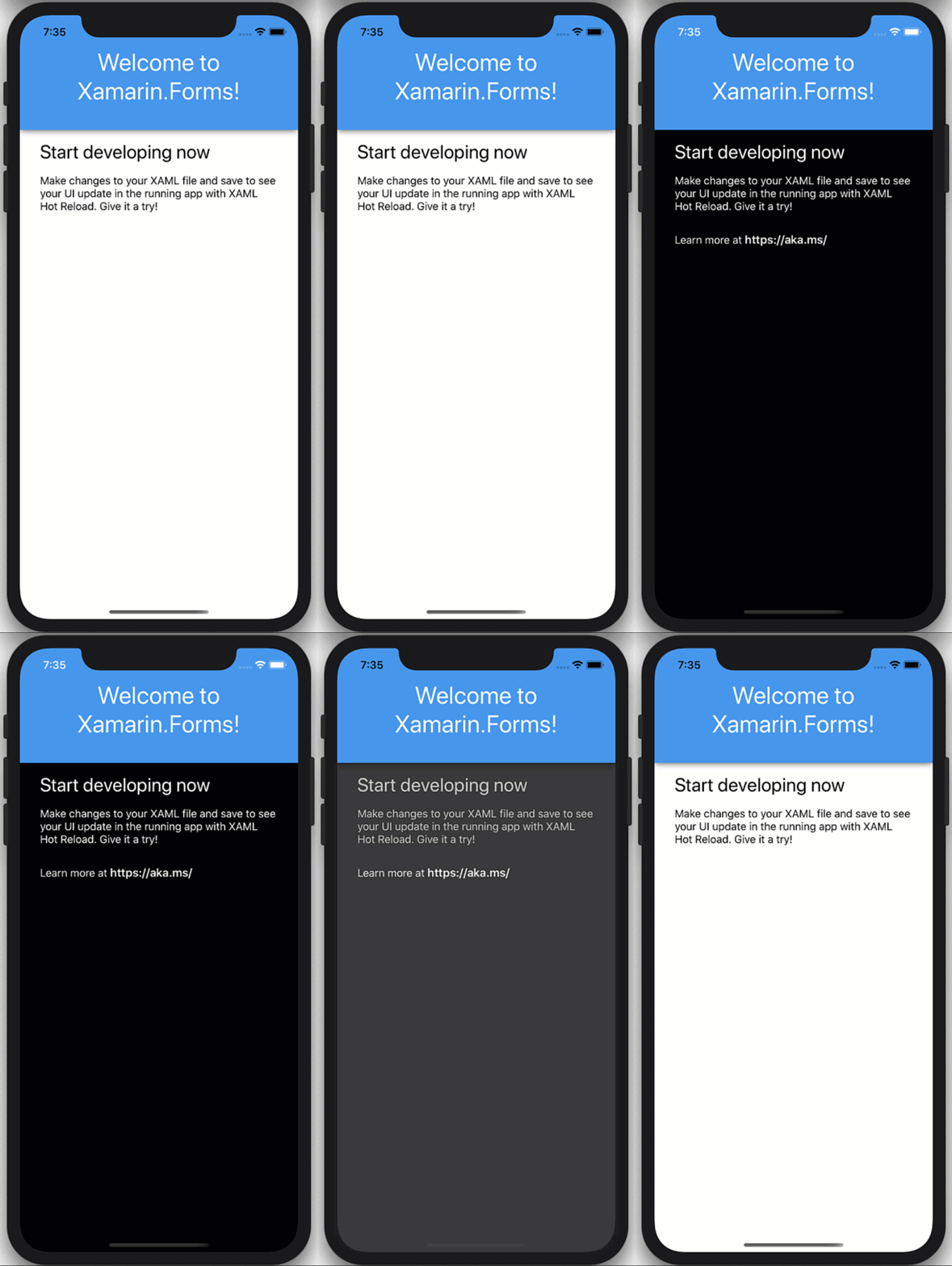
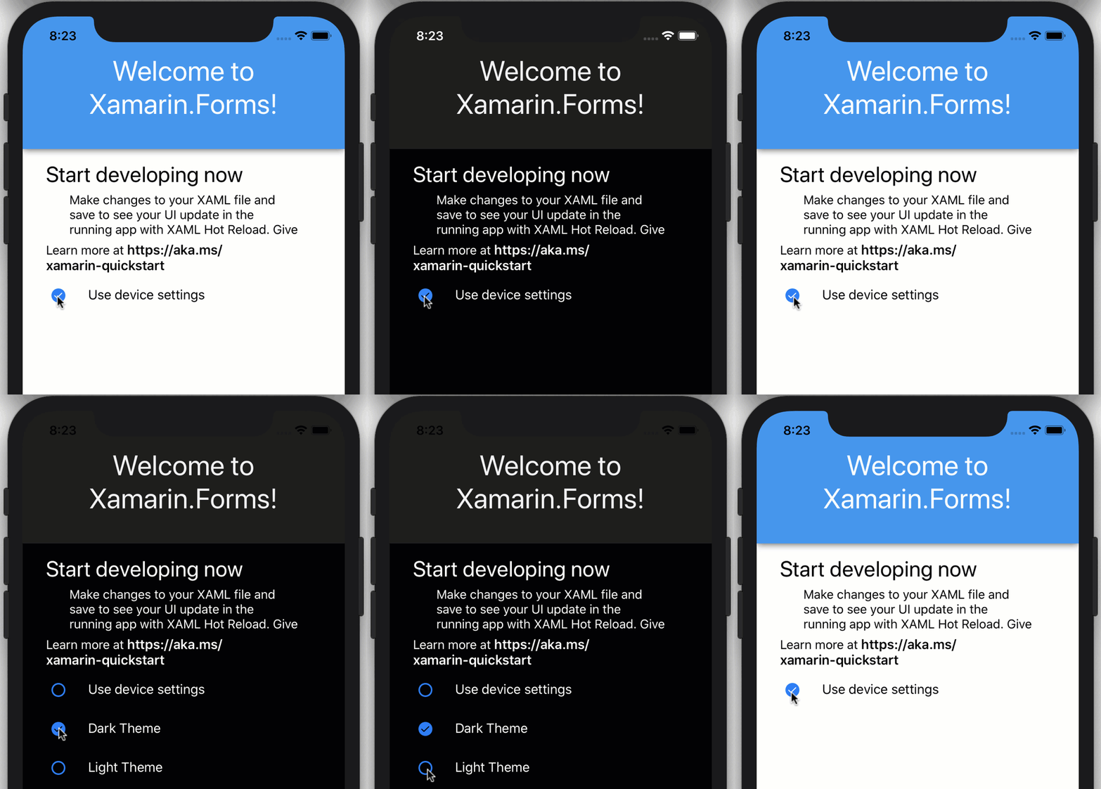
All major OSes now support dark and light app themes, and Xamarin.Forms 4.7 has arrived to make this easy to add to your applications. In fact, if you do nothing at all, your Xamarin.Forms apps will respect the user’s OS preference. Why stop there? You can also customize the light and dark colors used throughout your app UI, and even give the user a choice to control their own app theme. Let’s start at the beginning.
Default Platform Colors
When you set no styles or colors, your UI will default to the theme native to the platform the app runs on. For example, look at how this new “Blank App” template looks on iOS:
<StackLayout>
            <Frame BackgroundColor="#2196F3" Padding="36,48,36,36" CornerRadius="0">
                <Label Text="Welcome to Xamarin.Forms!" HorizontalTextAlignment="Center" TextColor="White" FontSize="36" />
            </Frame>
            <Label Text="Start developing now" FontSize="Title" Padding="30,10,30,10" />
            <Label Text="Make changes to your XAML file and save to see your UI update in the running app with XAML Hot Reload. Give it a try!" FontSize="16" Padding="30,0,30,0" />
            <Label FontSize="16" Padding="30,24,30,0">
                <Label.FormattedText>
                    <FormattedString>
                        <FormattedString.Spans>
                            <Span Text="Learn more at " />
                            <Span Text="https://aka.ms/xamarin-quickstart" FontAttributes="Bold" />
                        </FormattedString.Spans>
                    </FormattedString>
                </Label.FormattedText>
            </Label>
        </StackLayout>

When you toggle the iOS simulator between dark and light modes (CMD+SHFT+A) you can see the ContentPage background shift from white to black, and the text from black to white. Those are default platform colors. Contrast that with the header which remains blue and the header text that remains white. Those are explicit colors set in code.
Take Control of the Dark
To now control the colors for the dark and light of the head and text, you can replace the static colors with an AppThemeBinding that will react at runtime to the OS theme settings. First enable this preview feature by adding the flag to your App.xaml.cs:
public App()
{
    Device.SetFlags(new string[]{ "AppTheme_Experimental" });

    InitializeComponent();
}
Updating just the header, this looks like:
<Frame BackgroundColor="{AppThemeBinding Dark=#2196F3, Light=#2196F3}" Padding="36,48,36,36" CornerRadius="0">
                <Label Text="Welcome to Xamarin.Forms!" HorizontalTextAlignment="Center" TextColor="{AppThemeBinding Dark=DarkBlue, Light=White}" FontSize="36" />
            </Frame>

You can of course refactor these to styles like this:
<ContentPage.Resources>
    <Style x:Key="HeaderBg" TargetType="Frame">
        <Setter Property="BackgroundColor" Value="{AppThemeBinding Dark=#1d1d1d, Light=#2196F3}"/>
        <Setter Property="Padding" Value="36,48,36,36"/>
        <Setter Property="CornerRadius" Value="0"/>
    </Style>

    <Style x:Key="HeaderTitle" TargetType="Label">
        <Setter Property="TextColor" Value="{AppThemeBinding Dark=#F1F1F1, Light=White}"/>
        <Setter Property="HorizontalTextAlignment" Value="Center"/>
        <Setter Property="FontSize" Value="36"/>
    </Style>
</ContentPage.Resources>

<Frame Style="{StaticResource HeaderBg}">
    <Label
        Style="{StaticResource HeaderTitle}"
        Text="Welcome to Xamarin.Forms!" />
</Frame>
And if you wish to use predefined color styles, it might look like this:
<Color x:Key="Background_Dark">#1d1d1d</Color>
<Color x:Key="Background_Light">#1d1d1d</Color>
<Style x:Key="HeaderBg" TargetType="Frame">
    <Setter Property="BackgroundColor" Value="{AppThemeBinding Dark={StaticResource Background_Dark}, Light={StaticResource Background_Light}}"/>
Letting the User Choose
Sometime you may want to give the app user control over the theme instead of relying on the OS theme. To do this, you need only to provide a way to set the App.Current.UserAppTheme like this:
App.Current.UserAppTheme = OSAppTheme.Dark;

Then, to reset the app to respond automatically to OS theme changes, you can set it back to “Unspecified”:
App.Current.UserAppTheme = OSAppTheme.Unspecified;
Now create the above experience, add three checkboxes to your UI for default, dark, and light.
<StackLayout Orientation="Horizontal" Spacing="10">
    <CheckBox IsChecked="{Binding UseDeviceThemeSettings}" VerticalOptions="Center" />
    <Label Text="Use device settings"
            VerticalOptions="Center"/>
</StackLayout>

<StackLayout
    IsVisible="{Binding UseDeviceThemeSettings, Converter={StaticResource InvertedBoolConverter}}"
    Orientation="Horizontal"
    Spacing="10">
    <CheckBox IsChecked="{Binding UseDarkMode}" VerticalOptions="Center"/>
    <Label Text="Dark Theme"
            VerticalOptions="Center"/>
</StackLayout>

<StackLayout
    IsVisible="{Binding UseDeviceThemeSettings, Converter={StaticResource InvertedBoolConverter}}"
    Orientation="Horizontal"
    Spacing="10">
    <CheckBox IsChecked="{Binding UseLightMode}" VerticalOptions="Center"/>
    <Label Text="Light Theme"
            VerticalOptions="Center"/>
</StackLayout>
Then add the public properties to the BindingContext for the page, in this case the page handles its own state.
public MainPage()
{
    BindingContext = this;
    InitializeComponent();
}

private bool _useDarkMode;
public bool UseDarkMode {
    get {
        return _useDarkMode;
    }
    set {
        _useDarkMode = value;
        if(_useDarkMode)
        {
            UseLightMode = UseDeviceThemeSettings = false;
            App.Current.UserAppTheme = OSAppTheme.Dark;
        }

    }
}

private bool _useLightMode;
public bool UseLightMode
{
    get
    {
        return _useLightMode;
    }
    set
    {
        _useLightMode = value;
        if (_useLightMode)
        {
            UseDarkMode = UseDeviceThemeSettings = false;
            App.Current.UserAppTheme = OSAppTheme.Light;
        }
    }
}

private bool _useDeviceThemeSettings = true;
public bool UseDeviceThemeSettings
{
    get
    {
        return _useDeviceThemeSettings;
    }
    set
    {
        _useDeviceThemeSettings = value;
        if(_useDeviceThemeSettings)
        {
            App.Current.UserAppTheme = OSAppTheme.Unspecified;
        }
    }

}
The code above handles toggling between dark and light according to the user’s preference in the app, and then switching between user preference and OS theme preference.
That’s a Wrap
This new dark and light mode theme helper, AppThemeBinding along with UserAppTheme make it really easy to handle theme modes in your Xamarin.Forms apps. This works not only for colors, but images and other resources as well. As shown previously, it even works with the new Shapes and Paths introduced in Xamarin.Forms 4.7 too!

For more information on app themes, check out the system theme changes documentation. If you want to go even further than dark and light themes, then check out using dynamic resources and even loading themes at runtime to theme your applications.

Thanks for the blog post. What sharing styles across files where some styles are based upon other styles?
https://stackoverflow.com/questions/63379872/styles-that-are-based-upon-other-styles-that-span-multiple-files
I don’t want a huge App.xaml file. How can I handle this use case appropriately?
Hi,
I started using AppThemeBinding in one of my apps, and also decided to add settings to allow the user to force Dark or Light mode, just like in the example.
The problem I encountered is that is I set Dark theme (App.Current.UserAppTheme = OSAppTheme.Dark), and have a black or very dark background, then some controls like ToggleSwitch in off state and the new RadioButton were still painted with dark colors and were not visible. And there is no way to change the colors of the parts of those controls from Xamarin.Forms, so I could not apply dark theme to them.
A solution...
That is cool!!
But due to situation i am facing issue!! How can i disable App Theme totally in Xamarin.Forms 4.7.XX? Due to compatibility issue i had to upgrade to Xamarin.Forms 4.7.xx but the app is old and color are used randomly. In dire need to block device based colors/themes! Otherwise the app looks ugly and unreadable on many pages.
Yes I am also having this problem. Did you find a way to solve this ?
This is really cool. Does it support custom themes more than just “Light” and “Dark”? For example, like winter, fall, summer themes?
Good work
Hi very nice but please try to add reporting functionality for xamarin.forms
Awesome, great write-up. Looking forward to trying this out
This is really cool. Cant wait till i can use blazor syntax to achieve this with way fewer code lines <3