
The code in this blog post is based on code from Romain Guy’s blog.
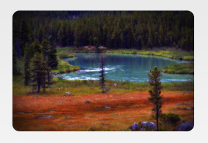
Today, we are going to discuss a really nice effect that you can apply to your ImageView to automatically add rounded corners and extra shadowing to the displayed Bitmap:
These effects are based on a couple of Shader classes like BitmapShader, RadialGradient and ComposeShader, so it’s also a nice introduction if you have not previously used them. The code of the Drawable wrapper that you use on your source Bitmap follows:
using System;

using Android.Graphics;
using Android.Graphics.Drawables;

public class VignetteDrawable : Drawable
{
	bool useGradientOverlay;
	float cornerRadius;
	RectF rect = new RectF ();
	BitmapShader bitmapShader;
	Paint paint;
	int margin;

	public VignetteDrawable (Bitmap bitmap, float cornerRadius = 5, int margin = 3, bool withEffect = true)
	{
		this.useGradientOverlay = withEffect;
		this.cornerRadius = cornerRadius;

		bitmapShader = new BitmapShader (bitmap, Shader.TileMode.Clamp, Shader.TileMode.Clamp);

		paint = new Paint () { AntiAlias = true };
		paint.SetShader (bitmapShader);

		this.margin = margin;
	}

	protected override void OnBoundsChange (Rect bounds)
	{
		base.OnBoundsChange (bounds);
		rect.Set (margin, margin, bounds.Width () - margin, bounds.Height () - margin);

		if (useGradientOverlay) {
			var colors = new int[] { 0, 0, 0x7f000000 };
			var pos = new float[] { 0.0f, 0.7f, 1.0f };
			RadialGradient vignette = new RadialGradient (rect.CenterX (),
			                                              rect.CenterY () * 1.0f / 0.7f,
			                                              rect.CenterX () * 1.3f,
			                                              colors,
			                                              pos, Shader.TileMode.Clamp);

			Matrix oval = new Matrix ();
			oval.SetScale (1.0f, 0.7f);
			vignette.SetLocalMatrix (oval);

			paint.SetShader (new ComposeShader (bitmapShader, vignette, PorterDuff.Mode.SrcOver));
		}
	}

	public override void Draw (Canvas canvas)
	{
		canvas.DrawRoundRect (rect, cornerRadius, cornerRadius, paint);
	}

	public override int Opacity {
		get {
			return (int)Format.Translucent;
		}
	}

	public override void SetAlpha (int alpha)
	{
		paint.Alpha = alpha;
	}

	public override void SetColorFilter (ColorFilter cf)
	{
		paint.SetColorFilter (cf);
	}
}
Usage of this class is pretty self-explanatory: together with the mandatory Bitmap parameter, you can set the corner radius and margin used to paint the image. You can also turn off the shadowing step using the withEffect parameter if it doesn’t go too well with your Bitmap (which is generally the case when using icons with a dominant solid color). When set up, use the SetImageDrawable method of the ImageView class to display the final result. Note that you need to give it a manual size for the code to behave correctly.
Below is an example instantiation:
var bmp = BitmapFactory.DecodeResource (Resources, Resource.Drawable.pic1);
imageView.SetImageDrawable (new VignetteDrawable (bmp, cornerRadius: 20, withEffect: true));
Now, let’s talk about how it actually works. As mentioned before, we use two main shaders to do the magic for us. First, we use BitmapShader, which takes a Bitmap and transforms it into a texture that can be set as the source of a Paint object. Combined with the DrawRoundRect method of Canvas, it gives us a pain-free way to display our image with rounded corners without having to manually add them to the initial bitmap.
Then, to create our halo effect, we use a gray-to-transparent RadialGradient that is set to fill the bounds of our Drawable canvas. That last shader is combined with the first one using a ComposeShader which takes two shader objects and puts them one over the other according to the specified Porter/Duff operator (in our case SourceOver, meaning the halo is simply layered on top of the texture).
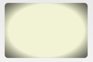
To show you the effect of the radial gradient on your image, here is a version where it’s applied on a solid color: