It was clear when Google introduced Material Design that it would shift the Android landscape even more than its Holo predecessor, and thus far the journey for developers to implement those new design principles in their apps has been a bit of a long and bumpy ride.

In the beginning, Material Design was only available on devices running Android 5.0+ Lollipop, but over time the Support Library v7 AppCompat was updated to enable Material theming on older versions of Android.
Theming, though, is only a part of the equation. Material Design also comprised a lot of new UI components and interactions that were not present in AppCompat. This is where the new Android Support Design Library comes in, offering a wide range of implementations of several portions of the Material Design specification in a fully backwards compatible fashion when combined with Support Library v7 AppCompat.
Get The Support Design Library
If you haven’t gotten up to speed yet on switching your apps to use AppCompatActivity and AppCompat theming, be sure to first read through our entire blog post on how to get set up. Once your app has been AppCompat enabled, head over to the component store from inside of Visual Studio or Xamarin Studio and Search for “Android Support Design”.

Add the component to your project and the Support Design Library NuGet, and samples will automatically be installed in your project. Be sure to browse the sample for an overview of everything that Support Design Library has to offer.
Now that you’re set up, let’s take a look at a few of my favorite new widgets that are built into this awesome library.
Floating Labels with TextInputLayout
The EditText widget offers a wide range of customizations, including my favorite, the Hint property, but there is one small issue with it. While the Hint property displays an indication of what your users should enter when in its unfocused state, it vanishes when the user taps the control or if anything is entered in the EditText field. This usually means you have to add a separate label to your fields to add context.
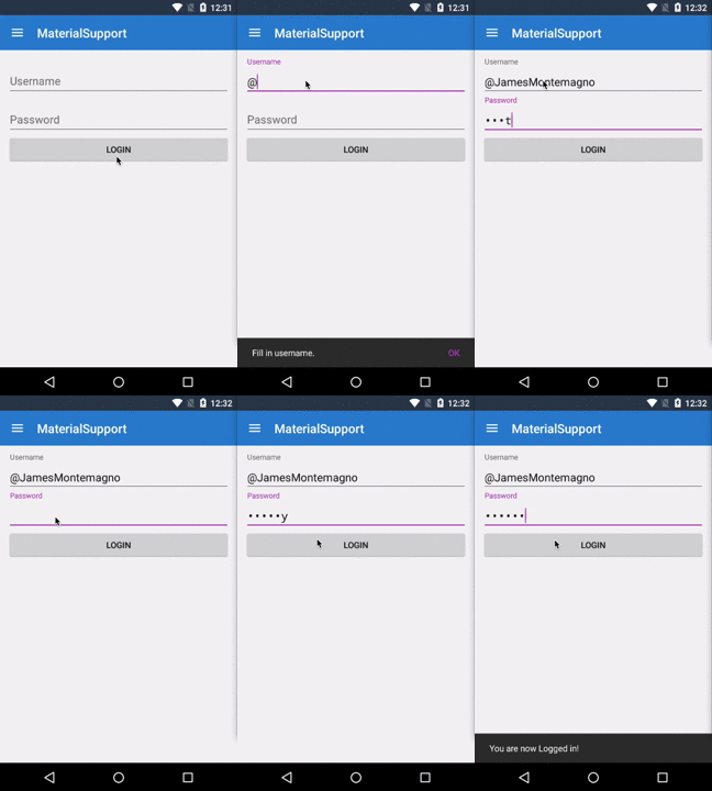
Not anymore! The TextInputLayout can now wrap any EditText and will automatically animate the Hint to be displayed right above the EditText widget.
<android.support.design.widget.TextInputLayout
    android:layout_width="match_parent"
    android:layout_height="wrap_content">
    <EditText
        android:id="@+id/username"
        android:layout_width="fill_parent"
        android:layout_height="wrap_content"
        android:hint="Username" />
</android.support.design.widget.TextInputLayout>
Here it is in action:

Snackbar: Powerful & Enhanced Toast
Toasts on Android are normally used to display short lived information that has no interaction.
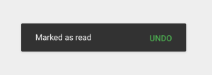
The new Snackbar component on the other hand, provides a similar lightweight feedback mechanism but lets you specify extra actions available to users. If you’ve used toasts before, the core API will look familiar:
Snackbar
  .Make (parentLayout, "Message sent", Snackbar.LengthLong)
  .SetAction ("Undo", (view) => { /*Undo message sending here.*/ })
  .Show (); // Don’t forget to show!

You should note the use of a View as the first parameter to Make () — Snackbar will attempt to find an appropriate parent of the Snackbar’s view to ensure that it’s anchored to the bottom.
There are several instances where the Snackbar will come in handy. Take the example above of a login page: you may want to use the new Snackbar to display information when the user attempts to log in. Additionally, if your user enters an incorrect password, you could supply an optional action to clear the password field:
loginButton.Click += (sender, e) => {
  if (string.IsNullOrWhiteSpace (username.Text)) {
    Snackbar.Make (drawerLayout, "Fill in username.", Snackbar.LengthLong)
	    .SetAction ("OK", (v) => { })
	    .Show ();
  } else if (password.Text != "monkey") {
    Snackbar.Make (parentLayout, "Invalid Password", Snackbar.LengthLong)
            .SetAction ("Clear", (v) => { password.Text = string.Empty; })
            .Show ();
  } else {
    Snackbar.Make (parentLayout, "You are now Logged in!", Snackbar.LengthLong)
            .Show ();
  }
};

Effective Navigation in Android
 There are several ways to handle navigation in your app, including dashboards, tabs, and even drop down spinners. My favorite, though, is the Navigation Drawer.
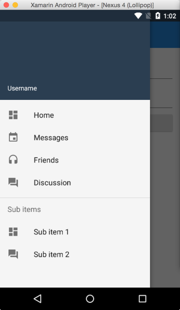
By providing a simple, yet highly customizable slide out menu, the Navigation Drawer is an ideal pattern for a lot of apps. Implementing the Navigation Drawer was always a bit of a pain, but this has been greatly simplified by combing the new NavigationView class with the standard DrawerLayout.
The NavigationView makes it easier to display menu items by leveraging the standard menu resource system that you’re already familiar with. It also provides a simplified way of adding a header layout to the top of your NavigationView. You can easily have a beautiful and functional Navigation Drawer up and running with just a few lines of code.
Setup
The root of your app will be a standard Android XML that will house three important items:
- DrawerLayout: Top-level container for an interactive drawer
- Your Content: What you want to display on your main activity (usually a fragment that is swapped out)
- NavigationView: Easy way of implementing the navigation drawer and inflating menu items
Here is the standard code for your Android XML:
<android.support.v4.widget.DrawerLayout
        xmlns:android="http://schemas.android.com/apk/res/android"
        xmlns:app="http://schemas.android.com/apk/res-auto"
        android:layout_width="match_parent"
        android:layout_height="match_parent"
        android:fitsSystemWindows="true">

    <!-- your content layout -->

    <android.support.design.widget.NavigationView
            android:layout_width="wrap_content"
            android:layout_height="match_parent"
            android:layout_gravity="start"
            android:id="@+id/nav_view"
            app:headerLayout="@layout/drawer_header"
            app:menu="@menu/nav_menu"/>
</android.support.v4.widget.DrawerLayout>
Add the Menu
You should note two attributes for NavigationView: app:headerLayout controls the (optional) layout used for the header and app:menu is the menu resource inflated for the navigation items. Create a new file named nav_menu.xml under Resources/menu.
A simple drawer will just contain a few items, but there’s nothing preventing you from having deeper menu hierarchies with sub-headers, like in the screenshot:
<menu xmlns:android="http://schemas.android.com/apk/res/android">
  <group android:checkableBehavior="single">
    <item
      android:id="@+id/nav_home"
      android:icon="@drawable/ic_dashboard"
      android:title="Home" />
    <item
      android:id="@+id/nav_messages"
      android:icon="@drawable/ic_event"
      android:title="Messages" />
    <item
      android:id="@+id/nav_friends"
      android:icon="@drawable/ic_headset"
      android:title="Friends" />
    <item
      android:id="@+id/nav_discussion"
      android:icon="@drawable/ic_forum"
      android:title="Discussion" />
  </group>
  <item android:title="Sub items">
    <menu>
      <item
        android:icon="@drawable/ic_dashboard"
        android:title="Sub item 1" />
      <item
        android:icon="@drawable/ic_forum"
        android:title="Sub item 2" />
     </menu>
  </item>
</menu>
Code Behind Setup
You’re nearly done! All you have to do now is fill in a little bit of code behind to cue click events to open and close the drawer and react when a menu item is selected. You’ll need to locate the DrawerLayout and NavigationView in OnCreate for your Activity, and then add an event handler to the NavigationView’s NavigationItemSelected event. This is triggered when an item is selected, and you will need to set it to “checked” and close the drawer.
DrawerLayout drawerLayout;
NavigationView navigationView;
protected override void OnCreate (Bundle bundle)
{
  base.OnCreate (bundle);

  // Set our view from the "main" layout resource
  SetContentView (Resource.Layout.main_layout);
  var toolbar = FindViewById<Android.Support.V7.Widget.Toolbar>(Resource.Id.toolbar);
  SetSupportActionBar (toolbar);

  //Enable support action bar to display hamburger
  SupportActionBar.SetHomeAsUpIndicator (Resource.Drawable.ic_menu);
  SupportActionBar.SetDisplayHomeAsUpEnabled (true);

  drawerLayout = FindViewById<DrawerLayout> (Resource.Id.drawer_layout);
  navigationView = FindViewById<NavigationView> (Resource.Id.nav_view);

  navigationView.NavigationItemSelected += (sender, e) => {
    e.MenuItem.SetChecked (true);
    //react to click here and swap fragments or navigate
    drawerLayout.CloseDrawers ();
  };
}
The only other thing to do now is to tell the drawer layout to open the drawer if the hamburger button is pressed:
public override bool OnOptionsItemSelected (IMenuItem item)
{
  switch (item.ItemId)
  {
    case Android.Resource.Id.Home:
      drawerLayout.OpenDrawer (Android.Support.V4.View.GravityCompat.Start);
      return true;
  }
  return base.OnOptionsItemSelected (item);
}

So Much More Material
This is only the start of your Material Design adventure. Be sure to check out the Support Design Library’s Getting Started Guide on how to take advantage of native Floating Action Button, Material Tabs, Collapsing Toolbars, and complex animations with CoordinatorLayout.
