At Build 2018 we shipped Xamarin.Forms 3.0. Did you miss the announcement? No worries, you can watch it here to catch up on many of the great new things that will help make you more productive building cross-platform mobile applications with C# and Visual Studio.
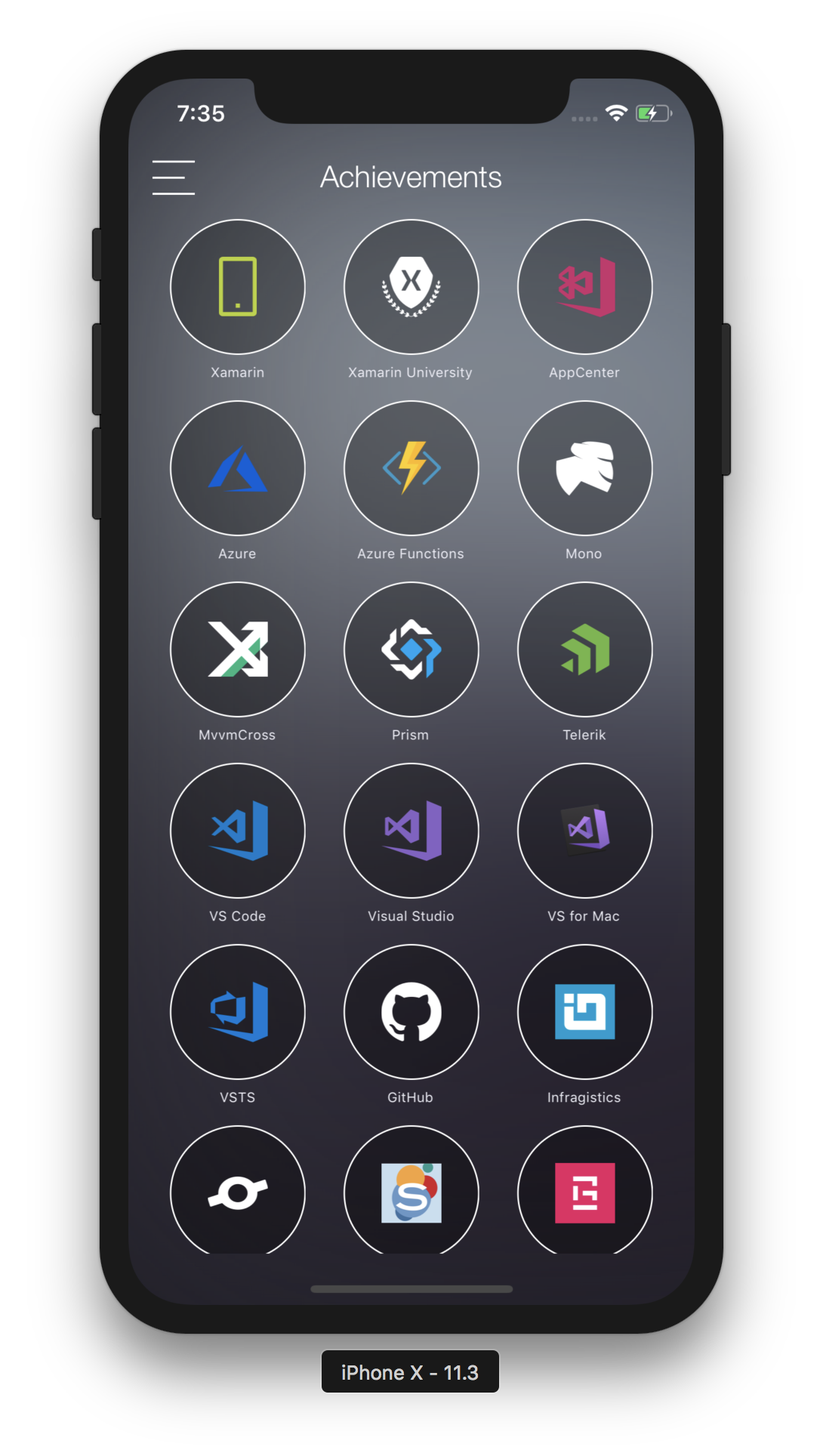
In the few weeks leading up to the release, David Ortinau built Conference Vision, a mobile app for taking photos during the conference and retrieving tags and text about the images. For added fun, he also included a scavenger hunt of sorts where you could help train vision models and identify mobile related products such as Xamarin and our awesome new monkey.

The goals were to:
- Showcase new capabilities of Xamarin.Forms including FlexLayout, CSS, and Visual State Manager.
- Produce an aesthetically beautiful app to use at Build.
- Show how easy it is to incorporate Cognitive Services for Custom Vision and the Vision API.
- Leverage AppCenter for builds, analytics, and distribution.
- Use the latest preview of Xamarin.Essentials for common cross-platform needs.
For a patterns and practices approach to mobile app development, read through the Enterprise Application Patterns using Xamarin.Forms. The Conference Vision app is not that kind of app and more represents the “get it done” style of development.
Xamarin.Forms 3.0
FlexLayout, CSS, and Visual State Manager were covered in a previous blog with lots of additional resources, so we won’t go into those details here. Instead, the following points out where and how they were used.
FlexLayout
FlexLayout was used largely for the grid of possible achievements one could unlock when taking photos of product logos. However, while reviewing the code you may not realize that this is a FlexLayout.

<local:RepeaterView x:Name="AchievementsContainer"
                    class="container"
                    ItemsSource="{Binding Achievements}">
    <local:RepeaterView.ItemTemplate>
        <DataTemplate>
            <local:AchievementView class="item" />
        </DataTemplate>
    </local:RepeaterView.ItemTemplate>
</local:RepeaterView>
In order to leverage data binding and keep the XAML tidy, a custom repeater control was implemented that one of our engineers, Shane Neuville, put together and shared via gist. There are also other repeater implementations you can find online, but this one was super easy and fit the needs of this project. Since the original is based on StackLayout, this was updated to use FlexLayout. Simple. Yay open source!
CSS
CSS is another way to express styles in Xamarin.Forms, and can be used alongside existing XAML styles. XAML styling was used in a few places such as some global styles a custom font (icon fonts are a great way to add vector images to your app). To add more styling, create individual CSS files for each page. Visual Studio has support for pre-processors, and you can use something like Dan Siegel’s Mobile Build Tools NuGet to add this everywhere.
In the previous XAML snippet you’ll see the class names declared. Here is a look at the corresponding CSS for those:
.container {
    flex-direction: row;
    flex-wrap: wrap;
    justify-content: space-between;
}

.item {
    padding: 0;
    margin: 5,5;
    height: 110;
    width: 90;
}
Visual State Manager
When the phone rotates, the camera interface needs to adjust accordingly. For this, use VisualStateManager and trigger a new state based on the view resize. In the page’s resources decalire styles for each orientation, in the code add an override of OnSizeAllocated, and depending on the orientation tell the controls which state to represent:
VisualStateManager.GoToState(Container, (width > height) ? "Horizontal" : "Portrait");
VisualStateManager.GoToState(LastImage, (width > height) ? "Horizontal" : "Portrait");
Extending Xamarin.Forms
We’ve already noted one way in which to extend Xamarin.Forms by implementing the custom RepeaterView control. This requires no platform code at all.
Effects
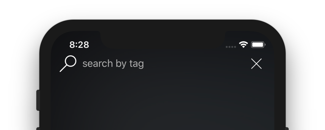
Effects provide a minimal way to tweak a control or layout. Take for example the search entry implemented for filtering the photos taken.

You’ll notice the Entry field doesn’t look like the default Entry, and that’s because two handy effects were added from the XamarinCommunityToolkit to remove the border (on iOS) and remove the bottom line (on Android).
<Entry
    Placeholder="search by tag"
    HeightRequest="40"
    FlexLayout.Grow="1"
    FlexLayout.Order="1">
    <Entry.Effects>
        <effects:EntryRemoveBorder />
        <effects:EntryRemoveLine />
    </Entry.Effects>
    <Entry.Margin>
        <OnPlatform x:TypeArguments="Thickness" Default="0">
            <On Platform="iOS" Value="10,0"/>
        </OnPlatform>
    </Entry.Margin>
</Entry>
To those effects for free, browse through the XamarinCommunityToolkit!
There was another area with specific customization, which needed a separate effect. Such as the content not scrolling behind the navigation bar area but underneath it.

<ListView x:Name="MediaList"
              AbsoluteLayout.LayoutBounds="0, 0, 1, 1"
              AbsoluteLayout.LayoutFlags="SizeProportional"
              SeparatorVisibility="None"
              BackgroundColor="Transparent"
              RowHeight="340"
              HasUnevenRows="false"
              CachingStrategy="RecycleElement"
              ItemTapped="Handle_ItemTappedAsync"
              myeffects:ContentInsetAdjustmentBehavior.ContentInset="0,100,0,0"
              ItemsSource="{Binding Memories, Mode=OneWay}">
            <ListView.Effects>
                <myeffects:ContentInsetAdjustmentBehaviorEffect />
            </ListView.Effects>
In the shared code, a BindableProperty and effect was added to set the inset on the controls (ListView and ScrollView), and then an effect on iOS was created to take that value and apply it to the native iOS control. Just that simple!
Custom Renderer
You can customize a bit of the navigation bar in Xamarin.Forms, though depending on your design goals you may hit a limitation. Custom renderers to the rescue!
Renderers on both iOS and Android were implemented because they both have very different controls for handling the navigation UI. This begins to explain why limitations are present in Xamarin.Forms for customizing the bar and the best next step is to work on the platform controls. To create a renderer and register it with Xamarin.Forms to be used instead of the default renderer, I created a CustomNavigationPage and then in my platform classes exported them as renderers by adding this to each custom platform renderer class (iOS | Android):
[assembly: ExportRenderer(typeof(CustomNavigationPage), typeof(CustomNavigationPageRenderer))]
A few other custom renderers are in this project. Check out the camera view (iOS | Android) and the master detail page renderer (Android).
Cognitive Services
In the app we use Vision in two ways, Custom Vision and the Computer Vision API.
Custom Vision
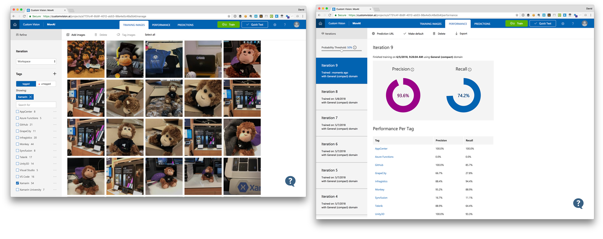
Custom Vision allows us to train a model to recognize products, generally those files and embed them in our mobile application so we can do the analysis offline. The pieces that come together to make this work are the Custom Vision service, uploading training sets of images with tags, generating models, adding those models to the iOS and Android projects, and using those models to identify achievements (or tags). Check out the great guides and documentation on the Custom Vision website, and how we use it within the VisionService.cs class.

During Build 2018 the app was really good at recognizing monkeys and Xamarin, which makes sense as that was the most complete training set. Other achievements were near impossible to obtain until the app is properly trained. So, we added an API call to allow users to upload their images and provide more training. Check out the ImageTrainingView and ImageTrainingViewModel.
More information and examples about Custom Vision can be found on Jim Bennett’s Xamarin Show episode and his blog.
Computer Vision API
Computer Vision allows us to upload images and get back tags and text that can be identified in the image. Take a look back at the VisionService class and how we’re using the Computer Vision NuGet.
Explore Today
The Conference Vision GitHub repositories are linked above with even more interesting things to examine. Grab a copy and explore it yourself, or just install the app on iOS or Android straight off App Center!
Repository: https://github.com/Microsoft/ConferenceVision
App Center:
- Android: https://aka.ms/androidmovai
- iOS: https://aka.ms/iosmovai

0 comments