As most of you know, we’ve rebuilt the editor and much of Visual Studio using WPF for Visual Studio 2010. This allows for a wealth of new visualizations and enables many new extensibility scenarios, often making previously impossible tasks possible and previously difficult tasks much easier. Unfortunately, the WPF text team has been plagued with complaints of text blurriness in all WPF applications, including VS 2010. They’ve been working hard to fix text rendering issues, and less than a week ago they announced additional WPF text clarity improvements for WPF 4.0. These improvements are not in the VS 2010 RC but will be included in RTM, and they’ll also benefit any application using the final release of WPF 4.
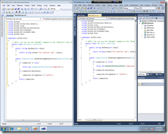
Take a look at the following side-by-side comparison of the default Visual Studio color scheme in VS 2008, left, and an internal VS 2010 RTM build, right, using Consolas (originally published by the WPF text team on their blog). Can’t tell the difference? That’s the idea. If you compare your own installation of the VS 2010 RC against the VS 2010 RTM image, you should see a noticeable difference, and RTM should look crisper.
[Note: Please click on the following screenshot to see the full-sized image.]
The WPF team also received feedback that light text on a dark background was particularly problematic. To see the difference pre- and post-fix, check out this enlarged comparison of VS 2008, VS 2010 RC, and VS 2010 RTM (originally published by Scott Hanselman on his blog):
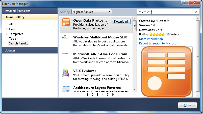
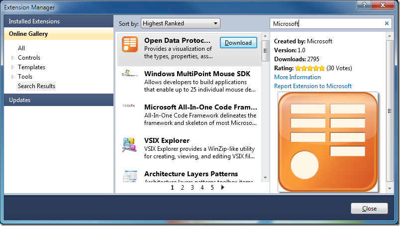
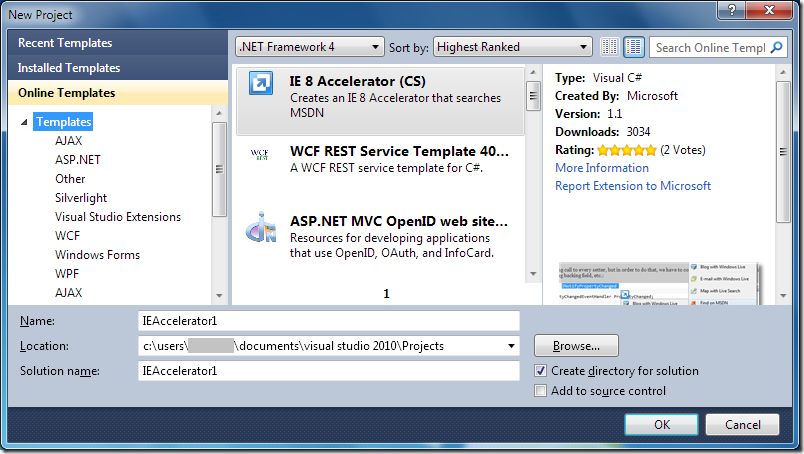
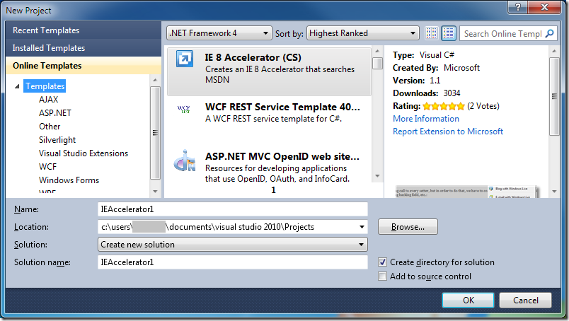
Again, these changes are not specific to Visual Studio and will benefit any WPF 4 application. But because we’ve had questions in this blog’s comments about the impact of this fix on other pieces of VS 2010 UI, here are a few “before and after” screenshots with side-by-side comparisons of the VS 2010 RC and a more recent internal VS 2010 RTM build*:
Tool window tabs, horizontal:
Tool window tabs, vertical:
Extension Manager:
New Project Dialog:
For more images of the text editor, please take a look at the WPF text team’s original blog post on this topic. To give feedback on these changes, feel free to leave a comment for WPF or e-mail their team directly via their blog’s contact link. And if you have any Visual Studio-specific questions, comments, concerns, etc., you can always leave a comment here.
Brittany Behrens Program Manager, Visual Studio Editor Team
* Special thanks to Paul Harrington, author of the Visual Studio Blog’s WPF in Visual Studio 2010 series, for the non-editor screenshots in this post.


 I’m Brittany, a Program Manager on the Visual Studio Editor team. Some of you may recognize me from
0 comments