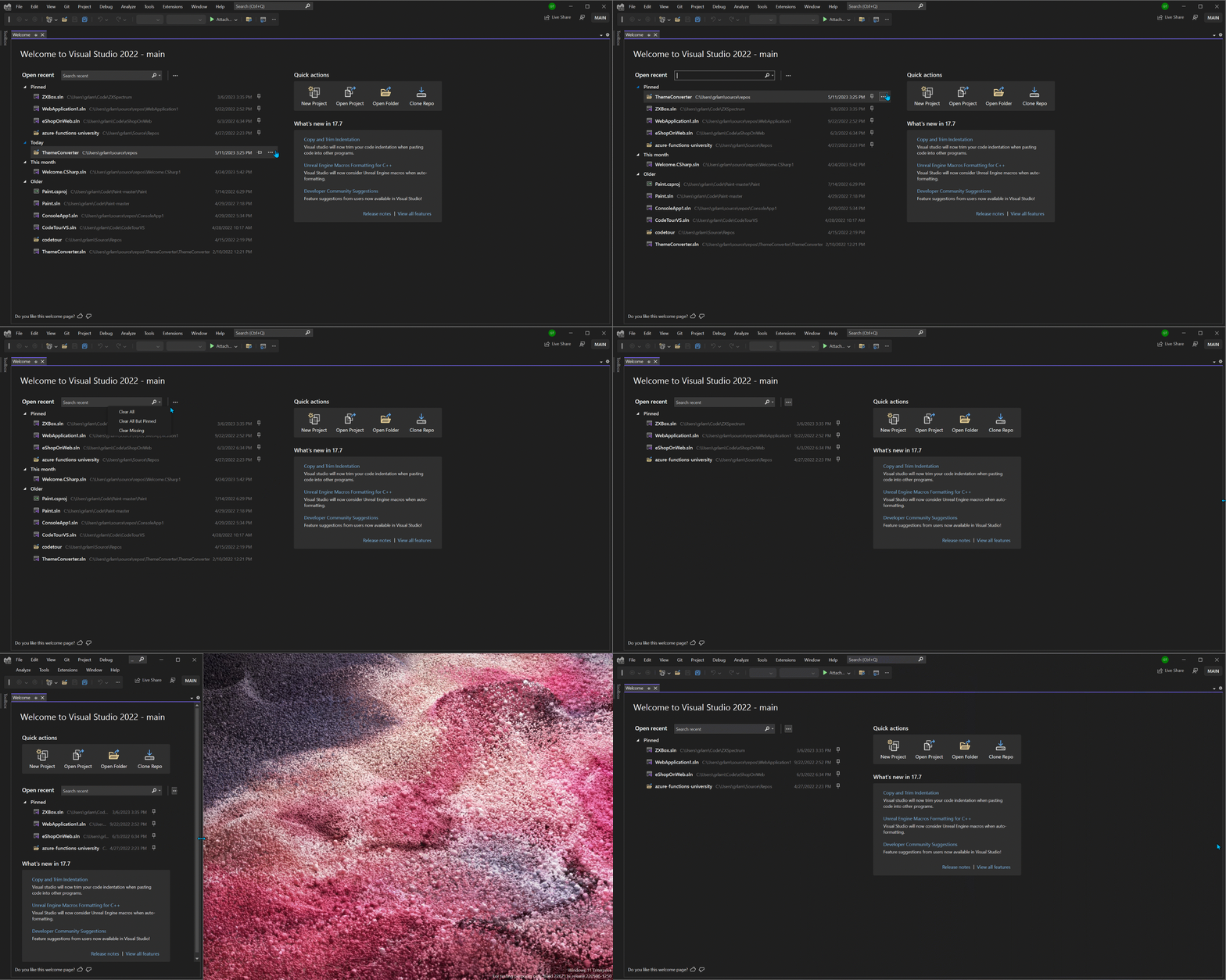
One of Visual Studio’s goals is to help you quickly ‘get to code.’ We’ve recently experimented with Welcome Experience in Preview that helps you get to the code and tasks that you care about, right within the Visual Studio shell. Take a look at the original Welcome Experience design and its motivations in the previous blog post. Developers like you shared a lot of great feedback for that experience, so we’ve iterated once more. Read on to learn about the design and functionality changes we made to the Welcome Experience. To give this experience a try, please install the latest Visual Studio Preview build:
One of the main issues that many of you pointed out in the original Welcome Experience was how the design felt empty or small for developers with larger screens. We’ve addressed this by designing a layout that uses more horizontal space for larger screens, and we’ve made the elements more space-efficient by adjusting margins and removing one of the headers. This means that the design is now responsive, so the elements will stack nicely on a small screen too.
We’ve also received feedback that the “Most Recently Used” (MRU) section of Visual Studio no longer meets the needs of modern developers. Some developers had over 50 items on the list, while others had items that had been deleted from disk. Now, you can remove individual items, missing items, or all items from the list. This means that your Welcome experience will only show you the most useful information, and it will always be up to date.
Let us know what you think!
We understand that your Welcome impacts how you begin your workflow, and we’re excited to hear your thoughts on this new Welcome. If you’d like to give it a try, download the latest Visual Studio Preview today and let us know what you think on this Developer Community ticket!


fixing user experiance…..
editor states doesnt have x/y/z…. literally unable to say HEY install this dep!!! [but you all had the audacity to make visual code… ]
instead we have hilarious /s problems like 2019…. you ever have a fun project on tools 141/142/143… hint one of them is so badly supported you may as well flush your software and start from scratch
https://chanmingman.wordpress.com/2021/01/17/msb8020-the-build-tools-for-v142-platform-toolset-v142-cannot-be-found/
after installing 2017… 2019 and having 2022 the whole time…. then when trying to install 2019 tool set to update on version the trash tier item decides 2022 it is and you are now on 143….
Just a few changes and good old Start page is back https://lh3.googleusercontent.com/-HGETK8S4inE/WNlaNdfkqPI/AAAAAAAAGJc/gWsXohh5rck/visual-studio-2017-start-page-default_thumb%25255B1%25255D.png?imgmax=800
More better to me, I hope you can add a context menu “Open Folder in File Explorer”.
Looks "better", but definitely needs grouping. Imagine having 3 or more projects (in the meaning of Software Projects), each consisting of a few or even many solutions. Some solutions in them may even have same or similar names, this is not manageable with pinning alone. Currently I rely on the file manager to open a solution instead. Especially since the search is the slowest thing I have ever seen. Even the web search in the windows start button is faster, which makes no sense at all.
Get rid of the 10 "Recent Projects and Solutions" in the File menu, link...
I added my observations to the Community Ticket mentioned above.
Second this!
1. Need grouping, not just pinned
2. Open the project in a new window
Great! Here’s my suggestions:
– Horizontally center the whole content. In wide screens the content is sticked to the left and the right side is empty.
– Bring back the blog section
– Ability to reorder pinned items
Looks like a big improvement over the current modal!