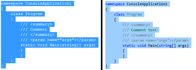
As you may have noticed, text selection in Visual Studio 2010 is a bit more colorful than in previous versions. In VS 2008 and earlier, selected text had a single foreground color and a single background color, usually white text on a navy blue background by default. However, we have made substantial changes and improvements to the Visual Studio Editor for this release, including the new for VS 2010 ability to compose different display layers together. One of the many benefits of this is that we can combine the background color for selection with the foreground colors for a variety of other display items (plain text, keywords, comments, etc.) to show syntax coloring not only for unselected text but now for selected text as well, which we think makes selected code easier to understand. Check out this side-by-side comparison to see the difference:

In light of this new mini-feature, we intentionally disabled the foreground color option for Selected Text in Tools->Options->Environment->Fonts and Colors. Because selected text doesn’t have a single foreground color but instead retains whatever syntax coloring it had when not selected, an option for selected text foreground color doesn’t make sense for Visual Studio 2010. For Beta2, the Tools->Options preview for Selected Text always shows the VS 2008-style white foreground color, which we realize can be confusing. We’ve already updated this internally so that for VS 2010 RTM, the Item Foreground Color dropdown and the Sample preview box will show your default Plain Text foreground color instead of white, giving you a more accurate idea of what selected text will look like in the editor.
This is one of many improvements we were able to make by moving the editor to WPF – hope you enjoy it!
Brittany Behrens
Program Manager, Visual Studio Editor Team


0 comments