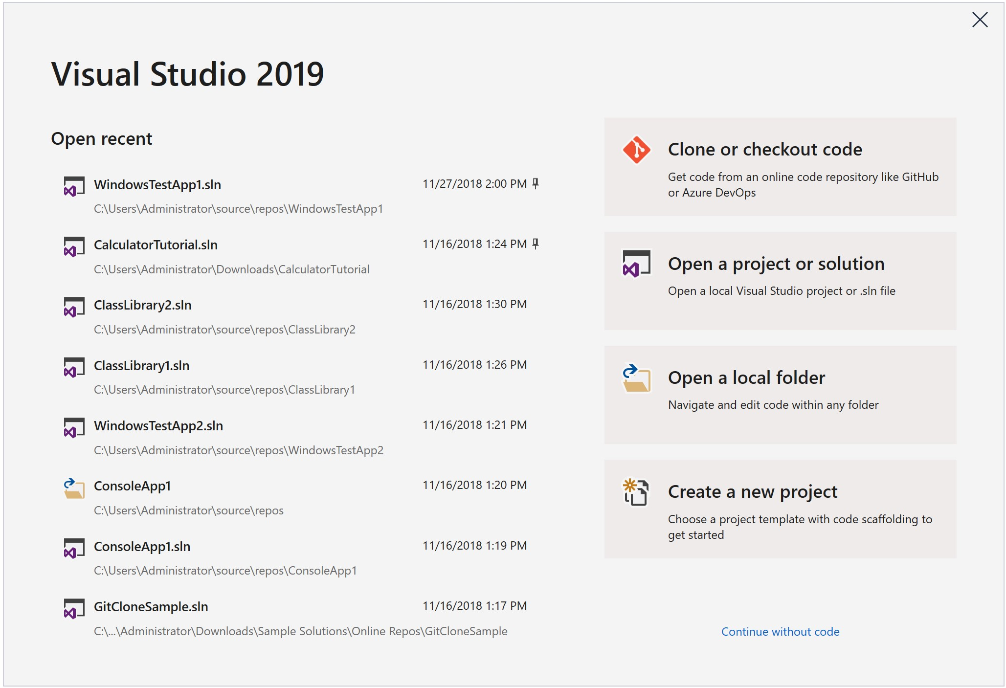
By now, many of you may have noticed a very prominent change to the launch of Visual Studio in Visual Studio 2019 Preview 1. Our goal with this new experience is to provide rapid access to the most common ways that developers get to their code: whether it’s cloning from an online repository or opening an existing project.

A month ago, we shared a sneak peek of the experience (in the blog post A preview of UX and UI changes) and mentioned the research and observation that we used as input into the design and development. This is the story about how we got there.
How & why we began this journey
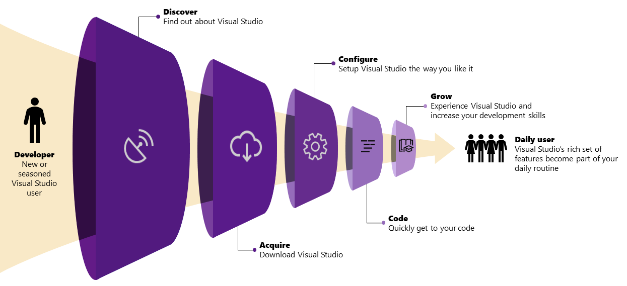
Two years ago, we reinvented the Visual Studio installation experience to offer developers the ability to install exactly what they need and reduce the installation footprint of Visual Studio. We broke Visual Studio down into smaller packages and components and then grouped them together into development-focused workloads (which are bundles of packages and components). We quickly realized that the installation was just one piece of the journey our users take when they are getting started with Visual Studio.
We began to think more broadly – beyond just the installation of the bits, to explore the developer journey of getting to code. This journey starts from the moment you think about that great idea for an app all the way to writing your first lines of code, and integrating Visual Studio into your daily routine. To help us understand what developers were doing throughout their first launch, we built a data informed model of the customer journey.

These insights helped improve installation success rates and address common failures but lacked the ability to answer questions around why some users drop off from one step to the next and how do we make sure Visual Studio meets the need of millions of developers? Some of you may even be trying to better understand how to make your own consumer or business customers more successful with your products.
So, from there we turned to existing mechanisms like surveys, interviews, social media (blogs), and A/B experimentation to help us understand where and how to improve these experiences. The surveys received an overwhelming number of responses (thank you to those of you who contributed!) and provided us with a foundation of anecdotes that helped us understand our individual users even more. They helped us recognize the different types of users coming into our “front door”, which is to say the first place they learn about Visual Studio and decide to download it. We identified through early cohort analysis, that almost half (50%) of users downloading were brand new to Visual Studio (but not necessarily new to coding) and only some of those users came back to Visual Studio for a second time. This was a surprising moment for us as we had no idea why this was happening!
Going beyond the data
We knew we needed deeper insights into how we could help new users be successful with their first time in Visual Studio and assist them in making the best choices along their journey. Fundamentally, we wanted to identify what the “Magic Moment” would be for them in Visual Studio. The “Magic Moment” is a phrase commonly used by product teams that maps a set of events or an experience a user has with a product that transforms them from a casual user trying something out to an avid, loyal user who finds success and even promotes the product. This moment is at the very core of identifying patterns to indicate users who will integrate a product or tool into their daily routine. We didn’t know what our Magic Moment was just yet, but we had a lot of ideas on what we believed it might be, so we asked ourselves:
Is there something new Visual Studio users do in the IDE that indicates they will return or abandon after 5 minutes?
We set out to answer this question by:
- Observing developers, both brand new to Visual Studio and seasoned, as they find Visual Studio to download, configure, and start writing code.
- Identifying the problems that they encountered throughout their journey to code.
- Building hypotheses and concepts around getting to a “Magic Moment.”
- Validating the hypotheses and concepts via an iterative process of weekly testing and experimentation.
Our iterative process from interns to external users
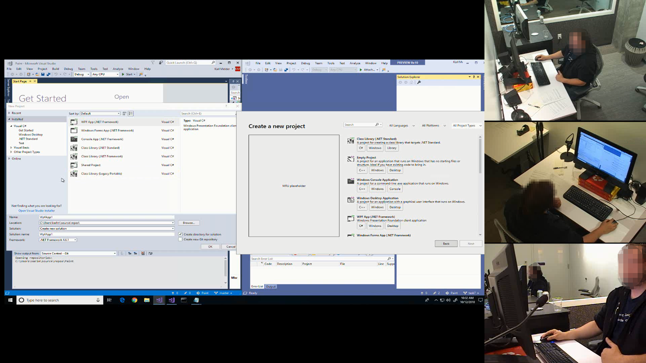
We started by asking our summer interns to install and use Visual Studio for the first time in our user experience (UX) lab and document their journey. We were surprised at how long and difficult the journey from download to writing and running code was for them. We also gained insights into their expectations for Visual Studio based on other editors and IDEs they had previous experience with.
Our first step was simple: we gave participants a clean virtual machine with only Windows 10 installed and asked them to find, install, use Visual Studio, and “do whatever is natural to you to get started.”
We then just watched…

Turns out even students think the 40 year-old concept of writing a “hello world” app is a great starting place. What also became extremely clear to us was that moment when users were writing and running code – we saw them become more engaged with Visual Studio and having fun. We saw an emotional change when they wrote their own code, compiled it, fixed some things, and ran it. We had a strong inkling that we were even closer to the “Magic Moment.”
We then scaled up our research to bring in more new and experienced developers every week. We tested out many ideas using low fidelity mockups built in PowerPoint and eventually moved to higher fidelity prototypes. We tried variations of tasks and UIs as we tested our assumptions. There were multiple problems to solve but one of the most significant became clear when we saw new Visual Studio developers struggle when trying to open code or create a new project. The first view of Visual Studio was overwhelming with no clear guidance of what they should do first. So, we set out to focus on that stage of the journey in our designs and storyboards for Visual Studio 2019. The design process looked a little something like this:


Bringing all our insights into Visual Studio 2019
From all the design explorations, experiments, and observations, evolved an idea of the start window which would offer a focused experience to quickly get you to writing those first lines of code. Given our insights, we wanted to ensure users, especially those new to Visual Studio (some who are already experienced in other development tools), could quickly experience that “Magic Moment” of writing their first lines of code and successfully run it each and every time.
The start window would support new Visual Studio users by:
- Highlighting the choices, they must make during the early, crucial steps of getting started with Visual Studio.
- Removing distractions and providing suggestions for the best path forward.
- Enabling a search and filter focused experience for creating a new project.
- Promoting a streamlined online repository-first workflow.
Developers who are already well-versed and experienced with Visual Studio might be wondering what’s in it for them. What we’ve heard from experienced developers is that onboarding junior developers is very challenging, so we believe the new start window is a step towards ensuring they are more successful in getting to their code each time they open the IDE. We will also continue to preserve and enable existing workflows in the start window to support the muscle memory that experienced users have established with Visual Studio. Lastly, seasoned developers in the user experience lab were delighted by the new “Clone and check out code” experience which brings your online repositories right to your fingertips on launch.
Anatomy of the start window
We know the list of recent projects and solutions is one of the most common ways developers open code, so it was very important that we maintain this list in the most prominent part of the start window. We also knew it was VERY important to not break existing flows where developers open projects/solutions from the desktop (by double-clicking) – so the start window will never show in this flow, as your code will always take priority and open immediately.
Bringing a more focused, source-first experience of clone and check out code (like the Start Page had) to the forefront of Visual Studio was an opportunity to not only show new users the power of source providers like GitHub and Azure DevOps. We have also heard from our research with developers that this action is a more prominent part of a their daily workflow.
Opening a project or solution brings forward the concept of Visual Studio project and solution files that you can click on to open your entire codebase if you have an MSBuild-based solution. But if you use a non-MSBuild build system, such as CMake, then we would recommend opening a local folder instead. We’ve been investing in support to allow you to browse, edit, build, and debug any code without a .sln or project file. You can learn more about Open Folder, including how to configure a different build system to work with it, in our documentation. In addition, if you want to browse loose files in Visual Studio, you can just open the containing folder and pick up the file from the folder view of Solution Explorer.
Creating a new project is a big part of getting to your code in Visual Studio even when it’s prototyping some throwaway code in a simple template (like the Console App) or trying out the capabilities of a new platform or language for the first time. Based on the workloads you install, you’ll always see the most commonly used templates first. We’ve observed that developers first think about the kind of application they want to build (a mobile app, a website, etc.) and not the language – so we removed the language centric tree hierarchy and have improved searching and filtering to help you get to the right template more quickly. You’ll also find a more prominent list of recently used templates so you can quickly get back to your favorite template with a single click.
Lastly, continue without code offers developers a one-time escape from the window for the times when a different action is needed to start work (like joining a Live Share collaboration session, or attaching to a process). Alternatively, hitting the ESC key will also dismiss the window and immediately bring up the IDE. If there are other scenarios that you perform frequently and think should have a home on the start window (like for example attaching to a debugger), please upvote or create a suggestion in our Developer Community.
What’s next for this experience
In just a week, after releasing Visual Studio 2019 Preview 1, we’ve heard developers tell us the start window provides a “focused way to get to the most common things.” We’re already working on some of your feedback, such as support for Team Foundation Version Control and better scan ability in the recent solutions/projects list.
The start window experience is just one part of the journey we’re on to continue to streamline the onboarding experience to Visual Studio. Our longer-term vision includes improvements like reducing the number of choices required to download and install and offering relevant samples and tutorials to assist when learning a new language or platform.
Tell us what you think
As you can tell from the journey we’ve taken to get here, your feedback is essential to making this experience better. We’d love to have you try it out for a few hours in your everyday work. If it still doesn’t jive with you, then you can revert to the previous Visual Studio ‘start’ behavior. Go to Tools > Options and search for ‘Preview Features’ which will allow you to configure this setting along with a few other preview features. Alternatively, you can find the option in Tools > Options | Environment | Startup.

After you’ve experienced Visual Studio 2019 Preview 1, please help us make this the best Visual Studio yet by letting us know what you like or tell us what is not working well for you. And of course, if you run into any issues, please let us know by using the Report a Problem tool in Visual Studio. You can also head over to the Visual Studio Developer Community to track your issue or, even better, suggest a feature, ask questions, and find answers from other developers.

Fails miserably, NO DEV NEWS and there is no way to PERMANENTLY REMOVE the annoying window.
We don't like the new start page.
This has been pointed out a number of times since early 2019 and the only response we've gotten is "How can we make our start page better?" We don't want your start page. We want our start page. One that we can customize, or dismiss, or dock, or leave open... just like the old start page.
Maybe your test groups were discouraged from comparing it to the old start page. Maybe they didn't use a workflow that actually incorporated consistent use of the start page.
If you have any doubts about whether the...
Well, as Steve notes here, the ticket was closed. That's disappointing. My primary objection is that it's a roadblock as Buddy Z notes and I will often launch VS with the intent of opening a project in a bit. Having the start window hanging out on top of the vs window is visual noise. I really dislike it.
Luckily, Jan Kučera has created an extension which (for the moment at least) brings back the old experience:
Start Page on Startup
Please revert this decision.
This is brutal… The Start Page works great as a docked window, not a ROADBLOCK when first opening the app. Did you at least build in a command line switch to skip this??? Because /nosplash doesn’t work, and I don’t see any command line switches in the documentation that would affect this. Try again Microsoft.
I really applaud all the effort that goes into all this research and testing. It seems like you guys know how to iterate and design new features.
What I don't understand is despite all the research and effort, the teams end up with such forgettable, infurriating, and/or user-hostile implementations. With a start screen like this that I can easily check 'dont show again', it only pains me for a moment. But even that option seems gone on this version.
Meanwhile, the entire visual studio IDE freezes constantly and the source control is implemented as a fake web-page-like half-interface.
I've been...
How to open Start page?
The results of this process have been a failure so far. A cursory glance at the submissions regarding the new start experience will convince you. I say this as a Microsoft lover, as a Visual Studio lover, and as someone who seeks out change and improvement. Try again, iterate until it does not fail the test of: ‘Is this really better??’ The team responsible for the title-bar fiasco have the same situation. Keep at it – you’re not there yet…