Document Management Improvements: Vertical document tabs are here!

Stephanie Su

Demonstration of Vertical Tabs

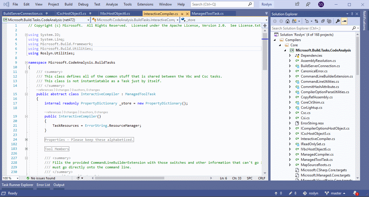
We are excited to announce that the first preview of Vertical Document Tabs is available as part of Visual Studio version 16.4 Preview 2. Vertical tabs give you the option to better utilize horizontal screen space and at the same time gives more vertical space for your code. It lets you see more of your open document tabs and gives an intuitive and flexible way of ordering them.

Enabling Vertical Document Tabs

Vertical Tabs in Tools > Options

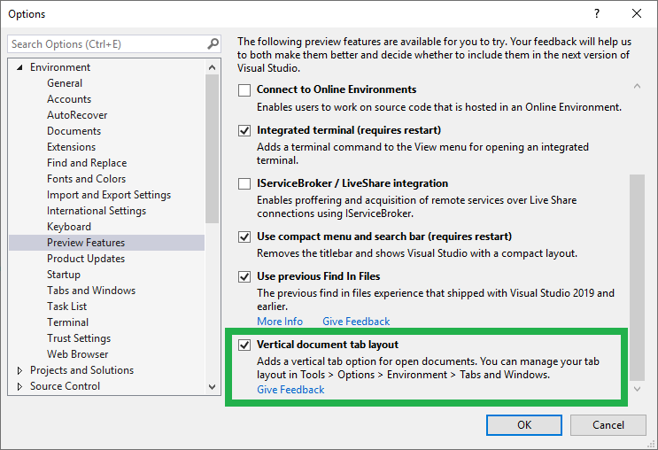
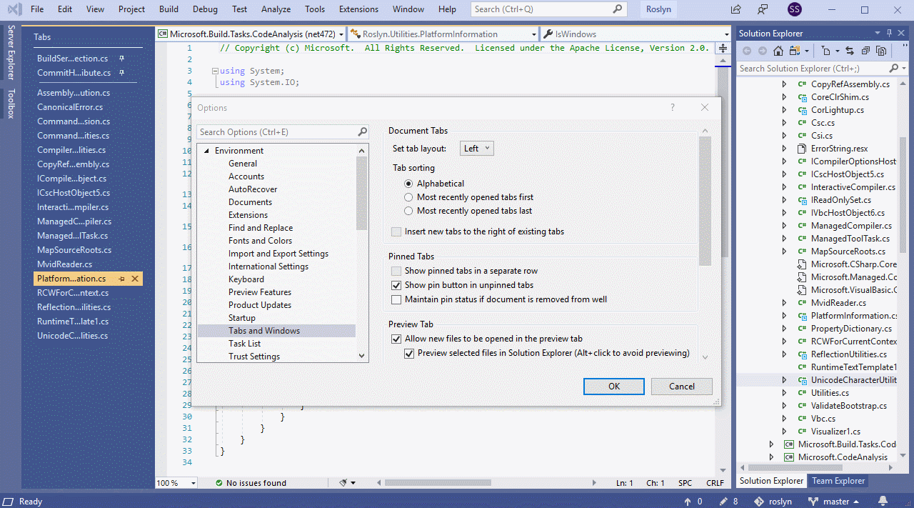
To try out vertical tabs, enable Vertical document tab layout feature by going to Tools > Options > Environment > Preview Features. Once the feature is enabled you will be able to see additional settings for vertical tabs under Tools > Options > Environment > Tabs and Windows and to easily change tab layouts between the three orientations (left, right, and top) with the document tab’s right-click context menu.

Two ways to change tab layout

What’s New in the Vertical Layout

While designing for the vertical layout, we took the opportunity to improve on today’s document management experience.

Easily Change Layouts

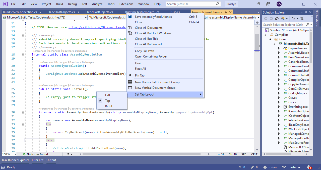
Easily switch your tabs to the left, to the right, and back to the top as needed with the right-click context menu.

Right-click context menu to change layout

Sorting

Take control of how your tabs will be opened. In addition to the default alphabetical sort, we’ve added the ability to have your tabs open via most recently opened as well. While alphabetical sort has a fixed order, most recently opened will allow you to rearrange the order of your tabs after opening them.

Change tab sort order

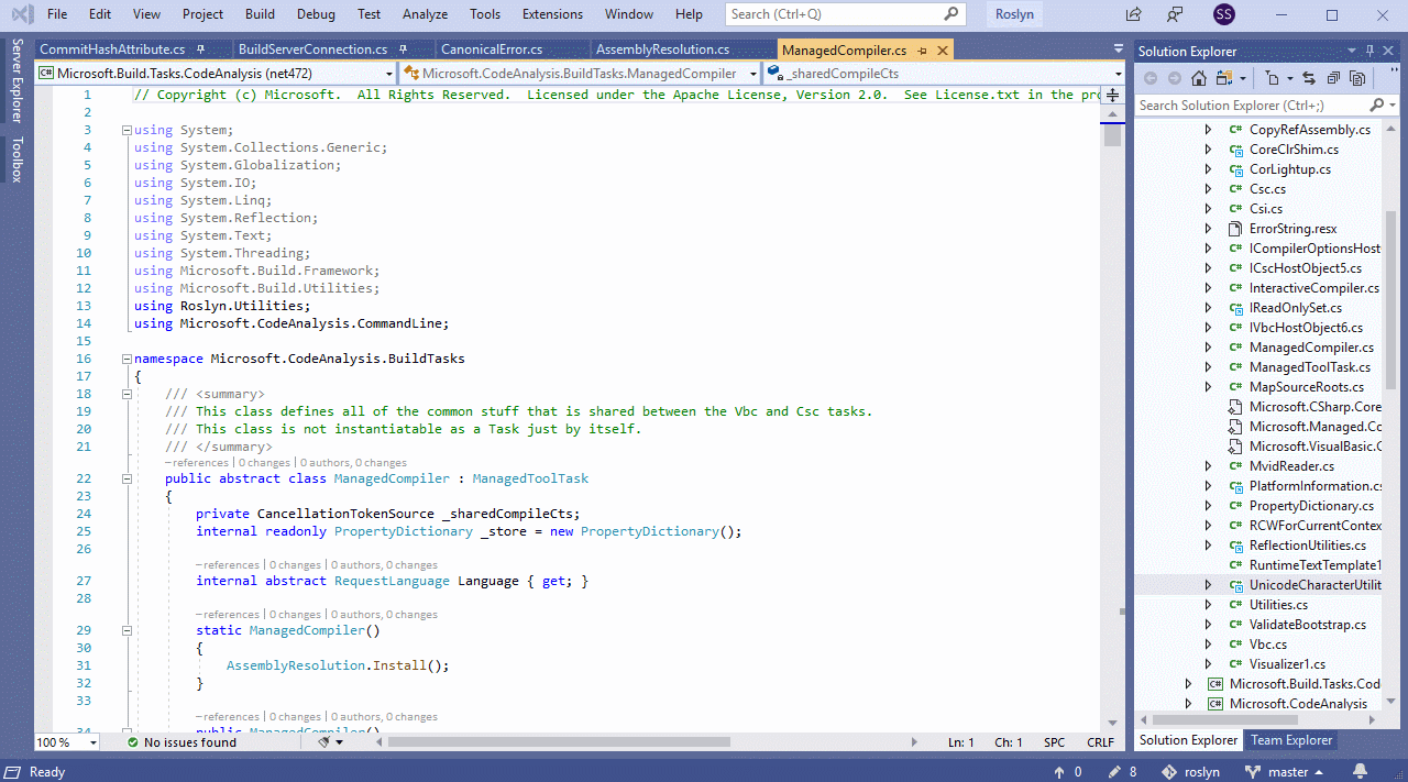
Vertical and Horizontal Document Groups

Vertical and horizontal document groups are also easily manageable with just one vertical tab well.

Vertical document groups with vertical document tabs

What’s Next?

Vertical Tabs

This is the first peek at the work we are doing in bringing vertical tabs to Visual Studio. For next steps, we will be monitoring all the feedback to identify any key missing features or enhancements needed for the feature.

Document Management

The Vertical Document Tabs feature is just one step in a larger effort to improve the document management experience in Visual Studio. We will be looking at other features that will help boost productivity like grouping, adding more sort types, and improving today’s horizontal tab experience. For a full list of suggestions we are tracking, take a look at this Developer Community ticket.

Try it out and let us know how we did!

Answer our survey here or through the Give Feedback link listed under our feature in Tools > Options > Environment > Preview Features > Vertical Document tab layout to help improve the feature.

26 comments

Discussion is closed. Login to edit/delete existing comments.

  • Karl Shifflett 0

    Why this feature? So much screen space lost. Will never use it.

    Why not add open tabs to the right-click menu on the tab to switch to another tab that is out of view?

    • Sergey 0

      I second Karl’s sentiment – I’ve never seen or heard of anyone really wanting something like that. How about you guys put your efforts into bringing back Start Page instead? Now that would be a clear productivity boost.

      • Pratik NadagoudaMicrosoft employee 0

        We’re tracking a suggestion ticket to make the start window non-modal – https://developercommunity.visualstudio.com/idea/435168/make-the-visual-studio-2019-start-window-non-modal.html. I apologize for the delay in action, but please feel free to chime in there with your vote. In addition the team would love to hear about any specific productivity losses you’re facing with the start window, if you email us at vsgtcfeedback at microsoft dot com. Thanks!

        • SuperCocoLoco . 0

          What users are requesting is to restore the Start Page and allow the custom Start Pages like in previous versions of Visual Studio. Custom Start Pages not run on Visual Studio 2019.

          Making the ugly, unuseless and garbage Start Screen non modal, not solve the problem.

          Please, listen to your user base and read all the comments instead of continue patching something that is bad, unproductive and no one wants.

    • MichaÅ‚ Rzepa 1

      Try and use it, you’ll never again use another solution 😉 This was a long missing feature stopping a lot of people with migration to VS 2019

    • Jonathan Trumbull 1

      Screens are usually much wider these days so it is an efficient use of real estate. Also, this means you can see all yours tabs even when bunch or open.

    • Kasper Bergh Østergaard 1

      Because while it uses up more screen space than horizontal tabs the space it uses is far less valuable screen space. With 16:9 and 16:10 wide-screen monitors everywhere we have tons of free horizontal space for vertical tabs to use. But we have very limited vertical space for placing horizontal tabs, which is the single most important space for seeing more code on screen.

      Also it actually makes pinning tabs useful. Try it.

  • DarkGray Knight 0

    I would prefer the tabs to be a separate window option that can drop in with Solution Explorer (or even part of Solution Explorer as a filter for only open files).

    • Stephanie SuMicrosoft employee 0

      You can filter your Solution Explorer today to show only open files. With focus inside the Solution Explorer, try the shortcut key: Ctrl + [ O.

      There is also an icon in Solution Explorer today that you can use to do this filtering. Pending changes filter (clock icon with a funnel in the top left) and open files filter (file icon with a funnel in the top left) are the two filters available today.

      Please do give it a try and let us know what you think and if it solves your needs. Feel free to email me at stsu [at] microsoft [dot] com to follow up as well.

  • Ben 0

    Just as horizontal tabs have horizontal text, when using vertical tabs I would strongly prefer the text be vertical as well. Vertical tabs and horizontal texts is a great waste of space.

    • Kasper Bergh Østergaard 1

      That would be pretty unreadable. The point is that horizontal space is large while vertical space is at a premium. Thus it’s better to use a bit more horizontal space with vertical tabs than waste precious vertical space.

      Also this way makes it a lot easier to navigate, read tab names and use pinning effectively.

  • Michael Künneke 1

    Cool feature, especially for wide screens! It would be neat to have some sort of grouping/color coding by document type, e.g. XAML files go into one group, code files into another etc.

  • Darren Knowles 0

    Excellent news, so glad to see this finally make it into Visual Studio as a native feature. I’m currently using the brilliant Custom Document Well in 2019 as horizontal tabs make VS inefficient to the point of unusable for even moderately large projects.

    Not sure I’ll stop using the extension immediately though, tabs need to be colour coded based on the project they’re in (the second most requested feature for VS 2019) but you’re onto a good thing with the Document Groups. If each project in the solution forms it’s own Document Group automatically and each Document Group has its own distinct tab colour then that will be damn near perfect 🙂

    Keep up the good work and thanks for listening to the community.

  • Francis Gomes 0

    I like this feature Vertical Document tabs. Previously, I would pin some frequently referred to documents which would occupy the top horizontal tab bar, and the transient ones would overflow into multiple tab bars. How does pinning behave in the vertical format?

    I had to uninstall VS 2019 due to the following usability features:
    1) New project dialog interface. Absolutely detest this interface. The previous interface served the purpose. The tree view was simple to navigate and sufficient for the number of templates bundled with the product. There was clear separation of templates packaged with the product and the templates from the marketplace. The search bar to the top right allowed to hone into a particular template.

    2) Trackpad input handling. Whenever I need to scroll, I use the two finger slide up and down. Instead of scrolling, the editor increases or decreases the font size or rather magnifies. This happens even when I have the cursor placed on the scroll bar. Happens in VS Code too. I am not viewing an Image or Photo that I would like to zoom to 1000%! How often does some one need to zoom in or zoom out a text document? We set the size we need based on our age from the drop down in the left corner of the document well (and perhaps just once). Whereas we need to scroll the document often. I can understand if it is an image editing tool where I may frequently zoom in to see the details, pan to an area etc. Seriously, someone needs to pay attention to UI/UX.

    3) I suspect Intellisense hampers my keying or typing. I type fast, so randomly the cursor jumps over to other lines and places the key strokes or sometime highlight and delete paragraphs of code, or switch to a different tab. Happens in VS Code too.

    I also like the CTL+Q search feature.

    • Pratik NadagoudaMicrosoft employee 0

      The team and I are super interested in chatting with you about the new project dialog to understand how it doesn’t match up to your use cases. We’d love to learn more and see what we can do to improve the experience. Feel free to email me at prnadago at microsoft dot com. Thanks for the feedback!

      • Chuck Ryan 0

        Pratik, you have been posting these “let’s have a chat” messages all over the place and under other circumstances it might be a good idea. But the fact is our feedback has not been, like you see in response to this feature, general approval and suggestions on how to make it better. No, our feedback has been that your team’s design just does not fit the purpose of the dialog at all.

        When I am lucky enough to tune out all distractions, and focus intensely on my task, my mind can be several steps ahead of my hands and then i need to add a new project to my solution so I right-click, select add, select new project and your new project dialog appears and it is like expecting to walk through a door into another room and you slam face first into the door because someone locked it.

        I lose my focus and find myself no longer thinking about my task but how am I going to get this dialog to display the project template I need. This is beyond frustrating and there is no cosmetic change you can make to this that will change the fact that this design is not suited for this purpose.

        I have also heard the explanation that this is to help new users of Visual Studio find what that are looking for but again, if you do not already know Visual Studio well it just makes it harder than the simple tree view ever did.

        And finally your design, unlike the vertical tabs shown here, is not optional.

    • Kasper Bergh Østergaard 0

      I strongly suspect #3 is because you hit the track pad with your wrists or similar while coding leading to unintentional clicks that will move the cursor. If you happened to also press shift when it happens a block of code will be selected and immediately overwritten as you keep typing.

      I’ve seen this exact issue sooooo many times.

  • Bryan Russell 0

    So glad to get the vertical tabs back. I resisted the move to 2019 simply because this was missing. Finally gave in and updated to VS2019, but never got used to the top tabs.

    Even more pleased with how splits are all handled within the one document well! Previously the two document wells consumed so much real estate that a left / right split was nearly impossible.

    Thanks so much to the entire team.

  • Kasper Bergh Østergaard 0

    Love this and in particular love the tab groups. That’s real productivity value right there.

    I really want some kind of coloring by project or custom rules although it should be a bit subtle.
    And I really want more sorting options (by project, by type, completely custom instead of timestamp you can rearrange and probably more).

    A lot of people will complain about the whitespace – while I think it could perhaps be optimized a bit in some cases (a narrow tab well should sacrifice whitespace over readable tabnames and such and the headers are… Large) I actually think it looks nice in general and helps in quickly locating the tab I want rather than being densely packed.

    All in all a huge thumbs up for this.

    One question. Is the font (and font size) of the tab text customizable as a separate option in VS? I would like to be able to use a custom narrow but very readable font.

  • Michal Krchnavy 0

    Hello Stephanie,

    thank you, and your team very much for implementing such a cool feature.

    Please when do you expect to be released?

    (I’m currently using the customized version of Custom Document well, extension. Can’t live anymore with horizontal tabs :))

    Thank you,
    Michal

  • Chuck Ryan 0

    In all a good start, but some issues:

    Tab Groups – Like the concept but no way I would use it with it splitting the editor for each group without at least a 49″ ultrawide monitor, and probably not even then as the IDE is busy enough without trying to see your teeny tiny colored line, at the top of the split to indicate which split goes with the group selected. Also the tab well looks like it is associated to the first split but not the additional splits.

    Project Groups – Add a way to group by project, without splitting the editor, perhaps with an OPTION to filter the displayed tabs by the group you are in.

    Tab Coloring – Coloring options by file type, project, folder, etc…

    Customizations – Allow customizing the tab well fonts, colors and docking with autohide.

    Right now it is ok but needs work to make it good. I do realize that you are handicapped by the overall poor UI design of the IDE but I hope that can slowly change over time with new features like this if the effort is made.

  • Neil MacMullen 0

    I posted this on feedback but perhaps more likely to get noticed here…

    I’ve just been playing around with the “vertical document tabs” feature which is quite nice but only has the ability to order files by the time they were opened. I often have a mix of files open – ones that I’m actively editing and ones I’m just using for reference or where I’m just touching a line or two to match changes in the “main” file. Sorting by open-time just results in a confusing arrangement and I waste time trying to get back to a particular edit point.

    I’d really like to be able to order these in a way that places the “main” file on the left and then less referenced files to the right (in order). In other words, I’d like to VS to track the amount of “activity” in a file and use that for ordering of the tab group. A very simplistic approach to this would be to use the last-modified date but a more sophisticated approach would be nice.

    An alternative/complementary approach might be to automatically place open-but-unmodified files in a separate tab group.

  • Hugo Quezada 0

    Such amazing feature.

    Will be interesting also have the option to have it in the left (or right) and in superior strip, as always.

    In my 29 inch screen looks amazing, actually I’m using like the 33% of the screen for code and the rest for undocked tools windows.

  • Ronald Chambers 0

    Very good tool. All I’d like added is ability to change font size and vertical spacing between items. Or have an option to fit all the items within the space provided.

    Thanks,
    RONC

Feedback usabilla icon