As we were beginning the development of Visual Studio 2012, the user experience teams from across Microsoft worked together to align the design of our products and services around a set of core company-wide design principles that each product and service applied to their specific domain. Windows Phone 8, Windows 8, Office 2013, and Visual Studio 2012 were the first wave of releases to reflect these shared principles in their new designs.
Having a more unified and consistent experience is growing in importance as we increasingly interconnect the new device platforms, tools, and services we are introducing this year and beyond.
Visual Studio 2012
The principle that had the greatest impact on the visual design of Visual Studio 2012 is frequently abbreviated as “content before chrome.” Applied to a development tool like Visual Studio, this principle translates to giving the content being created/edited dominant screen real estate and visual prominence.
Driven by this principle, the primary changes made to the visual design of Visual Studio 2012 were:
-
Increased content area by 3 lines of code in most contexts, through reduction of the interface chrome and toolbar real estate
-
All of the icons were redesigned in a simplified, modern style to reduce visual clutter
-
Introduced the Light and Dark themes, which utilize neutral tones to allow the chrome to recede and the content to stand out
-
The Status Bar was colorized, changing color to draw attention to the IDE state
Some of these changes to the user experience have been well received (or go largely unnoticed as a natural part of streamlining existing workflows). However, in some areas, we’ve received feedback that the changes in colors and designs went so far that they negatively impacted productivity and reduced the usability of the product.
Visual Studio 2013
In Visual Studio 2013 we are continuing to remain true to the Microsoft design principles while refining the VS 2012 visual design to address feedback and make improvements.
We have made broad but incremental changes, some of them subtle. Our overall aim is to have VS 2013 feel familiar to VS 2012 users, but better.
The changes are in the four primary areas which are explained and illustrated below.
Theme Chooser and Connected IDE
Starting with Update 2 of Visual Studio 2012 and moving forward, there are three built-in Color themes: Blue, Dark, and Light. Our surveys tell us that there are very strong feelings about the color themes—there is substantial support for all three, with each theme having at least 25% of developers who prefer it.
In Visual Studio 2013, you will be able to choose your preferred color theme when you first launch.
First-launch theme chooser
Working with the new connected IDE feature, the theme that you choose will be stored in the cloud in your Visual Studio account, and will roam to other Visual Studio 2013 machines you use. Of course, you can still change the theme via Tools > Options at any time.
In Visual Studio 2013 each of the three themes is on equal footing. You choose your theme once and then you’ll not need to set it again.
In our surveys of users, when we compare the themes that they prefer to the themes that our data shows they are using, there is a consistent gap—40% to 45% of users are not running the theme that they prefer. Our primary aim with this new experience is to help more people land in the theme that they will be most satisfied with.
Color Theme Enhancements
For the Light and Dark themes we have received feedback about insufficient contrast between areas of the IDE and about difficulty locating the separators between windows.
In Visual Studio 2013 the themes have been revised to address this feedback by increasing contrast in the color palette and with the introduction of more border line work highlighting the edges of content areas.
Hover color
New border line work
Icon Colors
Based on your feedback, we have systematically added color to a large number of icons to increase their distinguishability and recognizability.
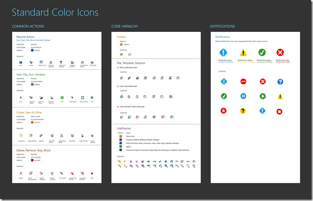
We have followed the icon color system diagrammed below, which uses accent colors in a consistent way while keeping them distinct from the colors used to draw attention to warnings/errors.
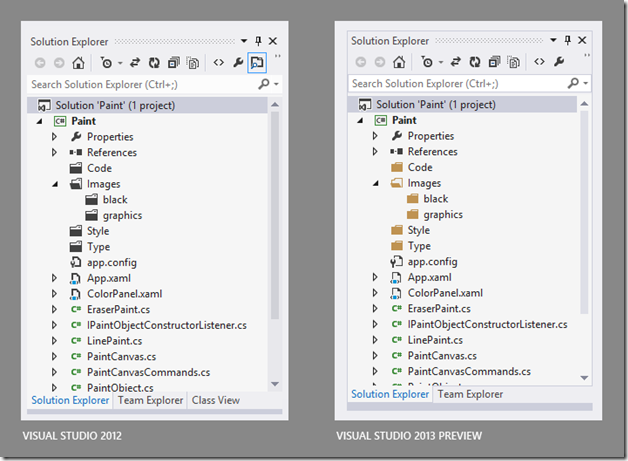
The additions to the color system in VS 2013 are primarily to the icons that include folders and to icons for save-related operations.
Icon Color System in Visual Studio 2013 (click to enlarge)
Examples of new color icons
Icon Redesigns
Feedback about the icons with rectangular shapes was they were too heavy, causing them to be hard to distinguish from one another. We have addressed this with a systematic redesign of the common square/rectangular icons.
For some families of icons we received feedback that they didn’t properly convey the intended concept, or were too visually similar at a glance to other icons in the product. Many of these icons have been redesigned, most notably the family of icons that are work item-related.
Examples of redesigned icons
Summary
Building on the major design changes in Visual Studio 2012, and utilizing the feedback you’ve given us, we are making targeted refinements to the visual design of Visual Studio 2013.
Visual Studio 2013 (click to enlarge)
Feedback
Thank you for all of the feedback you provided about Visual Studio 2012.
We encourage you to try the Visual Studio 2013 Preview and then share your feedback. We are committed to continuing to improve the Visual Studio user experience based on your feedback.
There are several convenient ways to provide feedback:
- If you have questions or comments about this post, please use this blog’s Comments.
- If you run into something frustrating (or pleasing) while you’re using the VS 2013 Preview, there is a new Send a Smile feedback tool in the upper right of the Title Bar.
- If there is a specific feature or visual change you would like to see in VS, please use User Voice to propose it (or to vote on it if it has already been proposed).
- If you run into a bug in the VS 2013 Preview, you can file it via the Visual Studio Connect site.
Thanks!


0 comments