
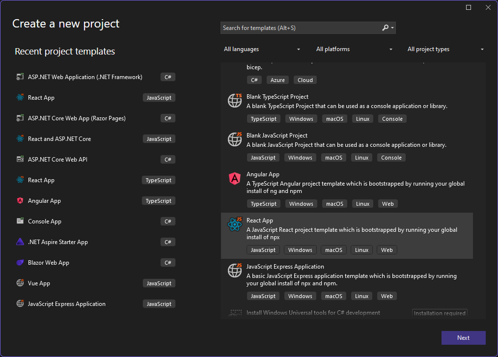
In this tutorial we will create a React front-end, with JavaScript, of a TODO web app using a Visual Studio 2022. To get started install Visual Studio with the Node.js development workload. This will include the JavaScript/TypeScript (JSTS) projects and the associated support. The code for this app can be found at sayedihashimi/todojswebapp (github.com). Create a new React project using the New Project Dialog in Visual Studio 2022. Use File > New > Project … to open that dialog. For this tutorial select the React App JavaScript template which is shown below.
After clicking Next, give the project the name TodoWebApp and click Create. This will create the JavaScript project using the vite command line tool. Now create a new component to encapsulate the todo list functionality. First create a new folder named components under the src folder. This is the folder where all components will go. It’s a common convention to place components in a components folder, but this is not required. Right click on this new folder and select Add > React JSX Component File, give it the name TodoList as shown in the following image.

This will create a new jsx file in the components folder. For now, replace the Hello World content with the h2 as shown in the snippet below.
function TodoList() {
    return (
        <h2>TODO app contents</h2>
    );
}
This component displays a header for now. We will replace this soon. Let’s wire up this component in the app and then later replace the contents with the desired functionality. Let’s add this component to the app and remove the boilerplate content that is no longer needed.
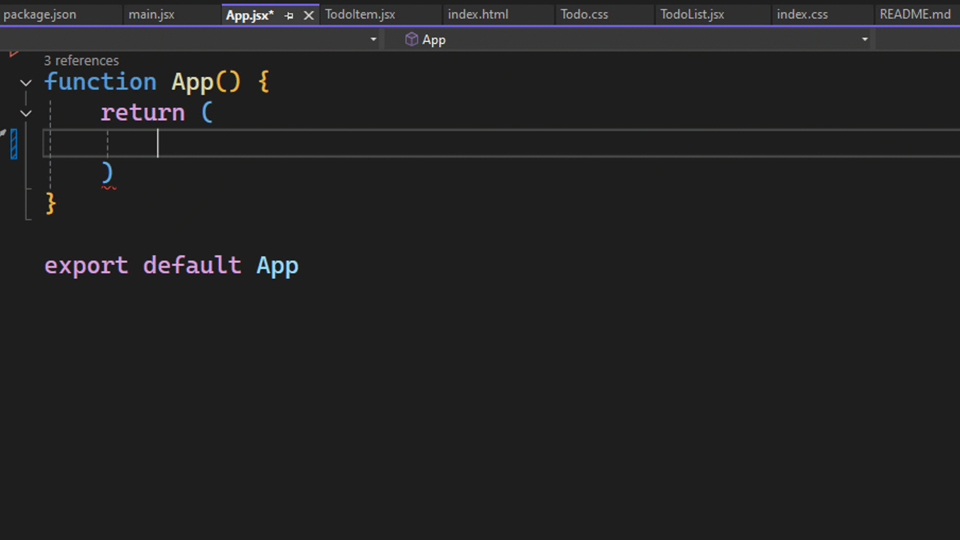
Open the App.jsx file. This is the main component that is loaded which represents the todo application. This is used in the main.jsx file. For this tutorial we will not need to modify the main.jsx file. In App.jsx, remove all the imports from the top and clear out the contents of the return statement. The file should look like the snippet below.
function App() {
    const [count, setCount] = useState(0)
    return (

    )
}

export default App
To add the TodoList component, place your cursor inside the fragment and then type <TodoL RETURN. This will add the component and the import statement. You can see this in the below animation.
Now let’s clear out the CSS files so that we can start with a fresh start. Open the App.css file and delete all the contents. In the Index.css file remove all contents except the styles for :root. The Index.css file should look like the following.
:root {
font-family: Inter, system-ui, Avenir, Helvetica, Arial, sans-serif;
line-height: 1.5;
font-weight: 400;
color-scheme: light dark;
color: rgba(255, 255, 255, 0.87);
background-color: #242424;
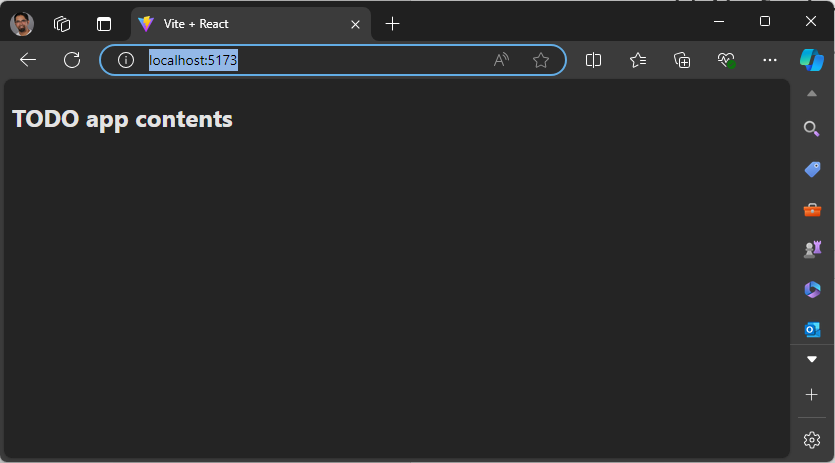
}Now run the app to ensure that everything is working as expected. You can use the Start Debugging button from the toolbar or the F5 keyboard shortcut. After that a browser window should open with the following content.
This would be a good time to create a commit in case you need to roll back to a good state later. Now that you’ve started the app you can leave it running, as you make changes the app will automatically refresh with the latest content using the Hot Module Replacement support. Some actions like adding folders or renaming files will require that you stop debugging and then restart it but in general you can leave it running in the background as you develop your app. Open the TodoList.jsx component so that we can start to define that.
In TodoList.jsx first add the UI needed to show and manage todo entries and then hook it up to store the values after that. Update TodoList.jsx to have the following content.
function TodoList() {
    return (
        <div>
            <h1>TODO</h1>
            <div>
                <input
                    type="text"
                    placeholder="Enter a task"
                    required
                    aria-label="Task text" />
                <button className="add-button" aria-label="Add task" >
                    Add
                </button>
            </div>
            <ol id="todo-list">
                <p>existing tasks will be shown here</p>
            </ol>
        </div>
    );
}

export default TodoList;
We have added an input box for the todo item as well as a button to submit that. The existing tasks will be displayed under the input and button, but we will get to that soon. Now that we have the input field to get a new task added, we will wire up the Add button. We will use the useState React hook to add two state variables, one for the task which is getting added and another to store the existing tasks. For this tutorial the tasks will be stored in memory we will not add a database for persistent storage. Add the following import statement to TodoList.jsx to import useState.
import { useState } from 'react'
Now we can use that hook to create the state variables. Add the following code in the TodoList function above the return statement.
const [tasks, setTasks] = useState([
    "Drink some coffee",
    "Create a TODO app",
    "Drink some more coffee"]);

const [newTaskText, setNewTaskText] = useState("");
This will setup two variables, tasks and newTaskText, for the data and two functions that you can call to update those variables, setTasks and setNewTasks. When a value for a state variable is changed React will automatically re-render the component. We are almost ready to update TodoList.jsx to show the todo items as a list, but there is an important React concept that we must explain before doing so.
In React when you display a list of items you will need to add a key to uniquely identify each item in the list. This is explained in depth in the React docs at Rendering Lists, but we will cover what is needed for this tutorial. We have a list of todo items that we want to display, and we need to associate a unique key for each item, the key for each item should not change. Since the key for each item should not change, we cannot use the index of the item in the array as the key. We need an id which will not change through out the lifetime of those values. We will use randomUUID() to create a unique id for each todo item.
Now let’s create TodoList.jsx using a uuid as the key for each todo item. Update TodoList.jsx to contain the following code.
import React, { useState } from 'react';
import './Todo.css';
import TodoItem from './TodoItem';

const initialTasks = [
    { id: self.crypto.randomUUID(), text: 'Drink some coffee' },
    { id: self.crypto.randomUUID(), text: 'Create a TODO app' },
    { id: self.crypto.randomUUID(), text: 'Drink some more coffee' }
];

function TodoList() {
    const [tasks, setTasks] = useState(initialTasks);
    const [newTaskText, setNewTaskText] = useState("");
    function handleInputChange(event) {
        setNewTaskText(event.target.value);
    }
    return (
        <article
            className="todo-list"
            aria-label="task list manager">
            <header>
                <h1>TODO</h1>
                <form className="todo-input" aria-controls="todo-list">
                    <input
                        type="text"
                        placeholder="Enter a task"
                        value={newTaskText}
                        onChange={handleInputChange} />
                    <button
                        className="add-button">
                        Add
                    </button>
                </form>
            </header>
            <ol id="todo-list" aria-live="polite" aria-label="task list">
                {tasks.map((task, index) =>
                    <li key={task.id}>
                        <span className="text">{task.text}</span>
                    </li>
                )}
            </ol>
        </article>
    );
}
export default TodoList;
Since the id values are assigned outside the TodoList function, we can be sure the values will not change if the page is rerendered. When you try the app in this state, you will notice that you cannot type into the todo input element. This is because the input element is bound to newTaskText which has been initialized to a blank string. To allow users to add new tasks, we will need to handle the onChange event on that control. We also need to implement the Add button support. Add the functions immediately above the return statement in the TodoList function.
function handleInputChange(event) {
    setNewTaskText(event.target.value);
}

function addTask() {
    if (newTaskText.trim() !== "") {
        setTasks(t => [...t, { id: self.crypto.randomUUID(), text: newTaskText }]);
        setNewTaskText("");
    }
}
In the handleInputChanged function, the new value from the input field is passed in via event.target.value and that is used to update the value for the newTaskText variable with setNewTaskText. In the addTask function we add the new task to the list of existing tasks using setTasks and we set the id of the item as a new uuid value. Update the input element to include onChange={handleInputChange} and update the Add button to include onClick={addTask}. This will wire up the event to the function that handles that event. Following this you should be able to add a new task to the task list. New tasks are added to the bottom of the list. To make this app more useful, we need to add support to delete tasks and to move a task up or down. Let’s get started on that.
We will add the functions to support delete, move up and move down and then update the markup to show a button for each action. Add the following in the TodoList function above the return statement.
function deleteTask(id) {
    const updatedTasks = tasks.filter(task => task.id != id);
    setTasks(updatedTasks);
}

function moveTaskUp(index) {
    if (index > 0) {
        const updatedTasks = [...tasks];
        [updatedTasks[index], updatedTasks[index - 1]] = [updatedTasks[index - 1], updatedTasks[index]];
        setTasks(updatedTasks);
    }
}

function moveTaskDown(index) {
    if (index < tasks.length) {
        const updatedTasks = [...tasks];
        [updatedTasks[index], updatedTasks[index + 1]] = [updatedTasks[index + 1], updatedTasks[index]];
        setTasks(updatedTasks);
    }
}
The delete function takes in the task id and deletes that one from the list and uses the Array filter() method to create a new array excluding the selected item and then calls setTasks(). The other two functions take in the index of the item since this is specific to the item ordering. Both moveTaskUp() and moveTaskDown() use array destructuring assignment to swap the selected task with its neighbor. Now we will update the view to include these buttons. Update the return statement to contain the following.
return (
<article
className="todo-list"
aria-label="task list manager">
<h1>TODO</h1>
<header>
<h1>TODO</h1>
<form className="todo-input" onSubmit={addTask} aria-controls="todo-list">
<input
type="text"
required
autoFocus
placeholder="Enter a task"
value={newTaskText}
aria-label="Task text"
onChange={handleInputChange} />
<button
className="add-button"
aria-label="Add task">
Add
</button>
</form>
</header>
<ol id="todo-list" aria-live="polite">
{tasks.map((task, index) =>
<li key={task.id}>
<span className="text">{task.text}</span>
<button className="delete-button" onClick={() => deleteTask(task.id)}>
🗑️
</button>
<button className="up-button" onClick={() => moveTaskUp(index)}>
⇧
</button>
<button className="down-button" onClick={() => moveTaskDown(index)}>
⇩
</button>
</li>
)}
</ol>
</article>
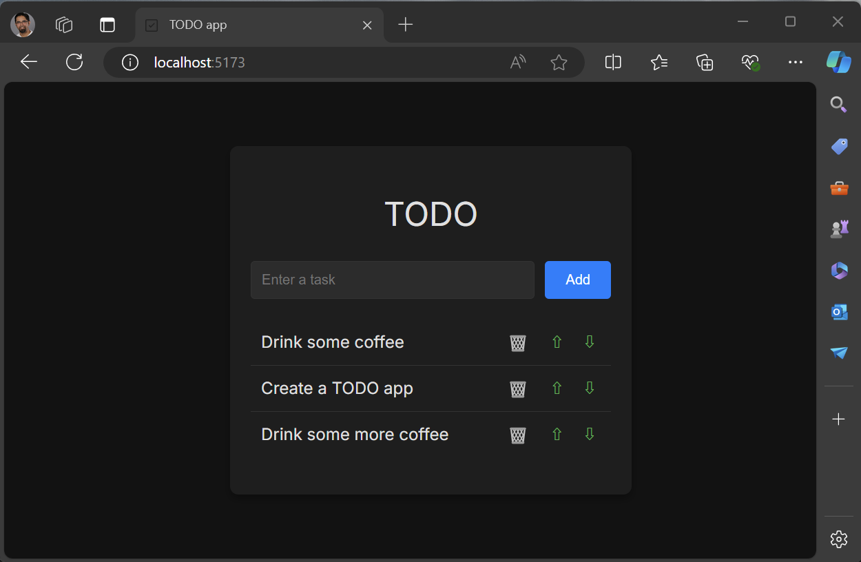
);We have added the buttons needed to perform the tasks we discussed above. We are using Unicode characters as icons on the buttons. In the markup there are some attributes added for when we add some CSS later. You will also notice the use of aria attributes to improve accessibility, the are optional but highly recommended. If you run the app it should look like the image below.

You should now be able to perform the following in the TODO web app.
- Add task
- Delete task
- Move task up
- Move task down
This is working well, but we can refactor this so that we have a reusable component to display the todo items. The markup for the todo item will go into a new component, TodoItem. Since the management of the list will stay in the Todo component, we will pass callbacks to the delete and move buttons. To get started, right click the components folder in the Solution Explorer and select Add > New Item. In the dialog that opens select the React JSX Component File. Give it the name TodoItem and click Add. We will pass in the task and callbacks as props to this new component. The TodoItem should contain the following code.
import PropTypes from 'prop-types';

function TodoItem({ task, deleteTaskCallback, moveTaskUpCallback, moveTaskDownCallback }) {
    return (
        <li aria-label="task" >
            <span className="text">{task}</span>
            <button
                type="button"
                aria-label="Delete task"
                className="delete-button"
                onClick={() => deleteTaskCallback()}>
                🗑️
            </button>
            <button
                type="button"
                aria-label="Move task up"
                className="up-button"
                onClick={() => moveTaskUpCallback()}>
                ⇧
            </button>
            <button
                type="button"
                aria-label="Move task down"
                className="down-button"
                onClick={() => moveTaskDownCallback()}>
                ⇩
            </button>
        </li>
    );
}

TodoItem.propTypes = {
    task: PropTypes.string.isRequired,
    deleteTaskCallback: PropTypes.func.isRequired,
    moveTaskUpCallback: PropTypes.func.isRequired,
    moveTaskDownCallback: PropTypes.func.isRequired,
};

export default TodoItem;
The code above contains the markup from the Todo component and at the bottom we declare the propTypes. Props are used to pass data from a parent component to child components. For more info on props the docs are available at Passing Props to a Component – React. Since the delete and move functions are being passed in as callbacks, the onClick handler will need to be updated to call into those callbacks. The full code for TodoList is below that uses the TodoItem component.
import React, { useState } from 'react'
import './Todo.css'
import TodoItem from './TodoItem'

const initialTasks = [
    { id: self.crypto.randomUUID(), text: 'Drink some coffee' },
    { id: self.crypto.randomUUID(), text: 'Create a TODO app' },
    { id: self.crypto.randomUUID(), text: 'Drink some more coffee' }
];

function TodoList() {
    const [tasks, setTasks] = = useState(initialTasks);
    const [newTaskText, setNewTaskText] = useState("");
    function handleInputChange(event) {
        setNewTaskText(event.target.value);
    }
    function addTask() {
        if (newTaskText.trim() !== "") {
            setTasks(t => [...t, { id: self.crypto.randomUUID(), text: newTaskText }]);
            setNewTaskText("");
        }
        event.preventDefault();
    }
    function deleteTask(id) {
        const updatedTasks = tasks.filter(task => task.id !== id);
        setTasks(updatedTasks);
    }
    function moveTaskUp(index) {
        if (index > 0) {
            const updatedTasks = [...tasks];
            [updatedTasks[index], updatedTasks[index - 1]] = [updatedTasks[index - 1], updatedTasks[index]];
            setTasks(updatedTasks);
        }
    }
    function moveTaskDown(index) {
        if (index < tasks.length) {
            const updatedTasks = [...tasks];
            [updatedTasks[index], updatedTasks[index + 1]] = [updatedTasks[index + 1], updatedTasks[index]];
            setTasks(updatedTasks);
        }
    }
    return (
        <article
            className="todo-list"
            aria-label="task list manager">
            <header>
                <h1>TODO</h1>
                <form onSubmit={addTask} aria-controls="todo-list">
                    <input
                        type="text"
                        required
                        placeholder="Enter a task"
                        value={newTaskText}
                        aria-label="Task text"
                        onChange={handleInputChange} />
                    <button
                        className="add-button"
                        aria-label="Add task">
                        Add
                    </button>
                </form>
            </header>
            <ol id="todo-list" aria-live=polite>
                {tasks.map((task, index) =>
                    <TodoItem
                        key={task.id}
                        task={task.text}
                        deleteTaskCallback={() => deleteTask(task.id)}
                        moveTaskUpCallback={() => moveTaskUp(index)}
                        moveTaskDownCallback={() => moveTaskDown(index)}
                    />
                )}
            </ol>
        </article>
    );
}

export default Todo;
Now the TodoItem component is used to render each todo item. Notice that we set the key to task.id which contains the uuid value for that task. When you run the app, you shouldn’t see any changes to the look or behavior of the app since we refactored it to use TodoItem. Let’s move on to styling.
Now that we have all the basic functions supported, it’s time to start adding some styling to this to make it look nice. Now would be a good time to create a commit to save your progress. Let’s first start by adding a link in the Index.html for a font family, Inter, that we will use for this app. In the Index.html there are some other items that need to be cleaned up. Specifically, the title should be updated and vite.svg file is still being used as the icon. Update the Index.html file to have the following content.
<!doctype html>
<html lang="en">
    <head>
        <meta charset="UTF-8" />
        <link rel="icon" type="image/svg+xml" href="/checkmark-square.svg" />
        <meta name="viewport" content="width=device-width, initial-scale=1.0" />
        <title>TODO app</title>
        <link href='https://fonts.googleapis.com/css?family=Inter' rel='stylesheet'>
        <script type="module" defer src="/src/main.jsx"></script>
    </head>
    <body>
    </body>
</html>
In addition to these changes the file checkmark-square.svg was added to the public folder. This is an SVG from the FluentUI checkmark square image which I downloaded directly. There is a package that you can use for a more integrated experience but that’s outside the scope of this post.
Now let’s update the styles of the TodoList component. Add the following to TodoList.css.
.todo-list {
    background-color: #1e1e1e;
    padding: 1.25rem;
    border-radius: 0.5rem;
    box-shadow: 0 0.25rem 0.5rem rgba(0, 0, 0, 0.3);
    width: 100%;
    max-width: 25rem;
}

.todo-list h1 {
    text-align: center;
    color: #e0e0e0;
}

.todo-input {
    display: flex;
    justify-content: space-between;
    margin-bottom: 1.25rem;
}

.todo-input input {
    flex: 1;
    padding: 0.625rem;
    border: 0.0625rem solid #333;
    border-radius: 0.25rem;
    margin-right: 0.625rem;
    background-color: #2c2c2c;
    color: #e0e0e0;
}

.todo-input .add-button {
    padding: 0.625rem 1.25rem;
    background-color: #007bff;
    color: #fff;
    border: none;
    border-radius: 0.25rem;
    cursor: pointer;
}

.todo-input .add-button:hover {
    background-color: #0056b3;
}

.todo-list ol {
    list-style-type: none;
    padding: 0;
}

.todo-list li {
    display: flex;
    justify-content: space-between;
    align-items: center;
    padding: 0.625rem;
    border-bottom: 0.0625rem solid #333;
}

.todo-list li:last-child {
    border-bottom: none;
}

.todo-list .text {
    flex: 1;
}

.todo-list li button {
    background: none;
    border: none;
    cursor: pointer;
    font-size: 1rem;
    margin-left: 0.625rem;
    color: #e0e0e0;
}

.todo-list li button:hover {
    color: #007bff;
}

.todo-list li button.delete-button {
    color: #ff4d4d;
}

.todo-list li button.up-button,
.todo-list li button.down-button {
    color: #4caf50;
}
This should improve the styling of the app. The app should look like the following screenshot.
Now you have built a working Todo app which stores the todo items in memory. From here you could update the app to store the todo items in localStorage/IndexedDb, or integrate this with a server-side database, or other backend, for more permanent storage.
Recap
In this tutorial you have created a new React app using Visual Studio 2022. The app consists of a todo list, which includes support to add tasks, delete tasks and to reorder them. You created two new React components and used those throughout this tutorial.
Resources
Below are some links to related resources.
- Code for this sample sayedihashimi/todojswebapp (github.com)
- Visual Studio JavaScript and TypeScript projects
Feedback
You can share feedback with us via Developer Community: report any bugs or issues via report a problem and share your suggestions for new features or improvements to existing ones. You can also leave a comment here or reach out to Sayed on Twitter at @SayedIHashimi.