As we’re closing in on the final designs for Visual Studio 11 I want to thank you again for your feedback. I want to pass along that we are still internalizing your feedback and actively working on the next Visual Studio 11 milestones.
The purpose of this post is to follow up on a common request relating to the earlier RC preview post. The request was for more information on the Visual Studio 11 dark theme.
Leading up to our being engineering complete for RC we focused most of our design attention on optimizing the light theme experience, because that’s what our telemetry indicates the majority of you are currently using. Once that was complete, we turned our attention to the dark theme, focusing on the top dark theme feedback we heard from Visual Studio 11 beta. Many of you will see significant improvements to the dark theme in the RC release, but several of the key changes I’m sharing with you now didn’t make the timeline for RC. In this post, I’d like to share what you will see in RTM and call out some of the dark theme improvements we’ve made from beta to RC and subsequently to RTM.
Themed Icons
As a part of giving you a preview of the dark theme I want to call your attention to several important characteristics of the Visual Studio 11 iconography. The first is that the icons are generally much simpler or more symbolic in their form. Secondly the color palette we employ within the icons has been simplified and made much more consistent.
In Visual Studio 11, we generate our icons from a common library of glyphs. This approach improves consistency as we produce the approximately 6000 icons of various sizes and formats that are used in approximately 28,000 different locations throughout the product. This presents an interesting challenge in terms of how to most effectively host these icons in different themes, and on different shaded backgrounds (tool windows, editors, drop-downs).
We considered the pros and cons of outputting separate complete sets of swappable icons for each theme. As we looked into this approach we found it still didn’t allow us to optimize across the various backgrounds on which the icons would be hosted in each theme.
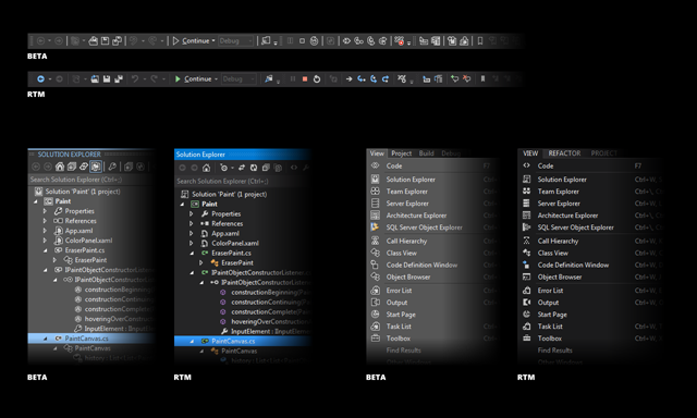
In Beta and RC we used a ghost outline around the icons to make them visible on both lighter and darker backgrounds. The disadvantage of this approach is that it makes the icons appear fuzzy on both themes and too bright in the dark theme.
In the RTM version, we dynamically adjust the icons according to the theme, resulting in icons that are cleaner and better matched to the theme and background color. At runtime, we modify the luminosity of the raster images to match the outline of the icon with the background on which it is drawn and to make the fill and accent colors stand out effectively. For the dark theme, this essentially inverts the brightness of the icon, making dark areas of the original icon light and light areas of the original icon dark. The same happens on the light theme, as icons are displayed on differently shaded backgrounds. The luminosity match makes the background and outline of icons disappear as it matches the surface color they are displayed on.
The difference between the traditional outline based approach we used for beta and RC, and the approach we employee for RTM, is readily apparent in the following screenshots.
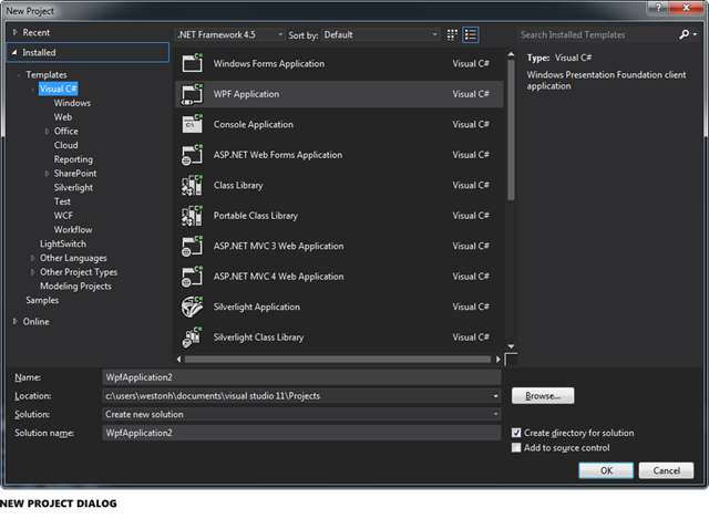
In addition to being simpler in form, and being better suited to dynamic theming, glyph style icons also lend themselves to much cleaner resizing or scaling. All of our Visual Studio 11 icons are maintained in an icon repository as vector graphic files which we output in various file formats and sizes as needed within our products. For example the same glyph can easily be rendered in a size and format appropriate for use in different Visual Studio 11 contexts such as the Solution Explorer or the New Project Dialog.
As a part of the Visual Studio 11 overall release plan we will be making all of the icons for this release available to you in multiple file formats including vector. You are free to take full advantage of the easy theme-ability and resize-ability of these assets within your own applications.
Themed Scrollbars
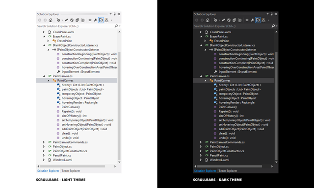
One of the most common requests for dark theme enhancements has been for us to theme scrollbars. As I hinted at previously we were close to sharing with you in our last post that scrollbars will be custom themed within both the light and dark themes. We’ve since completed sufficient testing to feel confident in sharing our RTM designs with you.
Visual Studio’s UI is a mix of WPF, Windows Forms, Win32, HTML, and other UI technologies which made scrollbar theming a challenging project. Because there is no single technology solution to theming all scrollbars in VS, we applied scrollbar theming on a technology-by-technology basis. We created a style targeting ScrollBar and ScrollViewer in the root of VS document and tool windows. In some cases, where it’s not appropriate to show a themed scroll bar, the UI can opt-out. An example is a pop-up dialog that will continue to show light even in the dark theme should not show dark scroll bars.
Individual pieces of UI can opt-out of themed scrollbars by setting a special property on the HWND. UI may decide to opt-out if it is not optimized for the dark theme or if it presents a very specific user content.
The themed scrollbars are designed to work together with the RC changes we shared with you previously, such as drawing our own custom window chrome, to improve the overall sense of coherent styling within Visual Studio 11. As I mentioned above we would like to hear more regarding your impressions of the cumulative updates we’ve shared with you.
Dark Editor Theme
Many of you have expressed a preference for coding within a dark editor. For example, dark editor themes dominate the list of all-time favorites at web sites such as http://studiostyl.es/ which serve as a repository for different Visual Studio styles.
Chief among the reasons many of you have expressed for preferring dark backgrounds is the reduced strain placed on the eyes when staring at the screen for many hours. Many developers state that light text on a dark background is easier to read over longer periods of time than dark text on a light background.
Downloading styles from web sites such as Studio Styles provides a great starting point to begin customizations. With that in mind, we themed every single customizable item and category in the Fonts and Colors list to be consistent with the overall dark theme design. This way, further customizations can be made and new features introduced in Visual Studio 11 will benefit from the defined default dark fonts and colors. We made several dark editor theme updates in RC in keeping with beta and early RC user feedback, including:
- Improving the contrast of the whites and grays in the editor fonts and colors to “pop” over the similar text colors used in the IDE/Shell
- Increasing saturation for several default dark colors to improve their visibility
- Enhancing “Use Defaults” to work as expected for all categories in the Fonts and Colors dialog when in the dark theme
Common Dialogs
In RTM you’ll also find that we have themed a core set of the commonly used dialogs. The New Project, New Web Site, Add New Item, Extension Manager, and Reference Manager dialogs now have dark theme versions of their UI.
For those of you who choose to work within the dark theme you will undoubtedly want us to continue to push our theming efforts deeper and more broadly across Visual Studio. We too are eager to continue our work in this area through the remainder of this release cycle and beyond.
Bringing it All Together
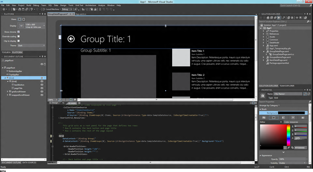
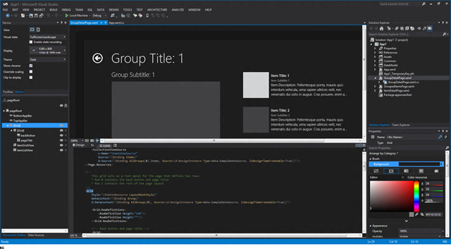
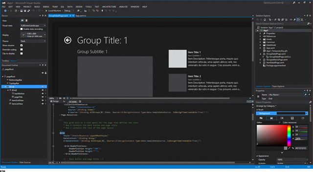
I’ve included a screenshot that helps bring into focus how the various dark theme updates such as the shell, editor, design surfaces, etc. all fit together. The screenshot below shows a dark themed Visual Studio 11 with the Windows 8 simulator running in the foreground.
As was the case with the changes we announced as part of the previous RC preview post the RTM changes reflected in this post are designed to both address core feedback areas and to maintain alignment with our primary design objectives for the release. I’m hoping you will take the time to share your feedback on these newly announced RTM changes.
 Monty Hammontree – Director of User Experience, Microsoft Developer Tools Division
Short Bio: Monty has been at Microsoft for ten years focusing primarily on developer tool experiences. He and his team provide product design and user research direction for the Visual Studio product family. He has 25 years of industry experience in product design and user research management.




0 comments