
Previously, I explained how to create a keyboard input scope application for Windows Phone 7. In this blog post, I want to share a sample that will help you to create a panorama and pivot effect in Windows Phone 7. A Panorama is any wide-angle view or representation of a physical space, whether in painting, drawing, photography, or a three-dimensional model. This feature allows you to view controls, data, and services by using a long horizontal canvas that extends beyond the confines of the screen. A Pivot is a page orientation in which a rectangular page is oriented for normal viewing. It helps you to easily manage views or pages. In this application, I will demonstrate how to create both panoramic and pivot experience for Windows Phone 7. Sounds interesting? So let’s begin.
But hey, wait a minute! Before you create the panorama and pivot effect application, you need to install the following applications:
- Visual Studio 2010 Professional, Premium, or Ultimate. If you do not have any of the releases, you can download any of the following trial versions as per your preference: Professional, Premium, or Ultimate.
- Windows Phone Developer Tools RTW
- Visual Basic
for Windows Phone Developer Tools – RTW
Note: You can install the newer version- Windows Phone Developer Tools 7.1 Beta instead of the above mentioned two tools as it will take comparatively less time. However, this sample was created using the previous version.
The panorama and pivot effect can be created in 7 easy steps as follows:
- Create a sample application and add controls and event handlers
- Create a pivot page
- Add controls to the pivot page
- Create a panorama page and set the background image
- Add controls to the panorama page
- Build and debug the application
- Rebuild in the release mode before publishing
Step 1 – Create a sample application and add controls and event handlers
Create a sample application
- Create a new project and browse to the “Silverlight for Windows Phone” node.
- Select the “Windows Phone Application” template.
- Enter a name for the application.
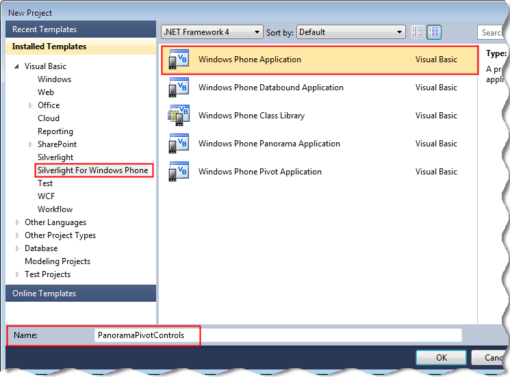
- Click OK. The MainPage.xaml page is displayed.
- In Solution Explorer, right-click the application name, and then add a new item. The Add New Item dialog box is displayed.
- Select the “Silverlight for Windows Phone” node, and then select the “Windows Phone Panorama Page” template.
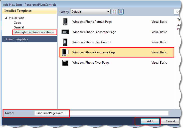
- Enter the name as “PanoramaPage1.xaml”, and then click Add. The PanoramaPage1.xaml page is displayed.
- In Solution Explorer, right-click the application name, and then add a new item. The Add New Item dialog box is displayed.
- Select the “Silverlight for Windows Phone” node, and then select the “Windows Phone Pivot Page” template.
- Enter the name as “PivotPage1.xaml”, and then click Add. The PivotPage1.xaml page is displayed.
Add controls
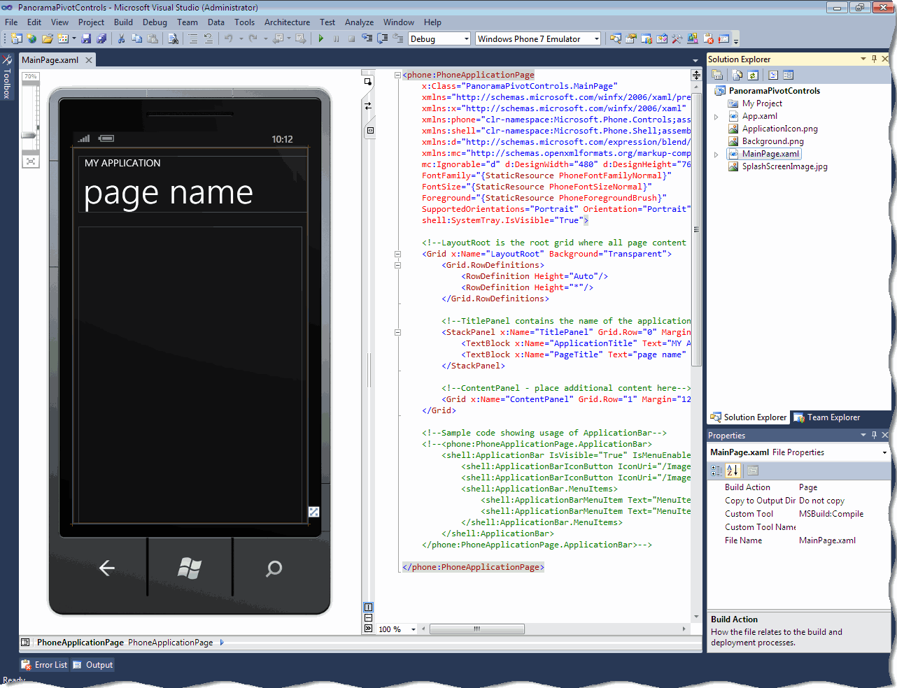
- Open the MainPage.xaml page.
- Click the MY APPLICATION text. In the Properties window, change the text property to “PANORAMA AND PIVOT CONTROLS”.
- Click the page name text. In the Properties window, change the Text property to “select”.
- From the toolbox, drag and drop the Button control to the design surface.
- Click the Button control. In the Properties window, change the Text property to “Panorama Experience”.
- From the toolbox, drag and drop another Button control to the design surface.
- Click the Button control. In the Properties window, change the Text property to “Pivot Experience”.
- Add the following code, to set the height, width, and the alignment of both the controls:
<Button Content=”Panorama Experience” Height=”168″HorizontalAlignment=”Left” Margin=”35,82,0,0″ Name=”btnPanorama”VerticalAlignment=”Top” Width=”383″ Click=”btnPanorama_Click” />
<Button Content=”Pivot Experience” Height=”168″HorizontalAlignment=”Left” Margin=”35,297,0,0″ Name=”btnPivot”VerticalAlignment=”Top” Width=”383″ Click=”btnPivot_Click” />
Add event handlers
It is essential to add an event handler to the application because it helps to navigate to the panorama or the pivot screen depending on the button clicked.
To add an event handler, do the following:
- Double-click the Panorama Experience button. The MainPage.xaml.vb is displayed.
- Replace the button1_Click event handler with the following code.This method will navigate the user to the screen to view the panorama effect.
PrivateSubbtnPanorama_Click(ByVal sender AsSystem.Object,
ByVal e AsSystem.Windows.RoutedEventArgs)
NavigationService.Navigate(NewUri(“/PanoramaPage1.xaml”, UriKind.Relative))
EndSub
- To define the event handler for the Pivot effect, add the following code. This method will navigate the user to the screen to view the pivot effect.
PrivateSubbtnPivot_Click(ByVal sender AsSystem.Object,
ByVal e AsSystem.Windows.RoutedEventArgs)
NavigationService.Navigate(NewUri(“/PivotPage1.xaml”, UriKind.Relative))
EndSub
Step 2 – Create a pivot page
- Open the PivotPage1.xaml page, and add the following XAML code:
<!–Pivot Control–>
<controls:Pivot Title=”PIVOT CONTROL”>
<!–Pivot item one–>
<controls:PivotItem Header=”item1″>
<Grid>
</Grid>
</controls:PivotItem>
<!–Pivot item two–>
<controls:PivotItem Header=”item2″>
<Grid>
</Grid>
</controls:PivotItem>
<!–Pivot item three–>
<controls:PivotItem Header=”item3″>
<Grid>
</Grid>
</controls:PivotItem>
</controls:Pivot>
- To add the third PivotItem, add the following XAML code:
<!–Pivot item three–>
<controls:PivotItem Header=”item3″>
<Grid>
</Grid>
</controls:PivotItem>
Step 3 – Add controls to the pivot page
Add controls to the first pivot item
- Add a TextBlock control containing wrapping text.
- To create first pivot item, add the following XAML code after the <controls:PivotItem Header=”item1″> tag.
<!–Added textbox control with formatted text–>
<TextBlock
TextWrapping=”Wrap”
Style=”{StaticResource PhoneTextLargeStyle}”>
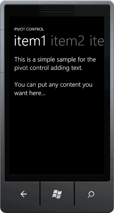
<Run>This is a simple sample for the pivot control adding text.</Run>
<LineBreak/>
<LineBreak/>
<Run>You can put any content you want here…</Run>
</TextBlock>
Add controls to the second pivot item
To create second pivot item, add the following XAML code after the <controls:PivotItem Header=”item2″> tag.
<!–Added background image and text content–>
<Border
BorderBrush=”{StaticResource PhoneForegroundBrush}”
BorderThickness=”{StaticResource PhoneBorderThickness}”>
<Grid>
<Image
Source=”samplePhoto.jpg”
Stretch=”UniformToFill”/>
<TextBlock
Text=”Here is some generic content to take up space.”
TextWrapping=”Wrap”
Style=”{StaticResource PhoneTextExtraLargeStyle}” />
</Grid>
</Border>
Note: This method adds an assortment of content including a background image and wrapping text.
Add controls to the third pivot item
- Add the following namespace declaration in the XAML code:
xmlns:sys=”clr-namespace:System;assembly=mscorlib”
- To create first pivot item, add the following XAML code after the <controls:PivotItem Header=”item3″> tag.
<!–This code is a series of string text values–>
<Grid>
<ListBox FontSize=”{StaticResource PhoneFontSizeLarge}”>
<sys:String>This</sys:String>
<sys:String>item</sys:String>
<sys:String>has</sys:String>
<sys:String>a</sys:String>
<sys:String>short</sys:String>
<sys:String>list</sys:String>
<sys:String>of</sys:String>
<sys:String>strings</sys:String>
<sys:String>that</sys:String>
<sys:String>you</sys:String>
<sys:String>can</sys:String>
<sys:String>scroll</sys:String>
<sys:String>up</sys:String>
<sys:String>and</sys:String>
<sys:String>down</sys:String>
<sys:String>and</sys:String>
<sys:String>back</sys:String>
<sys:String>again.</sys:String>
</ListBox>
</Grid>
Note: This method adds a series of sting text values inside a ListBox control. This allows the user to have the ability to navigate the hosted control. A user will also be able to pan the list contents vertically up or down.
Step 4 – Create a panorama page and set the background image
Create a panorama page
- Open the PanoramaPage1.xaml page, and add the following XAML code:
<Grid x:Name=”LayoutRoot”>
<controls:Panorama Title=”my pano”>
<!–Panorama item one–>
<controls:PanoramaItem Header=”item1″>
<Grid>
</Grid>
</controls:PanoramaItem>
<!–Panorama item two–>
<controls:PanoramaItem Header=”item2″>
<Grid>
</Grid>
</controls:PanoramaItem>
</controls:Panorama>
</Grid>
- To add an additional PanoramaItem control, add the following code:
<!–Panorama item three–>
<controls:PanoramaItem Header=”item3″
<Grid>
</Grid>
</controls:PanoramaItem>
Setting the background image
To set the background image, add the following XAML after the <controls:Panorama Title=”my application”> tag:
<!–Assigns a background image to the Panorama control–>
<controls:Panorama.Background>
<ImageBrushImageSource=”samplePhoto.jpg”/>
</controls:Panorama.Background>
Note: This method sets the background image to the default “samplePhoto.jpg” image. You can set any other image as the background as well. The recommended dimensions for a background image is a height of 800 pixels and a width less than 2000 pixels. At a width of 2000 pixels, the picture will be clipped. If your image does not have a height of 800 pixels, it will be stretched to that height without preserving the aspect ratio.
Step 5 – Add controls to the Panorama page
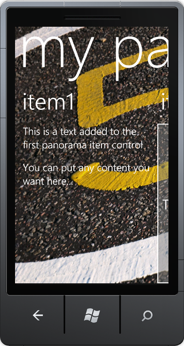
Add controls to the first panorama item
- Add twoTextBlock controls containing wrapping text. Place both the controls inside theStackPanel control.
- To create the first PanoramaItem, add the following XAML after the <controls:PanoramaItem Header=”item1″> tag.
<!–This code creates two TextBlock controls and places them in a StackPanel control–>
<StackPanel>
<TextBlock
Text=”This is a text added to the first panorama item control”
Style=”{StaticResourcePhoneTextLargeStyle}”
TextWrapping=”Wrap”/>
<TextBlock Text=” “/>
<TextBlock
Text=”You can put any content you want here…”
Style=”{StaticResourcePhoneTextLargeStyle}”
TextWrapping=”Wrap”/>
</StackPanel>
Add controls to the second panorama item
- To set the Orientationproperty to “Horizontal”, add the following XAML code:
<controls:PanoramaItem Header=”item2″ Orientation=”Horizontal”>
- To create the secondPanoramaItem, add the following XAML code after the <controls:PanoramaItem Header=”item2″ Oreintation=”Horizontal”> tag.
<!– Assigns a border to the PanoramaItem control and background for the content section. –>
<Grid>
<Border
BorderBrush=”{StaticResourcePhoneForegroundBrush}”
BorderThickness=”{StaticResourcePhoneBorderThickness}”
Background=”#80808080″>
<TextBlock
Text=”This content is very wide and can be panned horizontally.”
Style=”{StaticResourcePhoneTextExtraLargeStyle}”
HorizontalAlignment=”Center”
VerticalAlignment=”Center” >
</TextBlock>
</Border>
</Grid>
Note: This method changes the orientation of the control to horizontal. Also, this will affect the content to extend off the screen and the user will have to pan horizontally to expose the rest of the content.
Add controls to the third panorama item
- Add the following namespace declaration in the XAML code:
xmlns:sys=”clr-namespace:System;assembly=mscorlib”
- To create the thirdPanoramaItem, add the following XAML code after the, <controls:PanoramaItem Header=”item3″> tag.
<ListBoxFontSize=”{StaticResourcePhoneFontSizeLarge}”>
<sys:String>This</sys:String>
<sys:String>item</sys:String>
<sys:String>has</sys:String>
<sys:String>a</sys:String>
<sys:String>short</sys:String>
<sys:String>list</sys:String>
<sys:String>of</sys:String>
<sys:String>strings</sys:String>
<sys:String>that</sys:String>
<sys:String>you</sys:String>
<sys:String>can</sys:String>
<sys:String>scroll</sys:String>
<sys:String>up</sys:String>
<sys:String>and</sys:String>
<sys:String>down</sys:String>
<sys:String>and</sys:String>
<sys:String>back</sys:String>
<sys:String>again.</sys:String>
</ListBox>
Note: This method adds a series of sting text values inside a ListBox control. This allows the user to have the ability to navigate the hosted control. A user will also be able to pan the list contents vertically up or down.
There you are! Now your panorama and pivot effect application for Windows Phone 7 is ready! You just need to build and debug the application.
Step 6 – Build and debug the application
- To build the application, select Debug > Build Solution. The project should build without any errors. If there are errors, check the earlier steps, correct the errors, and then build the application again.
- To debug the application, set the deployment target of the application to “Windows Phone 7 Emulator”.
- Select Debug > Start Debugging. The emulator window is displayed.

- To test the panorama settings, click “Panorama Experience” and presto! The Panorama settings screen is displayed.

- Do you want to test the pivot settings? No problem, click the back arrow and then click “Pivot Experience”. The Pivot settings screen is displayed.


Note: To stop debugging the application, select Debug > Stop Debugging.
Step 7 -Rebuild in the release mode for publishing
- On the standard toolbar, change the configuration manager to Release.
- To rebuild the application, select Build > Rebuild. The XAP file of the application is generated, which is the package that you will have to submit in the marketplace to publish the application. You can also locate this XAP file in the BinRelease folder.
Finally, to submit your application to the market place, you can refer to upload your application walkthrough.
Summary
Voila! Wasn’t that fun? You have successfully created a panorama and a pivot effect application for Windows Phone 7, that too in just 7 steps! It’s very easy, right? I am sure you must have enjoyed a lot creating this application.
You can find the full source code for the panorama and a pivot effec application here. This application uses general Silverlight and Visual Basic features that are applicable for different application types including Windows Phone application.
0 comments
Be the first to start the discussion.