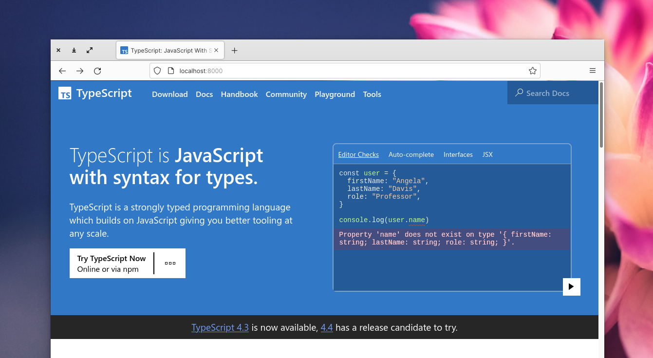
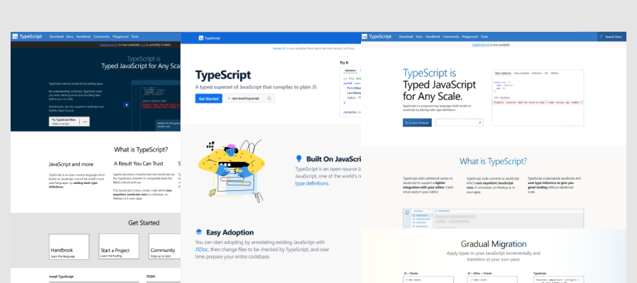
Hey folks, we’re happy to announce that the next iteration version of the TypeScript Website has been switched on for the TypeScript homepage.
Last August we deployed a re-design and re-architecture of the entire TypeScript web presence. The goals were to provide new foundations for documenting TypeScript, re-organize our information architecture and to have a cohesive design wrapping it together. The transition to the new site aimed for evolution over revolution with all previous URIs still accounted for because “cool URIs don’t change“, and most decisions about how to describe TypeScript staying reasonably consistent with the language over the last decade.
After the re-design shipped with all the prior content, we iterated on documentation resulting in the second version of the handbook in March. Now we’ve been looking at the messaging for describing TypeScript to new folks, with a focus on the homepage.
Welcome to the new TypeScript Website
The goals of the homepage are to introduce TypeScript and then explain the value proposition of using the language. This goal for us hasn’t changed, but we wanted to understand how new users felt about our old homepage, we ran a series of users tests which gave us a set of conclusions:
- There was not an obvious call to action at the top of the site
- You could not scan the text, because it was all the same visual weight
- We were probably using too much text explaining concepts
- There were not enough examples of code on the site
- People didn’t connect our color usage to its intended meaning
- The site-wide footer was a distraction
- People didn’t connect that TypeScript powered most JavaScript tooling
- There were parts of the site where people felt like they knew enough to make a decision, but didn’t know where to go next
A lot of these changes would require substantial design exploration, but we felt like looking at the call to action for the headline could be applied to the existing design and then migrated into the new site. What felt tricky is that we felt a tension because there isn’t one single link we can always recommend. People either wanted to try TypeScript in the browser or learn how to run it locally on their computer. We ran A/B tests to see if there was a preference for new users to the homepage, but the results came up more or less 50/50. This led to a design where we have a single call to action in the headline – but instead of taking you to either site, we provide a space explaining both potential options:
While that work was on-going, we winded through four different design concepts with different design aesthetics and approaches to how much information density we wanted.
Some of the highlights on the new homepage design:
- Reducing the amount of the text on the page. Each section now has key information bolded. This makes the page scannable, and the contrast added a hint of color given the next step.
- Limiting the colour palette to the blue from the TypeScript logo (a hue shift of the yellow from JavaScript) and shades of white and black.
- Creating a mid-way jump-off point, if you think you know enough about TypeScript there are probably 3 places you want to go: to documentation, the playground to try in your browser or learn how to run it on your computer.
- Replacing the footer content with jump-off point at the end of the page with the same links but tweaked design to fit the footer, removing distracting links for first-timers.
- Copy starts focused around the developer experience in using TypeScript, and then transitions to give you a further understanding of what sorts of primitives are in TypeScript and how they convert into JavaScript
One of the sections I thought was worth highlighting is our approach to showing the migration of a single JavaScript function to a TypeScript function. The code starts off with little inline tooling and an incorrect function body (it raises an exception due to a typo) where we show that just adding // @ts-check to the top raises useful errors instantly. If you have JavaScript enabled, this switches as you scroll and ties to your scroll, so it swaps out the new code samples with contextual annotations.
Like all of the code samples in the new homepage, we use the recently extracted Shiki Twoslash library to provide compiler-backed information inside each code sample. These code sample showcases a lot of the tooling advantages of using TypeScript without our copy having explicitly having to call them out.
As with the previous homepage, the revised version of the TypeScript homepage goes through regular accessibility audits, works with JavaScript disabled and can be navigated entirely by the keyboard. We hope you like it. Feel free to submit bugs and feedback via the TypeScript-Website repo.


So, we have to Google ‘typescript’ and find the url, right?
What is TypeScript Website?
I propose the following slogan for hero banner:
TypeScript: The future of Javascript
Feel free to use 😉
Odd that a post announcing the new home page doesn’t actually link to the new home page! 🙂
We can’t even use the URL from the screen-shots, since that’s your local copy of the site.
The only way to get there from here is to follow the link to the GitHub repo, then follow the link from the GitHub repo to the site.
No dark theme (let alone no auto-dark-theme through media queries). Sad.