
Hello Android developers,
In this post, you’ll learn how the Outlook team adapted our Android app to create a user-friendly experience on the dual-screen Surface Duo.
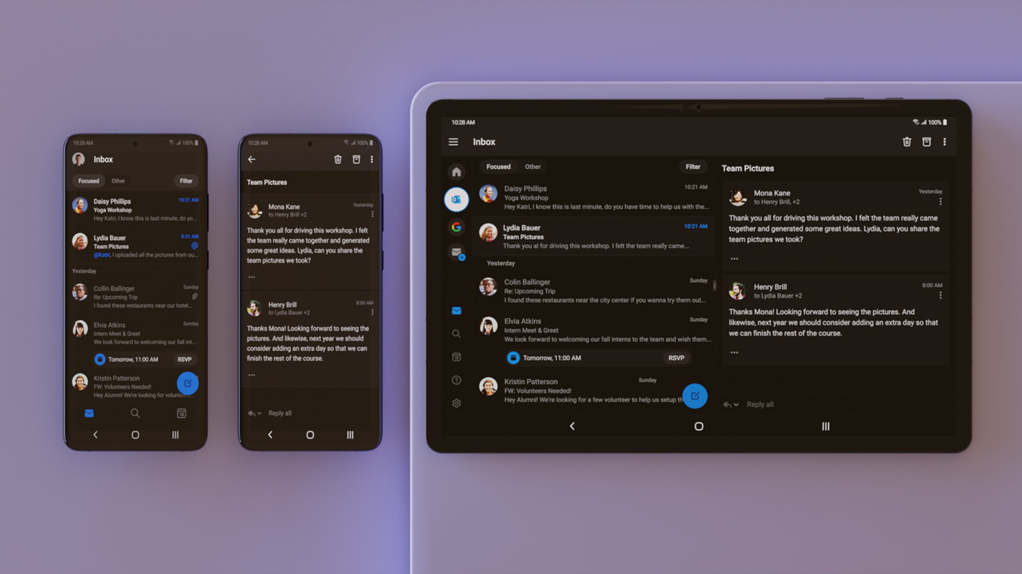
Outlook for Surface Duo has the same familiar experience that you find on both phone and tablet and this is no coincidence as Outlook has been designed with flexibility in mind. But while Outlook was easily able to handle the configuration change when switching from displaying on a single screen or spanning across two screens thanks to support from the Android framework from API 1, Surface Duo presented a unique challenge in how to address the physical hinge.
A standard Outlook workflow consists of displaying a collection of content briefs (list view of emails, events, search results) which can be selected to view the content in full (item view of email, event, search result). On a phone, list view and item view overlap each other in full-screen, while on a tablet, the two are displayed side-by-side, or in dual-pane mode. By default, Outlook displays dual-pane content with a predefined ratio customized for different form factors that is user-adjustable. The two panes have a visual on-screen separation in the form of a vertical divider.
Fitting dual-pane layout to Surface Duo
At a high level, Outlook uses the combination of a custom ViewGroup and Fragments to facilitate smooth arrangement and transitioning of app screens during configuration changes:
- The custom ViewGroup performs measure and layout of containers for list and item screens based on the active configuration.
- List and item Fragments are used to host list and item screens and are inflated into their respective containers inside the custom ViewGroup.
During configuration changes, both the custom ViewGroup and the Fragments go through a re-creation process:
- The custom ViewGroup re-measures and re-layouts containers based on the new configuration
- List and item Fragments go through lifecycle re-creation, invoking logic to inflate themselves into the new containers, and restore and rebind data to the newly inflated views
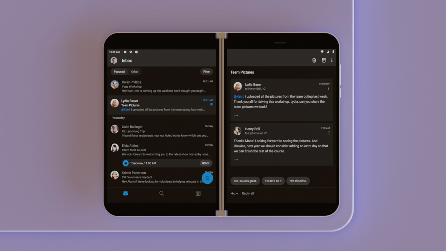
This works out of the box for Surface Duo; going from one screen to dual-screen will rearrange the list and item Fragments from single pane display to dual-pane display, though with content slightly off-screen and obscured due to the mismatch between the default dual-pane ratio and the positioning of the physical hinge. Here’s our simple fix:
- Create a new default 1:1 ratio for dual-pane display on Surface Duo
- Adjust the on-screen vertical divider to be a no-display space matching the size of the hinge on Surface Duo
This solution works for most of the Outlook app content, so we’re almost there, but not quite. How do we make it work for any screens that do not build on top of this display system, e.g., a screen that simply does not have a need for a dual-pane design? And how do we make it effortless for engineers on our team to follow the same development process, yet still have their screens work for Surface Duo?
Fitting any layout to Surface Duo
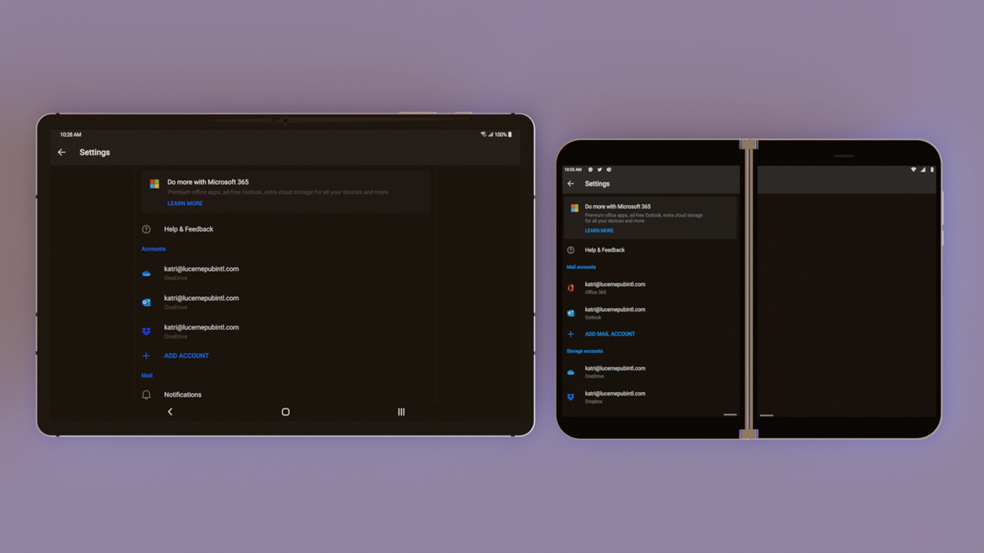
The Outlook design playbook (our internal adaptable design guidelines like Material Design) specifies that on a wider screen (like a tablet landscape device), larger side margins could be used to increase the space from the edge of the screen to give the main content a more ideal width. This specification, however, needs a better adaptation for our dual-screen Surface Duo due to the placement of the physical hinge. Together with our design team, we created a unique margin system in which the content is now placed on the primary screen, with a side margin on the secondary screen.
While it would be simplest to ask engineers to create different layouts for tablet and Surface Duo for every screen, that would create a large potential maintenance burden. We observed that most of the existing screens that follow this specification have a root layout that is of one of the classic Android ViewGroup types. Examples include FrameLayout and LinearLayout, which have a centralized style where margins are applied dynamically using proper qualifiers. What if we could have a smart FrameLayout or LinearLayout that could internally work out how and where to apply margins that could work for any device? And that’s how our in-house versions, AdaptableFrameLayout and AdaptableLinearLayout, were born.
To make these ViewGroups smart, we check against possible hinge bounds to identify screen types and apply the correct margins based on that information. Special concessions are made for common View classes that we know will always span, or never span, dual screen, e.g., Toolbar and nested smart ViewGroups.
class AdaptableFrameLayout : FrameLayout {

    override fun addView(child: View, index: Int, params: ViewGroup.LayoutParams) {
        child.applyAdaptableMargins()
        super.addView(child, index, params)
    }

    override fun onFinishInflate() {
        super.onFinishInflate()
        onFinishInflateWithAdaptableMargins(context)
    }

    override fun onConfigurationChanged(newConfig: Configuration) {
        super.onConfigurationChanged(newConfig)
        onFinishInflateWithAdaptableMargins(context.createConfigurationContext(newConfig))
    }

    private fun onFinishInflateWithAdaptableMargins(context: Context) {
        for (i in 0 until childCount) {
            getChildAt(i).applyAdaptableMargins(context)
        }
    }

    private fun View.applyAdaptableMargins(context: Context = this.context) = when {
        Duo.isDualScreen(context) -> when (this) {
            is AdaptableLinearLayout, is AdaptableFrameLayout -> {} // no adjustments
            else -> (layoutParams as ViewGroup.MarginLayoutParams?)?.let { params ->
                params.marginStart = 0
                params.marginEnd = (context.resources.displayMetrics.widthPixels + Duo.getDisplayMaskWidth(context)) / 2
                layoutParams = params
            }
        }
        else -> when (this) {
            is AdaptableLinearLayout, is AdaptableFrameLayout -> {} // no adjustments
            else -> (layoutParams as ViewGroup.MarginLayoutParams?)?.let { params ->
                val horizontalMargin = Device.getAdaptableMarginPixels(context)
                params.marginStart = horizontalMargin
                params.marginEnd = horizontalMargin
                layoutParams = params
            }
        }
    }
}
With these reusable smart ViewGroups in place, engineers can now swap their root layout element for relevant screens to the in-house one and it should just work! Using Azure DevOps (ADO), we created a smart bot that detects layout changes made under res/layouts and automatically code reviews pull requests and suggests to contributors to instead use the in-house AdaptableFrameLayout and AdaptableLinearLayout ViewGroups for a more adaptable quick start.
This post was contributed by Trung Ha, Senior Android Engineer, Outlook Android at Microsoft (hidroh.com) and Joe Woodward, Senior Product Design Manager, Outlook Design at Microsoft (joewoodward.co).
Feedback
Please reach to out to the Surface Duo Developer Experience team using the feedback forum or message us on Twitter @surfaceduodev. You can also join us on Twitch on Friday’s at 11am PST and join the discussion.
0 comments