
Hello, React Native for Android developers!
In a previous blog post, we discussed these existing React Native dual-screen features: DualScreenInfo to find information about the device, and TwoPaneView to get assistance with building dual-screen apps. Today’s post is about a new module we’ve released for JavaScript and TypeScript that makes it easier to manage component states and move apps around on dual-screen devices.
The TwoPane-Navigation module was built to solve the problem of retaining state across screens when apps shift positions on dual-screen devices and evolved into a powerful library that empowers developers to build apps with less focus on navigation problems. It is built to work side by side with the react-navigation library or work on its own as a replacement. This allows you, the developer, to have a flexible and premium developer experience to help pioneer the new wave of dual-screen device applications.
About TwoPane-Navigation
The TwoPane-Navigation library leverages Redux and is built around the core concept of viewing each pane (screen) on your dual-screen device as its own stack (LIFO), rendering the top element of the stack as the current page.
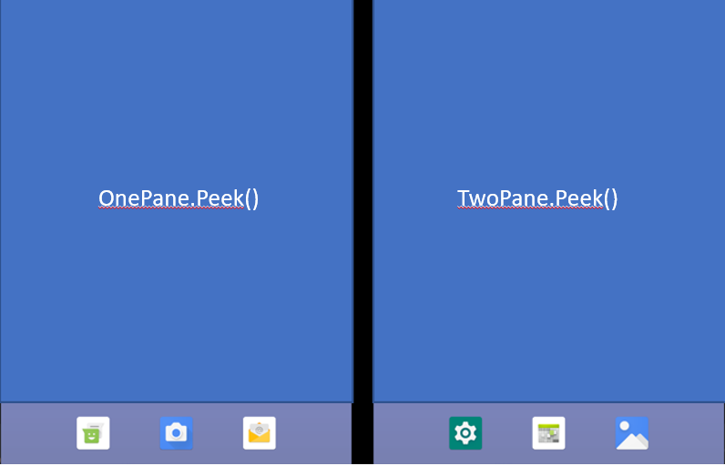
Figure 1: Two conceptual navigation stacks, one on each screen
The new TwoPaneApp must be the base for your React Native application and has the following properties:
- onePaneDefault – this will be the base pane you want when your application is in onePane View
- twoPaneDefault – this will be the base pane you want when your application is in twoPane View
- config? – overrides default values for your application
- navigationContainer? – AppContainer if using React Navigation
The code below shows an example application definition:
const App = () => {
  return (
    <TwoPaneApp
      onePaneDefault={ TwoPaneAppDefaultComponents.onePaneDefault }
      twoPaneDefault={ TwoPaneAppDefaultComponents.twoPaneDefault }
      config={ TwoPaneAppDefaultComponents.config }
    />
  );
};
The components are defined below – properties can be set or overridden for each pane:
const TwoPaneAppDefaultComponents: ITwoPaneAppProps = {
  onePaneDefault: {
    key: 'onePane',
    paneElement: <OnePane />,
    header: {
      title: 'OnePane Title'
    }

  },
  twoPaneDefault: {
    key: 'twoPane',
    paneElement: <TwoPane />,
    header: {
      title: 'TwoPane Title'
    }
  },
  config: {
    onePane: {
      paneHeader: {
        backgroundColor: 'gray'
      },
      paneBody: {
        backgroundColor: 'black'
      }
    },
    twoPane: {
      paneHeader: {
        backgroundColor: 'gray'
      },
      paneBody: {
        backgroundColor: 'black'
      }
      paneHeaderText: {
        color: 'red'
      },
      paneHeaderIcon: {
        tintColor: 'red'
      }
    }
  }
}
The TwoPaneApp can automatically detect and handle the display on one screen or being spanned across two screens. When the app is first opened, we will see:

Figure 2: Only the first pane is visible on startup
If we span the application across both screens, we will see:
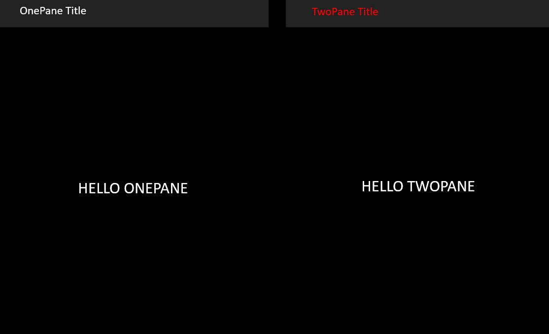
Figure 3: Both panes are visible when the app is spanned
- Notice in twoPane mode, our header text is red. This is because we provided an override on our default text color in our config during setup above.
- Notice how the onePane mode is now showing in the first panel as its own separate entity.
Panes
- onePane– will call every action specifically for the onePane stack
- twoPane – will call every action specifically for the twoPane stack
- autoPane – will check to see if there is onePane or twoPane currently active, and will call the appropriate action to the current pane
The Panes have a variety of Hooks and Methods, which are outlined in the TwoPane-Navigation docs.
Navigating Panes
Now with our TwoPane-Navigation app set up, we can finally start navigating.
To navigate between panes, we have a variety of built-in methods, but for this example, we’ll only introduce you to the core methods.
Moving Forward
The syntax for moving forward has a number of options for maximum flexibility. Calling Pane.Add pushes an element to the top of the stack, or replaces the original with the new element.
(one | two | auto)Pane.Add(key: string, element: ReactElement, header?: IHeader, isMergeONE = false, isMergeTWO = false)
For this example, we will be pushing to twoPane if both panes are active, or we will be pushing to the onePane if only using one pane.
autoPane.Add(
   'exampleScreen',
   <NextExampleScreen />,
   header: {
     title: 'NextExampleScreen'
   },
   true,
   true)
If we run our application in twoPane mode, we will see that we have only pushed the new screen to the twoPane stack (indicated by the back button on the second screen):

Figure 4: the second screen has a navigation stack
Because we provided an override on our default in twoPane config, the text color for the header is red.
Going Back
The header provided by TwoPane-Navigation automatically includes a back button when it’s possible to go back from the current pane. Note: If there’s only one pane in the stack, there’s nothing to go back to, so there’s no back button.
If you want to programmatically go back one element in the navigation stack, you can do so by calling:
(one | two | auto)Pane.GoBack()
<TouchableOpacity
  onPress={ () => onePane.GoBack() }>
  <Text>Press me to go back in our onePane stack</Text>
</TouchableOpacity>
If you have multiple panes in the stack and would like to go back to the very first pane in your stack (defaultPane), you can use:
(one | two | auto)Pane.BackToHome()
BackToHome removes all elements of the stack and returns the base component.
<TouchableOpacity
  onPress={ () => onePane.BackToHome() }>
  <Text>Press me to go back to our default pane in our onePane stack</Text>
</TouchableOpacity>
React Navigation
To use React Navigation with the TwoPane-Navigation module, create the required navigators (i.e. StackNavigators, SwitchNavigators, DrawerNavigators, etc.) and pass the appContainer into the navigationContainer prop in our TwoPaneApp component. After you have added the required navigators, you can then access the navigation/route objects with the useNavigation/useRoute hooks.
const App = () => {
return (
<TwoPaneApp
onePaneDefault={ TwoPaneAppDefaultComponents.onePaneDefault }
twoPaneDefault={ TwoPaneAppDefaultComponents.twoPaneDefault }
config={ TwoPaneAppDefaultComponents.config }
navigationContainer={ AppContainer() }
/>
);
};
const AppContainer = () => {
return (
<NavigationContainer>
Pane Merging
When you want to keep panes through pane transition from onePane to twoPane mode, you need to mark the screens you want as isMergeOne or isMergeTwo.
It is very simple to enable this behavior. Simply mark isMerge = true when you add your screen to the stack.
onePane.Add(
  'NextExampleScreen',
  <NextExampleScreen />,
  header: {
    title: 'NextExampleScreen'
  },
  true
);
With this setting, when the application is unspanned to a single screen, it keeps the correct pane on top, including state:
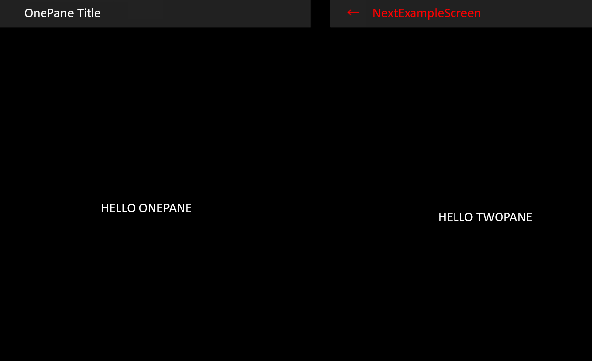
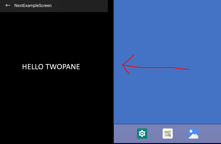
Figure 5: Unspanning while preserving state
Resources and feedback
Visit the docs and sample code to see more advanced usage, such as pane merging, header customization, and screen overlays, and try the new navigation module in your apps. Please provide us with your feedback on the GitHub repo.
We would also love to hear from you about your overall experience using the SDK, emulator, and what helpers or controls you’d like us to work on next. Please reach out using our feedback forum or message me GitHub.
0 comments