Hello Android developers!
Although multi-window support was first introduced in Android 7 (API 24), many developers are only recently starting to adapt their code to this feature as dual-screen, foldable, and large-screen devices are becoming more common. If you’re considering adapting your apps for the latest larger-screen devices, today’s post contains some strategies and tips to help you build responsive Android layouts, including for Microsoft Surface Duo.
Jetpack Window Manager
The most useful package for working with dual-screen and foldable devices is Jetpack Window Manager, which provides the FoldingFeature class and a message whenever the app’s layout is affected by being spanned (or unspanned) around a hinge or fold.
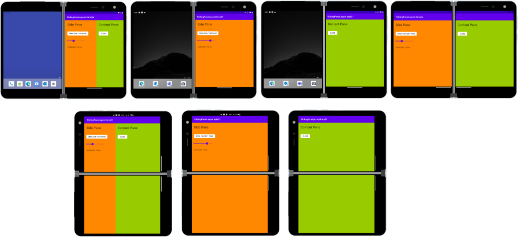
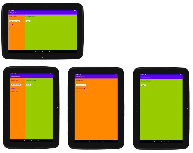
The SlidingPaneLayout class has been updated to use Jetpack Window Manager and can be used to build a responsive layout that adapts to different screen sizes:


Figure 1: SlidingPaneLayout configurations on a tablet and Surface Duo
There are a number of Kotlin samples that demonstrate how to use Jetpack Window Manager, SlidingPaneLayout, or both to create Android apps that adapt to different screen and device configurations.
The dual-screen developer docs also provide guidance using other developer tools, including Jetpack Compose, Flutter, React Native, Xamarin, Unity, and web sites and PWAs.
Resource qualifiers
The resources (res) folder of an Android project contains several subfolders that contain the images, icons, XML layout definitions, text strings, and other elements that make up the user interface of your apps. Apart from the default values, you can create additional groups of resources that apply to specific device attributes – it’s common to detect sw600dp or sw720dp to provide tablet-specific user interfaces.
You can add additional properties to target different devices, including adding screen dimensions to the resource qualifier that match Surface Duo devices:
- values-sw720dp-2754×1800 – for resource values, like strings.xml files
- layout-sw720dp-2754×1800 – for layout XML files
resizableActivity
The resizableActivity attribute can be set at the activity or application level of your project. When true, activities can be launched in split-screen or freeform (on larger screens) multi-window modes. Resizable activities are recommended for best compatibility with foldable, dual-screen, and larger screen devices.
configChanges
Application developers may choose to handle configuration changes as a result of window resizing rather than allow the activity to be destroyed and re-created. Use the following attribute in the AndroidManifest.xml to handle these events:
android:configChanges="screenSize|smallestScreenSize|screenLayout|orientation"
The app code will then have to implement onConfigurationChanged and ensure the layout adapts correctly to the new visual state. When changes are handled in code, the app won’t be able to take advantage of resources being re-loaded using a different qualifier (if applicable) because the activity is not re-created.
smallestScreenWidthDp
A common resource qualifier is the “smallest screen width” value, which can be used to differentiate between phone and tablet. Resources will be automatically loaded by Android, but you might want to write similar checks in your code, in which case there’s a context property:
resources.configuration.smallestScreenWidthDp
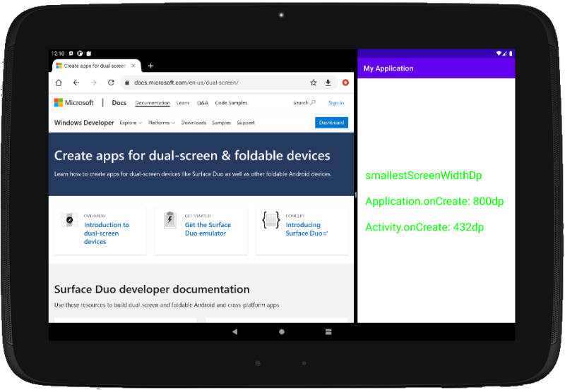
The Android multi-window guide reminders developers to “always use the activity context (or another UI-based context) to get information about the current window or display” – avoid using the application context , especially on app start-up. Just as important, in multi-window mode, “do not assume that the display size is going to be the constant size your application will be placed in”.
As an example of why this is important, there are many different sizing scenarios for an app on a multi-window tablet or foldable:
- Full-screen – some apps currently assume they will always be full-screen on the device and cache screen dimensions rather than querying and responding to configuration change events. Historically this was a safe assumption, but dual-screen, foldable, and large screen multi-window devices means your apps need to be ready for a variety of situations. Avoid assuming the app will be full screen, and instead of caching values, respond to configuration changes and use the updated values.
- Third, half, or two-thirds of the screen – if another app is put into split screen mode, your app might be started in a portion of the screen which could be so narrow that your resource qualifiers identify it as a phone!
- External or internal screen – Some foldable devices have a screen on the outside of the device and a larger foldable screen inside – the space available can be very different, and again might load different resources (the outside screen is often much narrower than the unfolded display).
- Window size change – The window divider can be moved in multi-window mode, causing the screen space available to your app to change including the smallest screen width. On a dual-screen or foldable device, in addition to different window sizes causing new resources to be loaded, the app might be appearing across a fold or hinge.

Figure 2: Apps can be started in a variety of configurations
To support the widest variety of devices and multi-screen scenarios, create responsive layouts and use the available configuration changed and Jetpack Window Manager events to detect and adapt to each situation. Avoiding caching values and making assumptions about using the entire screen on the device.
isInMultiWindowMode
Since Android 7, the Activity class has had a property isInMultiWindowMode that you can use to detect whether your app is sharing a screen with other apps.
IsInMultiWindowMode returns true when the application window is NOT taking up the entire screen, such as:
- On a single-screen phone, tablet, or large screen device where the screen has been split and one or more applications are visible
- On a foldable device where the screen is a continuous area, and one or more applications are visible
IsInMultiWindowMode returns false when the application window does take up the entire screen, which includes:
- On a single-screen phone, tablet, or large screen device where only one app is visible across the entire screen
- On a foldable device where the screen is a continuous area and only one app is visible across the entire screen
- On a dual-screen device like Surface Duo where the application uses up one of the two screens OR the application is spanned across both screens. Because an application is using the entire screen area, even when only on one screen, it is not considered to be in multi-window mode.
Resources and feedback
There are additional user interface design tips available in the Surface Duo Design Kit, and more coding tips in the Surface Duo developer documentation and Google’s Android Large Screen guidance. In addition to our samples, Google has also updated their Trackr demo for large screens and foldables.
If you have any questions, or would like to tell us about your large-screen apps, use the feedback forum or message us on Twitter @surfaceduodev.
Finally, please join us for our dual screen developer livestream at 11am (Pacific time) each Friday – mark it in your calendar and check out the archives on YouTube.

0 comments