Hello web developers!
The dual-screen CSS and JavaScript enhancements for Microsoft Edge were initially shared in June 2020 when they were first available behind a feature flag for testing. Since then there has been a lot of work and feedback on the proposals, and the implementation currently available in the latest version of Microsoft Edge (version 96) has been updated to reflect the final API design.
The changes are described below, and the documentation is up to date for the latest CSS and latest JavaScript syntax. These features are still behind a feature flag which you can enable for testing.
CSS
The original CSS proposal provided for three different modes – but they were not easily extensible beyond a single fold. The updated syntax uses a segment count for more flexibility.
OLD
@media (screen-spanning: <value>) { }
Where the value could be:
- single-fold-vertical
- single-fold-horizontal
- none
NEW
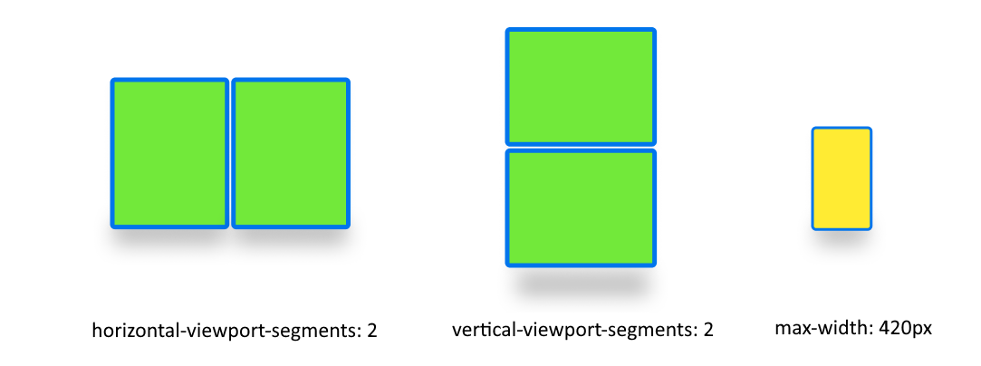
@media (horizontal-viewport-segments: <count>) { }
@media (vertical-viewport-segments: <count>) { }
The count reflects the number of segments, which for Microsoft Surface Duo devices would be 2.

Environment variables
The environment variables populated on foldable devices also needed to be updated, and introduced the concept of indexing to rows and columns of segments.
OLD
env(fold-top)
env(fold-left)
env(fold-width)
env(fold-height)
NEW
env(viewport-segment-width <x> <y>)
env(viewport-segment-height <x> <y>)
env(viewport-segment-top <x> <y>)
env(viewport-segment-left <x> <y>)
env(viewport-segment-bottom <x> <y>)
env(viewport-segment-right <x> <y>)
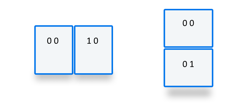
The x and y coordinates refer to a conceptual grid that begins with 0 0 in the top left. For Microsoft Surface Duo devices, you would use these values to use coordinates from each view segment:

You can also calculate interim values (such as the hinge dimensions):
/* dual-portrait hinge width */
calc(env(viewport-segment-left 1 0) - env(viewport-segment-right 0 0))
/* dual-landscape hinge height */
calc(env(viewport-segment-top 0 1) - env(viewport-segment-bottom 0 0))
JavaScript
The original JavaScript proposal was already capable of returning a collection of segment Rects. This behavior hasn’t changed, however the method has been renamed and added to the window.visualViewport property.
OLD
window.getWindowSegments()
NEW
window.visualViewport.segments
The same rules apply to both versions of the API – the value is an immutable snapshot of the moment it was queried. To adapt the layout programmatically as the device posture and app mode changes, listen for resize or orientationchange events and query for the latest segment data then respond accordingly.
Example
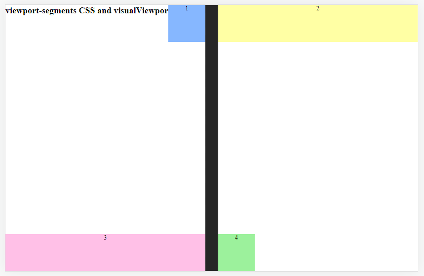
An example of the new CSS and JavaScript syntax can be found at this GitHub URL.

Figure: testing the dual-screen syntax in a desktop browser
Here’s a snippet of the CSS that’s creating a hidden visualization of the fold area, which uses the media query and environment variables:
@media (horizontal-viewport-segments:2) {
   .fold {
     top: 0;
     height: env(viewport-segment-height 0 0);
     width: calc(env(viewport-segment-left 1 0) - env(viewport-segment-right 0 0));
     left:  env(viewport-segment-right 0 0);
     position: absolute;
   }
You can view the complete CSS and HTML source for this example on GitHub.
Testing
You can test the updated syntax by downloading the latest versions of Edge for Surface Duo, or the desktop version of Edge or Chrome (for the devtools simulator) and enabling the feature-flag via edge://flags (or chrome://flags on Chrome).
Resources and feedback
Visit docs.microsoft.com for the latest latest CSS and JavaScript documentation, and this example on GitHub (css).
If you have any questions, or would like to tell us about your dual-screen web apps, use the feedback forum or message us on Twitter @surfaceduodev.
Finally, please join us for our dual screen developer livestream at 11am (Pacific time) each Friday – mark it in your calendar and check out the archives on YouTube.

0 comments