
Flutter is one of the fastest growing frameworks today and certainly a powerful toolkit for building amazing apps, which is why we’re adding foldable support.
Earlier today Microsoft announced a preview of foldable support for Flutter, at Google’s Flutter Engage. We love Flutter and foldable devices and want developers to have the best possible experience when working with both. We’re contributing to Flutter to give it foldable capabilities and this article goes into details of what is new.
Please note that Foldable support has not yet merged into the Flutter repo. We first want to listen to your feedback, which you can give on the framework PR and engine PR before they are closed. Our goal is to empower you to easily build amazing experiences for all foldables.
Types of foldable devices
There are many types of foldable phones out there already. Some have flexible displays that bend and curl. Microsoft Surface Duo has two separate displays joined by a hinge. In all cases, your app continues to see one larger single screen, with “display features” like the hinge blocking part of the display.
Learn more about Surface Duo and how it reimagines productivity. How would your app take advantage of the extra space? To experiment with it, have a look at the Surface Duo emulator.
Display features are areas of the display that can be non-functional or obstructed. Your app is already aware of one type of display feature if you use the SafeArea widget to avoid display cutouts. The three types of display features that we add support for are the cutout, hinge, and fold.
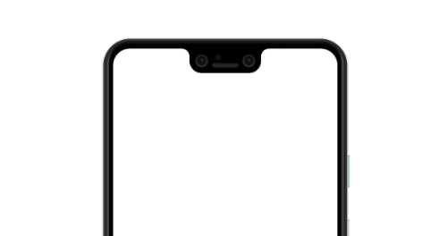
A cutout sits at the edge of the display and usually houses camera systems.
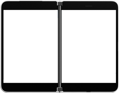
A hinge is a physical separator between the two displays of the device.
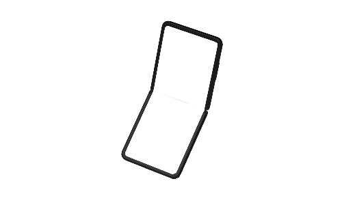
You can view the fold like a hinge that has zero width. It tells us where the flexible display has a crease.
For a complete reference, learn more from the display feature documentation.
New in MediaQuery
Display features are properties of the display. This kind of information is provided by MediaQuery. We are adding
- displayFeatures – a list of all display features.
- hinge – a simple way of knowing info about the hinge.
From the three types of display features, cutout and fold types will be used less often. You already use SafeArea for avoiding cutout features and you don’t need to avoid fold features since the display is continuous.
When the device is folded, MediaQuery changes and your widget is automatically rebuilt.
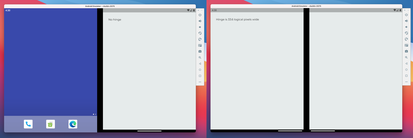
final hinge = MediaQuery.of(context).hinge;
if (hinge==null) {
   print('No hinge');
} else {
   print('Hinge is ${hinge.bounds.width} logical pixels wide');
}
For a complete reference, learn more from the MediaQuery documentation.
Dialogs and modal routes
Dialogs show up on the middle of the screen by default. On devices with a hinge, dialogs go on the first screen, which is left for LTR configurations. We added the optional parameter screen to showDialog which allows you to override this behavior. Context or popup menus avoid the hinge by default. In double landscape mode, the first screen is the top one.
You might have your own modal or popup route classes in your app, which you want to make “hinge-aware”. We provide a widget called HingeAvoidingModalWrapper which you add at the top of your route layout to make it avoid the hinge.
showDialog(
   context: context,
   builder: (_) => AlertDialog(
      title: Text("Hinge Aware Dialog"),
      content: Text("Going on the right screen"),
   ),
   screen: 1, // By default, this is 0
);
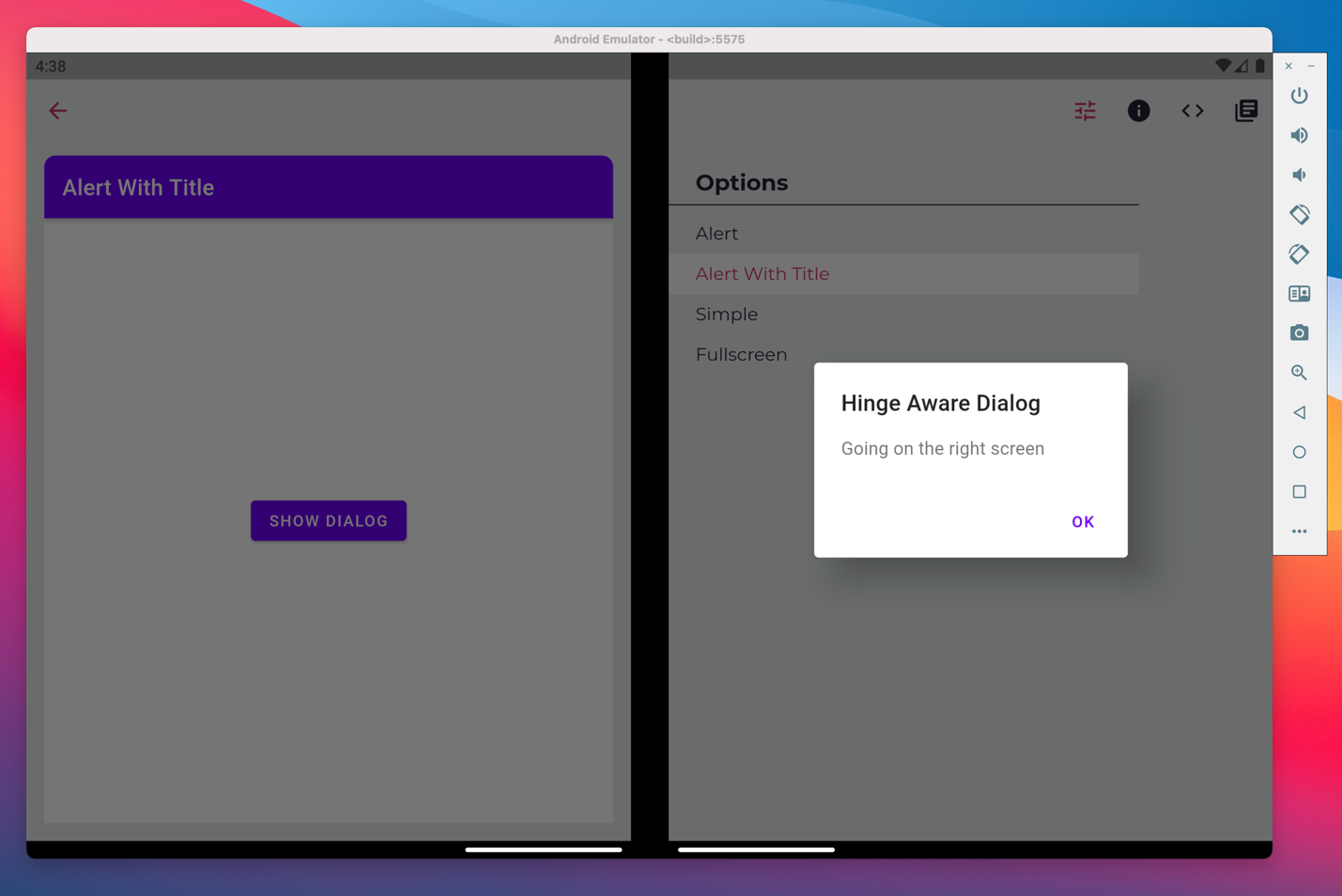
The above screenshot is taken from Flutter Gallery, which we enhanced to support dual-screen layouts. Learn more about making your route hinge-aware by looking at the HingeAwarePopupRoute documentation.
TwoPane widget
In many cases, adapting your layout to support dual-screen devices will be as easy as adding TwoPane, a widget that shows one or two widgets according to available space. It provides a simple way to scale up your design, not just for two screens, but for larger screens like tablets and desktops as well. This sample should give you a hint of how it works.
Widget build(BuildContext context) {
   return TwoPane(
      pane1: _widgetA(),
      pane2: _widgetB(),
      paneProportion: 0.3,
      panePriority: MediaQuery.of(context).size.width > 500 ? TwoPanePriority.both : TwoPanePriority.pane1,
   );
}
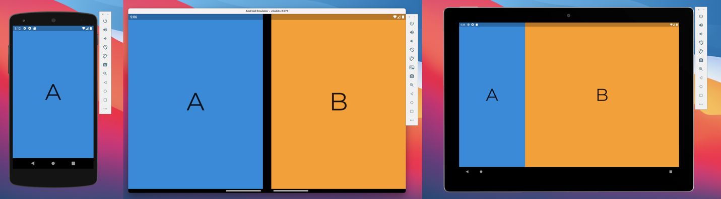
The panePriority property makes the phone version show only one of the two panes, since space is limited. If you look at the tablet version, you will notice that widget A takes up only 30% of the screen. This is the value given to paneProportion. On a dual-screen device, both these properties are ignored, and widget A and B take over one screen each.
TwoPane has many useful properties, and we encourage you to read the documentation to learn more.
What’s next
We want your feedback on the framework PR and engine PR. We can’t wait to see what Flutter developers build with this new capability. Plus, you can ask questions or tell us about your projects using our feedback forum or message us on Twitter @surfaceduodev.
Please join the Flutter Community Q&A session at 9am PST on Thursday, March 4, 2021 (the day after the Flutter Engage event) to discuss the foldable enhancements. You can also chat with us on Twitch on Friday, March 5 at 11am PST, and the Microsoft Learn Launch Space on Thursday, March 25 at 1pm PST.
Microsoft is not stopping here. Building amazing apps for foldable devices using Flutter should be easy and fun and our next areas of focus will be navigation, codelabs, and more components to help developers. Your feedback is important for deciding what we will build next.
0 comments