
Hello there, fellow web developers!
In an earlier blog post, we introduced the upcoming CSS @media feature primitives and the getWindowSegments() API for dual-screen and foldable devices.
In this blog post, we will look at how Kenneth Rohde Christiansen and myself created and adapted our existing Foldship demo to take advantage of the new capabilities provided by dual-screen devices, using these new APIs. We’re both software engineers at Intel Corporation.
Deciding between a major UX overhaul or tweaks here and there
When you think of a dual-screen, you may think of an extended canvas or a larger browser window for your website to be displayed on and that’s especially true when the browser is spanning across the two screens, which can be easily explained as “maximized” across both screens.
Also, a typical trait of a dual-screen device, in contrast to a foldable screen, is the presence of a physical hinge. As this hinge will occlude content, you will need to make adjustments to your apps to provide a nice experience to your users.
There are two approaches to adapt your existing content to the new form factor. Either you make a few tweaks here and there to avoid the hinge cutting text and images, or you take a step back and consider how you can take advantage of the new layout. Below we look at an example where we adapted a photo viewer to work better on dual-screen devices.
In the photo viewer you get a grid of photos, and the idea is that when you click on one of them, the full resolution photo is show in the center and expanded as much as possible while still fully visible within the viewport.
As you may notice, some of the photos in the grid, as well as the expanded photo, is partly occluded by the hinge, and the user experience suffers as a result.
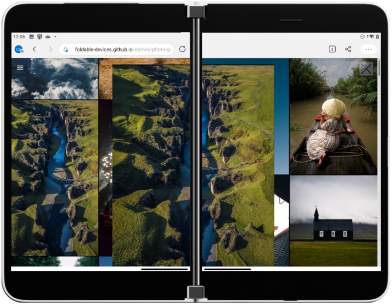
Figure 1: Photo viewing app showing expanded image partially hidden by dual-screen hinge
The way we decided to fix the above issue was to make sure the picture is showing on just one screen, so that the hinge is never in the way. However, by doing that, it will still show a grid of photo thumbnails on the other screen that looks like a selector – but unfortunately, not all the photos are visible as some will be below the expanded photo and some would still be cut off by the hinge.
To avoid this, we will simply only show the thumbnails on the opposite screen than the one showing the selected photo.
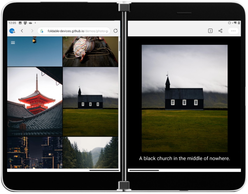 Figure 2: Photo viewing app showing selected image thumbnail on left screen and in expanded view on right screen of dual-screen device
The advantage of the new layout is that we can now show additional information to the user while preserving the full photo.
We hope this small example provides some insight intohow you can take advantage of the dual-screen approach and how to avoid the hinge negatively affecting your user experience.
Sometimes such a change might be simple, but you might also want to go the extra mile and provide a very differentiated experience to take full advantage of the two physical screens.
The FoldShip Demo
When Intel and Microsoft started to collaborate on these new APIs and primitives, we really wanted to “eat our own dogfood” by creating a set of simple, yet compelling demos.
The idea was that that would help us design better APIs as well as help developers navigate the newer APIs and get them excited. We brainstormed a few ideas, like the photo viewer app that we showed above, but we wanted to come up with one demo that would not only leverage the two physical screens, but also take advantage of the form factor of the device.
Typically, a dual-screen device can be used in different ways, which we call “postures”.


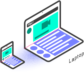
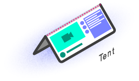
Figure 3: Illustrations of dual-screen device postures
Considering the book mode, tent mode, and the laptop/compose mode, we quickly thought about the old school battleship game. Many of you have probably played this game, but here is a picture of the actual physical game:
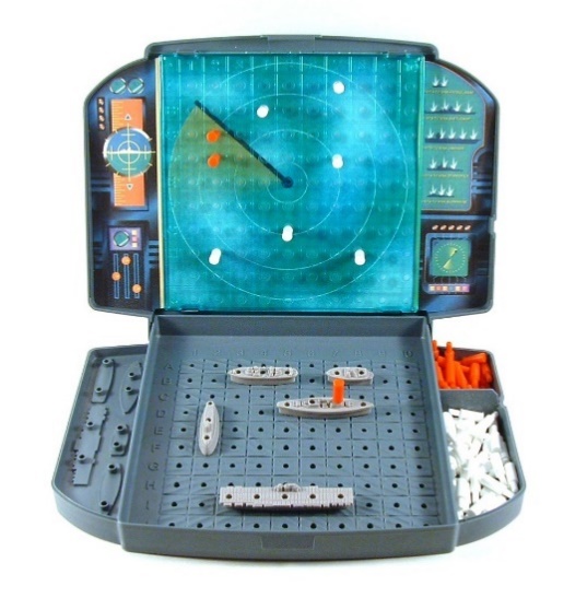
Figure 4: Battleship board game (Photo by jking89)
The game is quite basic; each one of the two players have two grids, one where they place their own ships, and one grid representing the opponent’s grid. They take turns firing on the grid (using coordinates) to try to find all of their opponent’s ships and sink them.
We thought that this little game would be a perfect example that leverages the laptop posture the user would use when playing against the computer.
Creating the demo
When we create tech demos like these, we aim to keep the code as simple as possible without too many exotic dependencies.
For most of the demos in the foldable devices page on GitHub, we decided to use the building blocks of the web, plus a few mini frameworks such as LitElement for easily creating reusable elements, as well as Snowpack for module management, and Workbox for making the web app work offline.
LitElement is a tiny base class that helps you write web components easily. It’s very fast, small, and interoperable as it outputs web components. It is also used by multiple Microsoft projects such as Microsoft Graph Toolkit and PWABuilder.com. Additional information can be found here.
Workbox
Workbox is a tiny library made by Google that simplifies the usage of Service Worker. This is what we used to enable the PWA capability of the demo. Workbox helped us with caching, precaching, and updating the cache whenever we published a new version of the demo. Additional information can be found here.
Snowpack
Snowpack is a frontend build tool that allowed us to generate the version that is live on https://foldable-devices.github.io/demos/. It’s typically a substitute for tools such as WebPack or Parcel, but it is fully based on JavaScript modules. It also includes a very convenient support of NPM modules. It also features a way to run a local web server that refreshes itself whenever you modify your code; although not new, it’s still very neat. Additional information can be found here.
The rest of the demo was built with the basic primitives of the web and we mostly used CSS Grid and CSS Flexbox which allowed us to create dynamic layouts relatively easily.
The overall UX is quite simple to implement. We threw two CSS grids side-by-side and handled the turn-by-turn. Quite quickly we decided that on mobile platforms, the portrait mode was irrelevant because we could only place one of the grids on top of the other, which would force the player to scroll constantly, which would quickly be annoying, so instead, we invited the user to rotate the device to landscape mode to reveal the game. This still applies for dual-screen devices because the browser window may not always be spanned across the two physical screens, but let’s cover that later.
Polyfills, configurator widget, and DevTools support
When we started working on the demo, there were no dual-screen devices yet on the market, and even now that they are available, they are not globally available, and can be hard to get our hands on. This also applies to a lot of developers who might already want to start preparing their apps for this new future.
While we always try to test on an actual device while developing, it is still faster to iterate on a desktop development machine first.
For these reasons, the community developed a set of tools to help developers to do the work right on their desktop.
CSS Spanning Polyfill
This is a polyfill of the CSS primitives described here. On the desktop it will basically emulate the two segments by using half of the viewport. This is quite convenient for quick prototyping.
The package is published on npm here.
Window Segment Polyfill
This is a polyfill of the JavaScript API described here. It works similarly as the CSS counterpart.
The package is published on npm here.
These two polyfills will not be loaded when an actual device supports the feature natively.
Iterate quickly with the foldable device configurator
Being able to quickly test the behavior of the website on a dual-screen device is crucial. Also being able to change the hinge location to simulate the rotation of the device is important. That’s why we created the Foldable Device Configurator. It’s a little web component that you can add to your page to test various foldable devices as well as turning on and off foldable support to test your application. When added onto your page using something like this:
<script type='module' src="foldable-device-configurator/src/foldable-device-configurator.js"></script>
And then in your HTML code you can just use the component:
<foldable-device-configurator></foldable-device-configurator>
It will look like this on your page:
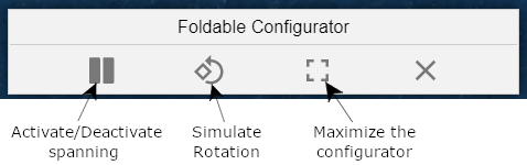
Figure 5: Screenshot of Foldable Device Configurator Controls
In the maximized mode, the configurator shows you a little preview of what the site would look like on some common devices. This should help you highlight some of the work you need to do to make sure your website works great.
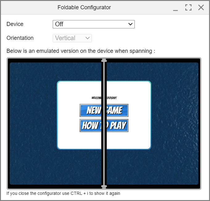
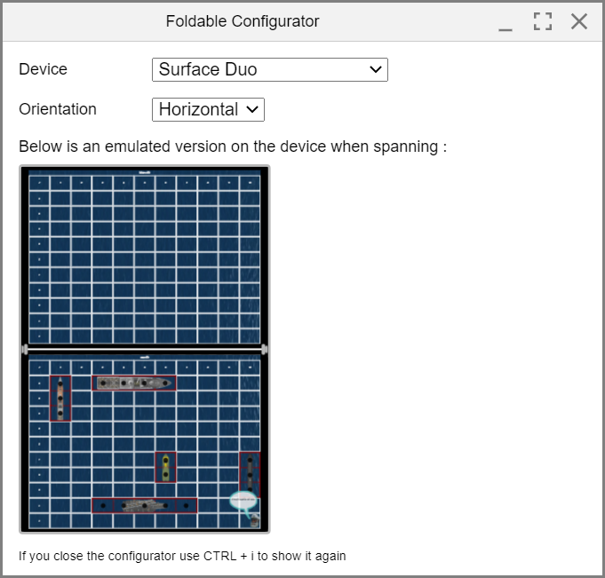
Figure 6: Screenshot of Foldable Device Configurator orientation modes
Chrome/Microsoft Edge Devtools
In future releases, Chrome and Microsoft Edge will let you emulate the Microsoft Surface Duo inside the Developer Tools. You can try out the experience in the current Canary version. Just open the developer tools and look for the icon below:
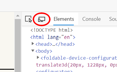
Figure 7: Dual-screen emulator in Developer Tools
Then it will render your page as if it was on one of the supported devices. You can select the Surface Duo from the drop-down list.
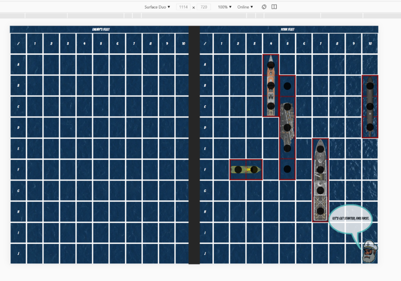
Figure 8: Foldship demo in Surface Duo emulator mode
For more details on how to activate the dual-screen mode, please see the desktop developer tools documentation.
This will allow quick prototyping as well. If your favorite desktop browser is not Chrome or Microsoft Edge, you can still use the Foldable Device Configurator to achieve similar results.
Dual-screen specific features
Hinge support
The foldship demo has quite a simple UX; it’s basically two grids next to each other. Here is a screenshot showing you how it looks.
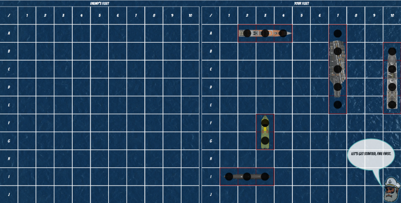
Figure 9: Screenshot of Foldship demo
To support dual-screen devices, we decided to have the region underneath the hinge to separate the two grids. For our demo to be fully responsive and support multiple devices with different types of hinges, we put the two grids inside a flexbox and a placeholder to represent the hinge. The benefits of the flexbox are that we can quickly change the flex-direction property to column rather than row, to support landscape mode (where the grids will stack on top of each other).
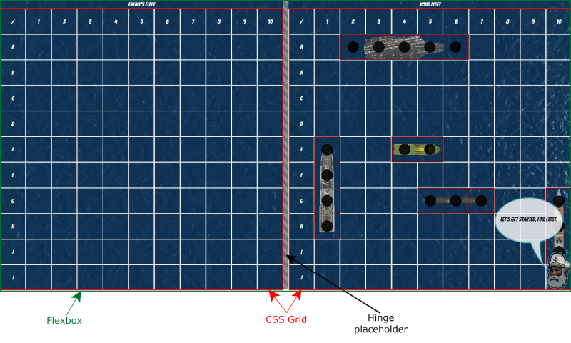
Figure 10: Screenshot of Foldship demo showing flexbox behavior and hingle placeholder
Now let’s look into how we setup each grid’s CSS properties and the hinge placeholder. These snippets are modified from the actual code to make it easier to understand in this post.
@media (screen-spanning: single-fold-vertical) {
      .content {
  display: flex;
        justify-content: center;
        flex-direction: row;
      }

      .enemy-fleet {
        width: env(fold-left);
        height: 100%;
      }

      .fleet {
        height: 100%;
        width: calc(100vw - env(fold-left) - env(fold-width));
      }

      .fold {
        height: env(fold-height);
        width: env(fold-width);
      }
}
and
@media (screen-spanning: single-fold-horizontal) {
      .content {
        display: flex;
      	  flex-direction: row;
        justify-content: center;
        width: 100%;
        height: 100%;
      }

      .enemy-fleet {
        height: env(fold-top);
        width: 100%;
        flex-grow: 0;
        flex-shrink: 0;
      }

      .player-fleet {
        width: 100%;
        height: calc(100vh - env(fold-top) - env(fold-height));
      }

      .fold {
        height: env(fold-height);
        width: env(fold-width);
      }
}
The use of the flexbox is very beneficial because when running on any device with any type of screen size, the grids will be resized accordingly. However, in this particular case, we still want the flexbox behavior to layout the grids side-by-side or on top of each other, but we don’t want the resizing because we have strict requirements on the size they are (so they don’t layout under the hinge). In order to achieve a fixed size for the grids, we can just use the flex-shrink and the flex-grow properties set to 0 to avoid flexbox to grow our items to fit them inside the combined screen sizes.
Dialogs/Menus
The game has few dialogs and menus, basically the welcome menu, and one that is shown when the game is over. These need to be adapted to handle the dual-screen case. A typical UX pattern for dialogs is to be centered in the viewport, obviously this will not be optimal for a dual-screen device. Here is the output without any modifications:
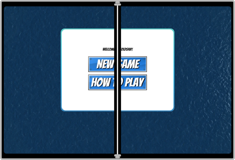
Figure 11: Game menu displayed on dual-screen device without any app modifications
It’s quite simple to fix that issue and display the dialog on either of the screens. In the foldship demo, we have a DialogBox web component that takes care of the supporting code for me. Here is a cut down snippet to handle the vertical spanning:
@media (screen-spanning: single-fold-horizontal) {
      :host {
        width: 30vw;
        height: 15vh;
        top: calc(env(fold-top) + (100vh - env(fold-top) + env(fold-height)) / 2 - 10vh);
        left: calc(50vw - 15vw);
      }
    }
This will look like this:
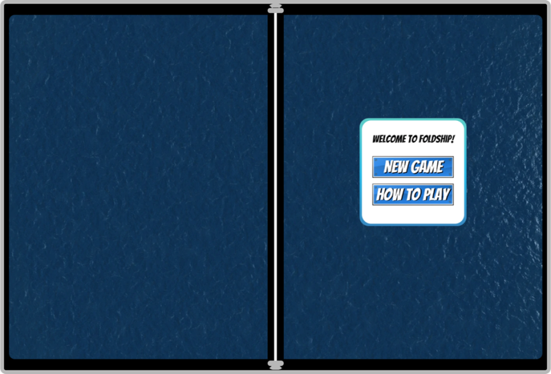
Figure 12: Game menu displayed on dual-screen device with app modifications to span across single screen
Handling the non-spanning mode on a dual-screen device
Like I said previously, in mobile devices where the viewport is narrow, we invite the user to rotate the device to play in landscape mode so we have more space to layout the grids sideby-side. On a dual-screen however, we want to go a step further because when spanning vertically, we have enough space (two physical screens!) to lay out the grids side-by-side, so we want to invite the user to span or rotate. In general, we think it’s a good idea to inform the user if you support dual-screens by letting them know that they can span to access a better UX, if you decided to provide one.
In our demo, I quickly update the rotation message with this snippet of code:
if (this._deviceSupportsSpanningMQs()) {
      let rotateMessage = this.shadowRoot.querySelector('#rotate-message');
      rotateMessage.innerHTML= 'Ahoy Captain!
Please rotate your device to play. \

 You can also span the window to play.'
    }
And here is the detection code I used to verify that the browser/device supports spanning:
_deviceSupportsSpanningMQs() {
    const hasBrowserSupport =
      window.matchMedia('(screen-spanning: single-fold-horizontal)').matches ||
      window.matchMedia('(screen-spanning: single-fold-vertical)').matches ||
      window.matchMedia('(screen-spanning: none)').matches || false;
    return hasBrowserSupport;
  }
}
Deployment
All the APIs that we’re talking about are experimental and under intense discussions within the W3C and are therefore not shipping in any browser yet. Typically, experimental features are behind a browser flag that the user needs to turn on to test the new API during development. However, if you have Surface Duo, you probably saw that this demo (and the others) work without the need of tweaking any flags.
The reason is that we’ve enabled Origin Trials on the domain the demos are hosted. Origin Trials are a mechanism to preview upcoming web platform APIs and give feedback. They can be activated on your website automatically for a certain amount of time until the trial expires, a new trial begins, or the feature ships!
You can request a token here: https://developer.microsoft.com/microsoft-edge/origin-trials/ and you’ll get a token that you can deploy on your website to enable the CSS primitives by default on Microsoft Edge running on the Surface Duo.
Resources
You can access the final Foldship demo, as well as look through the code on GitHub. If you find any issues or have feedback, feel free to reach out on Twitter or through the issues on GitHub.
I hope these examples help you to start building web-based dual-screen experiences. Visit the dual-screen web experiences documentation for more details. You’re also invited to send feedback on the specification itself.
The CSS Spanning specification is experimental and we’re working hard to improve it such as supporting more than two hinges, if one day such a device becomes available. We’re also looking at other improvements, like more environment variables to position the content in an easier fashion. There are also discussions to integrate with the Window Placement API to provide interoperable specifications.
Finally, the web community is going to meet virtually at the end of October for the annual TPAC to discuss these APIs. If you want to join and provide feedback, you’re welcome to register for TPAC; it’s free and you can attend the session dedicated to new APIs for these form factors.
We would love to hear from you! You can reach the team on Twitter @dartears, @kennethrohde, or the Microsoft Surface Duo team at @surfaceduodev.
0 comments