
Hello Android developers!
We’re excited to announce the release of our latest sample application, Dual Screen Experience Example, both as open-source code on GitHub and also available for download from Google Play.
What is the sample about?
The sample application provides developers and designers with the possibility to explore the dual screen form factor value for productivity on the go.
As a user you are going to play the role of a travelling salesperson that is searching to supply super cool guitars to a couple of guitar stores in Redmond. Each store is marked on the map using an orange pin and there will be a summary of its activity to help you in your journey.
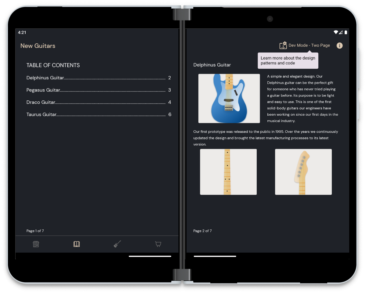
As you arrive at the chosen store, leverage your device by using the Catalog screen to explore the story for each guitar and present them to the store owner. You can also navigate through the Catalog using the Table of Contents by tapping on each item from the list.
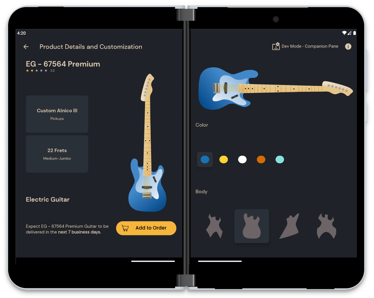
The discussion continues, and the owner decides on some interesting product designs from the list. Thus, you will move to customizing them by trying out different shapes and colors. When the perfect combination is achieved, you can add the products to the order.
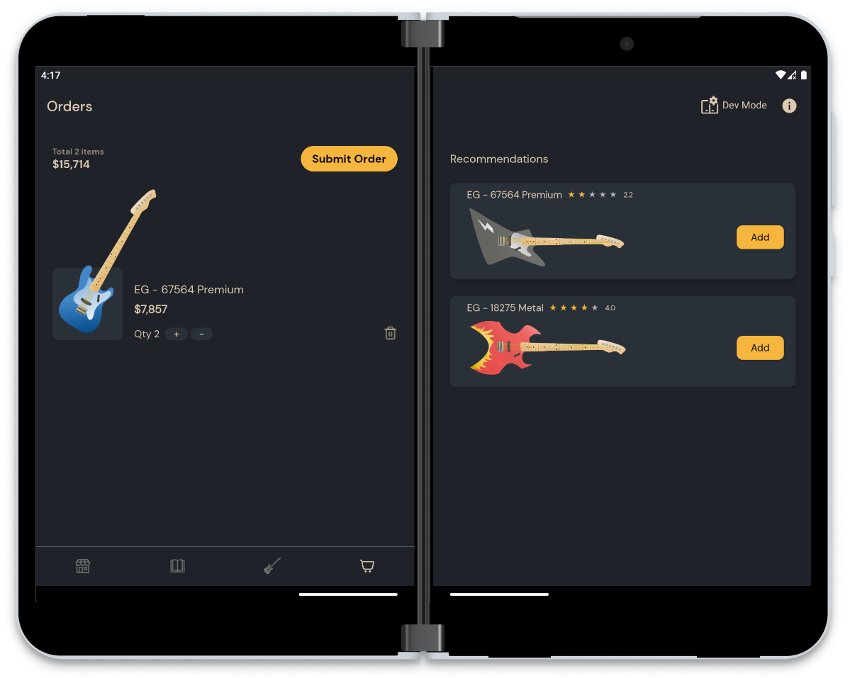
Finally, both of you will check the Orders screen where you can change the quantity for each guitar, understand the total price, remove items, or add another guitar from the recommendations. When everything looks good, the next step is to submit the order and move to another store.
(Please keep in mind that the application is just a sample, and it works with fictitious data for informative purposes only.)
What is the “Developer Mode”?
Each flow in the application was created to showcase how a specific UI pattern might be used to display more content for a more immersive experience. You can find the name of the pattern right next to the Dev Mode button in the toolbar, when the application is spanned across the folding feature.
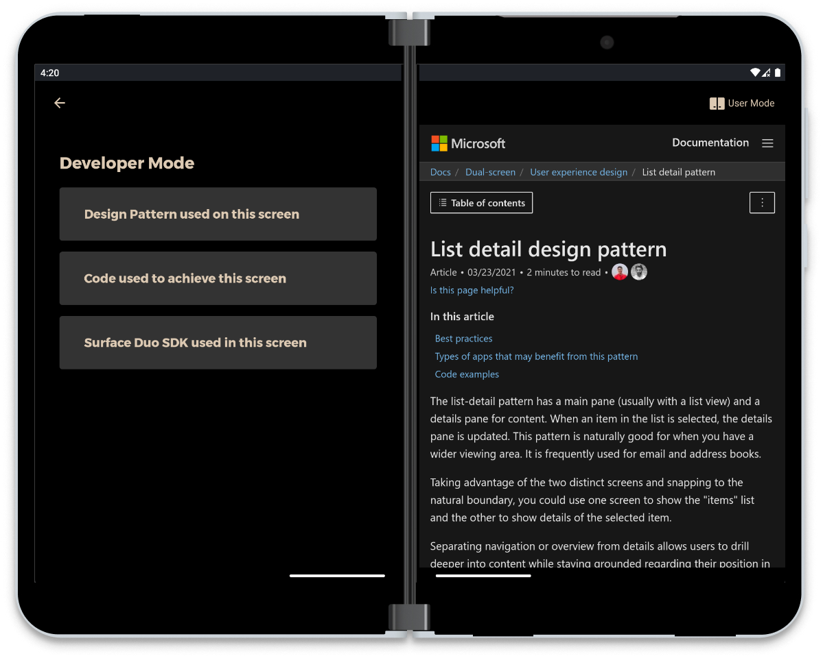
As a developer or designer, you can check each screen’s resources by tapping the Dev Mode button. Here you can explore the UI pattern that was used in that screen, the specific code we used directly from our Github repository or dive in the SDK documentation for even more details.
Is the application compatible with other devices?
Yes. The application can also be installed on other emulators or devices.
It is compatible with multiple screen sizes, following the official guidance for responsive UI and using ConstraintLayout helpers such as Flow, Guideline, Barrier, and Group, to decide the appropriate size of the components. In the case of TextViews, that is further improved by the autosizing feature for best look on the content.
It also supports multi-window mode and takes advantage of the entire large screen on other foldables with the help of the Jetpack Window Manager library and our SDK components. For example, for the Catalog section we are considering both the Activity size (when deciding how many pages to display), and the bounds of the folding feature (which changes some view constraints for a better UI layout).
Which components were used from the SDK?
To handle the navigation both in single screen and spanned mode we used our new Foldable Navigation component with FoldableLayout as the container of the fragments and foldable BottomNavigationView to change the main navigation nodes. The Foldable Navigation sets by default the first fragment on the first side of the fold when the application is rendered across a folding feature. Therefore, by setting the launchScreen attribute from the Navigation Graph, we managed to have the fragments spanned on both screens (for example for the Extended Canvas UI pattern) or moved to the end screen, as shown in the code below:
<fragment
    android:id="@+id/fragment_store_map"
android:name="com.microsoft.device.samples.dualscreenexperience.presentation.store.map.StoreMapFragment"
    android:label="StoreMapFragment"
    tools:layout="@layout/fragment_store_map"
    app:launchScreen="both">

    <action android:id="@+id/action_store_map_to_list"
        app:destination="@id/fragment_store_list"
        app:launchScreen="end" />

    <action android:id="@+id/action_store_map_to_details"
        app:destination="@id/fragment_store_details"
        app:launchScreen="end" />

</fragment>
In the Orders screen, we included the foldable RecyclerView component from the SDK, through the FoldableStaggeredLayoutManager and FoldableStaggeredItemDecoration, to prevent having the items of different sizes from being rendered behind the folding feature. The following method is being called for every WindowLayoutInfo change, so the UI can adapt to it:
private fun setupRecyclerView(windowLayoutInfo: WindowLayoutInfo) {
    binding?.orderItems?.apply {
        layoutManager = FoldableStaggeredLayoutManager(context, windowLayoutInfo).get()
        replaceItemDecorationAt(FoldableStaggeredItemDecoration(windowLayoutInfo))
    }
}
Available on Google Play
To install the application, access the link below on your preferred device. For the best experience, try it out on a foldable/dual-screen device. Enjoy the journey and don’t forget to tell us what you think!
Feedback and resources
Check out the Surface Duo developer documentation and past blog posts for links and details on all our samples. You can find this sample on GitHub.
If you have any questions, or would like to tell us about your apps, use the feedback forum or message us on Twitter @surfaceduodev.
This week the Twitch stream will be live at the Europe-friendly time of 13:00h CET (12 noon GMT) – join the team to chat live about this sample app. The stream will be replayed at our usual time of 11am Pacific time for those in the Americas.
0 comments