
Hello web developers!
Responsive design has always been the cornerstone of web development, rather than designing for a single use case, we focus on creating applications that can adjust to the needs of the platform they are running on. Microsoft Surface Duo is no exception to this and in past blog posts we’ve explored how we can use the CSS and JavaScript primitives to create experiences using standard web technologies. With the web being as complex a platform as it is, many developers prefer to use frameworks and libraries to help them build rich, complex responsive web applications.
In this post, we’ll look at how we can use one of the most popular libraries, React, to build a foldable web experience. We’ll take the photo gallery demo and make a React version of it, then look at how we can leverage the power of React to make a foldable experience.
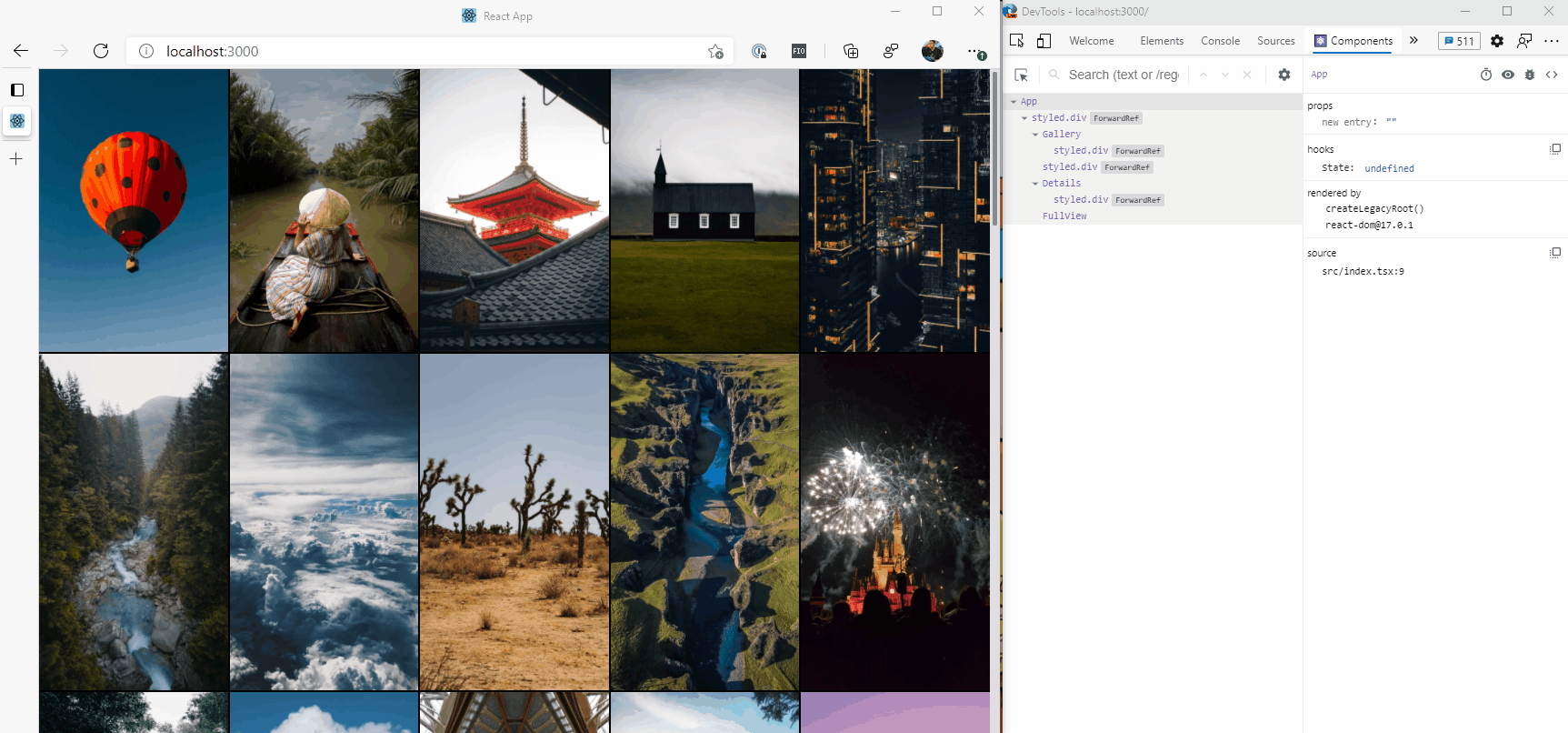
Figure 1: Animation of the photo gallery and web developer tools (click to start)
Creating the demo
To keep the demo application as simple as possible, we’ve used Create React App to scaffold up the application, using the TypeScript Template to give us type-safety in the codebase.
The full source code of the demo, which has converted the existing photo gallery to a React application, can be found on GitHub, but let’s look at a few specific parts of it.
App.tsx
This is the entry point for our application and contains some state for which image is selected presently, then adds components to the component tree representing how our application works.
import React, { useState } from "react";
import images, { Image } from "./images";
import "./App.css";
import Gallery from "./Gallery";
import Details from "./DetailContainer";
import Fold from "./Fold";
import FullView from "./FullView";
import { Container } from "./App.styles";

function App() {
  const [currentImage, setCurrentImage] = useState<Image>();

  return (
    <Container>
      <Gallery images={images} selectImage={setCurrentImage} />
      <Fold />
      <Details currentImage={currentImage} />
      <FullView
        currentImage={currentImage}
        closeImage={() => setCurrentImage(undefined)}
        prevImage={(image) =>
          setCurrentImage(images[images.indexOf(image) - 1])
        }
        nextImage={(image) =>
          setCurrentImage(images[images.indexOf(image) + 1])
        }
      />
    </Container>
  );
}

export default App;
Straight away we can see what the application is doing succinctly, we have a Container component which holds the application, and within that there are four components, Gallery, Fold, Details and FullView.
Let’s have a look at the Container component to see how we’ve styled it.
import styled from "styled-components";

export const Container = styled.div`
  display: flex;
  flex-direction: row;

  @media (screen-spanning: single-fold-vertical) {
    flex-direction: row;
  }

  @media (screen-spanning: single-fold-horizontal) {
    flex-direction: column-reverse;
  }

  @media (screen-spanning: none) {
    flex-direction: row;
  }
`;
We’re using Styled Components, a popular library for doing CSS-in-JavaScript and component styling. We can see that in the styles we’re applying, the appropriate media queries exist to make the application responsive across a single and dual-screen device. This means that our component is ready to go when it comes to working on a dual-screen device.
Fold, Details, and FullView
These three components are used for different display options, depending on whether we’re on a single or dual-screen device. For example, we don’t need to include the Fold if we’re on a single screen, as the screen doesn’t have a fold, so we can use CSS to hide it.
import styled from "styled-components";

const Fold = styled.div`
  background-size: 40px 40px;

  background-color: #737373;
  background-image: linear-gradient(
    45deg,
    rgba(255, 255, 255, 0.2) 25%,
    transparent 25%,
    transparent 50%,
    rgba(255, 255, 255, 0.2) 50%,
    rgba(255, 255, 255, 0.2) 75%,
    transparent 75%,
    transparent
  );

  @media (screen-spanning: single-fold-vertical) {
    height: env(fold-height);
    width: env(fold-width);
  }

  @media (screen-spanning: single-fold-horizontal) {
    height: env(fold-height);
    width: env(fold-width);
  }

  @media (screen-spanning: none) {
    height: 0;
    width: 0;
  }
`;

export default Fold;
As we can see here, there’s a lot of CSS being loaded when we’re going to end up hiding the element when it matches @media (screen-spanning: none). We have used a similar approach on the Details component, and the inverse for FullView, as it is hidden when we are in dual-screen mode.
With all this in place, our application is ready to go, and you can view it here.
But we’re not leveraging the real power of React, in fact, we’re doing a bit of a disservice to React as we’re adding components to the component tree that don’t need to be there. Let’s look at the component structure:
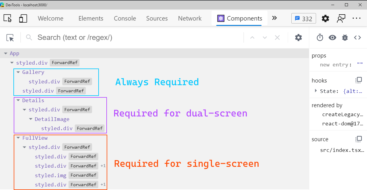
Figure 2: React component structure
You’ll notice that we’re adding both the Details and FullView components (and Fold for that matter), regardless of whether it’s needed or not, then relying on CSS to hide/show the right version. While this might not be an issue in our demo application, in a more complex application, this could manifest itself as a performance issue as we’re rendering components unnecessarily.
Introducing react-foldable
To make it easy to work with foldable displays from React, we can use the react-foldable npm package, which will provide us with components and hooks which expose the information from the underlying DOM APIs.
Creating a foldable region
Because part of our application may always be available regardless of whether we have a single or dual-screen experience, such as the Gallery, react-foldable gives us a component that allows us to make only part of the application “foldable aware”.
Let’s revisit the App.tsx file and have it use the Foldable component:
import { Foldable } from "@aaronpowell/react-foldable";

function App() {
  const [currentImage, setCurrentImage] = useState<Image>();

  return (
    <Container>
      <Gallery images={images} selectImage={setCurrentImage} />
      <Fold />
      <Details currentImage={currentImage} />
      <FullView
        currentImage={currentImage}
        closeImage={() => setCurrentImage(undefined)}
        prevImage={(image) =>
          setCurrentImage(images[images.indexOf(image) - 1])
        }
        nextImage={(image) =>
          setCurrentImage(images[images.indexOf(image) + 1])
        }
      />
      <Foldable>

      </Foldable>
    </Container>
  );
}

export default App;
The Foldable component itself doesn’t change how our application works, we do that by adding FoldableScreen components to it. The FoldableScreen component is a wrapper around parts of our component tree that will be conditionally added or removed, depending on a test we provide against the foldable state of the application.
Let’s make it so the Fold and Details components are not included unless we’ve spanned across to a second screen:
return (
    <Container>
      <Gallery images={images} selectImage={setCurrentImage} />
      <FullView
        currentImage={currentImage}
        closeImage={() => setCurrentImage(undefined)}
        prevImage={(image) =>
          setCurrentImage(images[images.indexOf(image) - 1])
        }
        nextImage={(image) =>
          setCurrentImage(images[images.indexOf(image) + 1])
        }
      />
      <Foldable>
        <FoldableScreen matchScreen={1}>
          <React.Fragment>
            <Fold />
            <Details currentImage={currentImage} />
          </React.Fragment>
        </FoldableScreen>
      </Foldable>
    </Container>
  );
On FoldableScreen we can provide a matchScreen prop, which takes a number that matches a segment in the windowSegments data. It’s important to remember that this is working from a zero-based index, so the “second screen” is the screen segment in position 1 of the array.
Next, we want to hide the FullView component if we’re not spanned across multiple screens, and we can’t do that by providing a matchScreen value of 0 as there’s always a screen there, we instead can provide a match function.
return (
    <Container>
      <Gallery images={images} selectImage={setCurrentImage} />

      <Foldable>
        <FoldableScreen matchScreen={1}>
          <React.Fragment>
            <Fold />
            <Details currentImage={currentImage} />
          </React.Fragment>
        </FoldableScreen>

        <FoldableScreen match={({ isDualScreen }) => !isDualScreen}>
          <FullView
            currentImage={currentImage}
            closeImage={() => setCurrentImage(undefined)}
            prevImage={(image) =>
              setCurrentImage(images[images.indexOf(image) - 1])
            }
            nextImage={(image) =>
              setCurrentImage(images[images.indexOf(image) + 1])
            }
          />
        </FoldableScreen>
      </Foldable>
    </Container>
  );
The match prop takes a function which receives an argument that has three properties, isDualScreen, windowSegments (the array of DOMRect), and screenSpanning (is the screen spanned as vertical, horizontal, or none, matching the media query). If we’re not in dual-screen mode we can render the component, so that’s what we’ll return from our function.
Now when we run our application and look at the component tree, we’ll notice that it starts a lot smaller as there’s no selected image, and as we transition between single and dual-screen, the components loaded are going to change.
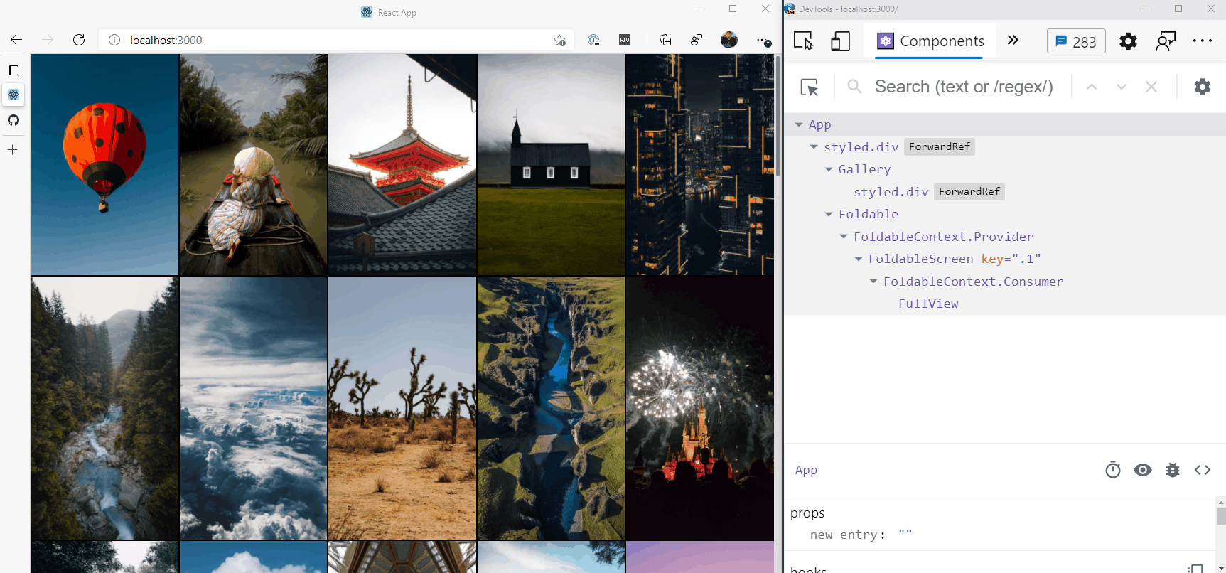
Figure 3: Animation of the photo gallery using react-foldable (click to start)
Conclusion
Here we’ve seen how we can leverage the power of React to make a foldable web experience and use the react-foldable library to expose the important information about the underlying foldable state of an application to have our component tree only represent what our application needs.
You can view the initial application (code), and the updated version using react-foldable (code).
If you want to learn more about the react-foldable library, check out the GitHub repository. For more information on dual-screen web development, visit the dual-screen web developer documentation.
The Surface Duo Developer Experience team is keen to hear about your experiences building dual-screen web apps – reach out via our forum or on Twitter @surfaceduodev.
0 comments