
Hello hybrid app developers,
This week I’m happy to share an example plugin for use with Cordova that will help to enhance your hybrid apps for dual-screens. The plugin includes DisplayMask.jar to detect the Surface Duo and return information about the masked hinge area when the app is spanned, and exposes it in JavaScript for Cordova apps to consume. In addition to the open-source plugin code there are three Cordova sample apps available on GitHub to show how to use it.
Cordova plugin
The plugin example can be easily included in your app with the following command:
cordova plugin add https://github.com/conceptdev/cordova-dualscreeninfo-plugin/
Once added to your Cordova app, you can use the methods provided by the plugin to get information about the device and, if it is a Surface Duo, whether the app is spanned and masked by the hinge:
-
window.ScreenHelper.isDualScreenDevice– Use this method to determine if the device is a Surface Duo. Returnstrueorfalse. -
window.ScreenHelper.getHinge– Returns the coordinates of the hinge (if the app is spanned) as a comma-separated string"x,y,width,height". All zeros"0,0,0,0"will be returned if the app is not spanned and the hinge can’t be detected (or the app is running on a single-screen device).
Using these methods you can detect when your app is running on a Surface Duo, whether it is spanned, and the orientation. The samples include a Hinge class to help work with the data returned.
Default app template demo
By adding the plugin to a cordova new app template, I used the two plugin methods to enhance the HTML and JavaScript for dual-screens:
- Show information about the device, screen size, and spanned state of the app.
- Display a ‘debug’ hinge that will draw slightly larger than the masked area (for testing, not required for your live apps).
- Position the content correctly when the app is spanned, and add a Surface Duo photo on the second screen.
When spanned, the app shows the content side-by-side with the hinge debug visualization in the middle:
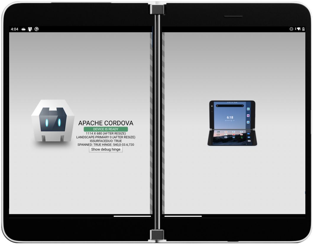
Figure 1: Default Cordova app template enhanced with a dual-screen aware layout
The basic structure of the index.html page consists of three div elements (the left and right panes, and the hinge between them):
<div class="app">
    <h1>Apache Cordova</h1><!--text placeholders omitted for clarity-->
</div>
<div class="fold angled stripes single" id="debughinge"></div>
<div class="secondscreen"></div>
The JavaScript for the page (in js/index.js) requires an event listener for the resize event:
window.addEventListener('resize', onResize, true);
The onResize function uses the ScreenHelper.getHinge method from the plugin to get the device metrics that indicate whether the app is spanned, and positions elements to adapt to the hinge and device orientation:
function onResize() {
    window.ScreenHelper.getHinge(
        function(result) {
            var h = new Hinge (result);
            if (h.isSpanned) {
                // show the debug hinge visualization, and show the second screen content
                document.getElementById('debughinge').classList.add('spanned');
                document.getElementsByClassName("secondscreen")[0].style.display = 'block';
                if (h.isVertical) { // move the app content to the left
                    document.getElementsByClassName("app")[0].style.left = '25%';
                    document.getElementsByClassName("app")[0].style.top = '50%';
                }
// ... rest of the layout changes ...
}, function(error) { }
    );
}
The complete sample code is available on GitHub – this approach could be used with existing Cordova apps to adjust the layout when spanned on a Surface Duo.
Foldable CSS demo
CSS and JavaScript browser extensions were discussed in an earlier blog post on building and testing dual-screen web apps. While the web view that’s embedded in Cordova does not yet natively support those extensions, it’s possible to use the polyfill implementations (in conjunction with the plugin) to get them working in your apps. Here’s how the boxes.html page looks when rendered inside Cordova (I added some app metrics text to each box):
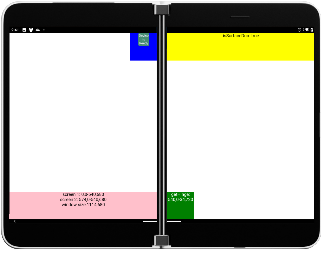
Figure 2: Explainer dual-screen CSS layout reproduced in a Cordova app
You can download the app source from GitHub to see how it works – the key elements are summarized below.
The HTML consists of elements that are positioned using CSS, and includes the polyfill JavaScript:
<div class="blue></div><!--text placeholders omitted for clarity-->
<div class="yellow"></div>
<div class="pink"></div>
<div class="green"></div>
<div class="fold angled stripes"></div>
<!-- Polyfills for dual screen capabilities -->
<script src="js/spanningcsspolyfill.js"></script>
<script src="js/windowsegmentspolyfill.js"></script>
The CSS uses the dual-screen @media query for screen-spanning to position the elements differently for each screen configuration (excerpt shown):
@media (screen-spanning: single-fold-vertical) {
    .fold {
      height: env(fold-height);
      width: env(fold-width);
      left: env(fold-left);
      top: 0;
    }
    .blue {
        left: calc(env(fold-left) - 100px);
    }
    .yellow {
        width: calc(100vw - env(fold-left) - env(fold-width));  /*fold-right*/
        left: calc(env(fold-left) + env(fold-width)); /*fold-right*/
        top: 0;
    }
    /* other styles */
  }
  @media (screen-spanning: single-fold-horizontal) {
    /* double-landscape styles */
  }
  @media (screen-spanning: none) {
    .fold {
      height: 0;
      width: 0;
    }
    /* other single-screen styles */
}
Finally, a resize event listener uses the plugin to detect when the app is spanned and supply relevant information to update the polyfills (which in turn processes the CSS and updates the layout):
window.ScreenHelper.getHinge(
    function(result) {
        var h = new Hinge (result);
        if (h.isSpanned) {
            if (h.isVertical) {
                window["__foldables_env_vars__"].update({spanning: 'single-fold-vertical', foldSize: parseInt(h.width)});
            } else { // isHorizontal
                window["__foldables_env_vars__"].update({spanning: 'single-fold-horizontal', foldSize: parseInt(h.height)});
            }
        } else { // not spanned
            window["__foldables_env_vars__"].update({spanning: 'none', foldSize: 0});
        }
Photo Gallery sample
This photo gallery sample was created to demonstrate the foldable CSS @media screen-spanning feature in the browser. It was embedded in a Cordova sample app using the approach described above to enable the CSS and JavaScript polyfills. The source is available on GitHub, and a screenshot is shown below:

Figure 3: Dual-screen web apps can be brought to Cordova with a few lines of code
Feedback
If you are using Cordova, Ionic, or any other web-based app deployment tools we’d love to hear about your app and how it might be enhanced for dual-screens.
Please reach to out to the team using our feedback forum or message us on Twitter @surfaceduodev.
0 comments