
Hello app designers!
Today we are going to talk about designing for foldable and large screens. We’ve been practicing responsive web design for a long time – let’s use those concepts to optimze your mobile app for different platforms and devices. Mobile apps can use adaptive designs to deliver a consistent app experience. In today’s blog, we will be talking about the design recommendations when adapting your app to foldable and large screens.
Design for unique postures
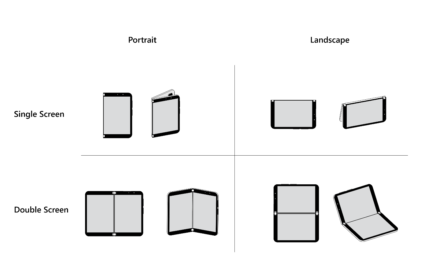
Posture overview
The difference between foldable and large screens with regular mobile devices is the diversity of postures. Postures here are the screen configurations to foldables. We can separate different postures using modes and orientations.
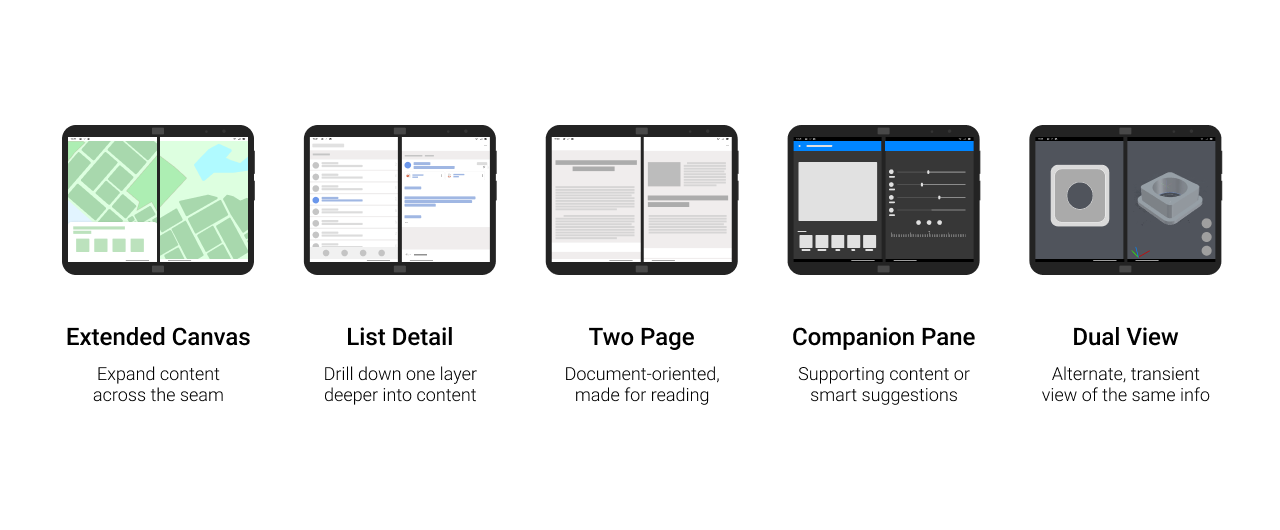
Dual-screen UX pattern and example
Postures using a single screen have similar proportions to a general mobile phone. However, when using double screens or spanning mode. We have several canonical UX patterns for apps to adapt to dual screens.
Depending on the use cases, an app usually can be some combination of a couple of these UX patterns. Take our Surface Duo Experience App as an example here.
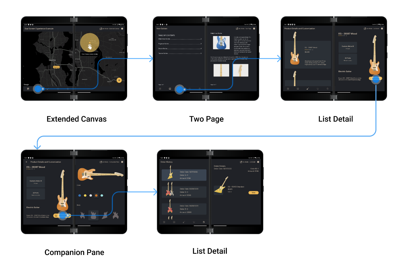
In our design workshops with 3-rd party apps, we saw a high percentage of them that are quite suitable for the list-detail pattern. In this pattern, the next frame in the navigation flow can be placed on the other screen:
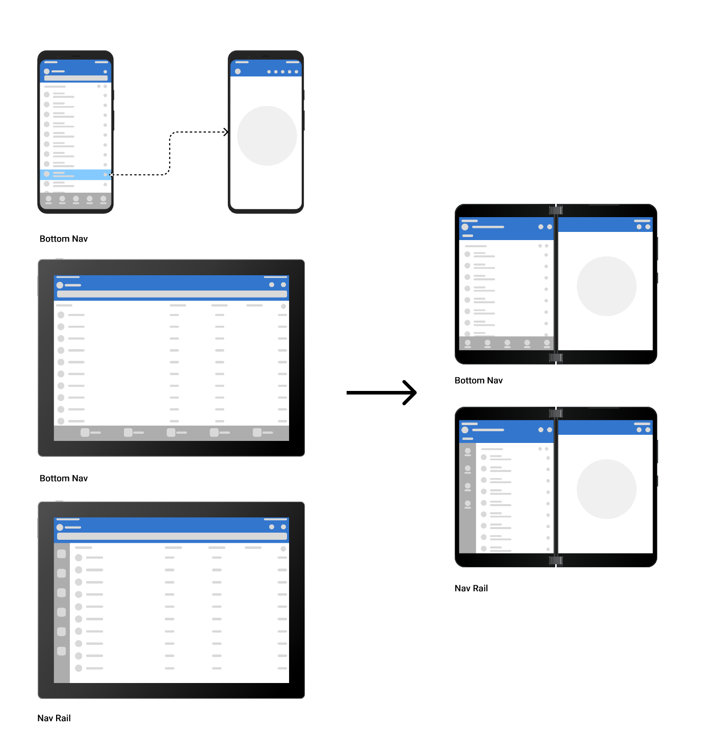
Consider ergonomics in spanning modes
When placing or choosing navigation components for spanning modes, it is best to also consider reachability while referencing the existing mobile app and tablet app design. For foldable devices, main navigation components should be placed closer to the sides or lower edge:
Components that need attention
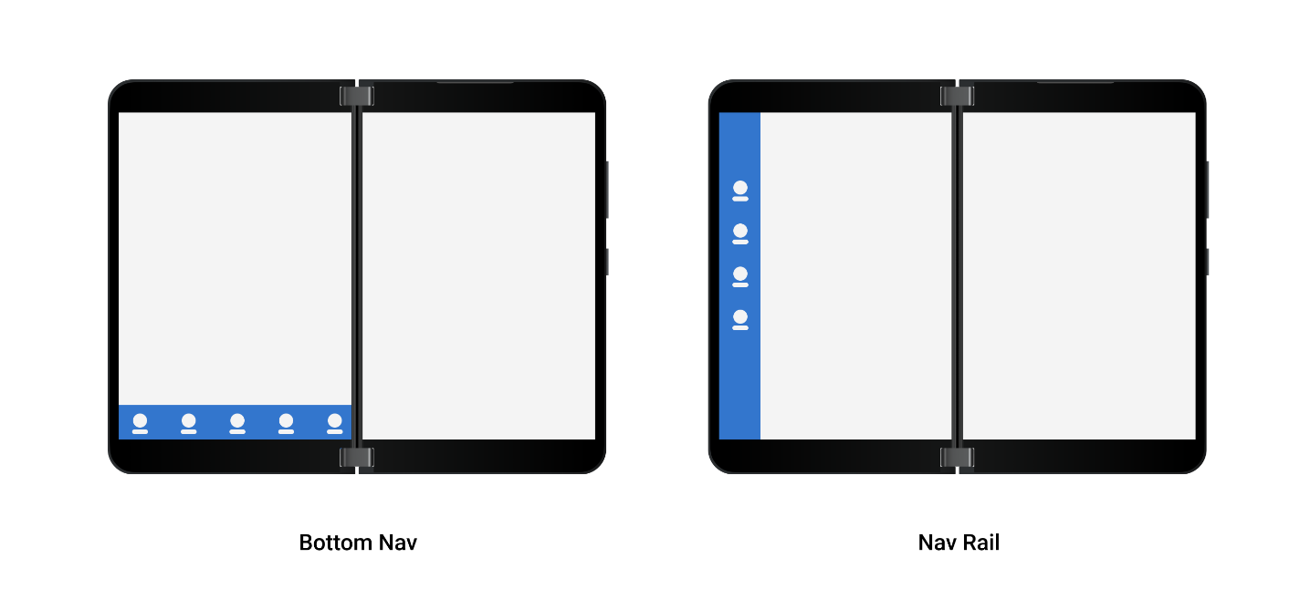
Bottom navigation or navigation rail
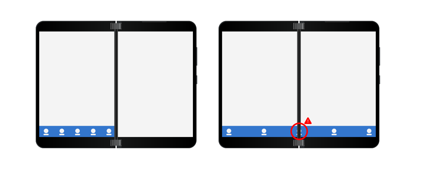
In most cases, optimizing for foldable devices can build on tablet design principles. Depending on app navigation and information design, you can choose either bottom navigation or navigation rail. Be cautious if you plan to span the bottom navigation component:
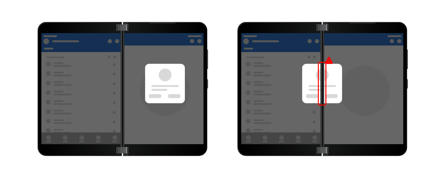
Dialog box
Dialog boxes should be placed on users’ primary hand side. Surface Duo has a handiness setting which users can set to right-hand or left-hand. Correct and incorrect placement is shown here:
Resources and feedback
You can find more information both design and development on optimizing your app for Surface Duo and foldable devices on our Learn site: Introduction to dual-screen devices and Design Kit. If you have any specific cases would like to discuss, please reach out to us on Tech Community or find us on Twitter @surfaceduodev.
You can also live chat with us on Twitch this Friday, on October 7th at 11am PST, where we will share more insights on designing for foldable and large screens!
0 comments