We want to continue our discussion of the recent changes made to the NuGet experience with the v3 releases, and in this second blog post of the series we are going to focus on the user interface updates that were made for Visual Studio 2015. I touched on it briefly in our last blog post about What and Why, but this time lets go a little deeper into the functionality and then explore the changes that are being made.
2013 compared to 2015
We showed this side-by-side comparison in the last blog post, and it helps to show immediately what has changed:
 Before: NuGet User Interface in Visual Studio 2013 |
 After: NuGet User Interface in Visual Studio 2015 |
I covered the good, bad, and ugly about this user interface previously, but lets now review some of the concepts and changes that are planned to make this experience better.
New Header

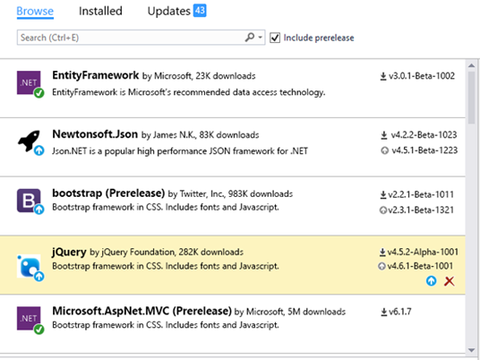
- The Filter combobox has been replaced with three filtered views of packages through the Browse, Installed, and Updates pivot menus.
- We’re introducing a badge on the Updates menu to indicate how many packages in the current project have updates available
- Search is now directly below the pivot menus to indicate that the search is within context of the menu selected
- Include Pre-release has been relocated next to the search box to indicate that the search and pre-release filter apply together to the results.
- Package source is moved to the right side. Many developers don’t change this frequently, and we believe that keeping it away from the typical controls should ease confusion.
Package List – Browse View

We made some targeted enhancements in the package list to allow developers to quickly scan the package list and act on the contents.
- The author and approximate download count are displayed next to the package name
- A badge is added to the package icon when the latest version is installed (green check) or if there are updates available (arrow)
- The currently installed version is listed with a down arrow
- If a newer version is available, that version number is also listed with an up arrow
- If no version is installed, the latest version number is listed with an arrow
- Package versions are stacked vertically to allow for easy comparison of version numbers to help determine if a new version install is appropriate
- Hovering over a package in the list reveals action buttons beneath the version numbers:
- Down arrow will install the latest version when no version is currently installed
- Up arrow will update to the latest version
- An X will uninstall the package from the project
We think this design will result in many developers using the left panel for most of their package interactions and using the right details panel for ‘advanced’ operations.
Package List – Updates View

This prototype demonstrates the concept for the new multiple package update feature. When viewing the list of updates that are available (yes, the header in this prototype is not aligned with the previous images) a bar will be presented at the top of the package list to facilitate this operation.
- Check the ‘Select all packages’ option to choose to update all available packages
- Hover over any package in the list to gain access to an individual checkbox that can be used to update only those chosen packages in the list.
Package Details – Project View

We plan to simplify the actions that can be taken on a package on the right details pane:
- Remove the action selector combobox
- List the installed version (if any) with an Uninstall button next to it
- Move the version combobox below the installed version and continue to allow developers to choose a version to update to.
- The Upgrade button will have the caption “Update” in order to generically apply to ‘Upgrade’ and ‘Downgrade’
- The release date of the package will be reported in the details at the bottom
Package Details – Solution View

Solution view will present the familiar project hierarchy to allow you to work with multiple projects in the solution again.
- The distinct count of package versions across the solution will be reported at the top of the panel
- Currently installed version will be reported next to each project
- Multi-select projects with checkboxes at the solution or project folder levels
- Separate Uninstall and Update buttons
- Version selector and Update button will update or install the package as necessary in all projects chosen.
Summary
We think these focused changes to address the most common issues that developers have in working with the user-interface will help with their daily workflow. Additionally, we are continuing to focus on optimizing repository interactions so that this experience is more on-par with the ‘Add Reference’ dialog.
This user interface update is scheduled for our next minor version release, version 3.3 You can follow along with the development on our 3.3-beta milestone on GitHub Do you see something in these samples that you like? Is there something that you think could be improved? Please comment in the Disqus section below, we appreciate your feedback.
In our next blog post, we will demonstrate how to enhance packages to support modern portable class libraries.

0 comments