The usage of SharePoint Framework keeps on growing and while there are already great solutions build, we have noticed that a lot of developers try to achieve the same thing. Also, many developers asked us to open source the first party solutions to learn from the SharePoint engineering team and re-use some of the code.
We want to announce the availability of two types of libraries that include reusable SharePoint Framework controls. This allows you to speed up your development process by not rewriting these components for every project.
Today the following types of controls types are available:
- Property pane controls: https://github.com/SharePoint/sp-dev-fx-property-controls/
- React controls: https://github.com/SharePoint/sp-dev-fx-controls-react/
The two projects are coordinated by the SharePoint Patterns and Practices initiative and are open to community contributions.
Property pane controls
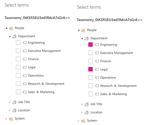
The property pane controls project contains a set of reusable controls that can be used while configuring the web part. Like, for example, a term picker control which allows you to select terms from various term sets without writing a lot of code.

The following controls are currently available:
- PropertyFieldColorPicker – Property pane color picker
- PropertyFieldDateTimePicker – Property pane date and time selector
- PropertyFieldListPicker – Property pane list selector
- PropertyFieldPeoplePicker – Property pane people / group selector
- PropertyFieldSpinButton – Property pane spin button
- PropertyFieldTermPicker – Property pane managed metadata term selector
The following controls are extended controls that show a callout next to the label
- PropertyFieldDropdownWithCallout – Property drop-down field with callout
- PropertyFieldTextWithCallout – Property text field with callout
- PropertyFieldToggleWithCallout – Property toggle field with callout
If you want to get started with these controls, check out the getting started documentation for these controls: https://sharepoint.github.io/sp-dev-fx-property-controls/getting-started/.
React controls
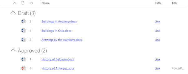
The React controls library contains a set of reusable controls that can be used in your React driven components. For example, a list view control which allows you to render your arrays as SharePoint like list views which allows sorting, grouping and other typical capabilities.

The following components are currently available:
- FileTypeIcon – Component that shows the icon of a specified file path or application
- ListView – List view component
- Placeholder – Component that can be used to show an initial placeholder if the web part has to be configured
- SiteBreadcrumb – Breadcrumb component
- WebPartTitle – Title control for web parts in similar ways as many out-of-the-box web parts have
Share your ideas and how to contribute
The SharePoint Framework reusable controls is an open-source project driven by the SharePoint Patterns and Practices initiative. The projects are built and managed publicly on GitHub at https://github.com/SharePoint/sp-dev-fx-property-controls/ and https://github.com/SharePoint/sp-dev-fx-controls-react/. We accept community contributions. If you have ideas of controls you are currently missing, and want to see being added to the projects, please share these ideas via the appropriate project issue lists. We will be harvesting ideas and reusable patterns also from the out of the box code used by the out-of-the-box client-side web parts, so you will be seeing some familiar capabilities from those web parts in these controls.
Let’s make our lives easier by making these great controls together.
“Sharing is caring”
SharePoint PnP team / SharePoint Engineering – 15th of December 2017
